blog
Using Visual Themes to Elevate Your Fantasy Book Cover
Visual themes serve as the cornerstone of captivating fantasy book covers, acting as a silent storyteller that instantly communicates the essence of your narrative. These themes encompass a cohesive set of visual elements, including color palettes, imagery, and stylistic choices, that work in harmony to create a powerful first impression. Effective visual themes evoke emotion and intrigue, drawing potential readers into the world you’ve crafted before they’ve even opened the book. When developing a visual theme for your fantasy cover, consider the core elements of your story: the setting, the mood, the main characters, and the central conflict. These aspects should inform your design choices, ensuring that your cover accurately represents the content within. For example, a dark and brooding theme might be appropriate for a gritty urban fantasy, while a whimsical and colorful approach could better suit a lighthearted fairy tale retelling. It’s crucial to research current trends in fantasy cover design while also striving for uniqueness that sets your book apart. “A book cover is a promise,” as the saying goes, and your visual theme should make a promise that aligns with the adventure awaiting readers inside. By carefully crafting a cohesive visual theme, you can create a cover that not only catches the eye but also resonates with your target audience, ultimately increasing the chances of your book finding its way into eager hands.
Choosing colors that evoke your story’s atmosphere
 Color selection is a powerful tool in crafting the perfect atmosphere for your fantasy book cover. The right palette can instantly transport viewers to your story’s world, evoking emotions and setting expectations. For epic fantasies set in vast, magical realms, consider using rich, deep colors like royal purple, emerald green, or sapphire blue to convey a sense of grandeur and mysticism. These hues can be complemented with metallic accents of gold or silver to add a touch of regality and magic.
For darker, more brooding tales, a palette of deep reds, blacks, and grays can effectively communicate the story’s ominous tone. These colors evoke feelings of danger, mystery, and intrigue, perfect for tales of vampires, dark magic, or apocalyptic scenarios. Conversely, for lighter, more whimsical stories, pastel shades of pink, lavender, and mint green can create a dreamy, enchanted atmosphere suitable for fairy tales or romantic fantasy.
Let your cover tell a story. Learn more on our site.
It’s essential to consider the psychological impact of colors. Blue, for instance, can evoke feelings of calm and serenity, making it suitable for stories set in aquatic or celestial realms. Green, associated with nature and growth, works well for tales involving forests, elves, or earth magic. Red, a color of passion and danger, can be perfect for stories with intense action or romance elements.
“Color is a power which directly influences the soul.” – Wassily Kandinsky
This quote from the renowned artist underscores the profound impact color can have on a viewer’s emotional response, a principle that applies equally to book cover design.
Remember to consider color harmony and contrast when selecting your palette. A well-balanced color scheme can guide the viewer’s eye to important elements of the cover, such as the title or a central image. High contrast between colors can create visual interest and make your cover stand out on a crowded bookshelf or digital marketplace.
Additionally, consider the cultural connotations of colors, especially if your fantasy world draws inspiration from specific real-world cultures. Colors can have different meanings across cultures, and being mindful of these associations can add depth to your cover’s visual storytelling.
Lastly, don’t shy away from unexpected color combinations. Sometimes, a unique or surprising palette can make your cover memorable and intriguing. For example, a fantasy story set in a traditional medieval-inspired world might stand out with a modern, neon color scheme, hinting at unexpected twists or a fresh take on the genre.
Incorporating symbolic elements and motifs

Symbolic elements and motifs play a crucial role in conveying the essence of your fantasy story at a glance. These visual cues can represent key themes, characters, or plot points, creating an immediate connection with potential readers. When incorporating symbols, consider both universal and story-specific imagery. For instance, a sword might represent conflict or heroism, while a unique magical artifact could be central to your plot. Carefully chosen motifs can subtly hint at the story’s genre, setting, or central conflict without overwhelming the design.
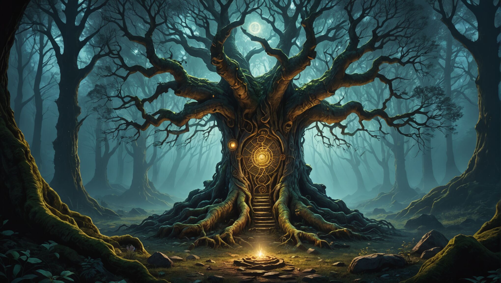
Natural elements often serve as powerful symbols in fantasy covers. A looming mountain range can suggest an epic quest, while a twisted tree might imply a dark, enchanted forest setting. Celestial bodies like moons, stars, or suns can evoke themes of destiny or cosmic significance. Animal motifs, such as wolves, dragons, or phoenixes, can represent character traits or magical abilities central to your story.
Geometric patterns and intricate designs can add depth and mystique to your cover. Celtic knots, for example, might suggest a connection to ancient lore, while fractal patterns could hint at complex magical systems or alternate dimensions. These elements can be subtly integrated into the background or used as framing devices to enhance the overall composition.
Consider the use of negative space to create hidden symbols or silhouettes that reveal themselves upon closer inspection. This technique can add an element of discovery for the viewer, encouraging them to engage more deeply with your cover design. For instance, the outline of a face hidden within a landscape can create an intriguing visual puzzle.
Color symbolism can work hand-in-hand with visual motifs to reinforce your story’s themes. A red rose might symbolize love or passion, while a wilting black rose could represent decay or lost hope. The interplay between symbols and colors can create layers of meaning that resonate with your target audience.
When selecting symbols and motifs, strive for a balance between familiarity and originality. While recognizable symbols can quickly communicate genre expectations, unique or unexpected elements can set your cover apart and pique curiosity. For example, a traditional fantasy sword intertwined with modern technological elements could suggest a blend of classic and contemporary themes in your story.
Remember that symbols can have different meanings across cultures. If your fantasy world draws inspiration from specific cultural traditions, research the symbolism carefully to ensure respectful and accurate representation. This attention to detail can add authenticity to your cover and demonstrate the depth of your world-building.
Lastly, consider how your chosen symbols and motifs will translate across different formats, from physical books to thumbnail images on digital platforms. Ensure that key symbolic elements remain clear and impactful at various sizes, maintaining their effectiveness in communicating your story’s essence regardless of how the cover is viewed.
Balancing typography with imagery
When designing a fantasy book cover, achieving the right balance between typography and imagery is crucial for creating a visually appealing and effective design. The title and author’s name should be clearly legible while complementing the visual elements, not competing with them.
Start by selecting a font that aligns with your story’s tone and genre. For epic fantasy, ornate serif fonts can evoke a sense of grandeur and tradition. Urban fantasy might benefit from sleek, modern sans-serif typefaces. Always prioritize readability, especially when the cover is viewed as a thumbnail.
Consider the placement of your text carefully. The title should be prominently displayed, typically occupying the top third or center of the cover. Experiment with different sizes and arrangements to find what works best with your imagery. Some designers opt for a large, bold title that becomes part of the illustration itself, while others prefer a more subtle approach with the text integrated into the background.
Color is a powerful tool for ensuring your typography stands out. Choose a text color that contrasts well with the background imagery. If your cover features a complex illustration, consider adding a subtle shadow or glow effect to the text to improve legibility. Alternatively, you might place the text over a semi-transparent overlay or within a design element like a banner or shield.
Incorporating typographic effects can enhance the overall theme of your cover. For instance, you might use a metallic or embossed effect for a title in a high fantasy novel, or a smoky, ethereal text treatment for a ghostly tale. However, use these effects judiciously to avoid overwhelming the design.
Don’t forget about the importance of negative space. Leaving some breathing room around your text can make it more impactful and easier to read. This doesn’t mean your cover needs to be sparse; rather, consider creating “quiet” areas within your design where the text can reside comfortably.
The relationship between your title and subtitle (if applicable) should be clear through hierarchy. Use size, weight, and color to differentiate between them while maintaining a cohesive look. The author’s name should also be given due prominence, especially for established writers with a following.
Consider the emotional impact of your typography. The way your text is presented can reinforce the mood of your story. Jagged, intense lettering might suit a thriller, while flowing, script-like fonts could be perfect for a romantic fantasy.
Lastly, remember that your cover design should work across various formats. Test your typography at different sizes to ensure it remains legible on both physical books and digital thumbnails. Be prepared to adjust text size or placement to accommodate different aspect ratios for ebook covers.
By carefully balancing typography with imagery, you can create a fantasy book cover that not only captures the essence of your story but also stands out in a crowded marketplace, effectively drawing readers into your magical world.
Creating depth and dimension in cover designs
 To create depth and dimension in your fantasy book cover designs, consider employing various techniques that add visual interest and a sense of immersion. Layering is a powerful tool that can create the illusion of depth. Start with a background layer that sets the scene, then add mid-ground and foreground elements to build a sense of space. This technique is particularly effective for fantasy landscapes, allowing you to showcase multiple aspects of your world in a single image.
Lighting plays a crucial role in creating dimension. Experiment with dramatic lighting effects, such as rays of sunlight breaking through clouds or the warm glow of magical energy. These lighting choices not only add depth but also contribute to the overall atmosphere of your cover. Consider using rim lighting to make characters or objects stand out from the background, giving them a three-dimensional quality.
Perspective is another key element in creating depth. Utilize vanishing points and foreshortening to guide the viewer’s eye into the scene. A winding path disappearing into the distance or a character reaching towards the viewer can create a strong sense of depth and draw the reader into the world.
Texture can add richness and dimension to your cover design. Incorporate detailed textures in clothing, landscapes, or magical effects to create visual interest and a tactile quality that invites closer inspection. Be mindful of how these textures will appear at different sizes, ensuring they enhance rather than overwhelm the design.
Color gradients and atmospheric perspective can significantly contribute to the perception of depth. As objects recede into the distance, they typically become cooler in color and less detailed. Implementing this principle in your cover design can create a convincing sense of space and distance.
Consider using 3D elements or embossing effects for physical book covers. These tactile features can literally add dimension to your design, making it stand out on a bookshelf. Even for digital covers, the illusion of such effects can add a premium feel to your design.
Negative space can be a powerful tool in creating depth. By strategically leaving areas of your cover empty or less detailed, you can draw focus to key elements and create a sense of vastness or mystery that aligns with your fantasy world.
Remember that depth and dimension in cover design are not just about creating a realistic image, but about evoking a sense of wonder and inviting the reader to explore. Your cover should hint at the rich, multifaceted world waiting within the pages of your book.
As you experiment with these techniques, consider how they align with your story’s themes and atmosphere. A cover with deep, layered imagery might be perfect for a complex, world-building heavy fantasy, while a simpler design with strategic use of depth might better suit a more character-driven tale.
Ultimately, the goal is to create a cover that not only catches the eye but also sparks the imagination, compelling potential readers to pick up your book and dive into the world you’ve created.
Adapting visual themes for different fantasy subgenres

Different fantasy subgenres require unique visual approaches to effectively capture their essence and appeal to their specific audiences. For epic fantasy, grand, sweeping landscapes and intricate details often work well. Consider incorporating vast mountain ranges, ancient castles, or mystical forests as backdrops. Use rich, vibrant colors and ornate design elements to convey a sense of grandeur and magic. Symbolic objects like swords, crowns, or magical artifacts can be prominently featured to hint at the story’s themes of power and destiny.
Urban fantasy covers, on the other hand, benefit from a more modern, edgy aesthetic. Blend fantastical elements with contemporary cityscapes to create an intriguing juxtaposition. Dark, moody color palettes with pops of neon or electric colors can evoke the gritty yet magical atmosphere of these stories. Incorporate recognizable urban elements like skyscrapers or street scenes, but add a twist with magical effects or supernatural creatures lurking in the shadows.
For paranormal romance, focus on creating an atmosphere of mystery and allure. Silhouettes of characters against dramatic backgrounds can be highly effective. Use softer, more ethereal color palettes with touches of deep, passionate reds or purples. Symbolic elements like roses, moons, or delicate magical swirls can add to the romantic ambiance while hinting at the supernatural elements of the story.
Grimdark fantasy requires a darker, more somber approach. Employ muted color schemes with hints of blood red or sickly greens to convey a sense of danger and moral ambiguity. Stark, high-contrast imagery can effectively represent the harsh worlds these stories often inhabit. Consider featuring weathered or broken objects, ominous landscapes, or characters shrouded in shadow to reflect the genre’s typically bleak outlook.
Young adult fantasy covers often benefit from a more vibrant and dynamic approach. Bold, eye-catching colors and energetic designs can appeal to younger readers. Incorporate elements that resonate with themes of self-discovery and coming-of-age, such as characters in motion or symbols of transformation. Blending modern aesthetics with fantastical elements can create an appealing look that bridges the gap between the real world and the story’s magical setting.
For historical fantasy, blend period-appropriate visual elements with magical touches. Research the aesthetics of the historical era your story is set in and incorporate authentic details into your cover design. Use color palettes that evoke the time period while adding subtle magical elements to hint at the fantasy aspects of the story. Ornate frames, vintage-style illustrations, or period-specific clothing on characters can help establish the historical context.
When adapting visual themes for different subgenres, it’s crucial to research current trends within each category. Look at bestselling books in your specific subgenre for inspiration, but strive to create something unique that will stand out. Remember that while adhering to certain genre conventions can help readers quickly identify your book’s category, adding unexpected or innovative elements can make your cover more memorable and intriguing.

