blog
Using Contrast to Create Dramatic Fantasy Book Covers
Visual contrast is a fundamental principle in graphic design that can make or break a fantasy book cover. It’s the art of juxtaposing different elements to create visual interest and guide the viewer’s eye. When applied effectively, contrast can evoke emotion, convey meaning, and capture attention in a split second. The key to powerful contrast lies in the interplay between opposing forces. This can be achieved through various means, such as light versus dark, large versus small, or rough versus smooth textures. For fantasy book covers, contrast is particularly crucial as it helps create a sense of magic, mystery, and otherworldliness that’s essential to the genre. By manipulating contrast, designers can emphasize focal points, establish hierarchy, and create depth within the composition. It’s important to note that contrast doesn’t always mean stark opposites; subtle variations can be just as effective in creating visual intrigue. Understanding how to wield contrast skillfully allows designers to craft covers that not only stand out on crowded bookshelves but also resonate with the target audience. Mastering visual contrast is akin to wielding a magical tool in the realm of cover design, capable of transforming a simple image into a captivating portal to fantastical worlds.
Color contrast techniques for fantasy books
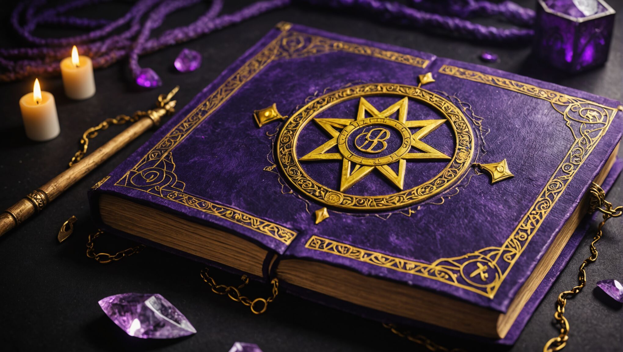 Color plays a pivotal role in creating dramatic and eye-catching fantasy book covers. By leveraging contrasting color schemes, designers can evoke specific moods, highlight key elements, and create a visual hierarchy that draws readers in. One powerful technique is the use of complementary colors, which sit opposite each other on the color wheel. For example, pairing deep purples with vibrant yellows can create a mystical and regal atmosphere, perfect for tales of ancient magic or royal intrigue.
Another effective approach is the use of analogous colors with a contrasting accent. This technique involves selecting colors that are adjacent on the color wheel and adding a pop of a contrasting hue. For instance, a cover might feature a range of cool blues and greens to represent a magical forest, with a bright red element to draw attention to a crucial character or symbol.
Monochromatic color schemes with varying levels of saturation and brightness can also create striking contrasts. A cover dominated by shades of gray with a single, vivid color accent can be particularly impactful, suggesting a world where magic brings color to an otherwise bleak landscape.
“Color is a power which directly influences the soul.” – Wassily Kandinsky
The emotional associations of colors play a significant role in fantasy cover design. Warm colors like reds and oranges can evoke feelings of passion, danger, or adventure, while cool colors like blues and greens might suggest mystery, serenity, or otherworldliness. By strategically combining these color temperatures, designers can create visual tension that reflects the book’s themes.
Contrast in color value is equally important. High-contrast covers with deep blacks juxtaposed against bright whites or vivid colors can create a sense of drama and intensity. Conversely, low-contrast covers using muted tones can evoke a sense of subtlety or foreboding, depending on the color choices.
For fantasy subgenres, specific color contrasts can become shorthand for themes. Dark fantasy might employ stark contrasts between deep blacks and blood reds, while epic fantasy could use golden hues against deep blues to suggest grand adventures in vast worlds.
Texture can also be incorporated through color, creating additional layers of contrast. Metallic accents against matte backgrounds can suggest magical artifacts or otherworldly elements, adding depth and intrigue to the cover design.
When applying color contrast techniques, it’s crucial to consider the book’s target audience and the emotions the story aims to evoke. The right color combinations can instantly communicate genre expectations and set the tone for the reader’s journey into the fantasy world within the pages.
Light and shadow in cover imagery
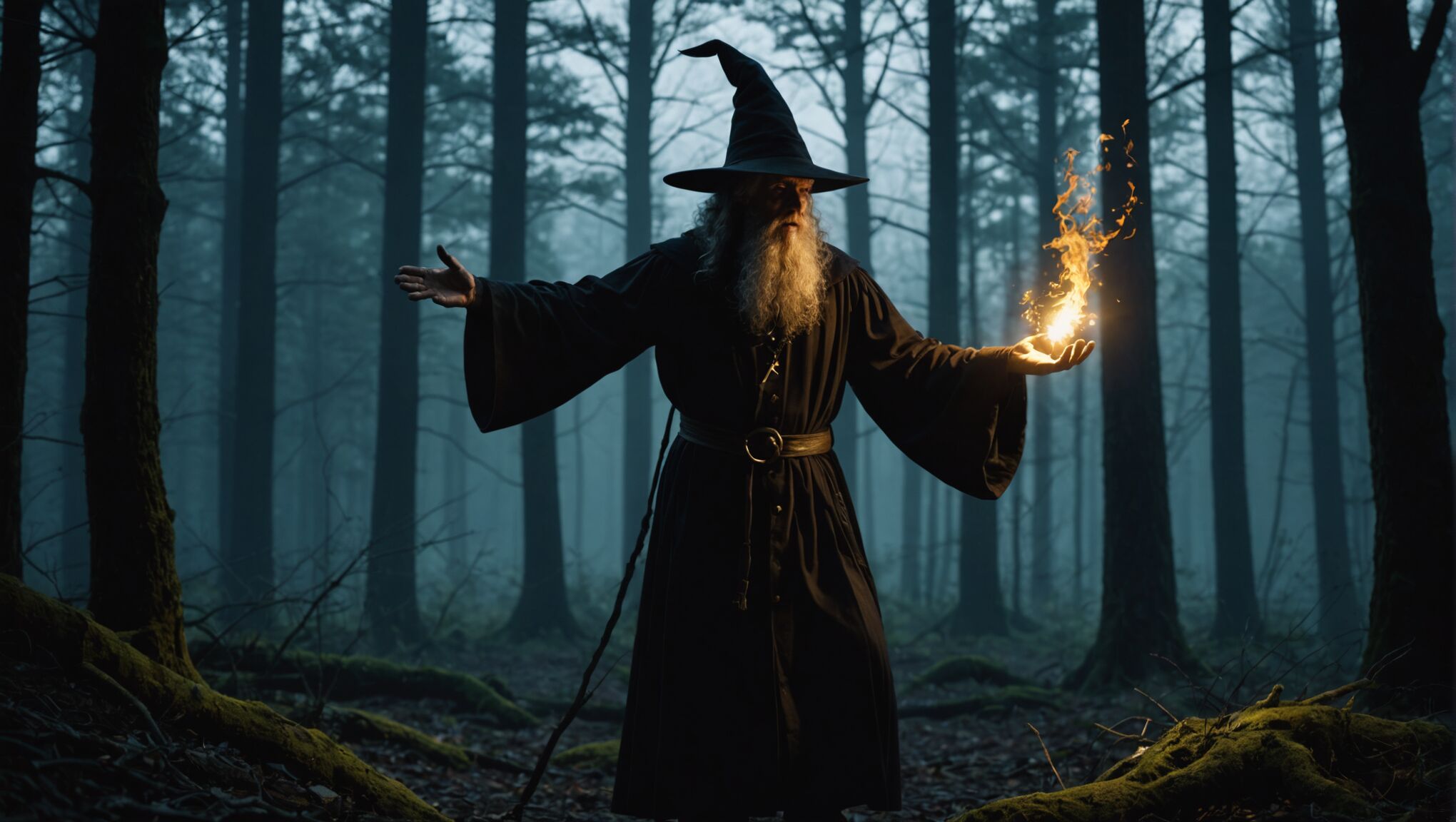
Mastering the interplay of light and shadow is crucial for creating captivating fantasy book covers. This technique can add depth, drama, and a sense of mystery to the imagery, drawing potential readers into the story before they even open the book. By manipulating light sources and shadow placement, designers can create focal points, enhance the mood, and even suggest magical elements within the cover art.
One effective approach is the use of chiaroscuro, a technique that employs strong contrasts between light and dark areas. This can create a sense of volume and depth, making characters or objects on the cover appear three-dimensional and more dynamic. For instance, a cover featuring a wizard casting a spell might show the character partially shrouded in darkness, with bright, magical light emanating from their hands, instantly conveying power and mystery.
Backlighting is another powerful tool in the designer’s arsenal. By placing the light source behind the main subject, a silhouette effect can be created, adding an air of intrigue and encouraging readers to imagine what lies beyond. This technique works particularly well for covers depicting mythical creatures or heroes embarking on quests, as it suggests adventure and the unknown.
Designers can also use light and shadow to create atmospheric effects that enhance the fantasy setting. Dappled light filtering through forest leaves can suggest a magical woodland realm, while harsh, angular shadows might evoke a sense of danger or an urban fantasy environment. The quality of light itself can be manipulated to convey different moods – soft, diffused light might indicate a dreamlike or ethereal world, while sharp, high-contrast lighting could suggest a more intense, action-packed story.
Entice readers with mysterious designs. Find out how.
The direction of light can significantly impact the cover’s emotional tone. Top-down lighting often creates a sense of hope or divine intervention, while light coming from below can appear eerie or supernatural. Side lighting can accentuate textures and create dramatic shadows, perfect for highlighting the intricate details of fantasy armor or the scales of a dragon.
Color temperature in lighting can also play a crucial role in setting the mood. Warm, golden light might evoke a sense of magic and wonder, while cool, blue-tinted light could suggest a world of ice magic or moonlit adventures. Combining different color temperatures can create visual interest and suggest the clash of opposing forces within the story.
Shadow play can be used to hint at unseen threats or hidden aspects of characters. A seemingly benign character casting a monstrous shadow can instantly intrigue potential readers, prompting them to question the true nature of the protagonist or antagonist. Similarly, shadows can be shaped to form subtle imagery that relates to the plot, adding an extra layer of meaning for observant viewers.
When working with digital illustrations, designers can take advantage of various lighting effects to enhance the fantasy elements. Glowing auras, lens flares, and particles of light can all be used to suggest magical energy or otherworldly phenomena. These effects, when used judiciously, can make the cover feel more dynamic and alive.
It’s important to remember that the use of light and shadow should always serve the story and genre. While high-contrast, dramatic lighting can be effective, it should not overshadow the core elements of the cover or make it difficult to read the title and author’s name. The key is to find a balance that creates visual interest while maintaining clarity and readability.
Contrasting elements to convey genre themes
Fantasy book covers offer a unique opportunity to use contrasting elements that not only capture attention but also communicate the essence of the genre. By juxtaposing different visual components, designers can create covers that instantly convey the magical, otherworldly nature of the stories within.
One effective technique is to contrast the familiar with the fantastical. This can be achieved by placing recognizable objects or scenes alongside clearly magical or supernatural elements. For instance, a cover might depict a modern cityscape with a dragon soaring between skyscrapers, immediately signaling an urban fantasy setting. This contrast between the mundane and the extraordinary piques curiosity and sets expectations for the story.
Scale can be manipulated to create dramatic contrasts that speak to the epic nature of many fantasy narratives. A tiny human figure set against a colossal, ancient ruin or a gargantuan mythical creature can instantly convey the sense of adventure and the vastness of the fantasy world. This play on proportions not only creates visual interest but also hints at the challenges and wonders the protagonist might face.
Texture contrasts can be particularly effective in suggesting different realms or types of magic within a fantasy setting. Smooth, glossy surfaces juxtaposed with rough, organic textures can represent the clash between technology and nature, or between different magical systems. For example, a sleek, metallic artifact placed in a wild, overgrown forest setting can hint at a lost civilization or advanced magic in a primal world.
Temporal contrasts can be used to great effect, especially in time travel or portal fantasy stories. Combining elements from different historical periods or even futuristic designs with ancient symbols can create intriguing visual paradoxes that hint at the complexities of the plot.
The juxtaposition of natural and supernatural elements is a classic technique in fantasy cover design. A serene landscape interrupted by swirling, ethereal mists or a tranquil forest scene with glowing, otherworldly flora can effectively communicate the presence of magic in seemingly ordinary settings.
Contrasting themes of light and darkness are particularly potent in fantasy, often representing the struggle between good and evil. This can be depicted literally through contrasting color schemes or more subtly through symbolic imagery. A radiant magical artifact set against a backdrop of encroaching shadows, for instance, can suggest a battle against dark forces.
Character contrasts can also convey genre themes effectively. Pairing characters of opposing natures—such as a battle-hardened warrior alongside a scholarly wizard, or a human child with a mythical creature—can hint at unlikely alliances or the diverse cast of a fantasy epic.
Stylistic contrasts in the artwork itself can be used to delineate different aspects of the fantasy world. For example, a cover might combine highly detailed, realistic elements with more abstract or stylized components to suggest the intersection of the real and the magical.
Symbolic contrasts can be particularly powerful in conveying complex themes. A delicate flower growing from a battle-worn shield, for instance, could represent hope amidst conflict or the rebirth of peace after war—themes common in many fantasy narratives.
When employing these contrasting elements, it’s crucial to maintain a balance that serves the overall composition and message of the cover. The goal is to create a visually striking image that not only captures the essence of the story but also stands out in the competitive world of book marketing. By thoughtfully combining these contrasting elements, designers can create covers that are not just beautiful, but also deeply resonant with the themes and spirit of fantasy literature.
Typography and contrast in cover text
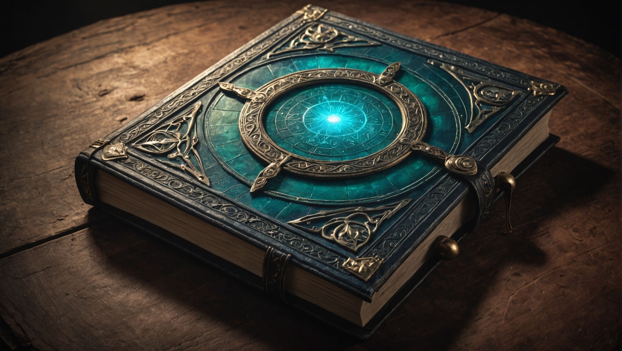 Typography plays a crucial role in creating contrast and impact on fantasy book covers. The choice of fonts, their placement, and interaction with other design elements can significantly enhance the overall appeal and convey the essence of the story.
One effective technique is to contrast serif and sans-serif fonts. Serif fonts, with their traditional and elegant appearance, can evoke a sense of history or timelessness often associated with fantasy worlds. When paired with a modern, clean sans-serif font, this contrast can suggest a blend of ancient magic and contemporary storytelling.
Size variation is another powerful tool. Large, bold titles can command attention and create a strong focal point, especially when juxtaposed with smaller, delicate subtitles or author names. This hierarchy not only guides the reader’s eye but also helps to establish the importance of different textual elements on the cover.
Texture in typography can add depth and intrigue to a cover design. Embossed or debossed lettering, when used sparingly, can create a tactile quality that invites touch and closer inspection. This technique works particularly well for titles that suggest ancient tomes or magical inscriptions.
Color contrast in typography is equally important. Metallic or iridescent fonts against dark backgrounds can simulate magical glows or otherworldly materials. Alternatively, stark white text on deep, rich colors can create a striking effect that draws the eye immediately to the title.
Layering text over imagery can create interesting visual interactions. For instance, having parts of the title partially obscured by foreground elements can add depth and encourage the viewer to engage more deeply with the cover design. This technique can also be used to integrate the text more seamlessly into the overall composition.
Experimental typography can be particularly effective for fantasy covers. Unique letterforms that incorporate fantastical elements – such as dragon scales, magical runes, or celestial patterns – can immediately set the tone for the book’s content. However, it’s crucial to balance creativity with readability to ensure the title remains clear and legible.
The placement of text can also contribute to the overall contrast and composition. Asymmetrical layouts or unexpected text orientations can add dynamism to the cover, challenging traditional design norms and reflecting the unconventional nature of fantasy narratives.
Combining different typographic styles within the same cover can create intriguing contrasts. For example, a handwritten script font for a character’s name alongside a bold, structured font for the main title can suggest different voices or elements within the story.
When working with series, typography can be used to create a cohesive brand while still allowing for individual book identities. Consistent font choices across covers with varying color schemes or subtle alterations in style can maintain series recognition while highlighting the unique aspects of each installment.
It’s important to consider the emotional impact of typography. Angular, sharp fonts might convey tension or conflict, while flowing, organic letterforms could suggest magic or natural themes. The typography should always align with the mood and themes of the book to create a harmonious overall design.
Remember that typography is not just about the letters themselves but also about the space around them. Clever use of negative space can create hidden images or symbols within the text, adding an extra layer of meaning for observant readers.
By carefully considering these typographic elements and how they contrast with other aspects of the cover design, creators can craft book covers that not only catch the eye but also provide a tantalizing glimpse into the magical worlds waiting to be explored within the pages.
Balancing contrast for maximum impact
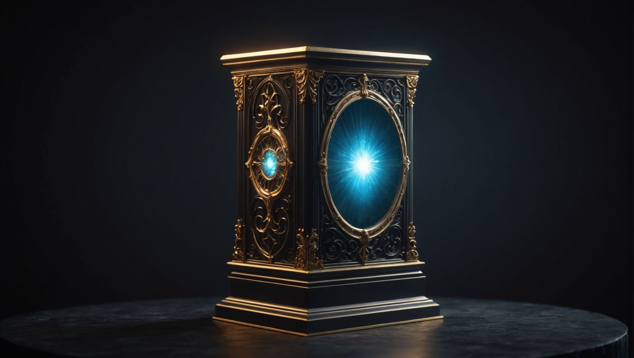
While contrast is a powerful tool in fantasy book cover design, achieving the right balance is crucial for creating a cover that is both visually striking and effective in communicating the book’s essence. Too much contrast can overwhelm the viewer and muddle the message, while too little may result in a flat, uninteresting design. The key lies in strategic application and thoughtful composition.
One approach to balancing contrast is to establish a clear visual hierarchy. This involves determining the most important elements of the cover and using contrast to guide the viewer’s eye accordingly. For instance, the title might be given the highest contrast against the background, followed by a key visual element, and then the author’s name. This hierarchy ensures that each component receives appropriate attention without competing excessively with others.
Another technique is to use contrast sparingly but effectively. Rather than applying high contrast throughout the entire design, focus on creating one or two areas of strong contrast that serve as focal points. These areas can draw the eye and create interest, while the rest of the cover can use more subtle variations to support the overall composition.
Incorporating transitional elements can help to soften extreme contrasts and create a more harmonious overall design. For example, if a cover features a stark contrast between light and dark areas, adding elements that gradually blend these extremes can create a more cohesive look while still maintaining the dramatic effect.
Consider the use of texture to add depth and interest without relying solely on color or value contrast. Subtle texture variations can create visual intrigue without overpowering the main elements of the design. This can be particularly effective in areas that might otherwise appear flat or uninteresting.
When working with color, aim for a balanced palette that includes both contrasting and complementary hues. While contrasting colors can create impact, using too many can lead to a chaotic appearance. Instead, choose a dominant color scheme and use contrasting colors sparingly for emphasis.
The scale of contrasting elements also plays a crucial role in achieving balance. Large areas of high contrast can be visually overwhelming, so consider using smaller elements or details to introduce contrast in a more subtle manner. This approach can create intrigue and encourage closer examination of the cover.
Negative space is an often overlooked but powerful tool in balancing contrast. By strategically incorporating areas of simplicity or “breathing room” within the design, you can enhance the impact of high-contrast elements without overwhelming the viewer.
Remember that contrast extends beyond visual elements to conceptual ones as well. Balancing familiar and fantastical elements can create an intriguing juxtaposition that captures the essence of the fantasy genre. This conceptual contrast should work in harmony with the visual contrasts to create a cohesive and compelling cover.
Ultimately, the goal is to create a cover that is visually appealing, communicates effectively, and stands out in a crowded marketplace. By carefully balancing contrast through these various techniques, designers can craft fantasy book covers that not only catch the eye but also resonate with readers and accurately represent the magical worlds within.

