blog
Unlocking the Magic: Choosing the Perfect Fantasy Book Cover Design
When crafting a captivating fantasy book cover, several key elements come into play to create a visually stunning and enticing design. The central image or illustration is often the most crucial component, serving as the focal point that draws readers’ attention. This image should encapsulate the essence of the story, whether it’s a powerful protagonist, a mystical creature, or an enchanted landscape. Complementing the main visual, background elements can add depth and context, hinting at the book’s setting or magical themes. Texture and layering are important techniques used to create a sense of dimension and richness, often incorporating intricate patterns or otherworldly effects. The title and author’s name must be prominently displayed, with careful consideration given to their placement and style to ensure they harmonize with the overall design. Fantasy covers frequently feature unique embellishments such as metallic accents, embossing, or spot UV treatments to enhance their allure and convey a sense of magic. “A great cover is a visual doorway to another world,” as many designers often say, emphasizing the importance of creating an image that transports potential readers at first glance. Color palette selection is another critical element, with designers choosing hues that evoke the appropriate mood and genre expectations. Finally, negative space should be used strategically to prevent the cover from becoming overly cluttered, allowing the key elements to shine and create a lasting impression on bookstore shelves or digital marketplaces.
Color psychology in fantasy cover art
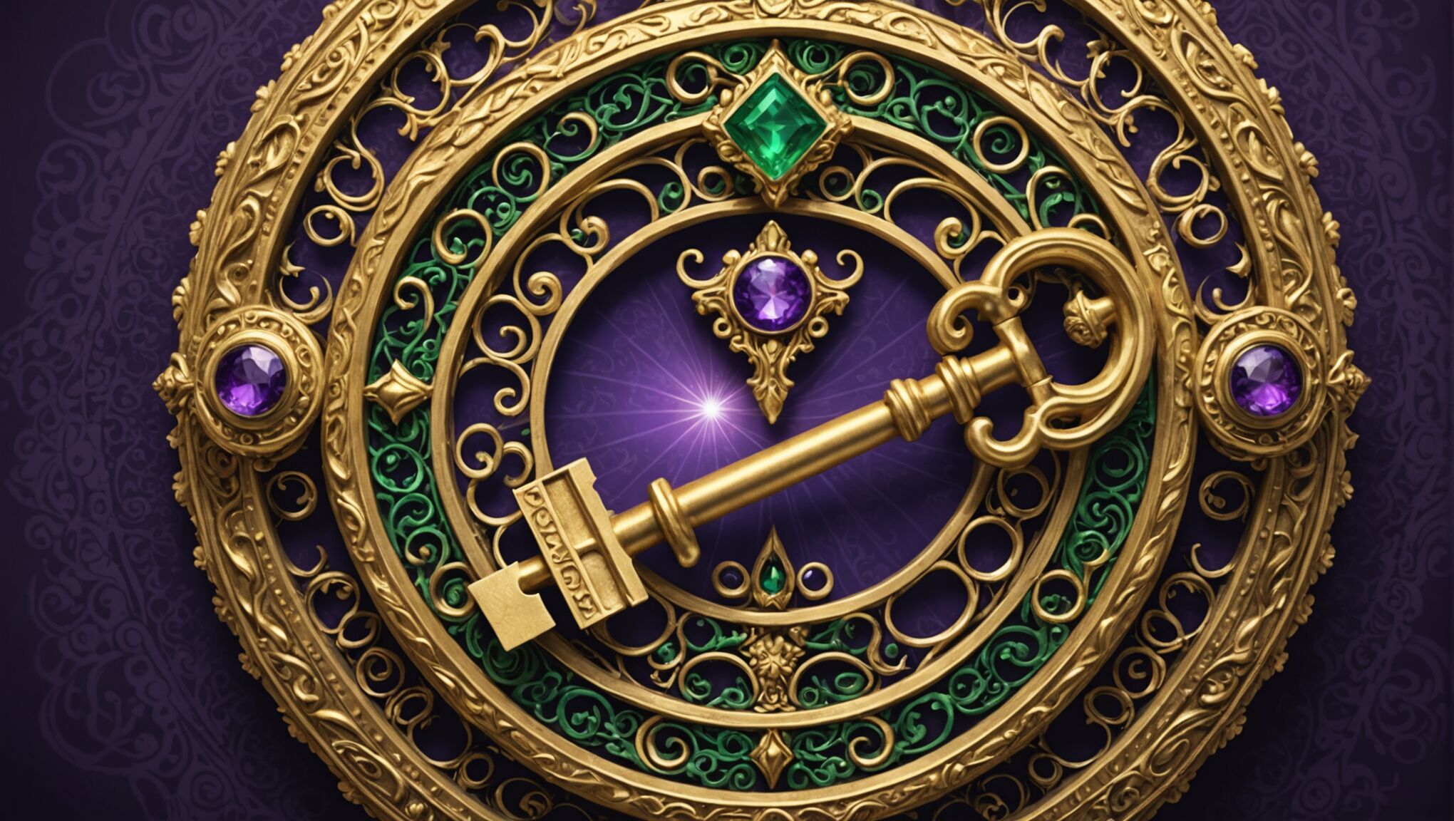
 Color plays a crucial role in fantasy book cover design, acting as a powerful tool to evoke emotions, set the tone, and instantly communicate genre expectations. Deep, rich colors like royal purple, midnight blue, and emerald green are often associated with magic and mystery, making them popular choices for fantasy covers. These hues can create a sense of depth and otherworldliness, drawing readers into the magical realm of the story.
Warm tones such as fiery reds and oranges can signify passion, adventure, or danger, making them ideal for action-packed fantasy epics. Conversely, cooler tones like icy blues and silvers might be used for stories set in winter landscapes or featuring frost magic. Earthy browns and greens can ground a fantasy cover in nature, perfect for tales of forest magic or elemental powers.
“Color is a power which directly influences the soul,” said Wassily Kandinsky, and this sentiment rings especially true in fantasy cover design.
Metallic accents in gold or silver are frequently employed to add a touch of luxury and magic, often used for titles or magical elements within the illustration. These shimmering details can catch the light and the reader’s eye, enhancing the cover’s allure.
Contrast is another essential aspect of color use in fantasy covers. A stark contrast between light and dark elements can create drama and intrigue, while a more harmonious color scheme might evoke a sense of serenity or otherworldly beauty. Designers often use color gradients to create smooth transitions between hues, adding depth and dimension to the cover art.
The saturation and brightness of colors also play a significant role in setting the mood. Vibrant, highly saturated colors can suggest a lighthearted or young adult fantasy, while muted or desaturated tones might indicate a darker, more mature theme.
It’s important to note that color associations can vary across cultures, so designers must consider their target audience when selecting a color palette. What might signify mystery in one culture could have a completely different connotation in another.
Lastly, the use of unexpected or unconventional color combinations can help a fantasy book stand out in a crowded marketplace. By breaking away from traditional genre color schemes, designers can create covers that are both eye-catching and memorable, while still maintaining the essence of fantasy.
Typography and font selection for fantasy titles

Selecting the right typography for a fantasy book cover is a crucial aspect of design that can significantly impact the overall aesthetic and appeal. The chosen font should not only be legible but also convey the essence of the story and its magical elements. Serif fonts, with their classic and timeless appeal, are often favored for fantasy titles, as they can evoke a sense of history and tradition. Fonts like Trajan, Cinzel, or custom-designed serif typefaces can lend an air of elegance and authority to the title.
However, sans-serif fonts are not to be overlooked, especially for contemporary or urban fantasy genres. These can provide a sleek, modern look that contrasts well with more traditional fantasy imagery. Designers might opt for fonts like Futura or Avenir for a clean, futuristic feel, or choose something like Gotham for a bold, impactful title that stands out against intricate background art.
Script fonts can add a touch of whimsy and magic to fantasy covers, particularly for titles aimed at younger readers or those featuring fairy tale elements. Fonts like Bombshell Pro or Allura can create a sense of enchantment and fluidity. However, it’s crucial to ensure that script fonts remain readable, especially when scaled down for thumbnail sizes in digital marketplaces.
Custom lettering is another powerful tool in fantasy cover design. Hand-drawn or specially crafted typefaces can perfectly capture the unique essence of a particular story, creating a one-of-a-kind visual identity. This approach allows for the incorporation of magical elements directly into the letterforms, such as swirls, sparkles, or even miniature illustrations.
The size and placement of the title are equally important considerations. A large, bold title can create a strong focal point, while a smaller, more integrated title might allow the cover art to take center stage. Designers often play with the layering of text and images, creating depth and intrigue by having elements of the illustration interact with or partially obscure the title.
Font pairing is another crucial aspect of typography in fantasy cover design. Combining different fonts for the title and author name can create visual interest and hierarchy. A common approach is to use a distinctive, eye-catching font for the title and a more understated, complementary font for the author’s name.
Color and texture of the font also play significant roles. Metallic effects, gradients, or textured overlays can enhance the magical quality of the typography. For instance, a gold-leafed effect on the title can suggest opulence and ancient magic, while a frost-like texture might be perfect for a winter-themed fantasy.
Lastly, it’s essential to consider how the typography will appear across different formats and sizes. What looks stunning on a full-sized hardcover may not translate well to a small thumbnail image on an e-book store. Designers must ensure that the chosen fonts remain legible and impactful across all potential viewing scenarios.
Incorporating magical symbols and motifs
Magical symbols and motifs are powerful visual elements that can instantly transport readers into the realm of fantasy. These iconic images serve as a universal language, conveying complex ideas and themes without the need for words. When incorporated thoughtfully into a book cover design, they can create an immediate connection with the target audience and set the tone for the story within.
One of the most effective ways to use magical symbols is to integrate them into the overall composition of the cover. This can be done subtly, with small icons woven into intricate border designs, or more prominently, with large, central motifs that dominate the artwork. Common symbols in fantasy cover art include:
| Symbol | Meaning |
| Pentagram | Protection, magic, elements |
| Dragon | Power, wisdom, ancient knowledge |
| Unicorn | Purity, innocence, healing |
| Runes | Mystery, ancient languages, divination |
| Spiral | Growth, evolution, journey |
When selecting symbols, it’s crucial to consider their relevance to the story and their cultural significance. Misuse or inappropriate combination of symbols can lead to confusion or even offense. Designers should research the origins and meanings of symbols to ensure they align with the book’s themes and target audience.
Motifs, recurring visual elements that reinforce the story’s themes, can be equally powerful. These might include repeated patterns of leaves for a forest-based fantasy, or waves for an ocean adventure. Celestial motifs like stars, moons, and suns are particularly popular in fantasy cover design, often symbolizing cosmic forces or divine intervention.
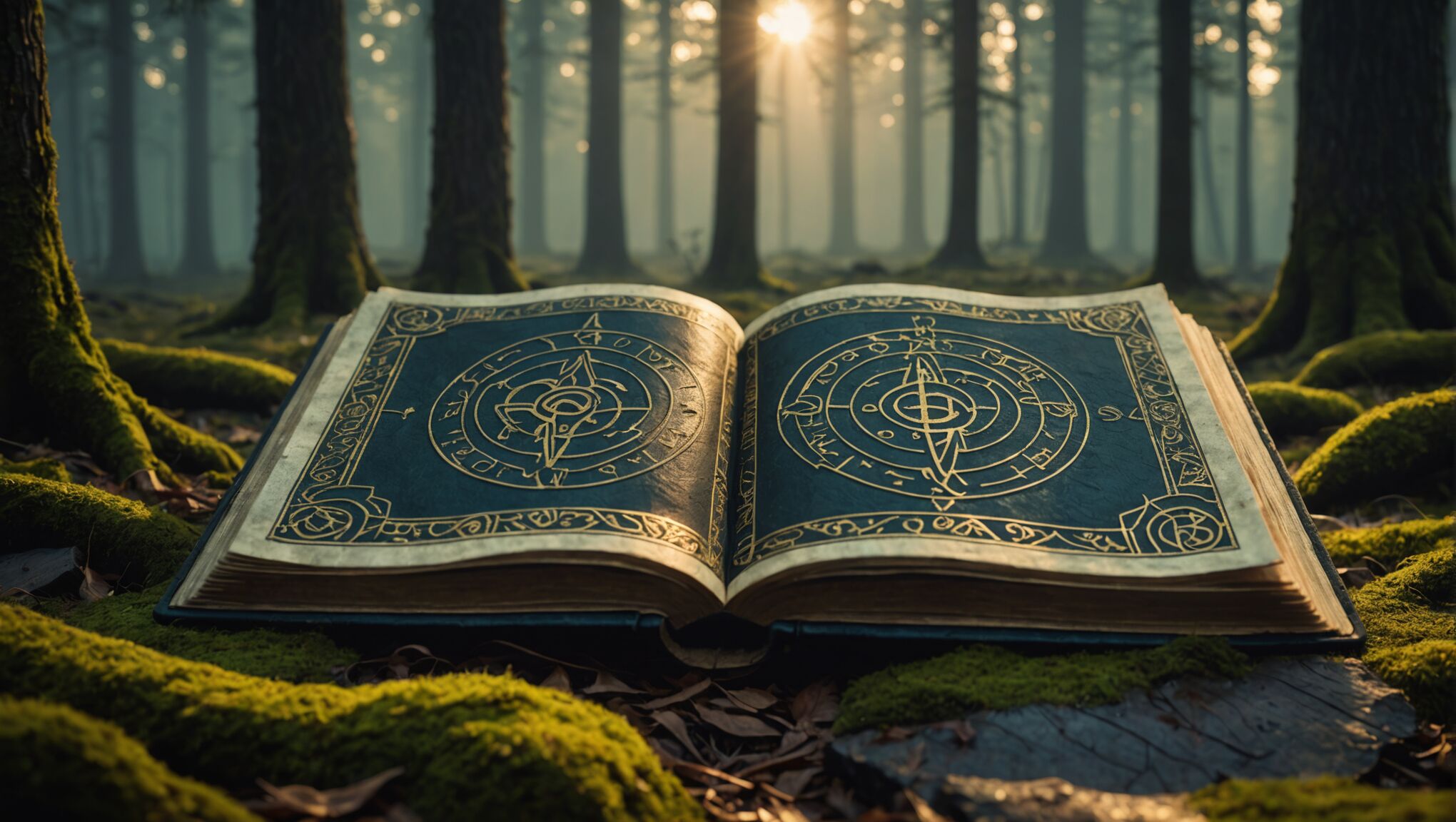
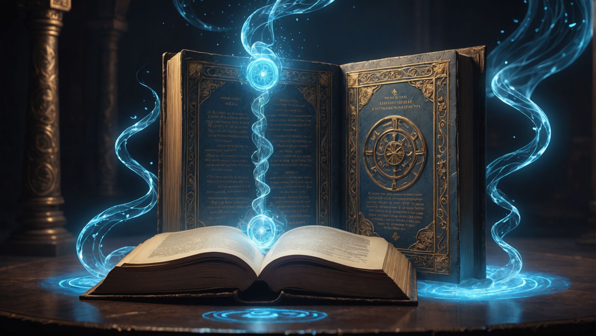
The integration of magical artifacts specific to the story can also serve as powerful symbols. A mystical amulet, an enchanted sword, or a magical tome can become central elements of the cover design, instantly communicating the fantastical nature of the book while piquing curiosity about its significance to the plot.
Texture plays a crucial role in bringing these symbols and motifs to life. Embossing, foil stamping, or spot UV treatments can add a tactile dimension to the cover, making magical elements seem to leap off the page. Digital designs can mimic these effects through careful use of lighting and shadow, creating an illusion of depth and dimensionality.
Color is another essential tool in emphasizing magical symbols. Glowing effects, achieved through careful use of contrasting hues or subtle gradients, can imbue symbols with an otherworldly quality. Metallic colors, particularly gold and silver, are often used to denote items of power or significance.
The placement of symbols and motifs should be carefully considered to create balance and guide the viewer’s eye. A large, central symbol might be balanced by smaller, repeating motifs in the background or around the edges of the cover. The interplay between symbols and other elements of the cover, such as the title typography or character illustrations, can create a cohesive and visually striking design.
It’s important to remember that while symbols can be powerful, overuse can lead to a cluttered or confusing design. The key is to select a few key elements that best represent the essence of the story and incorporate them in a way that enhances rather than overwhelms the overall composition.
Lastly, consider how these magical symbols and motifs will translate across different formats. What works on a large hardcover may need to be simplified for a thumbnail image in an online bookstore. Ensuring that key symbolic elements remain recognizable at various sizes is crucial for maintaining the cover’s impact across all platforms.
Balancing character representation and scenery
 When designing a fantasy book cover, striking the right balance between character representation and scenery is crucial for creating a visually compelling and story-appropriate design. This delicate interplay can make or break a cover’s ability to captivate potential readers and accurately represent the book’s content.
Character representation on a fantasy cover can provide an immediate connection with the audience. It offers readers a glimpse into the protagonist’s world and can help them identify with the hero or heroine of the story. However, the challenge lies in deciding how much of the character to reveal. A full-body portrayal might give too much away, leaving little to the imagination, while a partial view—perhaps just the eyes or a silhouette—can create intrigue and mystery.
Scenery, on the other hand, sets the stage for the adventure. It can transport potential readers to magical realms, ancient forests, or futuristic cities with just a glance. The landscape can be as much a character in fantasy stories as the protagonists themselves, and showcasing it on the cover can give readers a taste of the world they’re about to enter.
The key to successful balance often lies in the use of perspective and composition. For instance, a character could be placed in the foreground, with the fantastical scenery stretching out behind them. This approach not only introduces the protagonist but also provides context for their adventures. Alternatively, a vast landscape might dominate the cover, with a small figure in the distance, suggesting epic quests and grand adventures.
Layering techniques can be particularly effective in achieving this balance. Elements of the scenery can be used to frame or partially obscure the character, creating depth and encouraging the viewer to look closer. This method can also be used to hint at the character’s relationship with their environment, such as a warrior emerging from a misty forest or a mage conjuring elements from the surrounding landscape.
Color plays a vital role in unifying character and scenery elements. A cohesive color palette can tie together disparate elements, creating a harmonious overall image. For example, the hues of a character’s clothing might be echoed in the surrounding landscape, suggesting a deep connection between the hero and their world.
It’s important to consider the genre conventions and reader expectations when balancing these elements. High fantasy might lean more heavily on sweeping landscapes and distant castles, while urban fantasy could focus more on character representation against a backdrop of city skylines.
The use of symbolic elements can bridge the gap between character and scenery. Magical artifacts, creatures, or weather phenomena can serve as focal points that connect the protagonist to their environment. These elements can be particularly effective in covers where showing the character’s face might detract from the mystery or conflict with the reader’s imagination.
Scale is another powerful tool in creating balance. A tiny figure set against a vast, otherworldly landscape can evoke a sense of adventure and the unknown. Conversely, a close-up of a character with hints of an fantastical world in the background can create intimacy while still promising epic scope.
Dynamic action scenes can effectively combine character and scenery elements. A character in motion, interacting with their environment, can capture the essence of the story’s excitement while showcasing both the protagonist and the world they inhabit.
Negative space should not be overlooked in this balancing act. Sometimes, what is left unseen can be as powerful as what is shown. A minimalist approach, with carefully chosen elements of both character and scenery, can create a striking and memorable cover.
Ultimately, the balance between character representation and scenery should serve the story. It should entice readers, give them a taste of what to expect, but leave enough mystery to make them want to open the book and dive into the world within its pages.
Creating intrigue through visual storytelling

A compelling fantasy book cover should do more than just catch the eye; it should tell a story in itself, creating intrigue that compels potential readers to pick up the book. Visual storytelling on a cover is an art form that combines various elements to hint at the narrative within, without giving too much away. One effective technique is to depict a pivotal moment or scene from the book, leaving viewers curious about the context and outcome. This could be a character facing an unseen threat, a magical artifact glowing with mysterious energy, or a landscape on the brink of transformation.
Symbolism plays a crucial role in creating intrigue. Incorporating emblems, creatures, or objects that hold significance in the story can spark curiosity and encourage viewers to discover their meaning. These symbols can be subtly woven into the background or prominently featured, depending on their importance to the plot. For instance, a seemingly innocuous pendant worn by a character might actually be the key to unlocking ancient powers, prompting readers to wonder about its significance.
The use of perspective and composition can dramatically enhance the storytelling aspect of a cover. Unusual angles or viewpoints can create a sense of disorientation or wonder, mirroring the protagonist’s journey into an unfamiliar world. Partial views or obscured elements can also be powerful tools, allowing the imagination to fill in the gaps and fostering a desire to learn more.
Contrast and juxtaposition are effective ways to create visual tension and intrigue. Pairing opposing elements, such as light and dark, ancient and modern, or natural and supernatural, can hint at conflicts within the story and raise questions in the viewer’s mind. This technique can be particularly impactful when used to highlight the unique aspects of the fantasy world or the challenges faced by the characters.
Color plays a vital role in setting the mood and tone of the visual story. A carefully chosen color palette can evoke specific emotions or atmospheres, giving potential readers a sense of what to expect from the book. Unexpected color combinations or the strategic use of a single, bold color against a muted background can create focal points that draw the eye and spark curiosity.
Capture the essence of dark fantasy romance. See how it works.
Texture and depth can add layers of intrigue to a cover design. Incorporating elements that suggest hidden details or secrets waiting to be uncovered can be highly effective. This might include intricate patterns, partially obscured text, or images that reveal different details upon closer inspection. These elements reward careful observation and encourage viewers to engage more deeply with the cover.
The interaction between text and imagery is another powerful tool for visual storytelling. Integrating the title or author’s name into the cover art in creative ways can enhance the overall narrative of the design. For example, having text partially obscured by mist or emerging from a magical portal can add an extra layer of mystery and intrigue.
Ultimately, the goal of visual storytelling in fantasy book cover design is to create a window into the world of the book that is both inviting and mysterious. It should offer enough information to intrigue potential readers while leaving ample room for imagination and discovery. A well-executed cover will not only attract attention but will also set expectations and create excitement for the adventure that awaits within the pages of the book.

