blog
The Secrets to Epic Fantasy Cover Designs
When crafting the perfect fantasy cover, several crucial elements must come together to captivate potential readers. At the heart of any successful design lies a striking central image that immediately conveys the essence of the story. This focal point often features a protagonist, mythical creature, or emblematic object that represents the core of the narrative. Surrounding this central element, intricate details and atmospheric effects work in harmony to build a rich, immersive world. Texture and dimensionality play vital roles in bringing the cover to life, whether through the scales of a dragon, the rough bark of an ancient tree, or the gleaming surface of a magical artifact.
Lighting is another critical component, with many fantasy covers employing dramatic contrasts between light and shadow to create a sense of mystery and intrigue. The skillful use of perspective draws the viewer into the scene, often hinting at vast landscapes or hidden realms beyond the frame. “A great cover is a portal to another world,” as many designers often say. To achieve this effect, artists frequently incorporate elements that break the boundaries of the cover, such as tendrils of magic or wisps of otherworldly mist that seem to extend beyond the edges. This technique not only adds depth but also suggests that the story within is larger than life and ready to spill into the reader’s imagination.
The overall composition must strike a delicate balance between providing enough detail to intrigue and leaving sufficient mystery to entice. Too much clutter can overwhelm, while too little can fail to engage. Successful fantasy covers often employ a hierarchy of elements, guiding the eye through the design and revealing layers of meaning. Color plays a crucial role in setting the tone and atmosphere, with many fantasy covers favoring rich, saturated hues that evoke a sense of the extraordinary. Finally, the integration of genre-specific iconography—such as swords, crowns, or magical sigils—serves as a visual shorthand, instantly communicating the book’s genre and themes to potential readers.
Color palettes that evoke wonder
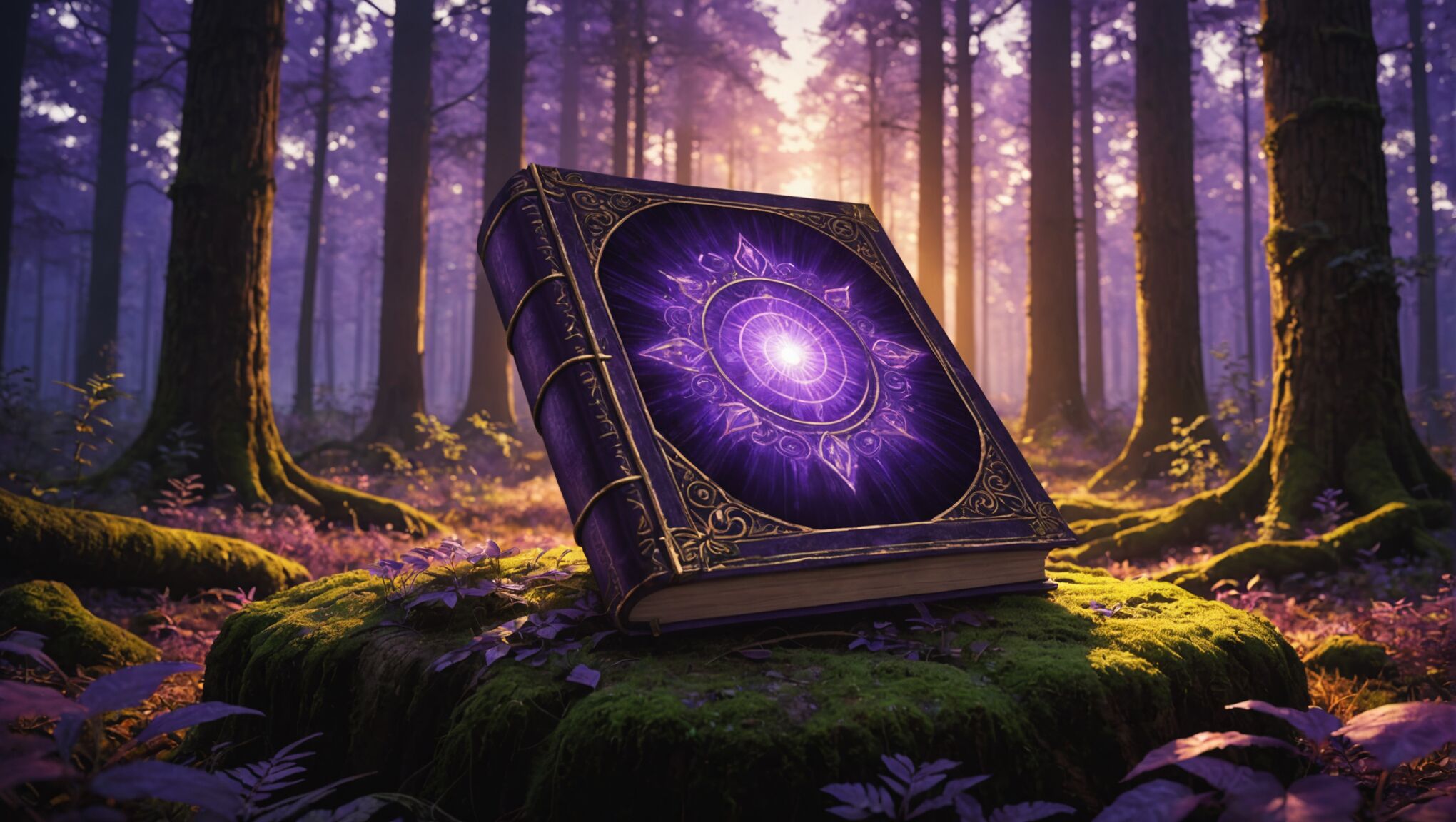 The art of selecting the perfect color palette for a fantasy book cover is akin to wielding magic itself. The right combination of hues can transport viewers to otherworldly realms, ignite their imagination, and evoke a sense of wonder that lingers long after they’ve closed the book. Successful fantasy covers often employ rich, saturated colors that defy the mundane and speak to the extraordinary nature of the stories within.
Deep, royal purples and midnight blues are perennial favorites, suggesting mystery, magic, and the vastness of the unknown. These darker tones serve as an excellent backdrop for brighter, more vibrant accents that draw the eye and hint at the magical elements of the story. Glowing golds and shimmering silvers, reminiscent of precious metals and magical artifacts, add a touch of opulence and otherworldliness to the overall design.
Earthy greens and warm browns can ground the fantastical elements, evoking ancient forests and untamed wilderness where adventures unfold. These natural tones provide a counterpoint to more ethereal colors, creating a balance between the familiar and the extraordinary. Fiery reds and oranges, used judiciously, can suggest danger, passion, or the presence of powerful magic, adding drama and intensity to the cover.
“Color is the keyboard, the eyes are the harmonies, the soul is the piano with many strings. The artist is the hand that plays, touching one key or another, to cause vibrations in the soul.” – Wassily Kandinsky
This quote from Kandinsky beautifully encapsulates the emotional power of color, which is particularly relevant in fantasy cover design. The careful orchestration of colors can elicit specific feelings and set the tone for the entire book.
Gradient effects and color blending techniques are often employed to create ethereal, dreamlike atmospheres. These subtle transitions between hues can suggest the merging of different realms or the fluid nature of magic itself. Designers might use a technique called color keying, where a dominant color scheme is established and then complemented by carefully chosen accent colors that pop and draw attention to key elements of the cover.
The use of light and shadow within the color palette is crucial for creating depth and dimension. Glowing effects, lens flares, and radiant bursts of color can simulate magical energy or otherworldly light sources, instantly conveying the fantastical nature of the book’s contents. Conversely, deep shadows and muted tones can create pockets of mystery, inviting the viewer to peer closer and imagine what secrets might be hidden within.
It’s worth noting that while vibrant, saturated colors are common in fantasy covers, some designers opt for more muted or monochromatic palettes to stand out in a sea of bold designs. These subdued approaches can be equally effective in evoking a sense of ancient legends or gritty, realistic fantasy worlds.
Ultimately, the most successful color palettes in fantasy cover design are those that not only capture the eye but also resonate with the essence of the story. They should work in harmony with other design elements to create a cohesive visual experience that promises adventure, magic, and worlds beyond imagination.
Typography and its role in fantasy covers
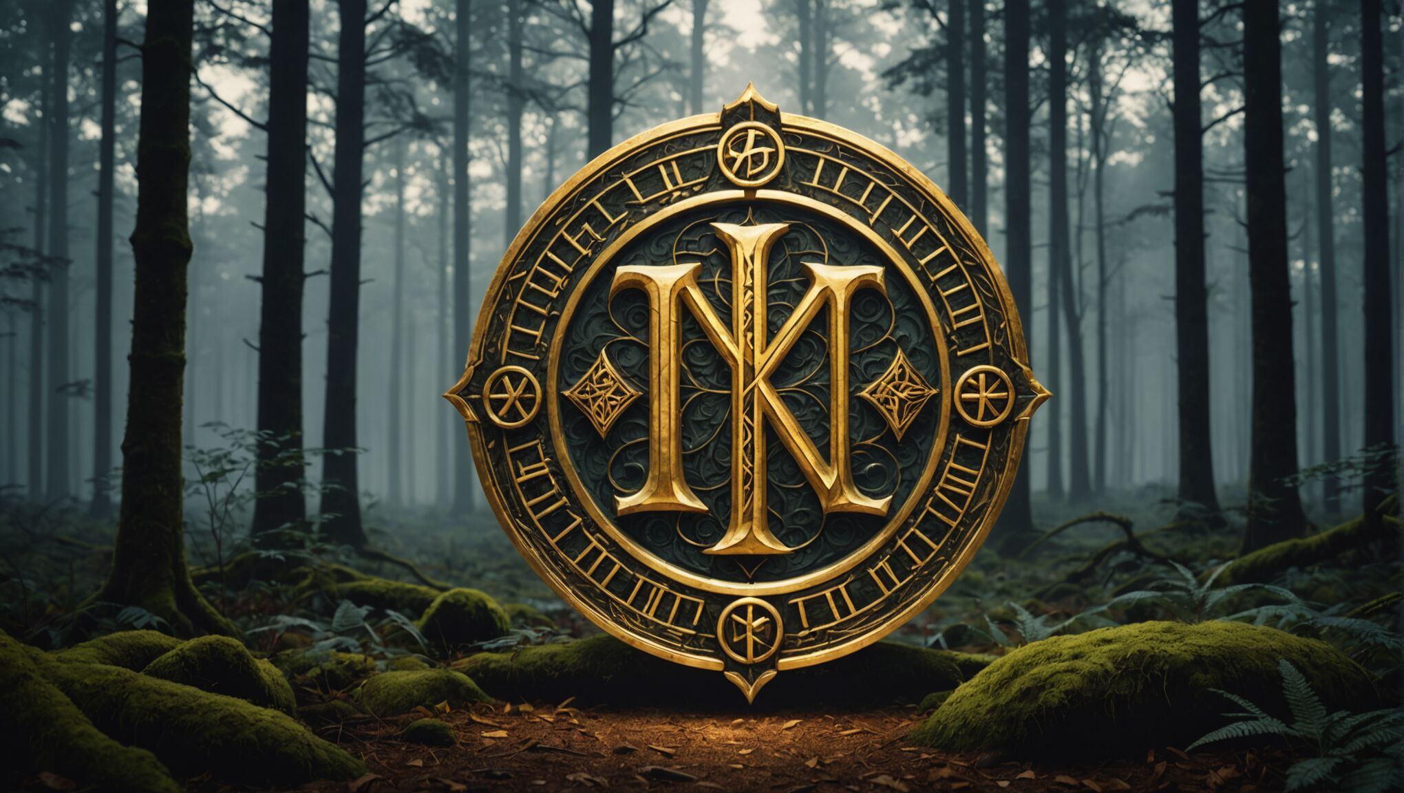
The typography chosen for a fantasy book cover is a crucial element that can make or break the overall design. It’s not merely about selecting a font; it’s about finding a typeface that embodies the spirit of the story and enhances the visual narrative. Bold, ornate lettering often takes center stage, with serifs and decorative elements that hint at ancient scripts or magical runes. These intricate designs can transform the title into an art piece in its own right, inviting readers to trace the curves and flourishes with their eyes.
Contrast is key when it comes to readability and impact. Many designers opt for a striking juxtaposition between the title and the author’s name, using different fonts, sizes, or weights to create a hierarchy of information. This not only guides the viewer’s eye but also allows for creative play with the cover’s composition. For instance, a large, imposing title might be balanced by a more delicate, script-like font for the author’s name, suggesting both the grandeur of the story and the craftsmanship of its creator.
The placement of text on a fantasy cover is an art form in itself. Designers must navigate the intricate artwork, finding spaces where the typography can breathe without obscuring crucial visual elements. Sometimes, the text becomes part of the scene, interacting with the imagery as if by magic—perhaps partially obscured by a misty forest or glowing with an inner light. This integration can create a seamless blend between text and image, enhancing the overall mystical feel of the cover.
Custom lettering is a powerful tool in fantasy cover design. Hand-drawn or digitally crafted bespoke fonts can capture the unique essence of a particular story or series. These custom typefaces might incorporate elements from the book’s lore, such as leaf-like serifs for a forest-based tale or fiery glyphs for a dragon-centric epic. Such attention to detail not only elevates the cover’s design but also provides a visual hook that can extend across an entire series, creating a recognizable brand for the author.
Texture plays a significant role in fantasy typography. Designers might employ techniques that give the impression of weathered stone, aged parchment, or burnished metal. These textures can be subtle, adding depth and character to the lettering without overwhelming the design. In some cases, the typography might even appear to be carved, embossed, or magically hovering above the cover, further blurring the line between text and image.
Color choice in typography is equally important. While gold and silver remain popular for their association with precious materials and magical elements, designers are increasingly experimenting with unexpected color combinations. Gradient effects, metallic sheens, and even color-changing foils can be employed to make the typography feel alive and enchanted. The color of the text must also work in harmony with the cover’s artwork, either complementing the overall palette or providing a striking contrast that demands attention.
Negative space is another tool that clever designers use to their advantage. By carefully crafting the shape of the letters, they can create hidden images or symbols within the typography itself. This technique adds an extra layer of intrigue, rewarding observant readers with hidden details that relate to the story. Such subtle touches can turn a book cover into a puzzle, inviting potential readers to engage with the design on a deeper level.
Ultimately, the typography on a fantasy book cover should do more than simply convey information—it should evoke emotion, spark curiosity, and transport the viewer to another world before they’ve even opened the book. When done right, it becomes an integral part of the cover’s magic, working in concert with the artwork to create an irresistible portal to the fantastical realms within.
Make your theme shine through your cover. See how.
Iconic symbols and motifs in fantasy design
Fantasy cover designs often incorporate iconic symbols and motifs that serve as visual shorthand for the genre, instantly communicating the book’s themes and setting to potential readers. These elements are deeply rooted in mythology, folklore, and the collective imagination of fantasy enthusiasts.
One of the most prevalent symbols in fantasy cover art is the sword, representing heroism, adventure, and conflict. Often depicted as ornate or glowing with magical energy, swords can be central to the composition or subtly integrated into the design. Similarly, crowns and thrones symbolize power, royalty, and the high-stakes political intrigue common in many fantasy narratives.
Magical artifacts play a crucial role in fantasy imagery. Crystal balls, ancient tomes, amulets, and wands are frequently featured, hinting at the mystical elements within the story. These objects often glow or emit ethereal light, drawing the viewer’s eye and suggesting their supernatural properties.
Mythical creatures are staples of fantasy cover design. Dragons, in particular, are iconic representations of the genre, symbolizing both danger and ancient wisdom. Other creatures like unicorns, griffins, and phoenixes also make frequent appearances, each carrying its own symbolic weight and evoking different aspects of fantasy lore.
Natural elements are often imbued with magical significance in fantasy art. Ancient trees, particularly those with faces or humanoid features, can represent wisdom, history, and the connection between nature and magic. Celestial bodies such as moons, stars, and planets are commonly incorporated to suggest cosmic themes or astrological influences.
Architectural elements like castles, towers, and ruins are powerful motifs that immediately set the scene for epic fantasy tales. These structures often blend realistic and fantastical elements, with impossible geometries or floating sections that defy gravity.
Symbolic patterns and designs drawn from various cultures add depth and authenticity to fantasy covers. Celtic knots, Norse runes, and mandala-like structures can be subtly woven into backgrounds or border designs, enriching the visual narrative.
Here’s a table showcasing some common symbols and their general meanings in fantasy cover design:
| Symbol | Common Meaning |
| Sword | Heroism, conflict, adventure |
| Crown | Power, royalty, destiny |
| Dragon | Ancient power, danger, wisdom |
| Crystal ball | Prophecy, magic, hidden knowledge |
| Ancient tree | Wisdom, nature magic, timelessness |
| Portal | Other worlds, adventure, the unknown |
The use of portals or doorways is particularly effective in fantasy cover design, symbolizing the transition between worlds or the journey into the unknown. These can be literal doorways, shimmering magical passages, or more abstract representations that invite the reader to step into the story.
Elemental symbols such as fire, water, earth, and air are often incorporated to represent different types of magic or the forces of nature. These can be subtle background elements or central features of the design, depending on their importance to the story.
Designers must be careful not to overuse these symbols, as too many can lead to a cluttered or cliché appearance. The key is to select motifs that are most relevant to the specific story and integrate them seamlessly into the overall composition. When used effectively, these iconic elements can create an instant connection with the target audience, promising the kind of fantastical adventure they crave.
By skillfully combining these symbols and motifs with unique artistic interpretations, cover designers can create visually striking and thematically rich images that not only represent the book’s content but also stand out in a crowded marketplace. The best fantasy covers use these elements to tell a story of their own, one that complements and enhances the written narrative within.
Balancing character portrayal and scenery
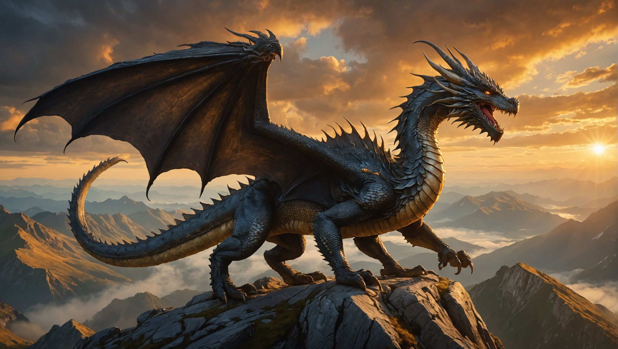 In the intricate dance of fantasy cover design, striking a balance between character portrayal and scenery is crucial. This delicate equilibrium can make the difference between a cover that merely catches the eye and one that truly captivates the imagination. The key lies in creating a synergy between the human (or humanoid) elements and the fantastical world they inhabit.
When featuring characters, it’s essential to provide enough detail to intrigue without revealing too much. A partial view of a protagonist, perhaps shrouded in shadow or mist, can be more enticing than a full-frontal portrait. This approach allows readers to fill in the blanks with their imagination, making the character more relatable and mysterious. The character’s pose and expression should convey emotion and hint at their role in the story, whether they’re a battle-hardened warrior or a wide-eyed apprentice mage.
The surrounding scenery serves as more than just a backdrop; it’s a character in its own right. Lush forests, towering mountains, or sprawling citadels can set the stage for epic adventures. However, the environment shouldn’t overpower the character. Instead, it should complement and enhance their presence. One effective technique is to use the landscape to frame the character, drawing the eye naturally to the focal point while still showcasing the rich world they inhabit.
Scale plays a vital role in this balancing act. Juxtaposing a lone figure against a vast, sweeping landscape can evoke a sense of adventure and the unknown. Conversely, placing characters in the foreground with glimpses of an intriguing world behind them can create a sense of immediacy and action.
Lighting is a powerful tool for integration. By using the same light source for both character and scenery, designers can create a cohesive image that feels organic. Dramatic lighting effects, such as backlighting or rim lighting, can help separate the character from the background while still maintaining a sense of unity.
Color palettes can be used to either harmonize or contrast the character with their surroundings. A character’s clothing or aura might echo the hues of the landscape, suggesting their connection to the world. Alternatively, bold color contrasts can make a character pop against their environment, instantly drawing the viewer’s attention.
Incorporating elements of interaction between character and scenery adds depth to the cover. A wizard’s spell affecting the surrounding air, a warrior’s cloak billowing in the wind, or a thief’s shadow cast upon ancient ruins all serve to bind the character to their world in a tangible way.
Negative space is another powerful element in this balancing act. Leaving areas of the cover less detailed can provide breathing room and prevent the design from becoming cluttered. This technique can also be used to create subtle shapes or symbols within the negative space, adding layers of meaning to the composition.
The perspective chosen for the cover can dramatically affect the balance between character and scenery. A low angle shot looking up at a character can make them appear heroic and dominant, while a high angle view might emphasize the vastness of the world around them. Experimenting with unconventional perspectives can lead to unique and memorable cover designs.
As you consider these elements, reflect on how they might apply to your favorite fantasy books. How do their covers balance character and scenery? What techniques do they use to create a harmonious yet intriguing composition? By analyzing successful covers, you can gain insights into effective design strategies and perhaps even discover new approaches to this artistic challenge.
Remember, the goal is not just to create a visually appealing image, but to tell a story within a single frame. A well-balanced fantasy cover should entice readers, giving them a taste of the adventure that awaits while leaving them hungry for more. It’s an invitation to step into another world, where the lines between character and landscape blur, and where every element on the cover holds the promise of magic and discovery.
Creating depth and mystery through composition
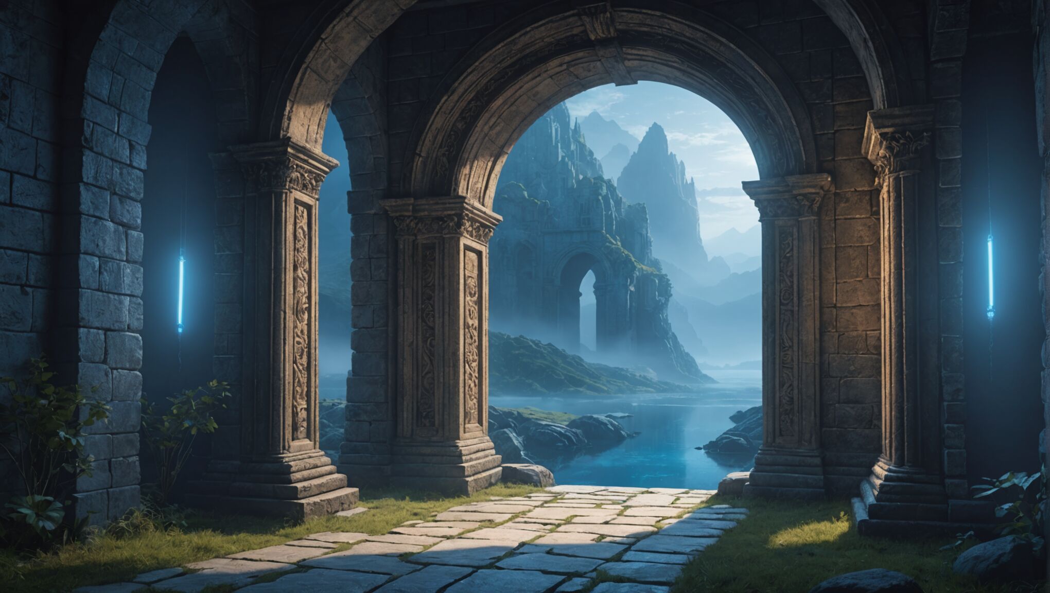
Mastering the art of composition is essential for creating fantasy book covers that draw readers into mysterious and captivating worlds. One of the most effective techniques is the use of layering, which adds depth and dimension to the design. By placing elements at varying distances from the viewer, designers can create a sense of vast landscapes or intricate magical realms. Foreground elements might be sharply detailed, while background features become progressively hazier, mimicking the natural way our eyes perceive depth.
Leading lines are another powerful tool in guiding the viewer’s gaze across the cover. These can be subtle, such as the arc of a dragon’s tail or the curve of a winding path, or more overt, like beams of magical light or the edge of a sword. When used skillfully, these lines direct attention to key elements of the design, creating a visual journey that tells a story even before the book is opened.
The rule of thirds remains a valuable principle in fantasy cover composition, but designers often play with breaking this rule to create tension or emphasize the otherworldly nature of their subjects. Placing key elements slightly off-center can create a dynamic imbalance that keeps the eye moving across the image, while central composition can lend a sense of power or importance to a character or object.
Negative space is a crucial element in building mystery. Areas of emptiness or simplicity can provide a powerful contrast to more detailed sections, allowing the imagination to fill in the blanks. This technique is particularly effective in suggesting the unknown or the magical, as it leaves room for the viewer to project their own ideas onto the cover.
Framing devices are often employed to create a sense of peering into another world. This might take the form of arched doorways, curtains of mist, or even more abstract elements that encroach on the edges of the design. Such frames not only focus attention on the central image but also hint at a larger world beyond the boundaries of the cover.
Atmospheric perspective is a technique borrowed from fine art that can add tremendous depth to fantasy covers. By gradually reducing the contrast, detail, and color saturation of elements as they recede into the distance, designers can create a sense of vast space and mystery. This is particularly effective for covers depicting sweeping landscapes or towering citadels.
Overlapping is another simple yet effective way to create depth. By having elements in the foreground partially obscure those behind, the designer establishes a clear sense of spatial relationships. This can be used to dramatic effect, with characters or objects emerging from behind others, suggesting movement and unveiling.
The interplay of light and shadow is perhaps one of the most powerful tools for creating depth and mystery. Dramatic lighting can carve out volumes, create focal points, and suggest the presence of unseen forces. Backlighting, in particular, can create silhouettes that are both mysterious and iconic, leaving much to the imagination while still conveying essential information about characters or settings.
Color gradients and transitions can be used to create a sense of depth that’s almost subliminal. By subtly shifting hues from warm to cool or light to dark across the composition, designers can guide the eye and suggest vast distances or the merging of different realms.
The concept of visual weight plays a crucial role in balancing the composition. Heavier, more detailed elements can be offset by lighter, more ethereal ones to create a sense of equilibrium that’s pleasing to the eye while still maintaining an air of intrigue and wonder.

