blog
The Evolution of Fantasy Book Cover Design Trends
The origins of fantasy book cover design can be traced back to the late 19th and early 20th centuries when the genre began to emerge as a distinct literary category. During this period, cover art was heavily influenced by the prevalent artistic movements of the time, such as Art Nouveau and Romanticism. Illustrators like Arthur Rackham and Edmund Dulac played pivotal roles in shaping the visual language of fantasy covers, infusing them with intricate details, whimsical creatures, and ethereal landscapes.
As the publishing industry evolved, so did the approach to fantasy cover design. The 1920s and 1930s saw a surge in pulp fiction magazines, which often featured bold, eye-catching illustrations on their covers. These vibrant, action-packed images set the stage for future fantasy book covers, emphasizing the genre’s ability to transport readers to otherworldly realms. The era also witnessed the rise of “wraparound” cover designs, which extended the artwork across both the front and back covers, creating a more immersive visual experience.
Celebrate diversity in your cover. Check the details here.
The mid-20th century brought about significant changes in printing technology, allowing for more complex and colorful cover designs. This period saw the emergence of iconic fantasy artists like Frank Frazetta and Boris Vallejo, whose dynamic and often sensual depictions of heroic figures and mythical creatures became synonymous with the genre. Their work not only influenced cover design but also helped shape the public’s perception of fantasy literature as a whole.
The 1960s and 1970s marked a turning point in fantasy cover design, as the genre gained mainstream popularity. Publishers began to invest more in cover art, recognizing its power to attract readers and convey the essence of the story within. This era saw a blend of traditional fantasy imagery with elements of psychedelia and surrealism, reflecting the cultural shifts of the time. Artists like Michael Whelan and Rowena Morrill pushed the boundaries of fantasy illustration, creating covers that were both visually striking and conceptually innovative.
Throughout its history, fantasy book cover design has consistently reflected broader artistic trends while maintaining its unique identity. From the ornate illustrations of the early 20th century to the bold, genre-defining works of later decades, these covers have played a crucial role in captivating readers and bringing fantastical worlds to life before the first page is even turned.
Iconic fantasy cover designs of the 20th century
 The 20th century saw the emergence of several iconic fantasy book covers that have left an indelible mark on the genre and continue to influence modern designs. One of the most notable examples is the original cover of J.R.R. Tolkien’s “The Hobbit,” published in 1937. Designed by Tolkien himself, the cover featured a simple yet evocative illustration of the Lonely Mountain, setting the tone for the adventure within and establishing a visual language for Middle-earth that would be expanded upon in future editions.
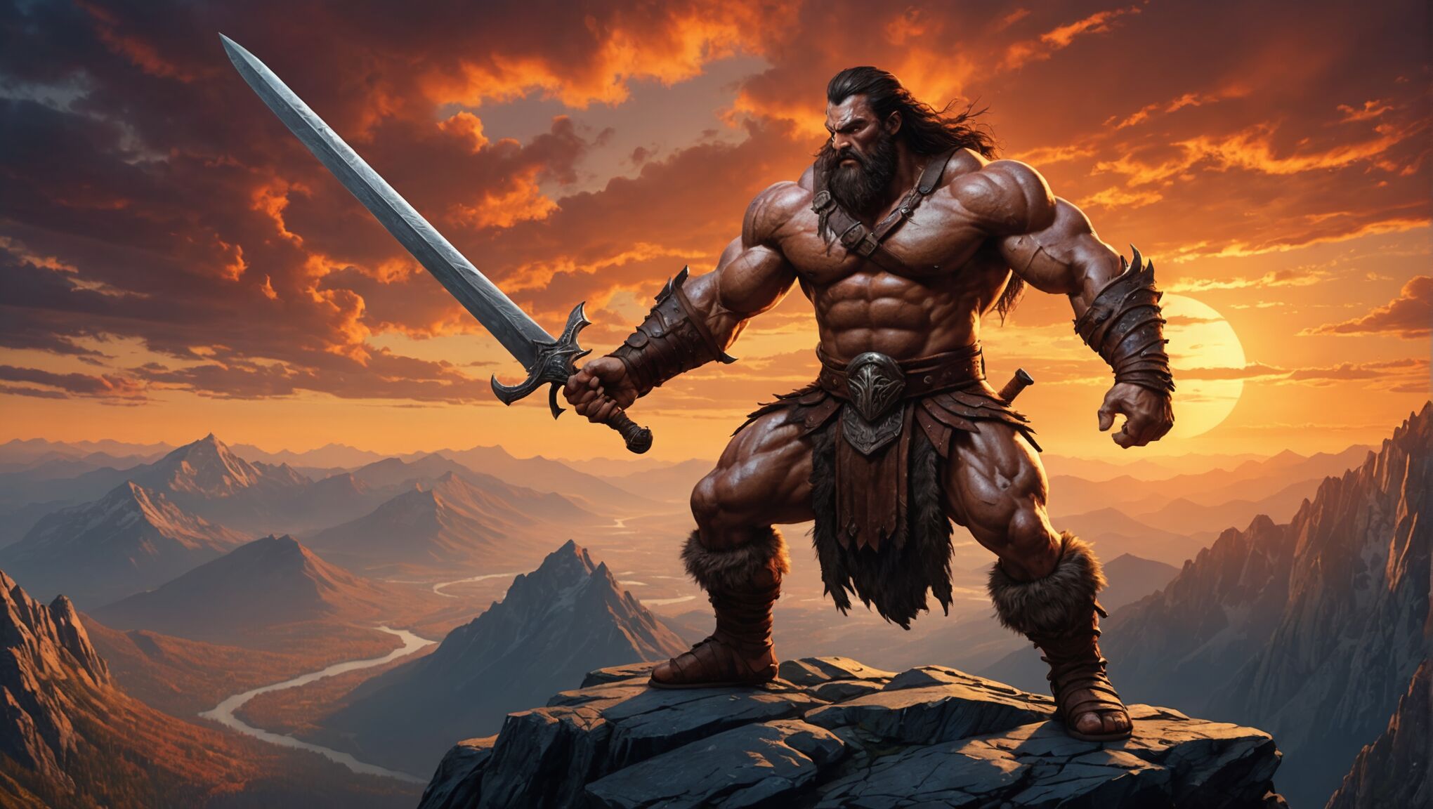
Frank Frazetta’s cover art for the Conan the Barbarian series in the 1960s and 1970s revolutionized fantasy cover design. His dynamic, muscular depictions of the titular hero in action scenes became instantly recognizable and heavily imitated. Frazetta’s style, characterized by bold colors, dramatic lighting, and a sense of motion, set a new standard for fantasy art and influenced countless artists in the decades that followed.
“I didn’t paint Conan to be a hero. I painted him to be a dominant force.” – Frank Frazetta
The 1970s and 1980s saw the rise of artists like Michael Whelan, whose detailed and imaginative covers for authors such as Anne McCaffrey and Isaac Asimov became synonymous with quality fantasy and science fiction literature. Whelan’s ability to capture complex narratives in a single image made his covers not just decorative, but an integral part of the reading experience.
In the realm of young adult fantasy, the original cover of Ursula K. Le Guin’s “A Wizard of Earthsea,” illustrated by Ruth Robbins in 1968, stands out for its simplicity and symbolism. The stark black-and-white design featuring a stylized map of Earthsea perfectly captured the novel’s themes of balance and duality, proving that effective fantasy covers didn’t always need to be elaborate or colorful.
The 1980s and 1990s saw a trend towards more photorealistic cover art, exemplified by artists like Darrell K. Sweet, whose covers for Robert Jordan’s “The Wheel of Time” series became iconic in their own right. These covers often depicted key scenes or characters from the books in vivid detail, giving readers a tangible glimpse into the worlds they were about to enter.
As the century drew to a close, digital art began to make its mark on fantasy cover design. Artists like Stephan Martiniere and John Harris used digital techniques to create otherworldly landscapes and futuristic visions that pushed the boundaries of traditional fantasy imagery.
Throughout the 20th century, fantasy book covers evolved from simple illustrations to complex works of art in their own right. They not only reflected the contents of the books they adorned but also played a crucial role in shaping readers’ expectations and the public perception of the fantasy genre as a whole.
Shift towards minimalism in the digital age

As the digital age dawned, a notable shift towards minimalism began to influence fantasy book cover design. This trend, partly driven by the rise of e-books and online marketplaces, saw designers adapting to smaller, thumbnail-sized images that needed to be visually striking and easily recognizable on digital platforms. The intricate, detailed artwork that had long been a hallmark of fantasy covers gave way to simpler, more iconic designs that could effectively capture attention in a crowded digital marketplace.
Color began to play an even more crucial role in this new era. Bold, contrasting color schemes became popular, with designers often opting for a limited palette to create maximum impact. Single, powerful images or symbols replaced the busy, narrative-driven scenes of previous decades. For instance, covers featuring a single object – a crown, a sword, or a mystical artifact – against a plain background became increasingly common, allowing readers to quickly grasp the essence of the book at a glance.
Typography also underwent a transformation during this period. Clean, modern fonts replaced the ornate scripts that had been popular in fantasy design. Text became larger and more prominent, often integrated seamlessly with the cover image to create a cohesive design. Some covers even began to rely primarily on typography, with creative and eye-catching font treatments becoming the main visual element.
The use of negative space became a powerful tool in minimalist fantasy cover design. Designers began to embrace the concept of “less is more,” using empty space to draw attention to key elements and create a sense of mystery or intrigue. This approach not only suited the digital format but also provided a refreshing contrast to the traditionally busy fantasy covers of the past.
Despite this trend towards simplification, fantasy cover design didn’t lose its ability to evoke wonder and imagination. Instead, designers found new ways to suggest fantastical worlds and epic stories through subtle details, textures, and atmospheric effects. Gradients, metallic finishes, and subtle patterns were employed to add depth and richness to otherwise simple designs.
The shift towards minimalism also saw a blending of genres in cover design. Elements traditionally associated with literary fiction or contemporary design began to appear on fantasy covers, broadening the visual language of the genre and appealing to a wider audience. This cross-pollination of styles helped to elevate fantasy in the eyes of critics and readers who might have previously dismissed it based on its traditional cover aesthetics.
As the digital age progressed, some publishers began to experiment with interactive or animated covers for e-books, adding a new dimension to fantasy cover design. While not universally adopted, these innovations pointed to potential future directions for the field, hinting at how cover art might continue to evolve in an increasingly digital world.
The move towards minimalism in fantasy cover design during the digital age represented not just a response to technological changes, but a broader shift in visual culture. It demonstrated the genre’s ability to adapt and remain relevant in a rapidly changing marketplace, while still maintaining its core appeal of transporting readers to worlds of imagination and wonder.
Influence of young adult fantasy on cover trends
The rise of young adult (YA) fantasy literature has significantly impacted cover design trends across the entire fantasy genre. As YA fantasy gained popularity in the late 1990s and early 2000s, it brought with it a fresh aesthetic that soon began to influence covers for adult fantasy as well.
One of the most notable changes introduced by YA fantasy covers was the increased focus on the protagonist. Covers began to feature close-up portraits or silhouettes of main characters, often depicting them in dramatic poses or engaged in action. This trend humanized fantasy stories, making them more relatable to younger readers and helping to create instant connections with potential audiences.
Color palettes also evolved under the influence of YA fantasy. Bright, bold colors became more prevalent, with designers often opting for eye-catching combinations that would stand out on bookshelves. Covers began to incorporate more vibrant hues and gradient effects, moving away from the darker, more muted tones that had been common in traditional adult fantasy.
| Traditional Fantasy Colors | YA-Influenced Colors |
| Dark blues, greens, and purples | Bright teals, pinks, and oranges |
| Muted earth tones | Neon accents and metallic finishes |
The incorporation of modern elements into fantasy settings became another hallmark of YA-influenced cover design. Covers began to blend traditional fantasy imagery with contemporary fashion, architecture, and technology, creating a unique aesthetic that appealed to younger readers while still maintaining the genre’s magical essence.
Symbolism and iconography also gained prominence in cover design, partly due to the influence of YA fantasy. Covers began to feature simple, powerful symbols that represented key themes or plot elements, often rendered in stylized forms that were both visually striking and laden with meaning. This approach allowed designers to create covers that were intriguing and mysterious, encouraging potential readers to pick up the book and discover its secrets.
The success of major YA fantasy franchises like Harry Potter, Twilight, and The Hunger Games had a ripple effect on cover design across the industry. Publishers began to recognize the power of creating a strong visual brand for fantasy series, leading to more cohesive and visually consistent cover designs across multiple books. This trend towards series branding influenced adult fantasy as well, with publishers putting more emphasis on creating recognizable visual identities for their authors and series.
YA fantasy also brought about a shift in the portrayal of female characters on covers. There was a move away from the often sexualized depictions common in some adult fantasy subgenres towards more empowered and diverse representations of women and girls. This change reflected broader cultural shifts and helped to expand the appeal of fantasy to a wider audience.
The digital age and social media have further amplified the influence of YA fantasy cover trends. Covers are now designed with shareability in mind, incorporating elements that translate well to small screens and have the potential to go viral on platforms like Instagram and TikTok. This has led to an increase in visually striking, high-contrast designs that make an immediate impact in digital spaces.
As the lines between YA and adult fantasy continue to blur, the influence of YA cover design trends shows no signs of waning. The emphasis on character-driven narratives, bold visuals, and contemporary elements has reinvigorated fantasy cover design, creating a more diverse and dynamic visual landscape for the genre as a whole.
Typography and font choices in fantasy covers
 The choice of typography and fonts in fantasy book covers plays a crucial role in setting the tone, evoking the right atmosphere, and capturing the essence of the story within. Over the years, designers have experimented with various styles, from ornate and decorative to sleek and modern, each contributing to the overall visual impact of the cover.
Historically, fantasy book covers often featured elaborate, hand-drawn lettering that mimicked medieval manuscripts or calligraphy. These intricate designs helped transport readers to bygone eras and magical realms. Fonts like Blackletter or Gothic scripts were particularly popular, evoking a sense of antiquity and mysticism.
As the genre evolved, so did the typography. The mid-20th century saw a shift towards more legible, yet still decorative fonts. Serif typefaces with slight embellishments became common, striking a balance between readability and fantasy aesthetics. Fonts like Trajan, with its Roman-inspired capital letters, became a staple in fantasy cover design, lending an air of epic grandeur to titles.
The digital age brought about a revolution in font design and accessibility. Designers now had a vast array of options at their fingertips, allowing for more creative and diverse typography. This led to the emergence of custom-designed fonts specifically created for fantasy series, helping to establish unique visual identities for different works.
Contemporary fantasy covers often blend traditional and modern elements in their typography. While some still opt for classic serif fonts, others embrace sans-serif or even experimental typefaces to create contrast and intrigue. The integration of typography with cover art has become more seamless, with text often interacting with or complementing the imagery in creative ways.
Color plays a significant role in fantasy cover typography. Metallic effects, particularly gold and silver, remain popular choices, evoking a sense of preciousness and magic. Gradient fills and textured lettering are also common, adding depth and dimension to the text.
The placement and size of typography on fantasy covers have also evolved. While titles were once typically centered at the top of the cover, modern designs often play with unconventional layouts. Oversized titles that dominate the cover or text that wraps around images have become increasingly common, creating visually striking compositions.
Font pairing has become an art form in itself, with designers carefully selecting complementary typefaces for titles, author names, and taglines. The contrast between a bold, attention-grabbing title font and a more understated author name can create a dynamic visual hierarchy on the cover.
In recent years, there’s been a trend towards more minimalist typography in some fantasy covers. Clean, simple fonts allow the cover art to take center stage while still conveying the necessary information. This approach can be particularly effective in creating a sense of mystery or intrigue.
The rise of young adult fantasy has also influenced typography trends across the genre. YA covers often feature more contemporary, trendy fonts that appeal to younger readers while still maintaining a hint of the fantastical.
As technology continues to advance, we’re seeing the emergence of animated typography in digital book covers. While still in its early stages, this trend opens up exciting possibilities for creating dynamic, eye-catching designs that can captivate readers in online marketplaces.
The evolution of typography in fantasy book covers reflects not only changing design trends but also shifts in the genre itself. From the ornate scripts of classic fantasy to the bold, modern typefaces of contemporary works, font choices continue to play a vital role in shaping readers’ perceptions and expectations of the stories within.
Modern fantasy cover design: Blending traditional and contemporary elements
In recent years, fantasy book cover design has undergone a fascinating transformation, blending traditional elements with contemporary aesthetics to create visually striking and innovative covers. This fusion reflects the genre’s evolution and its ability to adapt to changing tastes while honoring its rich visual heritage.
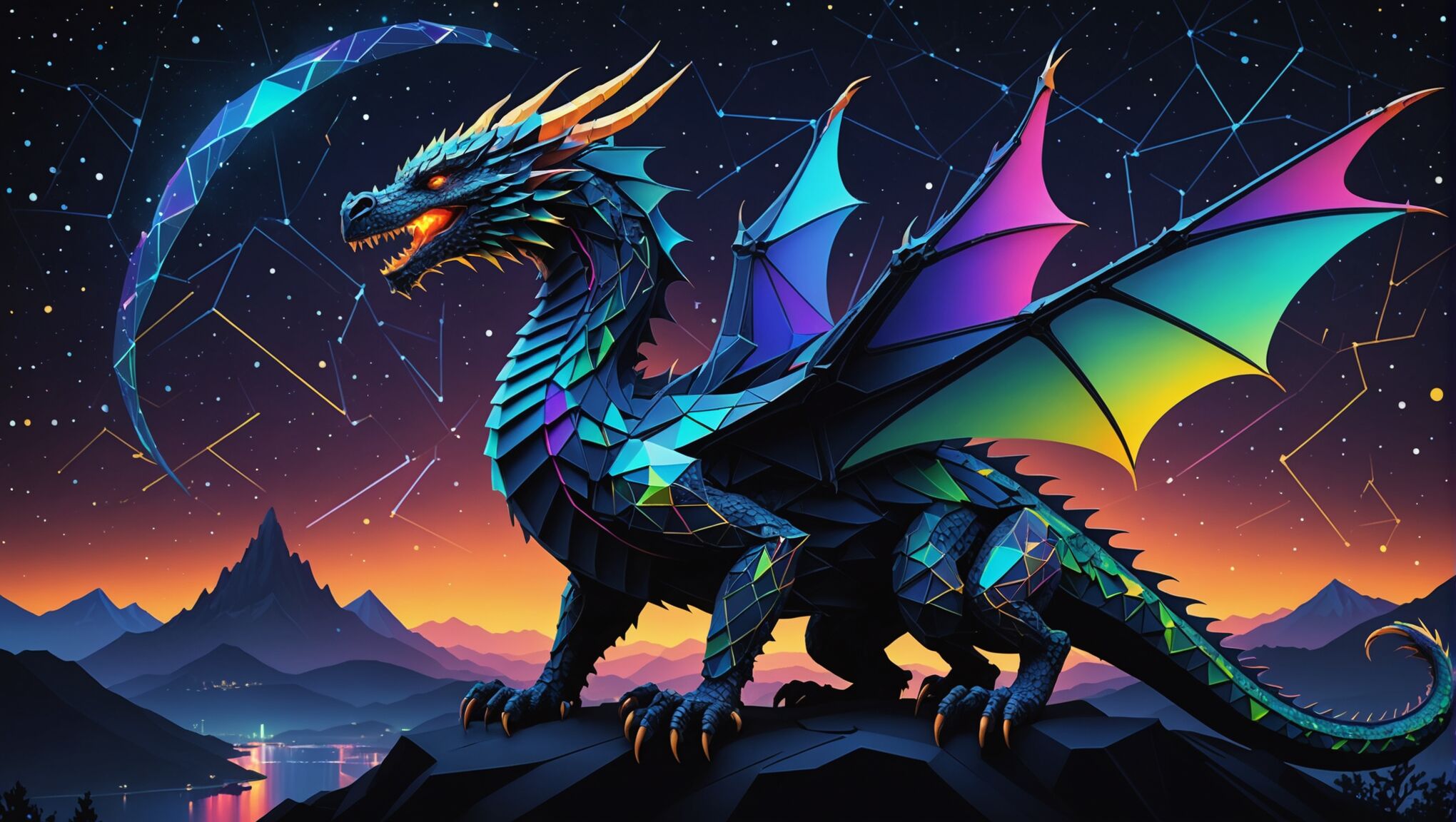
One notable trend is the reinterpretation of classic fantasy motifs using modern design techniques. Dragons, castles, and magical creatures are still present, but they’re often rendered in more abstract or stylized ways. For instance, a dragon might be represented by a minimalist line drawing or a geometric pattern, rather than a fully detailed illustration. This approach allows designers to evoke the essence of fantasy while appealing to a more sophisticated visual palette.
The use of mixed media has become increasingly popular, combining traditional illustration techniques with digital art and photography. This hybrid approach creates depth and texture, resulting in covers that are visually complex and intriguing. For example, a cover might feature a hand-painted landscape overlaid with digitally created magical effects, or a photographed model dressed in fantasy attire set against a digitally rendered background.
Color usage has also evolved, with designers embracing bold, unconventional palettes. While earthy tones and jewel hues are still prevalent, there’s a growing trend towards unexpected color combinations that catch the eye and set books apart on crowded shelves. Neon accents, pastel backgrounds, and monochromatic schemes are being employed to create covers that are both fantastical and contemporary.
Typography continues to play a crucial role, with designers experimenting with custom lettering that integrates seamlessly with the cover art. 3D effects, textured fonts, and creative placement of text elements all contribute to covers that feel cohesive and immersive. Some designers are even incorporating elements of the story into the typography itself, such as having the title formed by magical mist or intertwined with illustrated vines.
The influence of other genres and art movements is becoming more apparent in modern fantasy covers. Elements of science fiction, horror, and even contemporary fiction are being incorporated, reflecting the genre-blending nature of many current fantasy works. Covers might feature futuristic cityscapes alongside magical elements, or combine Victorian-inspired designs with modern graphic techniques.
Symbolism and metaphor are being used more subtly and effectively in contemporary fantasy covers. Instead of literal representations of scenes from the book, designers are opting for symbolic imagery that captures the essence of the story. This approach not only creates more visually interesting covers but also allows readers to form their own interpretations and connections with the book before even opening it.
The rise of digital platforms has also influenced cover design, with many covers now created to be equally impactful as thumbnails on online stores and as physical books. This has led to cleaner designs with strong focal points that read well at various sizes. However, designers are also taking advantage of special printing techniques for physical books, such as embossing, foil stamping, and spot UV coating, to create covers that offer a tactile experience that can’t be replicated digitally.
Inclusivity and diversity are becoming increasingly important in fantasy cover design. There’s a growing emphasis on representing a wide range of characters and cultures, moving away from the Eurocentric imagery that has long dominated the genre. This shift is not only reflected in the characters depicted on covers but also in the incorporation of diverse cultural motifs and artistic styles.
As fantasy continues to evolve as a genre, so too does its cover design. The current trend of blending traditional and contemporary elements creates covers that are at once familiar and fresh, appealing to long-time fans of the genre while also attracting new readers. This dynamic approach to cover design ensures that fantasy books remain visually captivating and relevant in an ever-changing literary landscape.

