
blog
Psychology Behind Book Cover Design
Understanding reader psychology is crucial for creating effective book covers that capture attention and evoke emotions. At its core, design psychology revolves around how visual elements influence a reader’s initial perceptions and subsequent decisions. Research has shown that readers often form an opinion about a book within seconds of seeing its cover. This snap judgment underscores the importance of tapping into psychological principles when crafting a book cover.
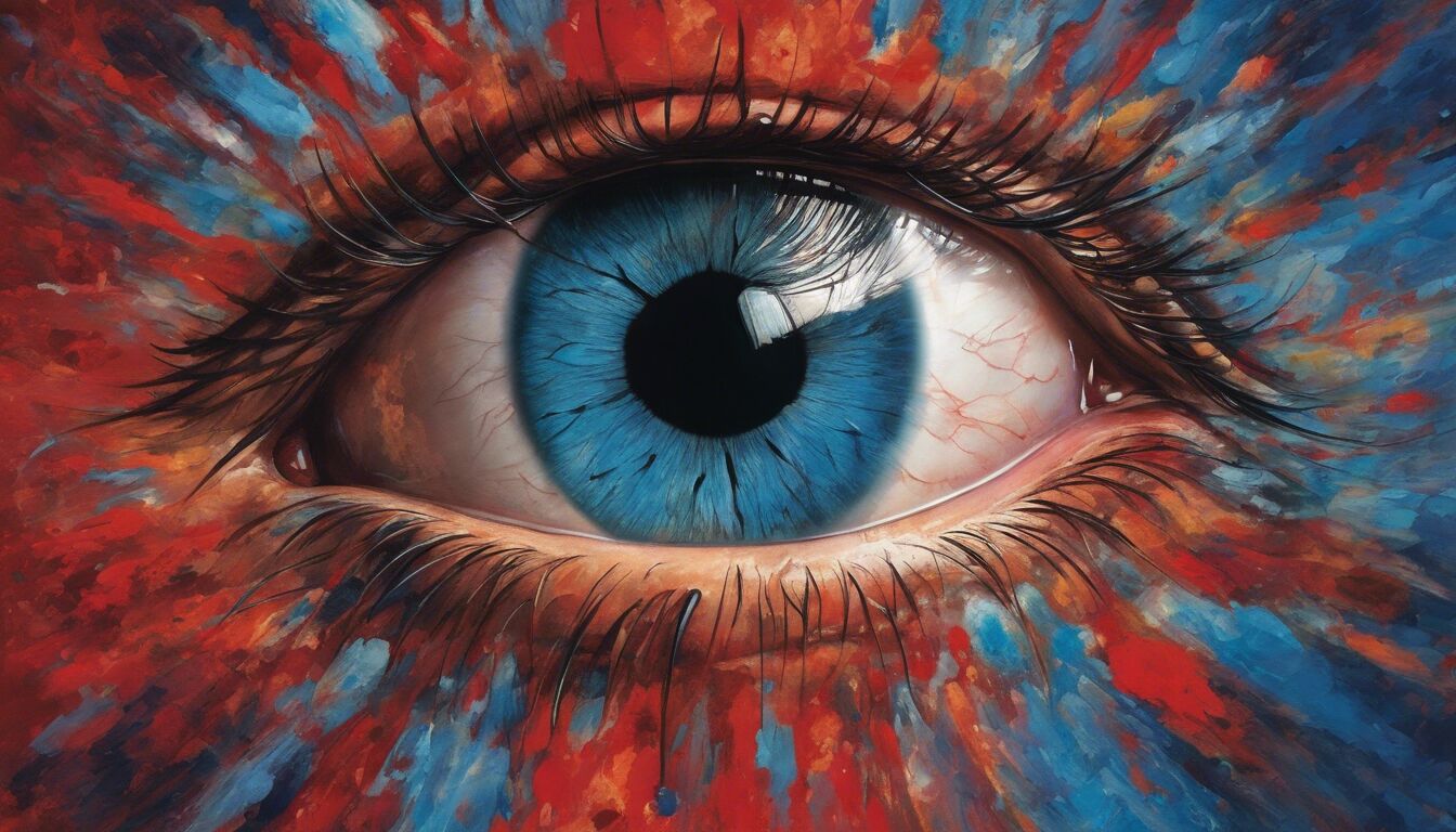
One essential psychological aspect is the emotional impact of visual stimuli. Colors, shapes, and layouts all play a pivotal role in how a cover is perceived. For instance, warm colors like red and yellow can evoke feelings of excitement and urgency, while cool colors like blue and green tend to have a calming and trustworthy appeal. As Ralph Waldo Emerson once said, “The eyes of men are better judges of men than their ears.” This quote highlights the importance of visual appeal in catching the eye of a potential reader.
Authors and designers should also consider how elements like symmetry and asymmetry affect the viewer. Symmetrical designs are often perceived as harmonious and pleasing, while asymmetrical layouts can evoke interest and curiosity by breaking conventional patterns. This balance helps in maintaining the reader’s attention and subtly guiding their focus toward the book’s title and author name.
Furthermore, understanding the psychological triggers related to familiar imagery or symbols can enhance a cover’s allure. People tend to be drawn to things they recognize or associate with positive feelings. Therefore, incorporating archetypal images or familiar scenes can subconsciously communicate themes or genres, helping potential readers quickly identify if the book is something they might enjoy.
Ultimately, the goal of leveraging reader psychology in book cover design is to create a harmonious blend of visual elements that not only attract attention but also convey the essence of the book’s content in an instant. The wise use of design psychology can transform a bland cover into a compelling visual narrative that draws readers in and entices them to explore further.
Color theory in cover design

Understanding reader psychology is crucial for creating effective book covers that capture attention and evoke emotions. At its core, design psychology revolves around how visual elements influence a reader’s initial perceptions and subsequent decisions. Research has shown that readers often form an opinion about a book within seconds of seeing its cover. This snap judgment underscores the importance of tapping into psychological principles when crafting a book cover.
One essential psychological aspect is the emotional impact of visual stimuli. Colors, shapes, and layouts all play a pivotal role in how a cover is perceived. For instance, warm colors like red and yellow can evoke feelings of excitement and urgency, while cool colors like blue and green tend to have a calming and trustworthy appeal. As Ralph Waldo Emerson once said, “The eyes of men are better judges of men than their ears.” This quote highlights the importance of visual appeal in catching the eye of a potential reader.
Authors and designers should also consider how elements like symmetry and asymmetry affect the viewer. Symmetrical designs are often perceived as harmonious and pleasing, while asymmetrical layouts can evoke interest and curiosity by breaking conventional patterns. This balance helps in maintaining the reader’s attention and subtly guiding their focus toward the book’s title and author name.
Furthermore, understanding the psychological triggers related to familiar imagery or symbols can enhance a cover’s allure. People tend to be drawn to things they recognize or associate with positive feelings. Therefore, incorporating archetypal images or familiar scenes can subconsciously communicate themes or genres, helping potential readers quickly identify if the book is something they might enjoy.
Ultimately, the goal of leveraging reader psychology in book cover design is to create a harmonious blend of visual elements that not only attract attention but also convey the essence of the book’s content in an instant. The wise use of design psychology can transform a bland cover into a compelling visual narrative that draws readers in and entices them to explore further.
Color theory goes far beyond mere aesthetics; it taps into the very core of human emotion and perception. Different colors can evoke different psychological responses, making it a significant element in the realm of design psychology. For instance, black often symbolizes sophistication, elegance, and mystery, which can be appealing for genres like thriller or literary fiction. On the other hand, bright colors like yellow and orange exude energy and optimism, making them ideal for self-help or children’s books.
Blue is widely recognized for its calming and trustworthy qualities, making it a popular choice for non-fiction topics related to wellness, self-improvement, or finance. Green, associated with nature and growth, often features on covers of books dealing with environmental themes or healthy living. Utilizing these color associations strategically helps in immediately communicating the book’s genre or theme to a potential reader.
Moreover, color combinations can create a focal point that draws attention to specific elements of the cover. A pop of contrasting color, like red against a neutral background, can highlight the book’s title or a critical endorsement. This technique leverages the visual hierarchy to guide the reader’s eye, making the cover not just visually appealing but also informative.
In the realm of design psychology, the cultural context of color cannot be overlooked. Colors carry different meanings in different cultures, which can affect how a book is perceived in various markets. White, for instance, might denote purity and simplicity in Western cultures but can symbolize mourning in some Asian cultures. Thus, a globally-aware approach to color selection can enhance the cover’s effectiveness in diverse markets.
“Color is a power which directly influences the soul.” – Wassily Kandinsky
Ultimately, the thoughtful application of color theory in book cover design aims to evoke the right emotions and connections from the very first glance. Through an understanding of how different hues and combinations can affect perception, designers can create compelling covers that resonate deeply with their intended audience.
Typography’s impact on perception
Typography uniquely influences how potential readers perceive and interact with a book cover. The style, size, and arrangement of the text all play critical roles in conveying the book’s tone, genre, and level of professionalism from the outset. For instance, serif fonts, with their classic and formal appeal, are often used for traditional literature, academic texts, or historical novels. In contrast, sans-serif fonts, which are modern and clean, are commonly seen on contemporary fiction, self-help books, or technology-related topics.
The weight and size of the typography also contribute significantly to its impact. Bold typefaces can make the title stand out, attracting attention and conveying importance or urgency. This is particularly effective for genres like thrillers or action novels, where the reader’s adrenaline and curiosity are immediately piqued. Conversely, lighter, more delicate fonts might be more appropriate for romance novels or poetry, subtly hinting at the softer, more emotional nature of the content.
Design psychology underscores the importance of readability. The ease with which potential readers can decipher the text on a cover can influence their initial impression and willingness to engage with the book. A cluttered or overly complicated font can deter readers before they even pick up the book. Therefore, clarity and simplicity are often key. Designers must strike a balance, ensuring that the typography is both eye-catching and legible, especially when considering smaller thumbnail images often seen in online marketplaces.
The alignment and spacing of text also play a vital role in creating a visually harmonious cover. Center-aligned text can impart a sense of balance and stability, often preferred for more formal works. Left-aligned text, however, can appear more dynamic and modern, suitable for contemporary or experimental genres. The use of negative space—the area around and between elements of the design—can give the text room to breathe, making the overall composition feel more balanced and aesthetically pleasing.
Moreover, the integration of typography with other visual elements on the cover is essential. The text should complement the imagery, not compete with it. For example, a minimalist cover with a single, striking image might require a similarly minimalist font to maintain visual cohesion. On the other hand, a cover bustling with intricate details might benefit from a more subdued typographic choice to avoid overwhelming the viewer.
Ultimately, the impact of typography on book cover design cannot be overstated. It is a powerful tool in design psychology that helps set the reader’s expectations and elicit specific emotional responses. By thoughtfully selecting and arranging typefaces, designers can create compelling, visually appealing covers that draw readers in and reflect the essence of the book’s content.
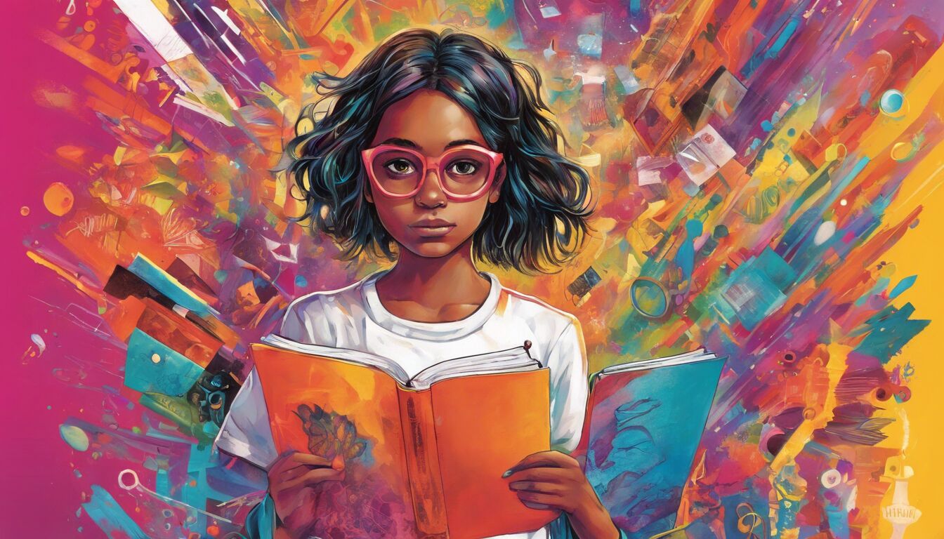
Imagery and visual appeal
Imagery is a fundamental aspect of book cover design that significantly influences a reader’s initial impression. In the realm of design psychology, images serve as visual shortcuts that convey complex messages quickly and effectively. The choice of imagery can communicate the book’s genre, tone, and themes, as well as evoke specific emotions in the viewer. For instance, a cover featuring dark, moody landscapes is likely to signal a mystery or thriller, while a cover with bright, whimsical illustrations might indicate a light-hearted or comedic read.
The use of imagery goes beyond mere representation; it taps into the reader’s subconscious. Iconic and archetypal images—such as a detective’s silhouette, a heart symbol, or a futuristic cityscape—can immediately convey recognizable cues about the story’s content. This harnesses a reader’s prior knowledge and associations, helping them quickly identify the type of reading experience they might expect. Incorporating familiar visual motifs helps to establish a connection with the reader, making the book more appealing and relatable.
Moreover, the style of imagery significantly impacts the reader’s perception. Photorealistic images might be used for non-fiction books to convey reliability and factual accuracy, while hand-drawn illustrations can give a sense of personal touch and creativity, often used for memoirs or indie fiction. Abstract art, on the other hand, might be chosen for literary fiction, inviting the reader to interpret the cover, much like the content within the book.
The composition of images on the cover is also crucial in guiding the reader’s eye. Strategic placement of imagery can create a focal point, drawing attention to key elements such as the book’s title or the author’s name. For example, placing a striking image at the center with the title layered over it can create a balanced and cohesive look. Alternatively, an off-center image can create a sense of dynamism and movement, adding interest and encouraging further exploration of the cover’s details.
Visual appeal through imagery is not just about what is shown, but also about what is suggested. Subtle details and background elements can enrich the narrative the cover is trying to convey. A seemingly simple image of a cup of tea could be accompanied by faint outlines of mystical creatures in the steam to hint at fantasy elements. This layered approach invites readers to look closer and engage more deeply with the cover.
Color integration within imagery also plays a vital role. Designers often use complementary color schemes within images to enhance visual harmony and aesthetic pleasure. For example, a cool-toned forest scene might be highlighted with warm, inviting lights to stand out and draw the reader’s eye. This technique, rooted in color theory, helps to balance the visual elements and evoke specific moods.
In addition to these psychological principles, it is essential to consider cultural nuances in imagery. Symbols and visual cues that are beloved in one culture might be misunderstood or even off-putting in another. Therefore, designers must approach imagery with a global perspective, ensuring that the cover is effective across diverse audience demographics.
Ultimately, the thoughtful integration of imagery in book cover design is a potent tool within design psychology. By combining strategic visual elements, cultural awareness, and color theory, designers can create covers that captivate and resonate with potential readers, enticing them to delve into the book’s pages.
Target audience analysis
 Creating an effective book cover goes beyond merely understanding broad psychological principles; it requires a nuanced analysis of the target audience. By tailoring the design to the specific preferences and expectations of different readership segments, designers can significantly enhance a book’s appeal and marketability. A fundamental aspect of design psychology involves recognizing these audience distinctions and how they influence perception and decision-making.
For instance, young adult readers are often drawn to dynamic, visually stimulating covers that reflect contemporary trends and vibrant color palettes. Conversely, a more mature audience might gravitate towards understated, sophisticated designs that convey a sense of depth and intellectual engagement. Recognizing these preferences enables designers to craft covers that resonate powerfully with the intended demographic.
Understanding the target audience begins with thorough research into their age, gender, cultural background, and reading habits. Social media platforms, reader reviews, and online communities provide valuable insights into what resonates with different reader groups. By analyzing these data points, designers can identify patterns and preferences, allowing for more informed creative decisions. For example, a cover aimed at fantasy enthusiasts might leverage intricate illustrations and mythological elements, while a business book might adopt a sleek, minimalist design to convey professionalism and clarity.
Moreover, genre conventions play a crucial role in audience expectations. Romance readers, for instance, often look for covers that feature characters or romantic themes, evoking emotions of love and intimacy. In contrast, science fiction aficionados might prefer covers that include futuristic elements and advanced technology, catering to their interest in speculative narratives. Adhering to these genre-specific elements not only meets reader expectations but also helps the book stand out within a crowded market.
However, it is also essential to challenge and innovate within these conventions. While adhering to established norms can attract readers familiar with the genre, unique and imaginative designs can capture attention and differentiate a book from its competitors. This balance between tradition and innovation is at the heart of effective design psychology, ensuring that a book cover is both recognizable and memorable.
Profiling the target audience also involves understanding their emotional and cognitive responses to various design elements. For instance, young adult fiction often employs bold typography and striking imagery that reflect the intensity and immediacy of adolescent experiences. In contrast, literary fiction might use more subdued, evocative imagery that invites contemplation and deep emotional engagement. These stylistic choices are rooted in a deep understanding of how different reader segments engage with visual stimuli and what they seek in a reading experience.
Cultural considerations further enrich this analysis. For example, certain symbols and colors might have specific connotations in different cultures, affecting how a cover is perceived. A cover design that resonates in the Western market might require adjustments to align with cultural sensitivities and preferences in East Asian or Middle Eastern markets. This global perspective ensures that the cover appeals to a diverse audience, enhancing its reach and impact.
Additionally, the role of trends and market research should not be overlooked. Staying informed about current design trends and popular themes in the publishing industry helps designers create contemporary and appealing covers. However, it is crucial to balance trend-following with originality to create a timeless design that stands the test of time.
Ultimately, the art of crafting a book cover that appeals to the target audience is a multifaceted endeavor that blends design psychology, market research, and cultural awareness. By delving deep into the preferences and expectations of different reader segments, designers can create compelling covers that not only attract attention but also forge a meaningful connection with potential readers. This thoughtful approach transforms a simple cover into a powerful marketing tool and an integral part of the reader’s journey.
The role of trends and market research
Designing a book cover that resonates with potential readers requires a solid grasp of current market trends and thorough research. Staying abreast of industry trends can provide valuable insights into what is capturing readers’ attention at any given time. For example, the minimalist design trend, which emerged prominently in recent years, signifies a move towards clean, simple aesthetics that focus on bold typography and limited color palettes. This approach can often convey sophistication and modernity, making it a favored choice for contemporary fiction and non-fiction titles alike.
Market research is indispensable in understanding not only what is currently popular but also what specifically appeals to different reader demographics. This involves analyzing sales data, reader reviews, and social media discussions to identify emerging patterns and preferences. For instance, the influx of dystopian narratives in the young adult genre a few years ago led to a proliferation of dark, moody covers with stark contrasts and gritty textures, designed to appeal to the pessimistic yet hopeful undertones of the genre.
Trends, however, are not static; they evolve over time. A cover design that is in vogue at one moment might quickly become outdated. Therefore, balancing trend awareness with timeless design principles is crucial. This ensures that while a cover feels fresh and relevant, it does not appear dated within a short period. For example, while typographic exploration—such as hand-lettered titles—might be trendy, combining such elements with classic, enduring design aesthetics can create a cover that remains appealing across different market cycles.
Beyond visual trends, market research also involves understanding the broader context of where and how books are being consumed. The rise of digital platforms has changed the way readers discover and purchase books, making thumbnail images on e-commerce sites a crucial aspect of cover design. This shift requires covers to be impactful even at a smaller scale, which often means prioritizing legibility and simplicity to stand out in crowded digital spaces.
Furthermore, using design psychology in conjunction with market research can amplify the effectiveness of a book cover. This involves not only recognizing the visual preferences of the target audience but also understanding the emotional triggers that drive their purchasing behavior. For example, nostalgia can be a powerful emotional driver, influencing readers to choose books that evoke a sense of familiarity or past joy. Vintage-inspired designs can therefore tap into this emotional reservoir, appealing to readers on a deeper psychological level.
The iterative process of aligning trends and market research with design psychology often includes protoyping and testing. Designers may create multiple cover variations and conduct focus groups or A/B testing to gather feedback. This empirical approach helps in fine-tuning the design to better match consumer preferences. Additionally, such testing can reveal unexpected insights, such as a particular color palette or imagery style that resonates more strongly with the audience than initially anticipated.
Collaboration between authors, designers, and marketing experts can further enhance the effectiveness of this approach. While authors bring a deep understanding of the book’s content and themes, designers translate these elements into visual form, and marketing experts ensure that the cover aligns with broader market strategies. This collaborative effort ensures that all aspects of the book cover—from its evocative imagery to its genre-specific typography—are meticulously crafted to maximize its market appeal.
Ultimately, the integration of market research, trend analysis, and design psychology allows for the creation of book covers that are not only visually striking but also deeply resonant with their intended audience. This holistic approach transforms the cover from a mere visual element into a strategic tool that drives engagement, enhances marketability, and ultimately contributes to the book’s success. More in this source.