blog
How to Create Enchanting Fantasy Covers That Capture Readers
Fantasy book covers serve as gateways to magical realms, enticing readers with promises of adventure and wonder. To create an enchanting cover, it’s crucial to understand the key elements that make fantasy designs stand out. “A great cover is a visual story in itself,” and this principle holds especially true for the fantasy genre. Begin by researching popular fantasy covers to identify recurring themes and motifs. Common elements include mythical creatures, magical artifacts, otherworldly landscapes, and heroic figures. These visual cues instantly signal to readers that they’re entering a fantastical world.
Consider the mood you want to convey through your cover. Is your story dark and brooding, or light and whimsical? The overall tone should be reflected in every aspect of the design, from the color palette to the imagery chosen. Pay attention to the balance between realism and abstraction. While some fantasy covers opt for highly detailed, realistic illustrations, others use more symbolic or stylized representations. The choice often depends on the target audience and the specific subgenre of fantasy.
Contrast and drama are essential in grabbing a potential reader’s attention. This can be achieved through bold color choices, dynamic compositions, or striking visual elements that draw the eye. Remember that your cover needs to work both as a full-size image and as a thumbnail, so ensure that the main elements are clearly visible at different scales. Incorporate subtle details that hint at the story’s depth, encouraging viewers to look closer and sparking their curiosity about the narrative within.
When designing fantasy covers, it’s important to consider the current trends in the genre while also striving for uniqueness. Look for ways to subvert expectations or combine familiar elements in novel ways. The goal is to create a cover that feels both familiar enough to appeal to fantasy fans and distinctive enough to stand out in a crowded marketplace. By understanding these fundamental elements of fantasy cover design, you’ll be better equipped to create visually stunning and commercially appealing book covers that truly capture the essence of your fantastical tales.
Choosing the right imagery and symbols
 Selecting the right imagery and symbols for your fantasy book cover is crucial in conveying the essence of your story and attracting your target audience. Begin by identifying the key themes, characters, and settings that define your narrative. These elements should be reflected in your cover design to give readers an accurate glimpse into the world you’ve created.
“A picture is worth a thousand words, but a symbol can speak volumes.” – Unknown
Consider iconic symbols that resonate with your story’s core concepts. For instance, a mystical amulet might represent a powerful artifact central to the plot, while a specific animal could symbolize a character’s spirit guide or transformation. Mythological creatures like dragons, phoenixes, or unicorns can instantly evoke a sense of magic and wonder, but be cautious not to rely too heavily on clichés unless you’re deliberately subverting them.
Landscapes can be powerful tools in fantasy cover design. A foreboding castle silhouette against a stormy sky might hint at a dark, epic tale, while a lush, ethereal forest could suggest a more whimsical adventure. The key is to choose imagery that not only represents your story but also creates an emotional response in potential readers.
Character depictions on covers can be tricky but effective when done right. If you choose to feature a character, ensure they embody the essence of your protagonist or a pivotal moment in the story. Their pose, expression, and attire should all contribute to the overall mood and genre expectations.
Symbolic objects can serve as powerful focal points. A glowing sword, an ancient tome, or a mystical portal can each tell a story of their own while hinting at the broader narrative. These objects should be carefully chosen to represent key plot elements or themes within your book.
Consider the use of abstract or surreal imagery to create a sense of mystery and intrigue. Swirling mists, fractured realities, or impossible geometries can suggest a world where the rules of reality don’t quite apply, perfect for certain types of fantasy stories.
Remember to balance complexity with clarity. While intricate details can be appealing, your cover should be easily readable and recognizable even at small sizes, such as on online bookstore thumbnails. The main imagery should be clear and impactful at first glance.
Lastly, ensure that the imagery and symbols you choose are cohesive and tell a unified story. Each element should complement the others, creating a harmonious composition that captures the imagination and invites the reader to explore further.
Capture readers with enchanting fantasy covers. Check it out on our homepage.
Mastering color palettes for magical atmospheres

Color is a powerful tool in creating magical atmospheres for fantasy book covers. The right palette can instantly transport viewers to otherworldly realms and evoke specific moods. Begin by considering the overall tone of your story. For dark fantasy, deep purples, midnight blues, and rich blacks can create a sense of mystery and foreboding. Conversely, lighter fantasies might benefit from ethereal pastel hues or vibrant, saturated colors that suggest whimsy and wonder.
Contrast plays a crucial role in making your cover pop. Consider pairing complementary colors to create visual tension and draw the eye. For instance, a fiery orange dragon against a cool blue sky can be striking. Alternatively, analogous color schemes can create a sense of harmony and cohesion, perfect for depicting serene magical landscapes or unified magical systems.
Metallics are particularly effective in fantasy cover design. Gold, silver, and bronze can add a touch of luxury and ancient magic to your palette. These can be used sparingly for accents or more prominently to suggest valuable artifacts or royal themes. Remember that metallic effects may not translate well to digital formats, so ensure your design works in both print and digital mediums.
Consider the symbolism of colors in your palette. Green often represents nature and growth, perfect for stories involving forests or nature magic. Red can symbolize passion, danger, or power, while blue might suggest calmness, wisdom, or vast oceans. Purple has long been associated with royalty and mystery, making it a popular choice for fantasy covers.
Gradients and color blending can create stunning atmospheric effects. A sky transitioning from twilight purples to fiery oranges can set the stage for an epic adventure. Subtle color shifts can also add depth and dimension to your cover elements, making them appear more magical and alive.
Don’t be afraid to experiment with unexpected color combinations. Sometimes, a unique palette can make your cover stand out in a sea of similar designs. However, always ensure that your color choices enhance rather than detract from the overall readability and impact of your cover.
Lastly, consider how your color palette will look in different formats. Test your design in both full color and grayscale to ensure it remains effective even when printed in black and white or viewed on e-readers with limited color displays. A strong color palette should create a magical atmosphere that not only captures the essence of your story but also remains visually appealing across various mediums and devices.
Typography and font selection for fantasy books
The typography and font selection for fantasy books play a crucial role in establishing the tone and atmosphere of your cover. A well-chosen font can transport readers to magical realms and evoke the right emotions before they even open the book.
When selecting fonts for fantasy covers, consider typefaces that have an ornate, vintage, or hand-drawn quality. These styles often align well with the genre’s aesthetic and can immediately signal to readers that they’re entering a world of magic and wonder. Fonts with serifs or decorative elements can add a touch of elegance and timelessness to your design.
For titles, opt for bold, eye-catching fonts that are easily readable even at smaller sizes. Fantasy titles often benefit from custom lettering or modified existing typefaces to create a unique look. Consider incorporating subtle magical elements into the letterforms, such as swirls, flourishes, or glow effects, to enhance the fantastical feel.
Balance is key when pairing fonts. If you choose an elaborate font for the title, opt for a simpler, more legible font for the author’s name and any subtitles. This contrast can create visual interest while ensuring all text remains clear and easy to read.
Here’s a table of font styles that work well for different fantasy subgenres:
| Fantasy Subgenre | Font Style | Example Fonts |
| Epic Fantasy | Bold, serif fonts with a medieval feel | Aniron, Enchanted Land, Morpheus |
| Urban Fantasy | Modern, edgy fonts with a hint of mystique | Cinzel, Supernatural Knight, Urban Jungle |
| Fairy Tale Fantasy | Whimsical, script-like fonts | Adine Kirnberg, Fairytale, Once Upon A Time |
| Dark Fantasy | Gothic, grungy fonts | Ravenscroft, Black Castle, Nocturne |
Consider the placement and arrangement of text on your cover. Experiment with layering text over images or integrating it with visual elements to create a cohesive design. You might curve text to follow the shape of a magical object or have it interact with illustrated elements to add depth and interest.
Color and texture are important aspects of typography in fantasy covers. Metallic effects, such as gold or silver lettering, can add a touch of magic and luxury. Gradient colors or subtle textures within the font can create depth and visual interest. However, ensure that any effects don’t compromise readability.
Remember to test your font choices at various sizes and in different contexts. A font that looks great on a full-sized cover might not be as effective when viewed as a thumbnail on an online bookstore. Ensure that your title remains legible and impactful at smaller sizes.
Lastly, don’t be afraid to mix and match fonts to create a unique look. Combining a decorative title font with a simpler subtitle can create an attractive contrast. Just be sure to limit yourself to two or three fonts maximum to avoid a cluttered appearance.
By carefully selecting and arranging your typography, you can create a fantasy book cover that not only captures the essence of your story but also stands out in a crowded marketplace, enticing readers to embark on the magical journey within your pages.
Composition techniques to create visual intrigue
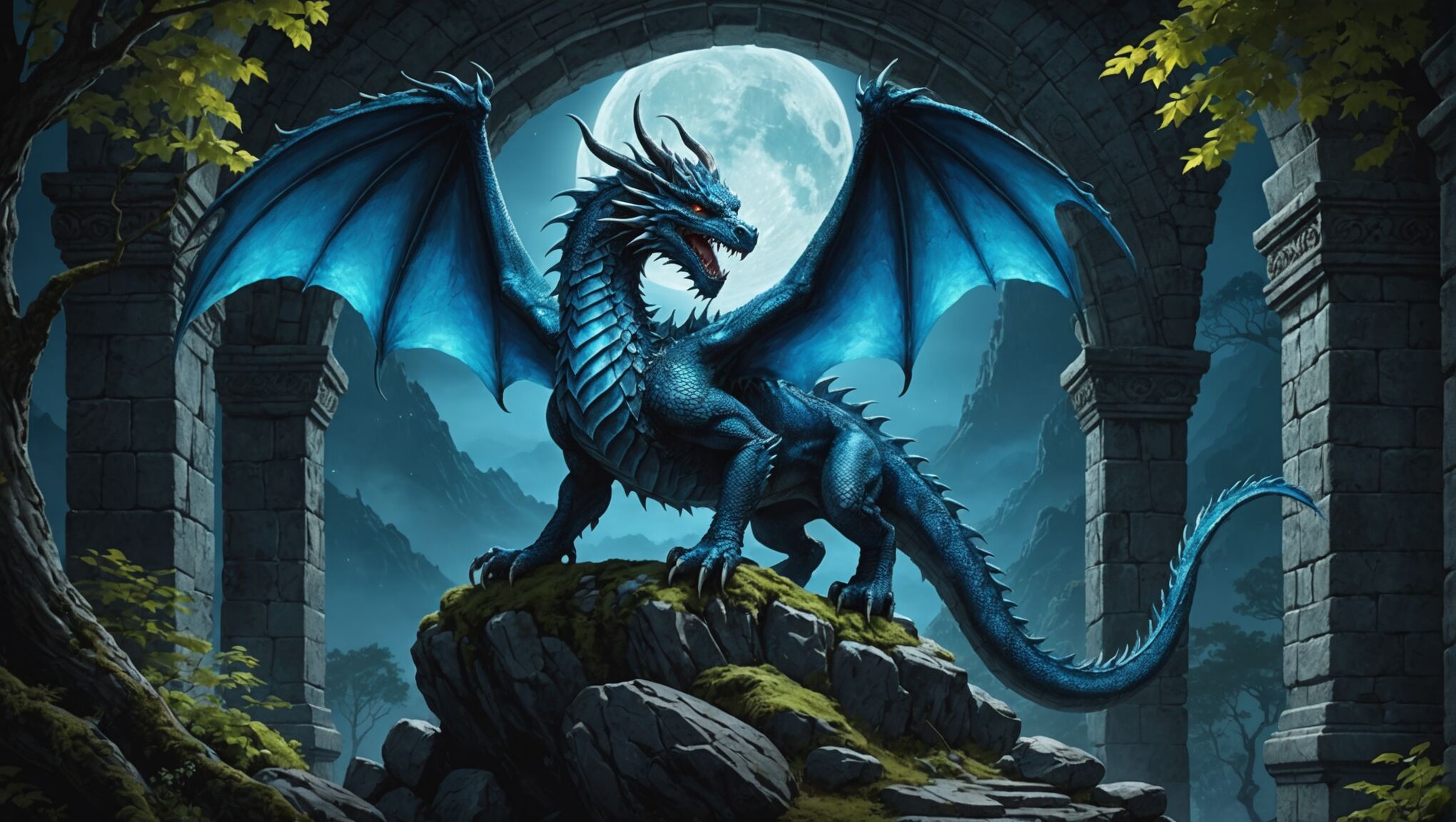 When it comes to creating visual intrigue in fantasy book covers, composition plays a pivotal role. The arrangement of elements on your cover can guide the viewer’s eye, create a sense of depth, and evoke emotions that resonate with your story’s themes.
Start by considering the rule of thirds. Divide your cover into a 3×3 grid and place key elements along these lines or at their intersections. This creates a balanced yet dynamic composition that naturally draws the eye. For instance, positioning a central character or magical artifact at one of these points can create a powerful focal point.
Layering is another effective technique to add depth and complexity to your cover. Place foreground elements in sharp focus, with background elements slightly blurred or faded. This not only creates a sense of perspective but also allows you to hint at the broader world of your story without overwhelming the viewer.
Consider using leading lines to guide the viewer’s gaze across the cover. These can be subtle, like the curve of a dragon’s tail or the angle of a character’s sword, or more overt, like a winding path through a mystical forest. These lines should ideally lead to your key focal points, such as the title or a central character.
Asymmetry can create tension and interest in your composition. While balance is important, perfect symmetry can sometimes feel static. Try offsetting your main elements slightly to create a more dynamic feel. This can be particularly effective for covers depicting action or conflict.
Negative space is a powerful tool in composition. Don’t feel the need to fill every inch of your cover with detail. Strategic use of empty space can draw attention to your key elements and create a sense of mystery or vastness that’s often fitting for fantasy settings.
Consider the emotional impact of different compositional choices. A character looking directly at the viewer creates a sense of connection and intimacy, while a character gazing off into the distance can evoke a feeling of adventure and unknown horizons. Similarly, a low-angle view can make characters appear heroic and powerful, while a high-angle view might create a sense of vulnerability or vastness.
Experiment with framing devices to create a window into your fantasy world. This could be achieved through ornate borders, magical portals, or natural elements like tree branches or rock formations. These frames can add depth and focus attention on your central elements.
Don’t forget about the impact of scale in your composition. Juxtaposing elements of vastly different sizes can create a sense of awe and wonder. A tiny character dwarfed by a massive dragon or an ancient ruin can instantly convey the epic scope of your story.
Remember that your cover needs to work at various sizes, from full-sized prints to small online thumbnails. Ensure that your key compositional elements remain clear and impactful even when scaled down.
By mastering these composition techniques, you can create fantasy covers that not only capture the essence of your story but also intrigue and captivate potential readers, compelling them to delve deeper into the magical worlds you’ve created.
Incorporating texture and special effects
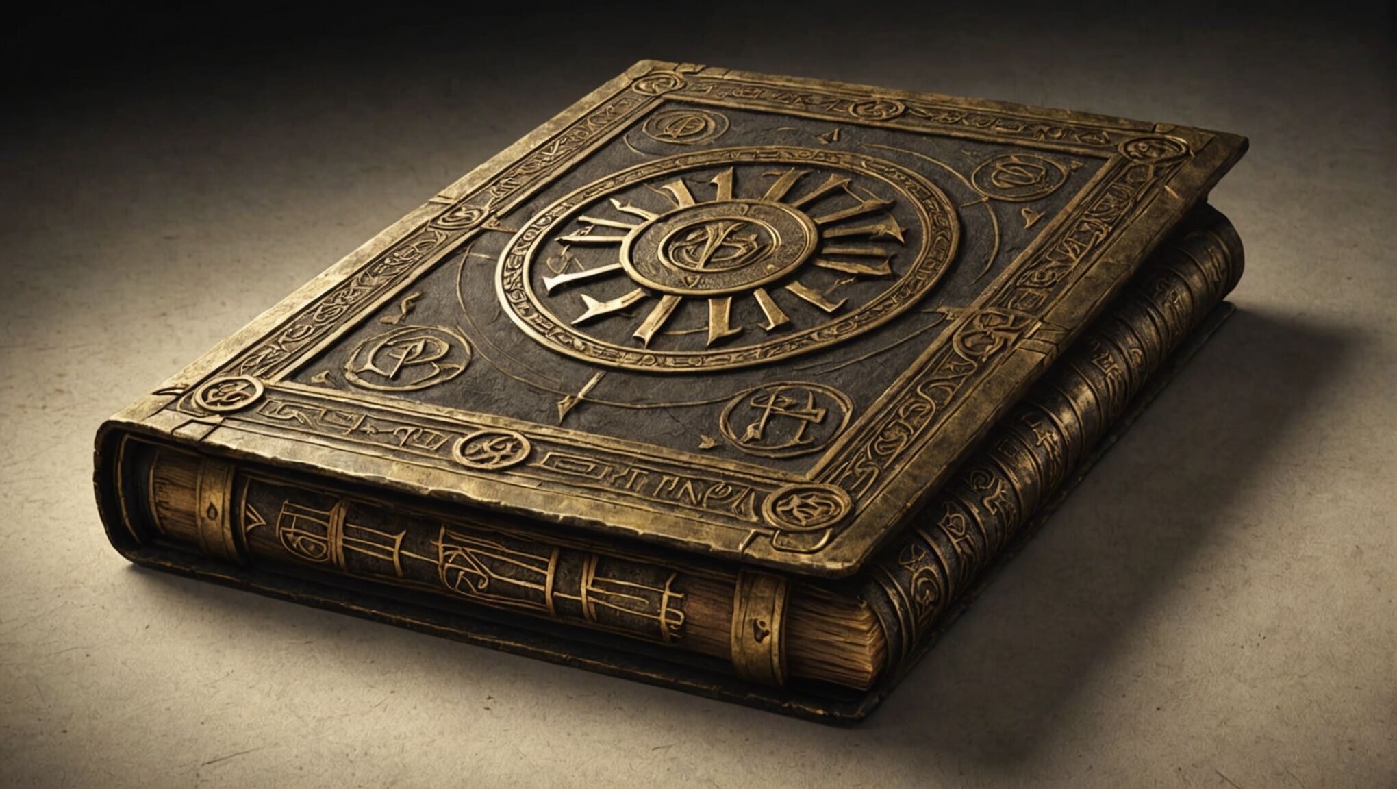
Adding texture and special effects to your fantasy book cover can elevate it from good to extraordinary, creating a tangible sense of magic and wonder. Start by considering the overall texture of your cover. A subtle paper or parchment texture can give the impression of an ancient tome, while a sleek, glossy finish might better suit a more modern urban fantasy.
Embossing and debossing techniques can add a tactile dimension to your cover, even in digital formats. These effects work particularly well for titles, magical symbols, or intricate border designs. When used sparingly, they can create focal points that draw the eye and invite touch, enhancing the overall sensory experience of the book.
Metallic foils are a classic choice for fantasy covers, adding a touch of luxury and mystique. Gold foil can suggest ancient treasures or divine magic, while silver might evoke moonlight or ethereal energies. Consider using foil accents for key elements like a magical weapon, a character’s crown, or mystical runes.
Holographic effects can create a sense of movement and transformation, perfect for depicting shape-shifting creatures or shimmering magical auras. These effects work best when used judiciously, as too much can overwhelm the design and detract from the core elements.
Glow effects can simulate magical energy or otherworldly light sources. A subtle inner glow around a character or object can make it appear to radiate power, while outer glows can create halos or auras. Be careful not to overuse this effect, as it can quickly become cliché if not applied thoughtfully.
Consider incorporating subtle animated elements for digital covers. A gently swirling mist, flickering flames, or twinkling stars can bring your cover to life on screens, capturing attention in online marketplaces. However, ensure that these animations enhance rather than distract from the overall design.
Layered transparencies can create depth and complexity in your design. Overlaying translucent elements like magical energy fields, ghostly apparitions, or ethereal landscapes can add richness to your composition without overwhelming the main focal points.
Texture mapping can add incredible detail to illustrated elements. Whether it’s the scales of a dragon, the bark of an ancient tree, or the intricate patterns on a wizard’s robe, well-applied textures can make your cover elements feel more tangible and real.
Weather effects can set the mood and add dynamism to your cover. Swirling snow, driving rain, or crackling lightning can create a sense of drama and atmosphere. These effects work particularly well when integrated with the overall composition, such as having characters interact with the elements.
Finally, consider the interplay between light and shadow. Dramatic lighting effects can create mystery, highlight key elements, and add depth to your design. Experiment with rim lighting, lens flares, or dappled forest light to enhance the magical atmosphere of your cover.
Remember, while special effects can greatly enhance your cover, they should always serve the overall design and story. Overuse can lead to a cluttered or gimmicky appearance. The goal is to create a cover that feels magical and captivating while still maintaining a professional and polished look that will appeal to your target audience.

