blog
How to Create Dark and Brooding Fantasy Covers
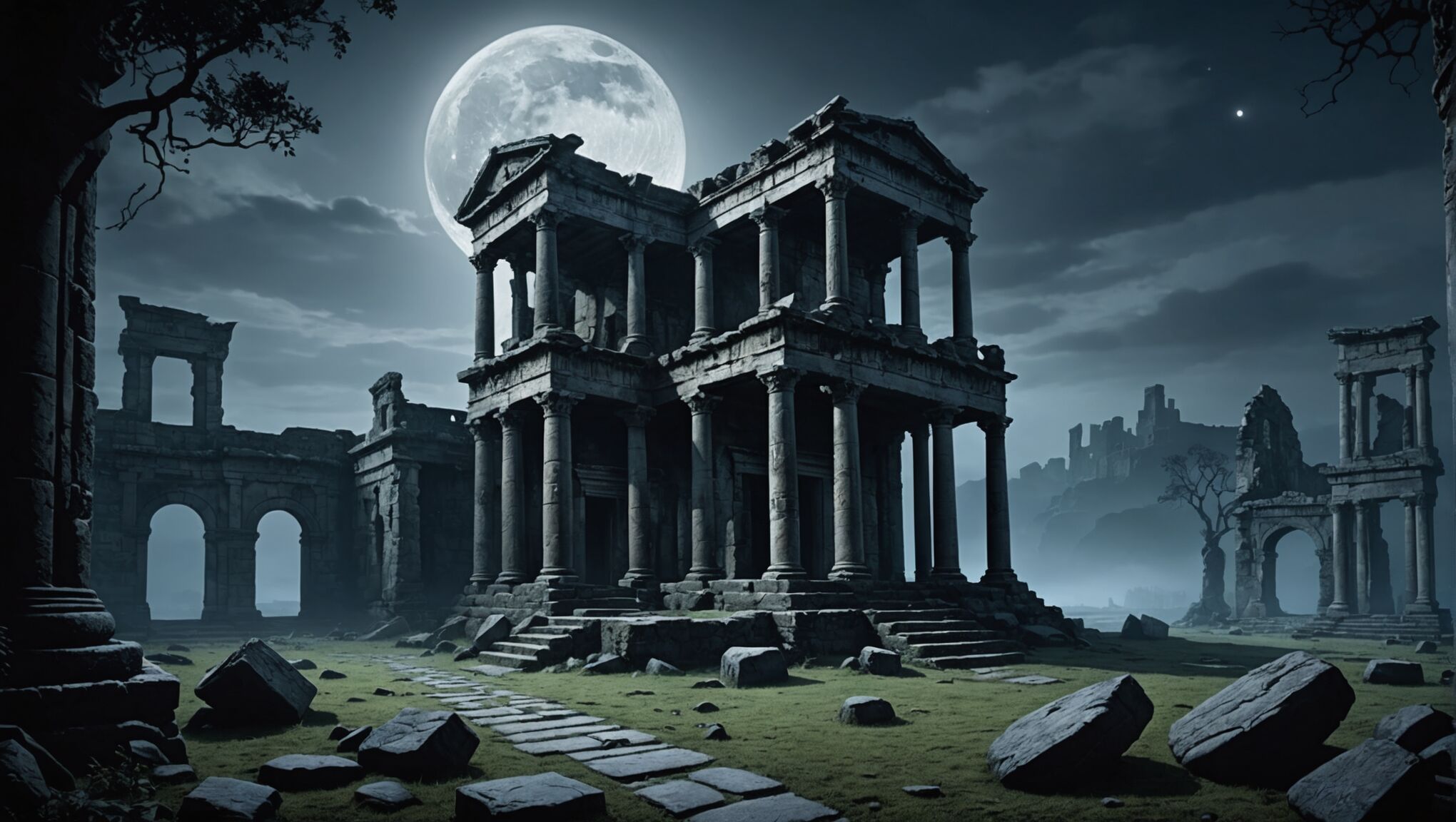
When crafting a captivating dark fantasy cover, several key elements work in harmony to create an atmospheric and brooding visual experience. The foundation of an effective design lies in the careful selection and manipulation of imagery that evokes a sense of mystery and foreboding. Ethereal landscapes shrouded in mist, ancient ruins bathed in moonlight, or twisted forests with gnarled branches can set the stage for the story within. Symbolism plays a crucial role, with objects like weathered tomes, ornate daggers, or arcane artifacts hinting at the magical or supernatural aspects of the narrative.
Texture is another vital component, adding depth and richness to the overall composition. Incorporating elements such as rough stone surfaces, weathered leather, or intricate metalwork can enhance the tactile quality of the cover, making it more engaging to potential readers. The strategic use of negative space can amplify the sense of isolation or impending danger, drawing the eye to key focal points while leaving room for the imagination to wander.
Character silhouettes or partially obscured figures can create intrigue and hint at the story’s protagonists or antagonists without revealing too much. Atmospheric effects such as swirling fog, billowing smoke, or drifting embers can add movement and dynamism to the design, breathing life into static images. Finally, the interplay of light and shadow is paramount in dark fantasy cover design, with carefully placed highlights and deep, inky blacks working together to create a sense of drama and tension that beckons readers to delve into the pages within.
Color palettes for brooding atmospheres
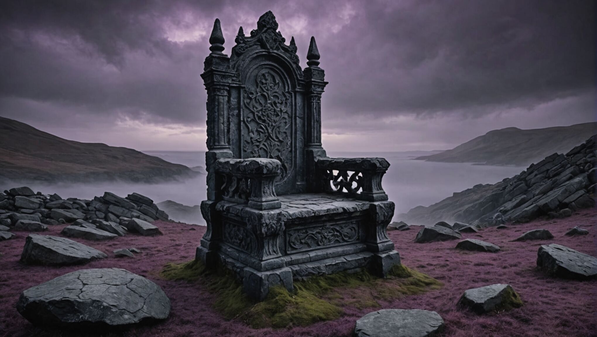 To create a brooding atmosphere in dark fantasy cover design, the color palette plays a crucial role. Muted and desaturated hues are often the cornerstone of such designs, evoking a sense of gloom and unease. Deep, rich purples can suggest mystery and the arcane, while smoky grays and charcoals create an air of uncertainty and foreboding. Midnight blues, when used sparingly, can add depth and a hint of otherworldliness to the composition.
Earthy tones like dark browns and deep greens can ground the palette, reminiscent of ancient forests or decaying landscapes. These colors can be accented with touches of muted gold or tarnished silver to suggest hidden treasures or forgotten relics. Blood reds, used judiciously, can provide a stark contrast and hint at violence or danger lurking within the story.
It’s essential to avoid bright, cheerful colors that might break the somber mood. Instead, opt for colors that appear to have been drained of life or tainted by darkness. Desaturated teals or sickly greens can evoke a sense of decay or corruption, perfect for darker themes.
“Color is a power which directly influences the soul.” – Wassily Kandinsky
The interplay between these colors is just as important as the colors themselves. Gradients that shift from deep, dark tones to slightly lighter shades can create a sense of emergence from shadows, while abrupt color transitions can represent the harsh realities of a dark fantasy world.
Texture within the color application adds another layer of depth. Gritty, grainy effects can make colors appear weathered and aged, enhancing the overall brooding atmosphere. Subtle color overlays, such as a faint purple cast over dark grays, can unify the palette and create a cohesive, unsettling ambiance.
Remember that the emotional impact of colors can vary across cultures, so consider your target audience when making final color selections. The goal is to create a palette that immediately conveys the dark and brooding nature of the fantasy world within, enticing readers to explore further while setting appropriate expectations for the story’s tone.
Typography and font selection for ominous titles
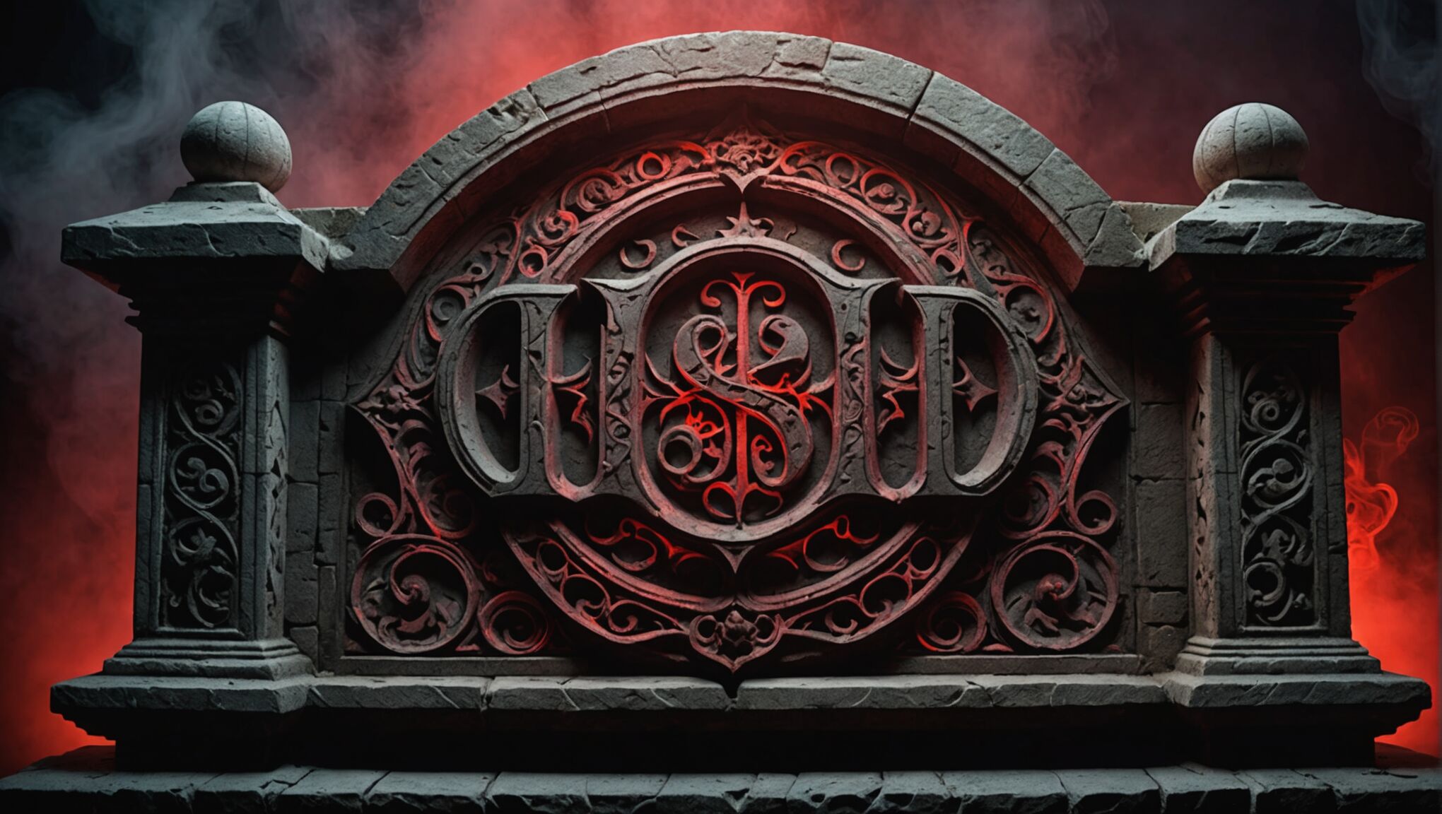
Selecting the right typography for a dark fantasy cover is crucial in setting the tone and creating an ominous atmosphere. Gothic-inspired fonts often work well, with their sharp angles and dramatic flourishes that evoke a sense of ancient, forbidden knowledge. Serif fonts with exaggerated serifs can add a touch of elegance while maintaining a sinister edge. For a more modern approach, distressed or weathered sans-serif fonts can create a gritty, apocalyptic feel that suits certain dark fantasy subgenres.
When choosing a font for the title, consider its legibility from a distance. While ornate scripts may be tempting, they can often be difficult to read when scaled down. Instead, opt for bold, clear letterforms that can be easily distinguished, even when layered over complex imagery. Custom lettering or modified existing fonts can provide a unique look that sets your cover apart while maintaining the dark aesthetic.
The positioning of the title is equally important. Placing it against areas of high contrast in the background imagery can make it pop, while integrating it with elements of the cover art can create a more cohesive design. Experiment with breaking up the title across multiple lines or incorporating it into the scene itself, such as carving it into stone or having it emerge from shadows.
Font pairing is another consideration. The author’s name and any subtitles should complement the main title without overshadowing it. A common approach is to use a simpler, more subdued font for secondary text, allowing the title to remain the focal point. The size difference between the title and other text elements can also contribute to the hierarchy and overall impact of the design.
Color and texture play significant roles in typography for dark fantasy covers. Metallic effects, such as tarnished silver or antique gold, can add a mystical quality to the text. Gradient fills within the letters can create depth, while subtle outer glows can make the text appear to emit an eerie light. For a more subtle approach, consider using deep, rich colors that blend with the overall palette while still maintaining readability.
Lastly, don’t underestimate the power of negative space in typography. Allowing the title to interact with the background by cutting through fog or emerging from darkness can create a powerful visual effect that draws the reader’s eye and enhances the overall brooding atmosphere of the cover.
Incorporating shadows and lighting effects
Shadows and lighting effects are crucial elements in creating a dark and brooding atmosphere for fantasy book covers. By manipulating light and shadow, designers can evoke a sense of mystery, danger, and the unknown, drawing potential readers into the world of the story before they even open the book.
One effective technique is the use of dramatic backlighting. This involves placing a light source behind the main subject, creating a striking silhouette effect. The contrast between the dark figure and the illuminated background can symbolize the struggle between good and evil or the unknown forces at work in the narrative.
Gothic typography sets the mood. Get more info here.
Rim lighting is another powerful tool. By adding a thin line of light along the edges of objects or characters, designers can create definition and separation from the background, enhancing the three-dimensional quality of the cover. This technique is particularly effective when combined with a predominantly dark composition, as it adds depth and intrigue without compromising the overall moody atmosphere.
Chiaroscuro, the artistic technique of using strong contrasts between light and dark, can be employed to great effect in dark fantasy covers. Deep shadows can conceal parts of a scene or character, leaving much to the imagination and hinting at hidden dangers or secrets. Meanwhile, carefully placed highlights can draw attention to specific elements, guiding the viewer’s eye across the composition.
Volumetric lighting, such as rays of light piercing through darkness or fog, can add a mystical quality to the cover. This effect can be achieved by using gradients or by manipulating the opacity of light beams to create the illusion of particulate matter in the air. This technique not only adds depth but also contributes to the overall mood, suggesting an otherworldly or supernatural setting.
The direction of light sources plays a significant role in setting the tone. Low-angled lighting, reminiscent of sunset or twilight, can cast long shadows and create a sense of impending darkness. Overhead lighting, when used sparingly, can create dramatic facial shadows on characters, adding to their mystique or menace.
Reflections and specular highlights can introduce points of interest in otherwise dark areas. A glint on a blade, a shimmer on water, or the reflection in a character’s eye can serve as focal points and add layers of visual interest to the composition.
Texture can be enhanced through the interplay of light and shadow. By using techniques such as cross-hatching or stippling in shadowed areas, designers can create the illusion of rough surfaces, adding tactile quality to the cover art. This can be particularly effective in depicting ancient stonework, gnarled tree bark, or weathered leather—elements often found in dark fantasy settings.
Color temperature also plays a role in shadow and lighting effects. Cool blue tones in shadows can evoke a sense of cold and isolation, while warm amber tones in highlights can suggest the flicker of firelight or magic, adding depth and contrast to the overall color scheme.
When incorporating these effects, it’s important to maintain a balance that serves the overall composition. Overuse of dramatic lighting can lead to a cluttered or confusing design. The key is to use these techniques strategically to guide the viewer’s eye and reinforce the mood and themes of the book.
Digital tools and software offer a range of options for creating and refining shadow and lighting effects. Layers, blending modes, and adjustment layers in programs like Photoshop allow for non-destructive editing and fine-tuning of these elements. However, regardless of the tools used, the goal remains the same: to create a visually compelling cover that captures the essence of the dark fantasy genre and entices readers to explore the world within the pages.
Selecting and positioning dark fantasy imagery
 When selecting and positioning dark fantasy imagery for your book cover, it’s crucial to choose elements that not only capture the essence of your story but also evoke a strong emotional response from potential readers. Begin by considering iconic symbols associated with your narrative—perhaps a cursed amulet, a foreboding castle, or a mythical creature. These central images should be powerful enough to stand alone yet mysterious enough to leave room for imagination.
Layering is a key technique in creating depth and intrigue. Start with a haunting background, such as a misty forest or a stormy sky, then build upon it with mid-ground and foreground elements. This approach creates a sense of dimensionality that draws the viewer into the scene. For instance, you might position gnarled tree branches in the foreground, framing a distant, ominous structure.
The rule of thirds can be a useful guide for positioning your main elements, but don’t be afraid to break this rule for dramatic effect. Placing a character or object off-center can create tension and visual interest. Consider using diagonals in your composition to lead the eye across the cover, perhaps from a looming figure in one corner to a significant object in the opposite corner.
Negative space is your ally in dark fantasy design. Don’t feel compelled to fill every inch of the cover; sometimes, what’s left unseen is more powerful than what’s shown. A partially obscured face or a figure emerging from darkness can be incredibly effective in sparking curiosity.
When incorporating characters, consider their pose and expression carefully. A silhouette can be more impactful than a fully detailed figure, allowing readers to project their own interpretations onto the character. If showing faces, subtle expressions of determination, fear, or mystery often work better than exaggerated emotions.
Texture plays a vital role in dark fantasy imagery. Incorporate elements like weathered stone, tattered fabric, or rusted metal to add tactile interest and reinforce the mood. These textures can be subtle background elements or integral parts of the main imagery.
Don’t overlook the power of scale in your composition. Juxtaposing small figures against vast, intimidating landscapes or enormous creatures can create a sense of awe and danger that’s perfect for the genre.
Remember that your cover is not just an illustration—it’s a marketing tool. Ensure that the imagery you choose and its positioning allow ample space for the title, author name, and any other necessary text without compromising the overall design.
As you work on your cover, step back regularly and view it at thumbnail size. This will help you assess its impact and legibility at the scale many readers will first encounter it online.
Ultimately, the imagery you select and how you position it should work in harmony to tell a visual story that complements and enhances the written narrative within. It should intrigue potential readers, giving them just enough information to pique their interest while maintaining an air of mystery that compels them to open the book and discover more.
Balancing composition for maximum impact
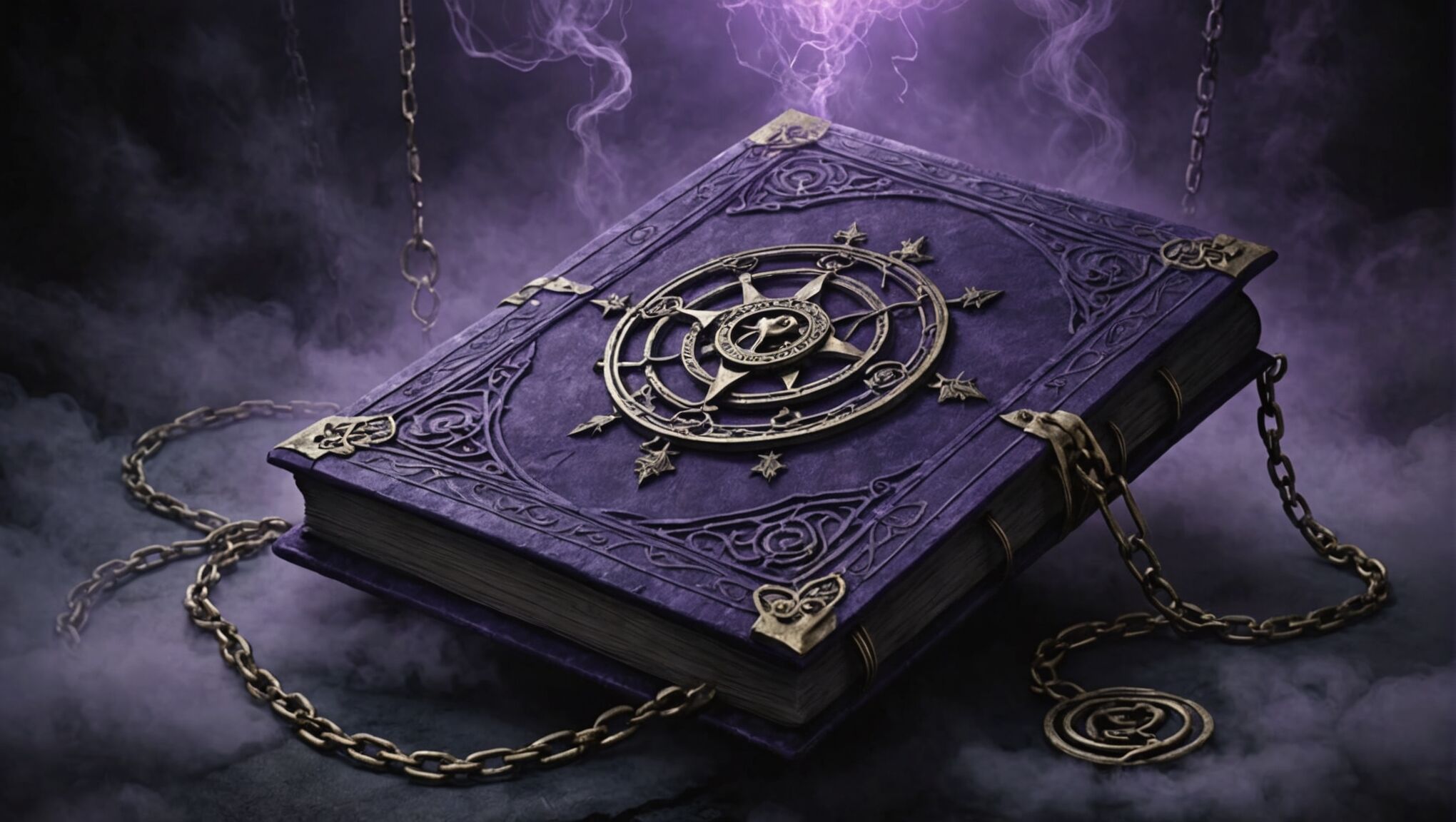
Achieving a balanced composition is crucial for creating a dark fantasy cover that captivates and intrigues potential readers. The key lies in strategic placement of elements to guide the viewer’s eye and create a sense of visual harmony while maintaining the brooding atmosphere. Begin by establishing a clear focal point, typically the most important element of your cover, such as a central character or a significant symbolic object. This focal point should command attention without overwhelming the entire composition.
Utilize the rule of thirds as a starting point, dividing your cover into a 3×3 grid and placing key elements along these lines or at their intersections. This technique naturally creates balance and interest. However, don’t be afraid to deviate from this rule to create tension or emphasize certain aspects of your design. Asymmetry can be particularly effective in dark fantasy covers, evoking a sense of unease or impending danger.
Consider the visual weight of each element in your composition. Darker, larger, or more detailed elements will draw more attention and feel “heavier” than lighter, smaller, or simpler elements. Distribute these elements thoughtfully to maintain balance while creating a dynamic visual flow. For instance, a large, dark figure on one side of the cover might be balanced by a cluster of smaller, intricate elements on the opposite side.
Negative space is a powerful tool in dark fantasy cover design. Don’t feel compelled to fill every inch of the canvas. Strategic use of empty or minimally detailed areas can enhance the impact of your focal points and contribute to the overall mood. This space can also provide breathing room for text elements like the title and author’s name.
Leading lines are another essential compositional tool. Use elements like the curve of a blade, the arc of a dragon’s tail, or the angle of a character’s gaze to direct the viewer’s eye through the composition. These lines can create a sense of movement and guide attention to important areas of the cover.
When incorporating text, treat it as an integral part of the overall composition. The title, in particular, should work in harmony with the visual elements, not compete with them. Consider how the placement and style of text can enhance the balance and flow of the design.
Color balance is crucial in maintaining the dark and brooding atmosphere while ensuring the cover remains visually engaging. Use your chosen color palette strategically, distributing colors in a way that supports the overall composition. A pop of a brighter or contrasting color can serve as a focal point, but use this technique sparingly to maintain the somber mood.
Remember that balance doesn’t necessarily mean symmetry. A well-balanced dark fantasy cover often has a sense of controlled chaos or tension. The goal is to create a composition that feels complete and intentional, drawing the viewer in and hinting at the dark and mysterious world within the pages of the book.

