blog
How to Create a Fantasy Book Cover That Speaks to Your Audience
To create a fantasy book cover that resonates with readers, it’s crucial to delve deep into the minds of your target audience. Start by researching the demographics of fantasy readers, including age groups, gender distribution, and reading preferences. Analyze bestselling books in your specific sub-genre to identify common themes and visual elements that appeal to your audience. Know your readers by engaging with them on social media platforms, forums, and book clubs to gain insights into their expectations and desires. Consider conducting surveys or focus groups to gather direct feedback on cover design preferences. Pay attention to the emotional connections readers form with certain visual styles and how these relate to the themes in your book. Reader engagement is key, so explore what triggers curiosity and excitement in your target audience. Remember that different age groups within the fantasy genre may have varying tastes; young adult readers might prefer bold, contemporary designs, while adult fantasy enthusiasts may gravitate towards more classic or intricate artwork. By understanding the nuances of your audience’s preferences, you can tailor your cover design to capture their attention and communicate the essence of your story effectively.
Elements of effective fantasy book covers
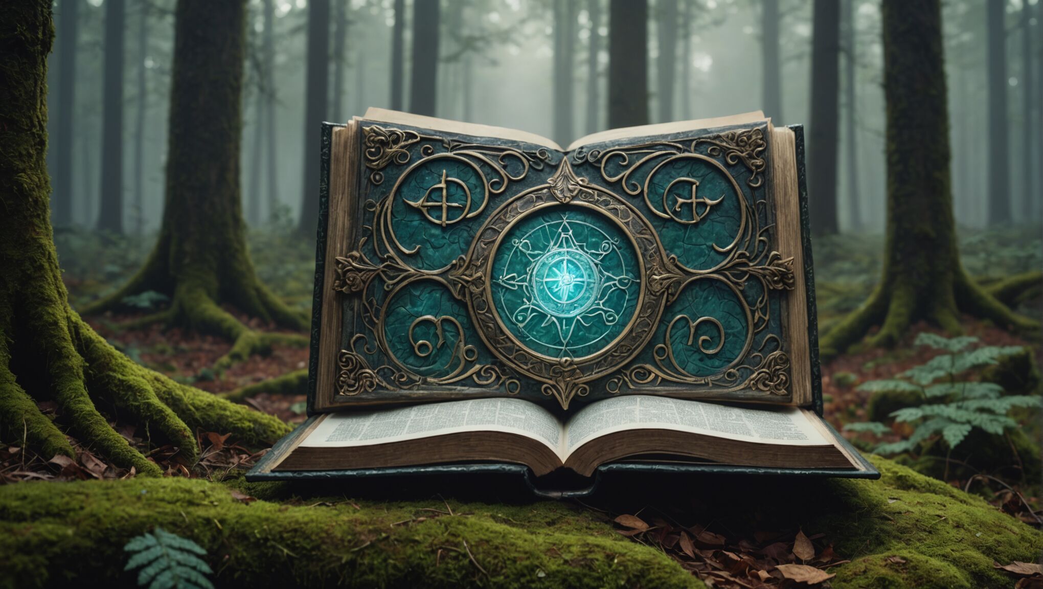 When creating a fantasy book cover, several key elements work together to captivate potential readers and convey the essence of the story within. A striking central image or character is often the focal point, drawing the eye and giving a taste of the book’s protagonist or a pivotal moment in the plot. This image should be intriguing and mysterious enough to spark curiosity without giving away too much of the story.
Atmosphere plays a crucial role in fantasy covers. The use of lighting, shadows, and background elements can evoke a sense of wonder, danger, or magic that is central to the fantasy genre. Whether it’s a misty forest, a looming castle, or a starlit sky, the environment should transport the viewer into the book’s world at a glance.
Magical elements or artifacts are another common feature. These can be subtle, like glowing runes or wisps of magical energy, or more prominent, such as mythical creatures or enchanted weapons. These elements hint at the magical systems or fantastical aspects of the story, enticing readers who are drawn to specific types of fantasy.
Texture and depth are important for creating a rich, immersive feel. Many successful fantasy covers incorporate intricate details, ornate borders, or layered designs that reward closer inspection and hint at the complexity of the world within the pages.
“A book cover is a distillation. It is a haiku of the story.” – Chip Kidd
The overall composition of these elements is crucial. A well-balanced cover guides the eye smoothly across the design, creating a hierarchy of information that leads from the eye-catching imagery to the title and author’s name. Negative space can be just as important as the elements themselves, providing breathing room and preventing the design from becoming cluttered or overwhelming.
Color harmony is essential, with a cohesive palette that reflects the tone of the book. Bold, contrasting colors might suit an action-packed adventure, while muted, ethereal tones could better represent a dreamlike fantasy world.
Lastly, the cover should have a sense of scale and grandeur befitting the epic nature of many fantasy stories. This can be achieved through panoramic landscapes, towering structures, or by juxtaposing small figures against vast backdrops, conveying the sense of an expansive world waiting to be explored.
By skillfully combining these elements, a fantasy book cover can not only attract attention but also communicate the unique qualities of the story, setting reader expectations and inviting them to embark on an imaginary journey.
Choosing the right imagery and symbolism

Selecting the right imagery and symbolism for your fantasy book cover is a crucial step in creating a visual narrative that resonates with your audience. Start by identifying key themes, characters, or objects from your story that can serve as powerful visual metaphors. For instance, a mystical amulet might represent the core of your magic system, while a lone figure atop a cliff could symbolize the hero’s journey.
Consider the setting of your fantasy world and how it can be represented visually. If your story takes place in a lush forest realm, incorporate elements like ancient trees, mystical creatures, or shimmering streams. For a dark fantasy, you might opt for ominous castles, swirling mists, or shadowy figures that hint at the lurking dangers within your pages.
Symbolic animals or creatures can be particularly effective in fantasy cover design. Dragons, phoenixes, or unicorns each carry their own set of associations and can instantly convey certain aspects of your story. However, be mindful of clichés and strive to present these familiar elements in unique ways that align with your specific narrative.
Incorporate symbolism through subtle details that reward closer inspection. Hidden runes, constellations, or intricate patterns can add depth to your cover and intrigue potential readers. These elements can also serve as Easter eggs for fans who are familiar with your world’s lore.
When choosing imagery, consider the emotional response you want to evoke. A looming tower might instill a sense of awe and adventure, while a hand reaching for a glowing object could spark curiosity and wonder. The imagery should not only be visually appealing but also emotionally compelling, drawing the viewer into the world you’ve created.
Balance is key when working with symbolic elements. While you want to include enough detail to intrigue, avoid overwhelming the cover with too many competing symbols. Each element should have a purpose and contribute to the overall story you’re telling through the cover design.
Remember that cultural context can affect the interpretation of symbols. What might be seen as a symbol of good fortune in one culture could have negative connotations in another. Research the symbols you’re considering to ensure they communicate your intended message across different cultural backgrounds.
Lastly, ensure that the imagery and symbolism you choose align with your target audience’s expectations while still offering something fresh. A young adult fantasy might lean towards more dynamic, contemporary symbolism, while an epic fantasy for adult readers might benefit from more classical, ornate imagery. By carefully selecting and combining meaningful visual elements, you can create a cover that not only captures the essence of your story but also speaks directly to your intended readers.
Landscapes add depth to fantasy covers. Find details here.
Color psychology for fantasy genres
Color plays a pivotal role in evoking emotions and setting the tone for your fantasy book cover. In the realm of fantasy, certain color schemes have become associated with specific subgenres, helping readers quickly identify the type of story they can expect.
For epic fantasy, rich, deep colors like royal blue, emerald green, and deep purples often dominate. These colors convey a sense of majesty and ancient power, perfect for tales of grand adventures and legendary quests. Gold accents can add a touch of nobility and magic to these designs.
Dark fantasy or grimdark novels often utilize a more muted palette. Shades of black, charcoal gray, and deep crimson create an atmosphere of foreboding and danger. These colors hint at the darker themes and complex moral landscapes often found in such stories.
For lighter, more whimsical fantasy, pastel colors like soft pinks, mint greens, and sky blues can be effective. These gentle hues suggest magic of a more playful nature and are particularly suitable for young adult or children’s fantasy books.
Urban fantasy often incorporates bold, neon colors against dark backgrounds, mimicking the glow of city lights. Electric blues, vibrant purples, and acid greens can create a modern, edgy feel that resonates with the genre’s contemporary settings.
High fantasy frequently employs ethereal color schemes. Misty whites, silvers, and pale golds can evoke a sense of otherworldliness and ancient magic. These colors work well for stories involving elves, fae, or celestial beings.
Consider the emotional associations of different colors:
| Color | Emotion/Association |
| Red | Passion, danger, power |
| Blue | Calmness, wisdom, loyalty |
| Green | Nature, growth, harmony |
| Purple | Royalty, mystery, spirituality |
| Gold | Wealth, divinity, achievement |
Complementary colors can create striking contrasts that draw the eye. For instance, a predominantly cool-toned cover with a splash of warm orange can create a focal point that demands attention.
Consider the psychological impact of color saturation and brightness. Vivid, saturated colors can convey energy and intensity, while softer, more muted tones might suggest subtlety or melancholy.
The interplay of light and shadow in your color scheme can add depth and dimension to your cover. A beam of light breaking through darkness can symbolize hope or revelation, common themes in many fantasy narratives.
Remember that color perception can vary across cultures, so research your target market if you’re publishing internationally. What works in one region may not have the same impact in another.
Lastly, ensure that your color choices maintain sufficient contrast for readability, especially for the title and author name. The most beautifully colored cover will fail if the text is lost in the design.
By thoughtfully applying color psychology to your fantasy book cover, you can create a visual representation that not only captures the essence of your story but also elicits the right emotional response from your target audience.
Typography and title design
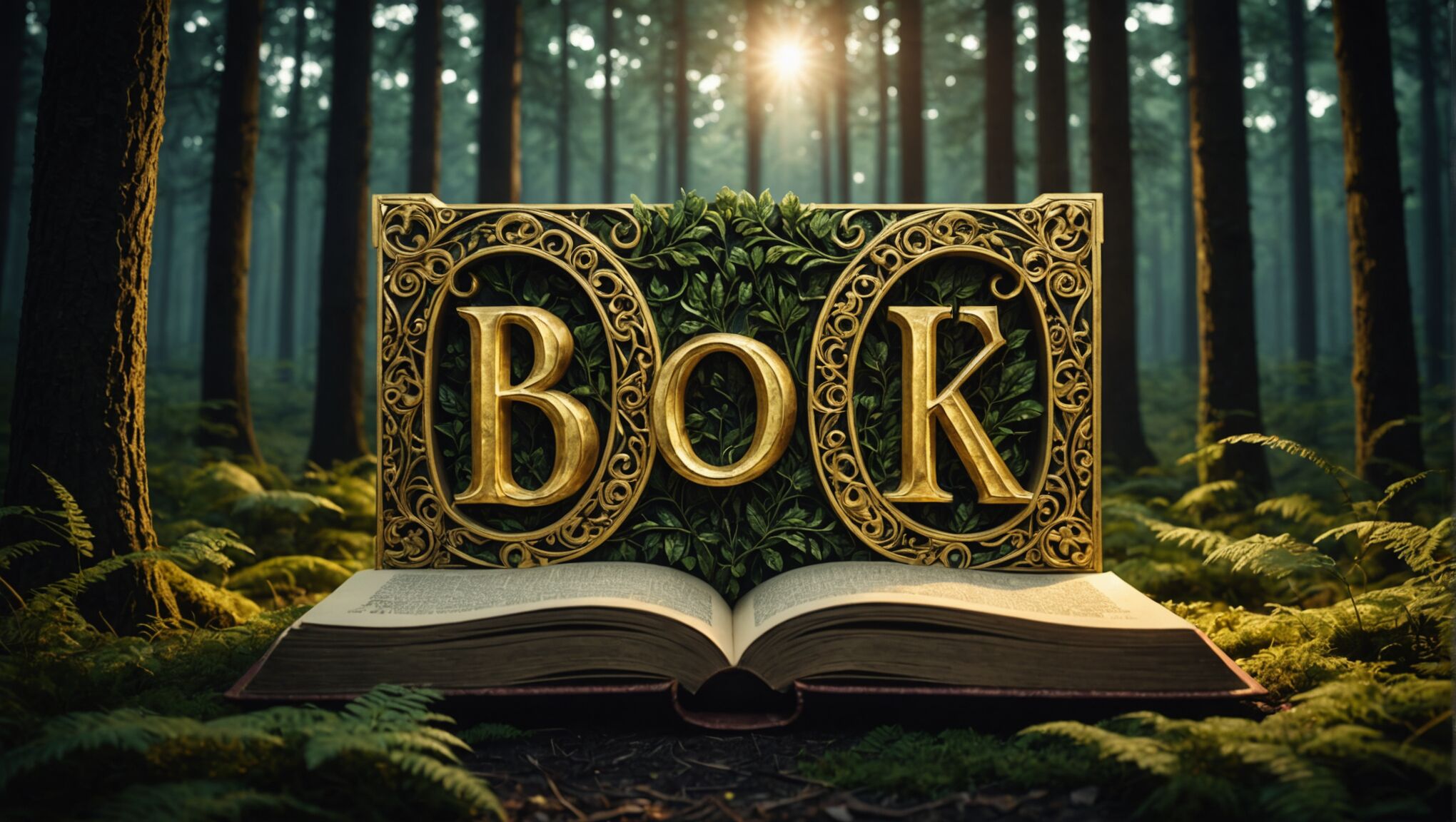 The art of typography and title design is a crucial element in creating a captivating fantasy book cover. The font you choose and how you present your title can make or break a reader’s first impression. When selecting a typeface, consider the mood and era of your fantasy world. Gothic or blackletter fonts might suit a dark, medieval fantasy, while flowing, ornate scripts could be perfect for a whimsical or romantic tale.
Custom lettering can set your book apart, creating a unique visual identity that readers will associate with your story. Consider working with a professional letterer to develop a bespoke title treatment that incorporates elements from your narrative, such as intertwining vines for a nature-based fantasy or flame-like serifs for a story centered around fire magic.
The placement of your title is equally important. It should be prominent and easily readable, even at thumbnail size for online bookstores. Experiment with different layouts – a title that spans the width of the cover can create a sense of epic scale, while a vertically stacked title might convey a sense of height or depth.
Texture and depth can elevate your typography from simple text to a work of art. Consider embossing effects, metallic foils, or even subtle animations for digital covers. These techniques can make your title feel tangible and magical, inviting readers to reach out and touch the cover.
Color contrast is vital for legibility. Ensure that your title stands out against the background imagery. Sometimes, a simple drop shadow or glow effect can make all the difference in readability while adding to the magical atmosphere.
Don’t forget about the author’s name. While it may be tempting to focus solely on the title, your name is your brand. For established authors, a consistent treatment of their name across multiple books can help with recognition.
Integrate your typography with the cover art. Perhaps the letters of your title could be formed by tree branches, or maybe characters from your story could be interacting with the words. This integration can create a cohesive, immersive design that tells a story at a glance.
Consider the hierarchy of information on your cover. The title should typically be the largest text element, followed by the author’s name, and then any subtitles or series information. This hierarchy guides the reader’s eye and emphasizes the most important information.
Remember that typography is not just about aesthetics; it’s about communication. Your font choice should be legible and appropriate for your target audience. A young adult fantasy might use bolder, more modern fonts, while a classic fantasy epic might benefit from a more traditional serif typeface.
Lastly, don’t be afraid to break the rules if it serves your story. Sometimes, an unexpectedly minimalist font on a fantasy cover can create intrigue through contrast. The key is to ensure that whatever choice you make, it enhances the overall concept of your book and appeals to your intended readers.
Balancing originality and genre expectations

Creating a fantasy book cover that stands out while still meeting genre expectations is a delicate balancing act. To achieve this, start by familiarizing yourself with current trends in fantasy cover design. Study bestsellers and critically acclaimed works in your subgenre to understand what readers expect. However, don’t simply mimic these designs; use them as a springboard for your own creative ideas.
Incorporate familiar elements that signal your book belongs to the fantasy genre, such as magical artifacts, mythical creatures, or otherworldly landscapes. These touchstones help readers quickly identify your book as fantasy. However, present these elements in a unique way that reflects your story’s specific themes and tone.
Consider subverting common tropes to create intrigue. For instance, if dragons are prevalent in your genre, you might show only a dragon’s shadow or scales rather than a full creature, leaving more to the imagination. This approach respects genre conventions while offering a fresh perspective.
Focus on what makes your story unique within the fantasy genre. If your book features an unusual magic system or a rarely explored mythological creature, highlight these elements in your cover design. This showcases your book’s originality while still anchoring it within the fantasy realm.
Experiment with unexpected color palettes or artistic styles that aren’t commonly used in your subgenre. A minimalist design in a field dominated by detailed illustrations, or vice versa, can make your cover stand out on the shelf or in digital marketplaces.
Consider the composition of your cover elements. While many fantasy covers feature a central character or scene, you might opt for an abstract representation of a key theme or emotion from your story. This can intrigue potential readers while still conveying the essence of fantasy.
Typography offers another opportunity to balance tradition and innovation. Choose a font that aligns with fantasy conventions but customize it with unique flourishes or treatments that reflect your story’s specific attributes.
Remember that originality doesn’t mean alienating your audience. Your cover should still communicate clearly what kind of fantasy experience readers can expect. The goal is to stand out within the genre, not to appear as though you belong to a different category entirely.
Test your design with your target audience. Gather feedback from beta readers, writing groups, or through social media polls. This can help you gauge whether your cover successfully balances originality with genre expectations.
Ultimately, your cover should be a visual promise to the reader about the story within. By skillfully blending familiar fantasy elements with innovative design choices, you can create a cover that honors genre traditions while showcasing your book’s unique qualities, effectively speaking to your audience and standing out in a crowded market.

