blog
How to Choose Colors for Fantasy Book Covers
Colors wield immense power in shaping readers’ perceptions and emotions, making them a crucial element in book cover design. Each hue carries its own psychological associations, which can be leveraged to convey the essence of your fantasy story at a glance. Red, for instance, evokes passion, danger, and excitement, while blue suggests calmness, mystery, and depth. Green often represents nature, growth, and magic, while purple is associated with royalty, luxury, and the supernatural. Understanding these psychological impacts allows designers to create covers that resonate with the target audience and effectively communicate the book’s themes.
When selecting colors for your fantasy book cover, consider the emotional journey you want readers to embark upon. Warm colors like yellows and oranges can create a sense of energy and optimism, while cool tones like blues and greens may evoke a more introspective or mystical atmosphere. “Color is a power which directly influences the soul,” as noted by artist Wassily Kandinsky, highlighting the profound impact that color choices can have on potential readers. By carefully considering the psychological implications of each hue, you can craft a cover that not only catches the eye but also sets the stage for the adventure within.
It’s also important to recognize that color associations can vary across cultures. While white might symbolize purity and innocence in Western cultures, it’s often associated with mourning in some Eastern traditions. Similarly, red can signify good luck in Chinese culture but danger in others. When designing for a global audience, take these cultural nuances into account to ensure your cover resonates positively with readers from diverse backgrounds. By mastering the principles of color psychology, you can create a fantasy book cover that speaks volumes before a single page is turned.
Analyzing successful fantasy cover color schemes
 To analyze successful fantasy cover color schemes, it’s essential to examine bestsellers and critically acclaimed works within the genre. Many popular fantasy covers employ rich, saturated colors that evoke a sense of magic and otherworldliness. Deep purples, midnight blues, and emerald greens are often featured prominently, creating an air of mystery and enchantment.
“The cover is the first bit of information we have about a book. It’s the first impression and the first message.” – Chip Kidd, renowned book cover designer
One common approach is the use of contrasting color palettes to create visual interest and drama. For example, a fiery orange or red against a dark background can suggest conflict or passion, while a luminous gold or silver against deep blues or blacks can convey a sense of wonder and celestial magic.
Many successful fantasy covers also incorporate gradients or color transitions to add depth and dimension. This technique can create the illusion of magical light sources or otherworldly atmospheres, drawing the reader into the fantastical realm before they even open the book.
Another effective strategy is the use of complementary colors to make certain elements pop. For instance, a cover featuring predominantly cool tones might use a splash of warm color to highlight the title or a central character, instantly drawing the eye to the most important elements.
It’s worth noting that some fantasy subgenres have their own color trends. Urban fantasy often leans towards darker, grittier color schemes with touches of neon to reflect city environments, while high fantasy might favor more naturalistic palettes with touches of regal colors like gold or deep red.
Successful covers also consider the interplay between color and other design elements. Metallic foils, embossing, and spot UV varnishes can enhance certain colors and create tactile experiences that complement the visual appeal of the chosen color scheme.
Analyzing bestsellers reveals that while there’s no one-size-fits-all approach, certain color combinations consistently perform well. Dark backgrounds with vibrant accents, jewel tones that suggest opulence and magic, and nature-inspired palettes that hint at vast, mysterious worlds are all recurring themes in successful fantasy cover designs.
By studying these successful color schemes, designers can gain insights into what resonates with fantasy readers and use this knowledge as a springboard for creating unique and compelling covers that stand out in a crowded marketplace.
Selecting colors that reflect your story’s tone

When selecting colors for your fantasy book cover, it’s crucial to consider the overall tone and atmosphere of your story. The colors you choose should act as a visual representation of the emotions and themes that readers will encounter within the pages. For a dark and gritty tale of survival, you might lean towards muted, earthy tones with splashes of deep reds or blacks to convey danger and struggle. On the other hand, a whimsical coming-of-age adventure might benefit from brighter, more playful hues that capture the essence of youth and discovery.
Consider the setting of your fantasy world when making color choices. If your story takes place in a lush forest realm, shades of green and brown can immediately transport readers to that environment. For an icy tundra setting, cool blues and whites can effectively communicate the harsh, frozen landscape. Desert-based narratives might benefit from warm oranges and yellows, evoking the heat and vastness of sandy expanses.
The magical elements in your story can also influence your color selection. For instance, if elemental magic plays a significant role, you could incorporate colors associated with different elements: fiery reds and oranges for fire magic, deep blues for water, earthy browns for earth, and airy whites or pale blues for air magic. If your fantasy involves celestial or cosmic themes, consider using deep purples, midnight blues, and sparkling silvers to suggest the vastness of space and the mystery of the unknown.
Character-driven fantasies might benefit from colors that reflect the personalities or journeys of key protagonists. A cover featuring colors that symbolize growth, such as from dark to light shades, can subtly hint at a character’s transformative arc. For stories centered around royalty or nobility, rich purples, deep reds, and golds can convey a sense of regality and power.
It’s also important to consider the emotional impact you want your cover to have on potential readers. Warm colors like reds, oranges, and yellows tend to evoke feelings of excitement, passion, and energy. These might be suitable for action-packed adventures or romantic fantasies. Cool colors like blues, greens, and purples often create a sense of calm, mystery, or melancholy, which could be perfect for introspective journeys or stories with a more somber tone.
Combine fantasy and mystery in your cover. Read the article.
Remember that color combinations can also play a crucial role in reflecting your story’s tone. High contrast color schemes, such as black and white with a pop of vivid color, can create a sense of drama and intensity. Monochromatic or analogous color schemes, on the other hand, can evoke harmony and subtlety, which might be more appropriate for gentler narratives or those with a focus on personal growth and relationships.
Lastly, don’t underestimate the power of negative space and the use of white or light colors. In a genre often dominated by dark and rich colors, a strategically light cover can stand out and suggest themes of hope, purity, or new beginnings. This approach can be particularly effective for stories that deal with redemption, rebirth, or the triumph of good over evil.
Balancing contrast and harmony in cover design
When designing a fantasy book cover, striking the right balance between contrast and harmony is crucial for creating a visually appealing and effective design. Contrast helps draw attention to key elements and creates visual interest, while harmony ensures that all components work together cohesively.
One effective way to achieve contrast is through the use of complementary colors. These are colors opposite each other on the color wheel, such as blue and orange, or purple and yellow. When used together, they create a vibrant, eye-catching effect that can make your cover stand out on a crowded bookshelf. However, it’s important to use complementary colors judiciously to avoid overwhelming the viewer.
Another method for creating contrast is through value differences. This involves using light and dark shades of colors to create depth and focus. For example, a light title against a dark background can make the text pop, immediately drawing the reader’s attention. Conversely, a dark silhouette against a light sky can create a sense of mystery and intrigue.
While contrast is important, harmony is equally crucial in creating a cohesive design. One way to achieve harmony is through the use of analogous colors, which are colors that sit next to each other on the color wheel. These create a sense of unity and can be used to represent different aspects of your fantasy world without clashing.
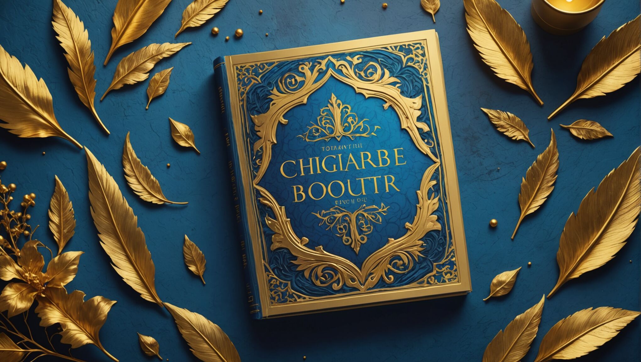
Consider using a dominant color to tie the design together, with accent colors used sparingly to highlight important elements. This approach can create a sense of balance while still allowing for visual interest. For instance, a cover predominantly in shades of blue might use touches of gold to highlight the title or key imagery.
Texture can also play a role in balancing contrast and harmony. A textured background can add depth and interest without disrupting the overall color scheme. This can be particularly effective in fantasy covers, where textures can suggest elements like aged parchment, dragon scales, or rough stone.
When working with multiple colors, consider using the 60-30-10 rule as a starting point:
| Percentage | Color Use |
| 60% | Dominant color (background) |
| 30% | Secondary color (supporting elements) |
| 10% | Accent color (highlights, small details) |
This distribution can help create a balanced design while still allowing for contrast and visual interest.
Remember that the human eye naturally seeks out patterns and balance. Use this to your advantage by creating symmetry or intentional asymmetry in your color placement. A symmetrical design can convey stability and order, while asymmetry can create tension and movement.
Gradients can be an excellent tool for bridging contrasting colors and creating a sense of harmony. They can suggest magical effects, transitions between realms, or the passage of time – all common themes in fantasy literature.
Lastly, consider the role of white space (or negative space) in your design. This doesn’t necessarily mean leaving parts of the cover blank or white, but rather using areas of simplicity to balance out more complex or colorful elements. This can help prevent the design from becoming too busy or overwhelming.
By carefully balancing contrast and harmony in your color choices, you can create a fantasy book cover that is both visually striking and cohesively designed, effectively capturing the essence of your story and appealing to your target audience.
Incorporating genre-specific color trends
 As the fantasy genre evolves, so do the color trends associated with it. Staying attuned to these trends can help your book cover resonate with contemporary readers while still maintaining its unique appeal. Currently, there’s a noticeable shift towards more nuanced and sophisticated color palettes in fantasy book covers.
One emerging trend is the use of moodier, more atmospheric color schemes. Deep teals, rich burgundies, and smoky grays are becoming increasingly popular, creating a sense of depth and intrigue. These colors often appear in gradients or with subtle texture overlays, adding complexity to the overall design.
Another trend is the incorporation of metallic accents. Gold, silver, and rose gold elements are being used to add a touch of magic and luxury to covers. These metallic hues are particularly effective when combined with darker backgrounds, creating a striking contrast that catches the eye.
Pastel colors are also making a surprising comeback in fantasy cover design. Soft pinks, muted lavenders, and pale blues are being used to create ethereal, dreamlike atmospheres, particularly in young adult fantasy and romantic fantasy subgenres.
There’s also a growing trend towards using bold, saturated colors in unexpected combinations. Vibrant purples paired with acid greens, or electric blues with bright oranges, create a modern, edgy look that appeals to readers seeking fresh and innovative stories.
Nature-inspired color palettes continue to be popular, but with a twist. Instead of traditional forest greens and earthy browns, designers are opting for more unusual natural hues like lichen greens, sunset oranges, and deep ocean blues. These colors evoke a sense of the natural world while maintaining a fantastical edge.
Minimalist color schemes are gaining traction as well. Some covers are using just two or three colors to create striking, graphic designs. This approach can be particularly effective for high-concept fantasy or speculative fiction.
It’s worth noting that color trends can vary within fantasy subgenres. Urban fantasy, for instance, is seeing a rise in neon accents against dark backgrounds, reflecting city nightlife. Epic fantasy, on the other hand, is embracing more complex, layered color schemes that suggest vast, detailed worlds.
While following trends can help your cover feel current, it’s crucial to balance trendiness with timelessness. A cover that’s too trend-focused may quickly look dated. Instead, consider how you can incorporate trendy elements in a way that still feels true to your story and will stand the test of time.
Remember, trends are cyclical and can vary by region and target audience. What’s popular in young adult fantasy might not work for grimdark adult fantasy. Always consider your specific readership and the core themes of your book when deciding how to incorporate current color trends.
Ultimately, the most successful covers are those that effectively communicate the essence of the story within, regardless of trends. Use color trends as inspiration, but don’t be afraid to break away from them if a different approach better serves your book. The goal is to create a cover that not only catches the eye but also accurately represents the unique world and story you’ve created.
Testing color combinations for visual impact

Once you’ve selected a color palette for your fantasy book cover, it’s crucial to test various combinations to ensure maximum visual impact. Start by creating digital mockups of your cover using different color arrangements. This allows you to experiment quickly and easily without committing to a final design. Pay attention to how different color combinations affect the readability of your title and author name, as well as the overall mood and atmosphere they create.
Consider testing your color combinations in different lighting conditions and on various devices. A cover that looks stunning on a computer screen might not have the same impact when viewed on a smartphone or in print. It’s also worth examining how your cover appears in thumbnail size, as this is often how readers will first encounter it online. Ensure that the colors remain distinct and eye-catching even at a smaller scale.
Gather feedback from a diverse group of people, including fellow authors, designers, and potential readers within your target audience. Their perspectives can provide valuable insights into how your color choices are perceived and whether they effectively convey the essence of your story. You might be surprised by the different interpretations and emotions that various color combinations can evoke.
Try creating multiple versions of your cover with slight variations in color intensity, hue, or placement. Sometimes, small adjustments can make a significant difference in the overall impact. For instance, shifting from a cool blue to a slightly warmer teal might better capture the magical atmosphere you’re aiming for.
Utilize online tools and color harmony calculators to explore scientifically proven color combinations. These resources can suggest complementary, analogous, or triadic color schemes that you might not have considered. While these tools are helpful, remember that they should serve as a starting point rather than a strict rule to follow.
Consider the psychological impact of your color choices in relation to your target audience. For example, younger readers might be drawn to brighter, more saturated colors, while an adult audience might respond better to more subdued or complex color palettes. Test your combinations with these demographic considerations in mind.
Experiment with the balance between your primary colors and accent colors. Sometimes, a small pop of an unexpected color can create a striking focal point that draws the eye. Try different ratios of color distribution to see what creates the most compelling visual hierarchy on your cover.
Don’t forget to test your color combinations against various background colors that might appear on online retailers’ websites. Your cover should stand out whether it’s displayed on a white, black, or gray background. This testing can help ensure that your book remains visually appealing across different platforms and contexts.
Consider creating a simple A/B test with potential readers. Present two or three color variations of your cover to a sample group and gather data on which version resonates most strongly. This quantitative approach can provide concrete evidence to support your final color choice and help you make an informed decision based on audience preference.

