blog
Fantasy Cover Design: From Dragons to Wizards
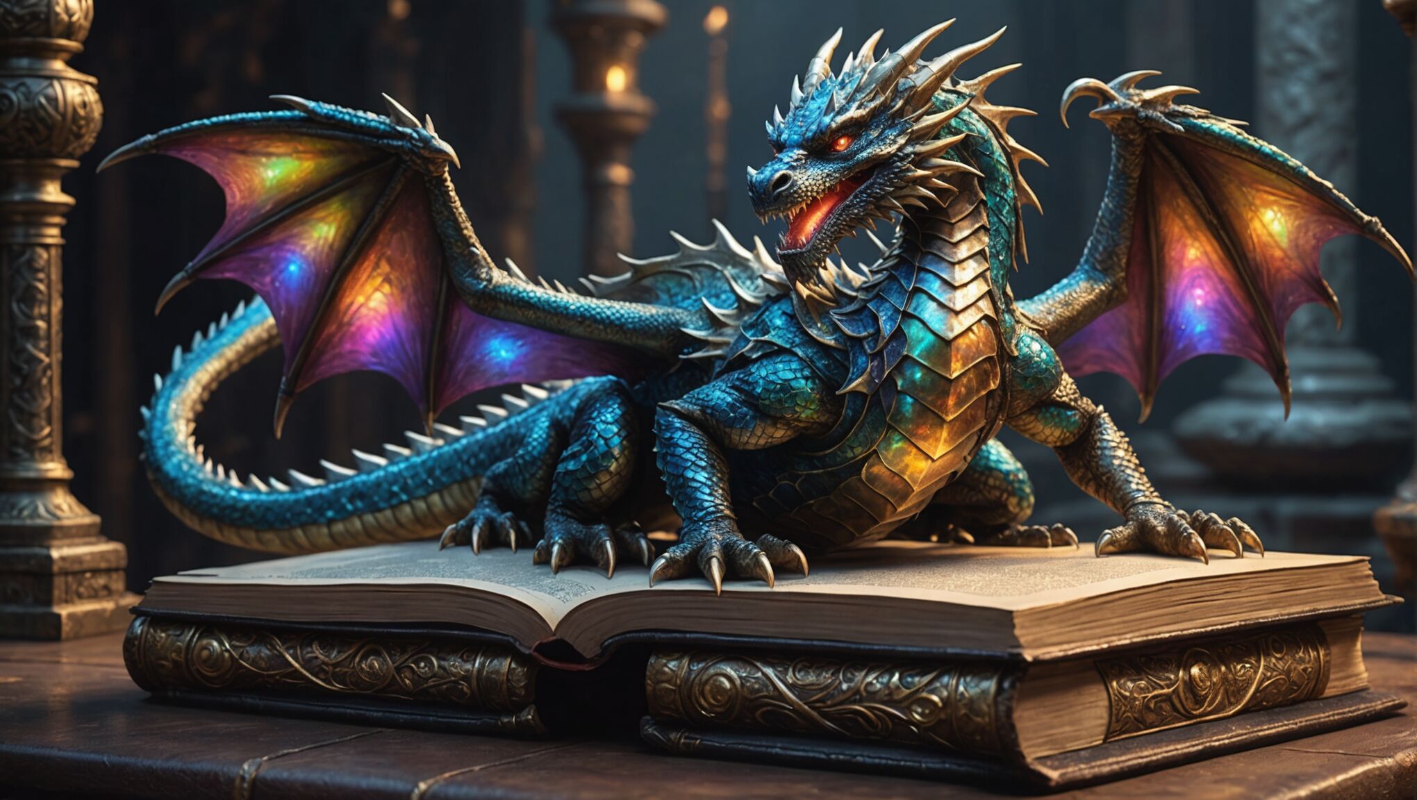
In the realm of fantasy literature, book covers serve as gateways to extraordinary worlds. Effective fantasy cover design hinges on several crucial elements that captivate readers and convey the essence of the story within. “A book cover is a distillation of the story’s soul,” as many designers often say. Central to this art is the creation of a striking focal point, typically featuring iconic fantasy characters or creatures such as dragons, wizards, or mythical beasts. These elements should be rendered with exquisite detail and realism to spark the imagination.
Equally important is the establishment of a compelling setting that reflects the book’s unique universe. This might include towering castles, enchanted forests, or otherworldly landscapes that immediately transport the viewer. The interplay of light and shadow is crucial, often used to create an aura of mystery or magic. Many successful fantasy covers incorporate intricate borders or ornate frames that not only enhance the overall design but also subtly hint at the story’s themes or historical inspirations.
Select a color scheme that stands out. Find out here.
Color plays a pivotal role in fantasy cover design, with bold, rich hues often dominating the palette to evoke a sense of wonder and the extraordinary. Metallic accents, particularly gold and silver, are frequently employed to add a touch of elegance and suggest valuable artifacts or ancient magic. The integration of magical elements, such as glowing runes, swirling mists, or ethereal light effects, can further emphasize the fantastical nature of the story and draw the eye to key areas of the composition.
Typography in fantasy cover design is an art form in itself. Fonts should be carefully selected to complement the overall aesthetic while remaining legible. Often, custom lettering or modified typefaces are used to create a unique and memorable title treatment that becomes part of the visual storytelling. The placement of text elements must be balanced with the imagery to ensure neither overshadows the other, creating a harmonious composition that invites closer inspection.
Choosing the right color palette
 Color selection is a critical aspect of fantasy cover design, serving as a powerful tool to evoke emotions, set the tone, and instantly communicate the genre. Designers often lean towards rich, saturated hues that convey a sense of magic and otherworldliness. Deep purples, royal blues, and emerald greens are frequently employed to suggest mysticism and enchantment, while fiery reds and oranges can signify danger, passion, or the presence of magical creatures like dragons.
“Color is a power which directly influences the soul,” said Wassily Kandinsky, and this principle is particularly relevant in fantasy cover design.
Earthy tones such as warm browns and golds can ground the fantastical elements and provide a sense of antiquity or historical depth. These colors often complement the more vibrant hues, creating a balanced palette that draws the eye without overwhelming it. Designers may also incorporate metallic sheens or iridescent effects to enhance the magical quality of the imagery and suggest precious metals or otherworldly materials.
Contrast plays a crucial role in color selection. A well-designed fantasy cover often features a stark contrast between light and dark elements, which can create depth and focus attention on key aspects of the design. For instance, a glowing magical artifact might stand out against a dark, brooding background, immediately capturing the viewer’s attention.
The time of day depicted on the cover can also influence color choices. Twilight scenes with deep purples and blues can evoke a sense of mystery and impending adventure, while golden hour lighting with warm yellows and oranges might suggest epic quests or heroic journeys.
It’s important to consider the target audience when selecting a color palette. Young adult fantasy might lean towards brighter, more vibrant colors, while adult fantasy could utilize more subdued or sophisticated color schemes. Additionally, the specific subgenre within fantasy can guide color choices – dark fantasy might favor moodier, desaturated tones, while high fantasy could embrace a broader, more colorful spectrum.
Consistency across a series is another consideration in color palette selection. Designers often develop a cohesive color strategy that ties multiple books together visually while allowing each cover to have its own unique identity. This might involve using a signature color that appears on each cover or maintaining a consistent overall tone throughout the series.
The psychological impact of colors should not be underestimated. Blues can convey calmness or sadness, greens might suggest nature or growth, and reds can signal danger or passion. By thoughtfully combining these colors, designers can create complex emotional landscapes that resonate with the themes of the story.
Lastly, the interplay between color and light is essential in fantasy cover design. The way light interacts with different hues can create a sense of magic, such as the soft glow of a fairy’s wings or the harsh glare of a dragon’s flame. By manipulating color and light, designers can create focal points, suggest magical energy, and bring fantastical elements to life on the cover.
Typography and font selection

The selection of fonts for fantasy book covers is a crucial element that can make or break the overall design. A well-chosen typeface not only enhances the visual appeal but also communicates the tone and genre of the book at a glance. Fantasy fonts often lean towards ornate, decorative styles that evoke a sense of antiquity, magic, or otherworldliness. However, it’s essential to strike a balance between artistic flair and legibility to ensure the title and author’s name are easily readable, even at thumbnail size.
Serif fonts are popular choices for fantasy covers, as they can lend an air of tradition and timelessness to the design. Typefaces with elegant flourishes or slightly irregular edges can suggest handcrafted lettering from a bygone era. Some designers opt for custom-designed lettering or modified existing fonts to create a unique identity for the book or series. This approach can result in highly distinctive title treatments that become iconic and instantly recognizable to readers.
The weight of the font is another critical consideration. Bold, heavy typefaces can convey power and drama, making them suitable for epic fantasy or action-packed adventures. In contrast, lighter, more delicate fonts might be appropriate for romantic fantasy or stories with ethereal themes. The spacing between letters, known as kerning, can also be adjusted to create specific effects, such as stretching out letters to suggest vastness or compressing them to imply intensity.
Layering and texture can add depth to typography on fantasy covers. Designers might incorporate metallic effects, weathered appearances, or even integrate magical elements like glowing runes or swirling mists into the lettering itself. This technique can make the text feel like an integral part of the cover art rather than a separate element.
The placement of text on the cover is as important as the font choice itself. Titles are often prominently displayed, sometimes taking up a significant portion of the cover space. The author’s name, particularly for established writers, may be given equal or even greater prominence than the title. Subtitles or series information should be carefully positioned to provide necessary information without cluttering the design.
Color plays a vital role in typography for fantasy covers. Text color should contrast with the background to ensure readability while complementing the overall color scheme. Gold, silver, or bronze lettering can add a touch of luxury and magic, especially when combined with effects like embossing or drop shadows to create dimensionality.
It’s also worth considering how the typography will interact with the cover’s imagery. Text can be integrated with visual elements, such as having letters partially obscured by a character or object, or wrapping around key features of the illustration. This integration can create a more cohesive and dynamic composition.
Consistency in typography across a series is crucial for brand recognition. While each book may have unique art, maintaining a consistent font style or title treatment helps readers quickly identify books within the same series or by the same author. This consistency can be achieved through the use of the same typeface, similar text placement, or recurring decorative elements.
Ultimately, the goal of typography in fantasy cover design is to complement the artwork, convey the essence of the story, and create an immediate emotional connection with potential readers. When done effectively, the chosen fonts become an integral part of the cover’s narrative, inviting readers to embark on the magical journey that awaits them within the pages of the book.
Balancing characters and scenery
When designing a fantasy book cover, achieving the right balance between characters and scenery is crucial for creating a compelling and visually engaging composition. The characters often serve as the primary focal point, drawing the reader’s attention and providing a human (or humanoid) element with which to connect. However, the scenery is equally important, as it establishes the setting and atmosphere of the fantasy world.
One effective approach is to feature a prominent character or group of characters in the foreground, occupying roughly one-third to one-half of the cover space. This allows for detailed rendering of their features, expressions, and attire, which can convey a wealth of information about the story and its protagonists. The remaining space can be dedicated to the background scenery, which might include sweeping landscapes, towering castles, or mystical forests.
Layering is a key technique in balancing these elements. By placing characters at different depths within the scene, designers can create a sense of dimensionality and guide the viewer’s eye through the composition. For example, a wizard might be positioned in the immediate foreground, with companions visible in the middle ground, and a looming dragon or distant citadel in the background.
The use of scale can dramatically affect the balance between characters and scenery. Depicting a character as small against a vast, awe-inspiring landscape can convey themes of adventure and the enormity of the quest ahead. Conversely, a large, dominating character set against a minimalistic background might emphasize the power and significance of that individual within the story.
Lighting plays a crucial role in harmonizing characters and scenery. By using a consistent light source and carefully considering how it interacts with both the characters and the environment, designers can create a cohesive atmosphere. Dramatic lighting, such as backlighting or chiaroscuro effects, can help characters stand out while still maintaining the integrity of the background elements.
Color harmony is another essential factor in balancing cover elements. Using a complementary color palette for both characters and scenery can unify the composition. Alternatively, contrasting colors can be employed to make characters pop against the background, drawing immediate attention to them while still allowing the scenery to provide context and depth.
Negative space can be a powerful tool in achieving balance. Sometimes, leaving areas of the background relatively simple or even empty can help to emphasize the characters and prevent the cover from becoming visually overwhelming. This technique can be particularly effective in high-fantasy or more minimalist designs.
The integration of magical elements or special effects can serve as a bridge between characters and scenery. Swirling energy, glowing auras, or mystical artifacts can create visual connections that tie the foreground and background together, enhancing the overall cohesion of the design.
When multiple characters are featured, their arrangement and interaction with each other and the environment become critical. Group compositions should feel natural and dynamic, with characters positioned in a way that leads the eye around the cover and into the scenery.
It’s important to consider the genre conventions and target audience when balancing these elements. Epic fantasy might call for more expansive scenery, while urban fantasy could focus more heavily on character depictions with subtle environmental cues.
Ultimately, the goal is to create a harmonious composition where neither the characters nor the scenery overwhelm the other. A well-balanced fantasy cover should tell a visual story, inviting the viewer to explore both the intriguing characters and the captivating world they inhabit, all while leaving room for the imagination to fill in the details that lie within the pages of the book.
Creating depth and atmosphere
 To create depth and atmosphere in fantasy cover design, artists employ a range of techniques that transport viewers into the magical realms depicted. Layering is a fundamental approach, with foreground, middle ground, and background elements carefully arranged to guide the eye and create a sense of three-dimensionality. This can be achieved through the use of overlapping elements, varying sizes, and atmospheric perspective.
Lighting plays a crucial role in establishing mood and depth. Dramatic chiaroscuro effects can create stark contrasts between light and shadow, evoking mystery and tension. Soft, diffused lighting might suggest tranquility or ethereal beauty. The direction and quality of light sources – be they natural, magical, or a combination – can dramatically alter the perception of space and atmosphere.
Color gradients are often employed to enhance depth, with cooler tones receding into the distance and warmer hues drawing the eye forward. This technique, known as aerial perspective, mimics the natural way distant objects appear hazier and less saturated due to atmospheric interference.
Texture is another powerful tool for creating depth and atmosphere. Detailed foreground elements contrasted with softer, less defined background features can enhance the illusion of distance. Artists might use various techniques such as stippling, cross-hatching, or digital brushwork to create rich textures that invite closer inspection and add layers of visual interest.
Atmospheric effects like mist, fog, or magical particle effects can add depth and mystery to a scene. These elements not only create a sense of atmosphere but also serve to partially obscure distant objects, further enhancing the perception of depth.
The use of scale is particularly effective in fantasy cover design. Juxtaposing small figures against vast landscapes or towering structures can create a sense of awe and emphasize the epic nature of the story. Conversely, close-up views of intricate details can draw the viewer into more intimate, magical moments.
Perspective plays a crucial role in establishing depth. Strong vanishing points and converging lines can lead the eye into the scene, while unusual angles or distorted perspectives can create a sense of disorientation or otherworldliness appropriate for fantasy settings.
Symbolic elements can be strategically placed to add layers of meaning and depth to the composition. These might include ancient ruins in the background, mystical symbols woven into the environment, or subtle references to plot elements that reward closer examination.
The interplay between positive and negative space can dramatically affect the perception of depth and atmosphere. Strategic use of empty space can create a sense of vastness or isolation, while densely packed elements might suggest complexity or chaos.
Dynamic motion implied through flowing fabrics, swirling magic, or the postures of characters can add a sense of energy and life to the cover, enhancing the overall atmosphere.
By carefully considering and combining these elements, cover designers can create rich, immersive fantasy worlds that capture the imagination and entice readers to explore further. The goal is to create a visual experience that not only represents the story within but also evokes emotions and sparks curiosity, compelling potential readers to pick up the book and dive into its pages.
As you contemplate these techniques, consider how they might be applied to other forms of visual storytelling. How might filmmakers, game designers, or artists in other media use similar principles to create depth and atmosphere in their work? What lessons from fantasy cover design could be applied to real-world architectural or interior design to create more engaging spaces? By exploring these connections, we can gain a deeper appreciation for the art of visual storytelling and its power to transport us to other worlds.
Incorporating symbolic elements
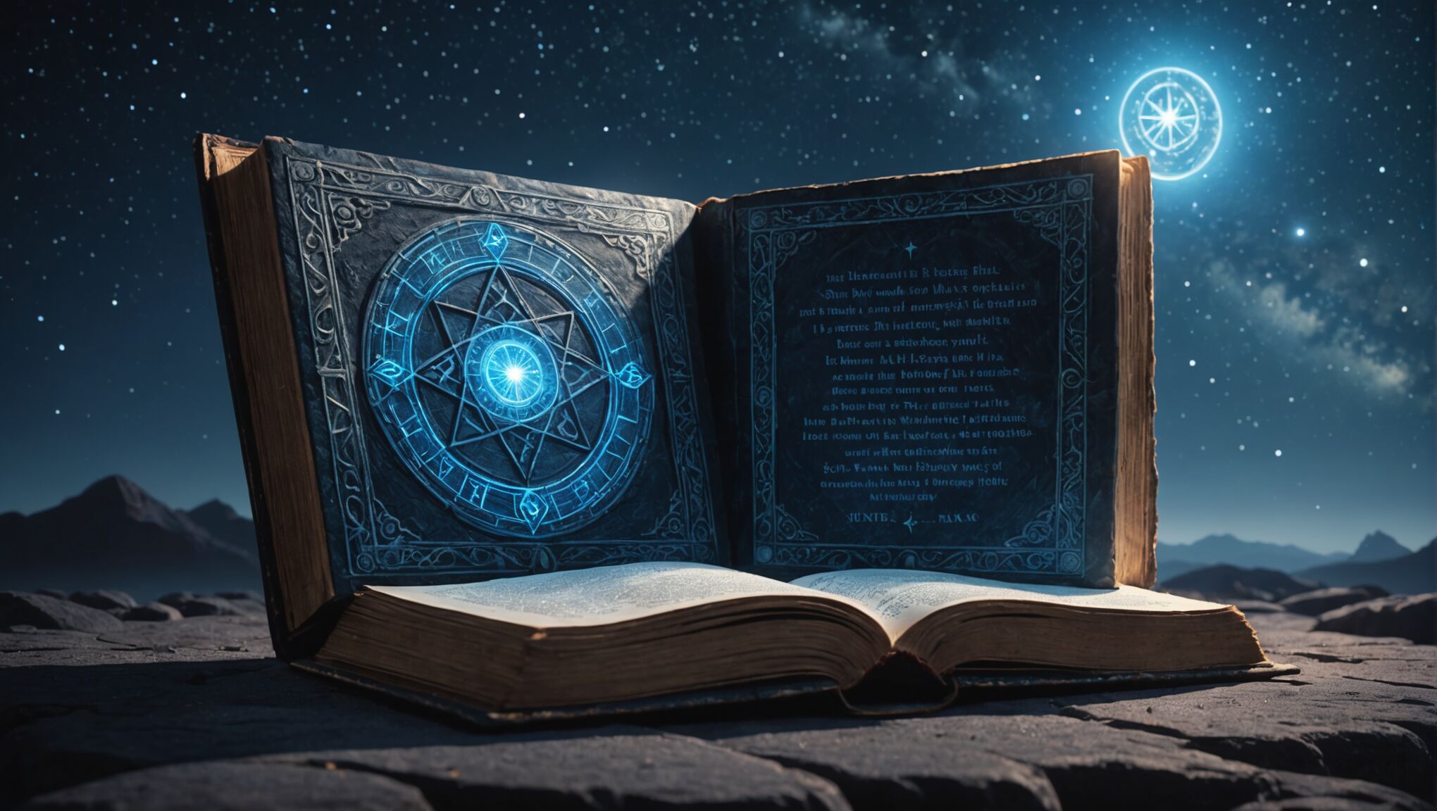
Symbolic elements play a crucial role in fantasy cover design, serving as visual shorthand for complex themes and ideas within the story. These symbols can range from subtle motifs to prominent focal points, each carefully chosen to resonate with the book’s narrative and themes. Incorporating such elements requires a deep understanding of both the story and the genre’s visual language.
Ancient artifacts often feature prominently in fantasy cover designs. A mystical sword, a powerful amulet, or an ancient tome can serve as a centerpiece, hinting at the quest or magical elements central to the plot. These objects are typically rendered with intricate detail, sometimes embellished with glowing runes or swirling energy to emphasize their supernatural properties.
Natural elements are frequently imbued with symbolic meaning in fantasy art. A lone tree might represent life, knowledge, or the world’s axis, while a moon phase could signify transformation or the passage of time. Mountains often symbolize challenges to be overcome, while bodies of water can represent the subconscious or the boundary between worlds.
Creatures from mythology and folklore are potent symbols in fantasy cover design. Dragons, phoenixes, and unicorns are not merely decorative but carry rich symbolic weight, representing power, rebirth, and purity respectively. The presence of such creatures can instantly convey the type of fantasy world the reader will encounter.
Celestial imagery is another common symbolic element. Stars, constellations, and cosmic patterns can suggest destiny, divine influence, or the vastness of the universe. These elements are often incorporated into the background or integrated with other design features to create a sense of wonder and scale.
Architectural elements can serve as powerful symbols on fantasy covers. Towers may represent ambition or isolation, while gates or doorways can symbolize transitions or choices. Ruins can evoke a sense of lost civilizations or forgotten knowledge, adding depth to the world-building hinted at by the cover.
Color symbolism plays a significant role in conveying meaning. Red might signify passion or danger, while gold could represent divinity or wealth. The strategic use of color can guide the viewer’s interpretation of other symbolic elements and set the overall tone of the cover.
Geometric shapes and patterns often carry symbolic weight in fantasy design. Circles might represent unity or cycles, while triangles could suggest balance or tension. Intricate knot work or fractals can imply complexity or infinite possibilities within the story.
The arrangement of symbolic elements is as important as their individual meanings. Placing a small figure beneath a looming symbol can convey the character’s relationship to greater forces, while intertwining symbols can suggest the interconnectedness of different story elements.
It’s crucial to strike a balance when incorporating symbolic elements. Too many symbols can clutter the design and dilute their impact, while too few might fail to capture the richness of the story. The most effective fantasy covers use symbols judiciously, creating a visual puzzle that intrigues potential readers and rewards closer inspection.
By thoughtfully integrating these symbolic elements, cover designers can create a visual narrative that complements and enhances the written story. The result is a cover that not only attracts attention but also provides a deeper, more engaging experience for those who take the time to unravel its symbolic language.

