blog
Fantasy Book Covers: The Impact of Color Psychology
Fantasy literature has long employed color as a powerful tool for conveying deeper meanings and evoking specific emotions within readers. Authors and illustrators alike harness the symbolic power of various hues to enhance their storytelling and create vivid, memorable worlds. “Colors speak all languages,” as Joseph Addison once said, and this rings especially true in the realm of fantasy. Red, for instance, often represents passion, danger, or power, while blue can symbolize tranquility, wisdom, or magic. Green frequently denotes nature, growth, or envy, and purple is commonly associated with royalty, mystery, or spirituality. These color associations are not arbitrary but are deeply rooted in cultural and psychological foundations, making them particularly effective in fantasy world-building. Writers skillfully weave these color symbols throughout their narratives, from character descriptions to magical artifacts and landscapes, creating a rich tapestry of meaning that resonates with readers on both conscious and subconscious levels. Color symbolism extends beyond the written word to book covers, where it plays a crucial role in setting the tone and expectations for the story within. Fantasy artists and designers carefully select color palettes that not only capture the essence of the narrative but also tap into the reader’s innate understanding of color meanings, effectively drawing them into the fantastical world before they’ve even opened the book.
Emotional responses to cover art hues
 Visual elements on fantasy book covers, particularly color choices, play a significant role in eliciting emotional responses from potential readers. The human brain processes color before it registers shapes or text, making it a powerful tool for instant communication and emotional connection. Warm colors like reds, oranges, and yellows tend to evoke feelings of excitement, passion, and energy, which can be particularly effective for action-packed or romantic fantasy novels. Cooler hues such as blues and greens often instill a sense of calm, mystery, or otherworldliness, making them suitable for more introspective or magical tales.
“Color is a power which directly influences the soul,” said Wassily Kandinsky, and this sentiment is particularly relevant in the context of fantasy book covers.
The psychological impact of color on emotion is not merely subjective but has been studied extensively. For instance, red has been shown to increase heart rate and create a sense of urgency, which can be leveraged to convey danger or intense emotions in fantasy cover art. Blue, on the other hand, has a calming effect and can lower blood pressure, making it an excellent choice for covers that aim to evoke a sense of serenity or deep contemplation.
Contrasts and combinations of colors can also trigger complex emotional responses. A dark, brooding background punctuated by a vivid splash of color can create a sense of hope amidst despair, perfectly encapsulating the journey of a hero in a dystopian fantasy world. Similarly, complementary colors like purple and yellow can create visual tension that mirrors the conflict within the story.
The saturation and brightness of colors also play crucial roles in emotional impact. Highly saturated colors tend to be more stimulating and can convey a sense of vibrancy and life, while muted tones might suggest a more somber or mature narrative. Designers often use this knowledge to target specific age groups or subgenres within fantasy literature.
Moreover, the emotional response to color can be intensified when combined with other design elements. Texture, for example, can add depth to a color, making it feel more tangible and enhancing its emotional impact. A rough, gritty texture combined with deep reds might evoke feelings of struggle and determination, while a smooth, glossy finish on cool blues could suggest sophistication and magical prowess.
It’s important to note that while there are general trends in color-emotion associations, individual experiences and cultural backgrounds can influence how colors are perceived. Fantasy book cover designers must consider their target audience and the specific emotions they wish to evoke to create covers that resonate on a deeply personal level with potential readers.
Cultural differences in color interpretation

When it comes to interpreting colors on fantasy book covers, cultural differences play a significant role in shaping perceptions and meanings. What may be seen as auspicious or positive in one culture could be perceived as ominous or negative in another. For instance, while white is often associated with purity and innocence in Western cultures, it is traditionally linked to mourning and death in many Eastern cultures. This cultural variance can present both challenges and opportunities for fantasy book cover designers aiming to appeal to a global audience.
In Chinese culture, red symbolizes good fortune, joy, and prosperity, making it a popular choice for celebratory occasions. However, in some African cultures, red can be associated with death and sacrifice. Similarly, purple, often linked to royalty and luxury in Western societies, may be connected to mourning in some Latin American countries. These cultural nuances require careful consideration when designing fantasy book covers for international markets.
The interpretation of green also varies widely across cultures. In many Western countries, it represents nature, growth, and environmental consciousness. However, in some Middle Eastern cultures, green is associated with Islam and holds sacred significance. In contrast, in some South American folklore, green might be linked to death or the supernatural.
Blue, while generally perceived as calming and trustworthy in many Western cultures, can have different connotations elsewhere. In Iran, blue is considered a color of mourning, while in Hindu culture, it is associated with Krishna, a major deity, symbolizing divine love and spirituality. These diverse interpretations can significantly impact how a fantasy book cover is received in different regions.
Fantasy authors and publishers often navigate these cultural differences by employing universal symbols or by creating unique color associations within their fictional worlds. Some opt for covers that blend cultural interpretations, using color combinations that resonate across multiple societies. Others might create different cover versions for various markets, tailoring the color schemes to align with local cultural norms and preferences.
The use of black and white on fantasy book covers also warrants careful consideration. While black often symbolizes sophistication or mystery in Western design, it can represent bad luck or evil in some Asian cultures. White, conversely, is associated with purity and weddings in the West but can signify death and mourning in parts of Asia.
Understanding these cultural nuances is crucial for fantasy book cover designers, especially in an increasingly globalized market. By respecting and incorporating diverse cultural perspectives on color, designers can create covers that not only appeal to a wider audience but also avoid unintentional offense or misinterpretation. This cultural sensitivity in color choice can contribute to the book’s success in different markets and enhance its global appeal.
Moreover, the fantasy genre offers a unique opportunity to bridge cultural divides through color. By creating fictional worlds with their own color symbolism, authors and designers can introduce readers to new ways of perceiving and interpreting colors. This approach can foster cross-cultural understanding and appreciation, making fantasy literature a powerful medium for cultural exchange and exploration.
Genre-specific color trends in fantasy
Fantasy literature encompasses a wide range of subgenres, each with its own distinct color trends that have evolved over time. These trends not only reflect the thematic elements of the stories but also serve to guide readers towards their preferred subgenres at a glance.
Epic fantasy, often characterized by sweeping narratives and grand conflicts, frequently employs rich, deep colors on its covers. Golds, deep reds, and royal purples dominate this subgenre, evoking a sense of grandeur and ancient regality. These colors often accompany images of swords, crowns, or mythical creatures, reinforcing the epic scale of the stories within.
In contrast, urban fantasy tends to favor darker, more muted palettes. Blacks, grays, and deep blues are common, often accented with neon splashes of color to represent the magical elements intruding into the modern world. This color scheme reflects the gritty, nocturnal settings typical of urban fantasy and appeals to readers seeking a blend of the familiar and the supernatural.
Young adult fantasy covers often feature brighter, more vibrant colors to attract their target audience. Teals, bright purples, and vivid oranges are frequently used, sometimes in gradient effects or with metallic overlays. These eye-catching designs are meant to stand out on shelves and appeal to the energy and imagination of younger readers.
Grimdark fantasy, known for its darker themes and morally ambiguous characters, typically uses desaturated colors and high-contrast images. Blacks, grays, and deep reds dominate, creating a sense of foreboding and moral complexity that aligns with the subgenre’s tone.
High fantasy covers often incorporate ethereal blues and greens, evoking a sense of magic and otherworldliness. These colors are frequently paired with intricate designs or landscapes, hinting at the complex world-building within the pages.
Romantic fantasy blends elements of both genres in its color choices. Soft pastels like rose gold, lavender, and mint are popular, often combined with more traditional fantasy elements like dragons or castles. This creates a visual representation of the genre’s blend of romance and magical adventure.
Historical fantasy tends to use color palettes that evoke the time period in which the story is set. Sepia tones, rich browns, and muted golds are common, often paired with images that blend historical and fantastical elements.
| Fantasy Subgenre | Dominant Colors | Associated Elements |
|---|---|---|
| Epic Fantasy | Golds, deep reds, royal purples | Swords, crowns, mythical creatures |
| Urban Fantasy | Blacks, grays, deep blues, neon accents | City skylines, modern weapons with magical elements |
| Young Adult Fantasy | Teals, bright purples, vivid oranges | Youthful protagonists, magical objects |
| Grimdark Fantasy | Desaturated colors, blacks, deep reds | Gritty textures, weapons, dark landscapes |
| High Fantasy | Ethereal blues and greens | Magical landscapes, fantastical creatures |
| Romantic Fantasy | Soft pastels, rose gold, lavender | Couples, magical creatures, romantic settings |
| Historical Fantasy | Sepia tones, rich browns, muted golds | Historical artifacts, period costumes with fantastical elements |
These color trends are not rigid rules but rather general tendencies that have developed within the industry. Innovative cover designs often play with these expectations, using unexpected color combinations to stand out or subvert genre conventions. However, understanding these trends is crucial for authors, publishers, and designers who want to effectively communicate the essence of their stories and appeal to their target audience.
Moreover, as the fantasy genre continues to evolve and new subgenres emerge, we can expect to see the development of new color trends. For instance, the rising popularity of science fantasy has led to covers that blend the color palettes of both science fiction and fantasy, creating unique visual identities that reflect the hybrid nature of the stories.
The digital age has also influenced color trends in fantasy book covers. With many readers discovering books online, covers must now be eye-catching as small thumbnails, leading to bolder color choices and simpler designs that translate well to digital platforms.
Color psychology and reader expectations
 Readers’ expectations play a crucial role in their book selection process, and color psychology is a powerful tool that publishers and designers use to meet and shape these expectations. When a potential reader encounters a fantasy book cover, their brain processes the colors before any other visual elements, instantly creating associations and setting the tone for what lies within the pages.
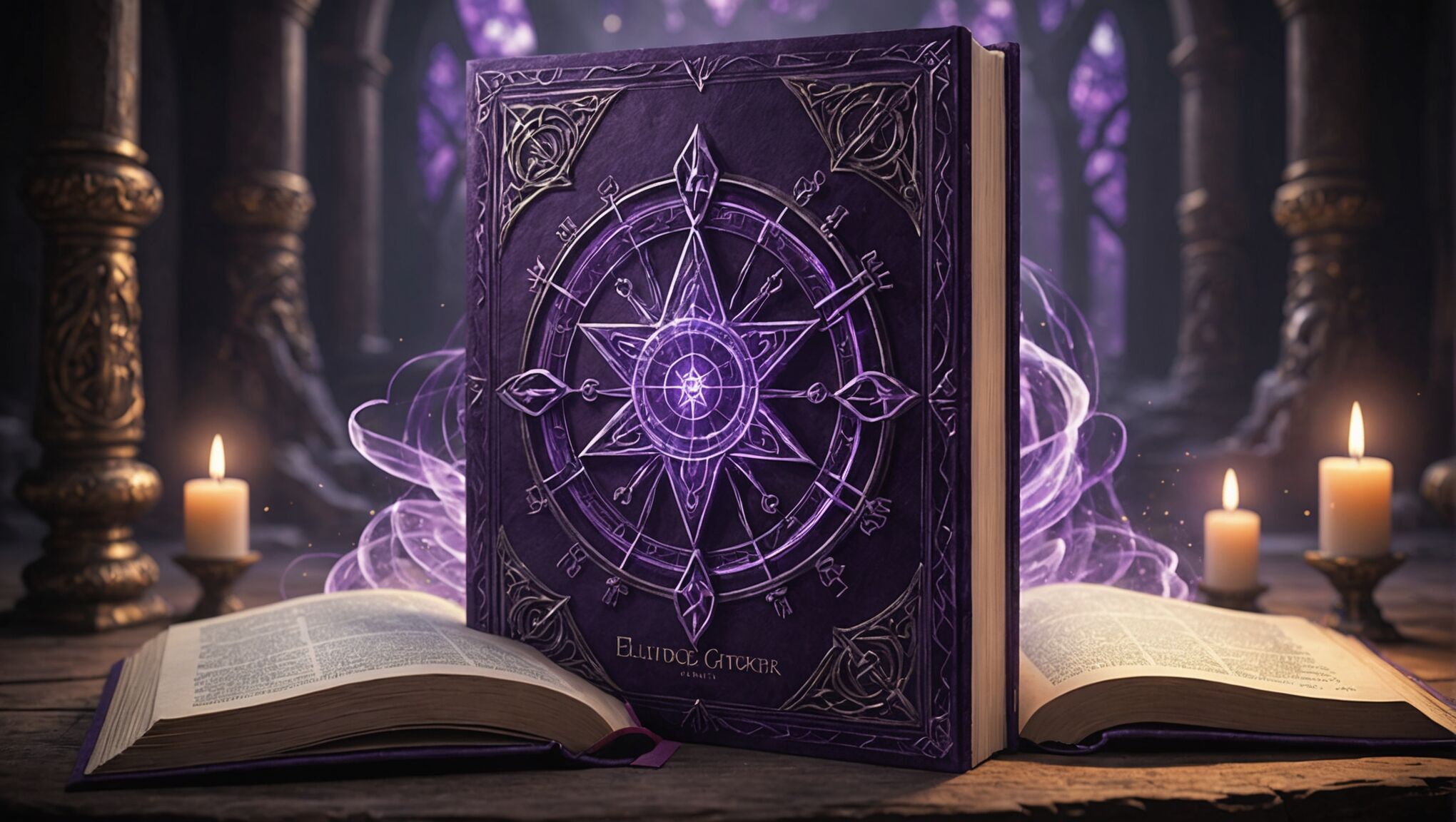
For instance, a cover dominated by deep purples and midnight blues might lead readers to anticipate a story filled with magic, mystery, and otherworldly elements. This color scheme taps into the collective understanding of these hues as representative of the unknown and the mystical. Conversely, a cover featuring vibrant greens and earthy browns could signal a tale deeply rooted in nature, perhaps involving elves, druids, or forest-dwelling creatures.
The use of metallic accents, such as gold or silver, often creates an expectation of high stakes or epic quests. These shimmering elements can suggest treasure, ancient artifacts, or the clash of powerful forces, appealing to readers who seek grand adventures and heroic journeys.
Dark, muted colors with splashes of vibrant hues might prepare readers for a gritty, urban fantasy setting where magic intersects with the modern world. This color strategy aligns with the expectations of readers who enjoy stories that blend the familiar with the fantastical.
It’s important to note that these color-based expectations are not universal and can vary based on cultural background and personal experiences. However, publishers often rely on general trends and market research to create covers that resonate with their target audience.
The relationship between color psychology and reader expectations is a two-way street. While covers are designed to meet existing expectations, they also play a role in shaping and evolving these expectations over time. As certain color schemes become associated with specific subgenres or themes within fantasy literature, they create a visual shorthand that readers learn to interpret.
This interplay between color and expectation raises interesting questions about the evolution of fantasy literature and its visual representation. How do changing societal norms and cultural shifts influence color trends in fantasy book covers? Are there untapped color combinations that could revolutionize how we visually categorize fantasy subgenres?
Moreover, the digital age has introduced new considerations in cover design. With many readers discovering books online, covers must now be effective as small thumbnails, leading to bolder color choices and simpler designs. This shift raises questions about how digital platforms are influencing our color associations and expectations in the fantasy genre.
As readers, it’s valuable to consider how our own expectations are shaped by color psychology. Are we limiting our reading experiences by adhering too closely to these visual cues? Challenging our color-based assumptions might lead us to discover unexpected gems within the vast world of fantasy literature.
The psychology of color in fantasy book covers also opens up fascinating avenues for cross-cultural studies. How do color expectations in fantasy literature differ across various cultures and regions? Understanding these differences could not only enrich our appreciation of global fantasy literature but also provide insights into broader cultural perceptions of magic, adventure, and the unknown.
Ultimately, the relationship between color psychology and reader expectations in fantasy literature is a rich field for exploration. It invites us to question our assumptions, broaden our perspectives, and delve deeper into the visual language of storytelling.
Marketing strategies using color theory

Publishers and designers leverage color theory extensively in their marketing strategies for fantasy books, recognizing its power to attract readers and convey essential information about the story. By strategically employing specific color palettes, they can target particular demographics, evoke desired emotions, and position books within the fantasy genre’s various subgenres.
One common approach is using color to create brand identity for a series or author. For instance, a fantasy author known for epic sagas might consistently use rich, deep colors like royal blues and golds across their book covers. This color consistency helps readers quickly identify the author’s works and builds a visual brand that becomes synonymous with their storytelling style.
Color gradients have become increasingly popular in fantasy book marketing, particularly for young adult titles. These gradients often blend complementary colors to create a sense of magic and transition, mirroring the transformative journeys typical in fantasy narratives. This technique not only catches the eye but also conveys the idea of a world in flux, appealing to readers seeking immersive, dynamic stories.
Marketers also use color to differentiate books within a series. Each installment might feature a dominant color that relates to its specific themes or plot elements while maintaining a cohesive overall look. This approach satisfies readers’ desire for familiarity while also signaling the unique aspects of each book.
In digital marketing, color plays a crucial role in creating eye-catching thumbnails for online bookstores and social media. Vibrant, high-contrast color schemes are often employed to ensure visibility even at small sizes. This consideration has led to a trend of bolder, more simplified cover designs that translate well across various digital platforms.
Limited edition covers and special releases often utilize metallic or iridescent colors to create a sense of exclusivity and luxury. These special treatments appeal to collectors and dedicated fans, encouraging multiple purchases of the same title.
Color theory is also applied in creating book trailers and promotional materials. The colors used in these materials often mirror those on the book cover, creating a cohesive visual experience across all marketing touchpoints. This consistency reinforces brand recognition and helps cement the book’s identity in potential readers’ minds.
Explore how color psychology can transform your fantasy book covers by visiting our homepage.
Publishers sometimes use A/B testing with different color schemes to determine which covers perform best with target audiences. This data-driven approach allows for refined color strategies that maximize appeal and sales potential.
Seasonal color trends are another consideration in fantasy book marketing. Covers might be designed with colors that align with release dates – warmer tones for summer releases, cooler hues for winter – to resonate with readers’ seasonal moods and expectations.
Cross-promotional strategies often involve color coordination between books and related merchandise. From bookmarks to tote bags, the color schemes used on these items typically echo those of the book covers, creating a cohesive brand experience for fans.
As the fantasy genre continues to evolve and diversify, so too do the color strategies employed in marketing. The rise of indie publishing has led to more experimental approaches, challenging traditional color associations within the genre and potentially reshaping reader expectations.

