blog
Epic Battles and Showdowns: Action-Filled Fantasy Cover Design
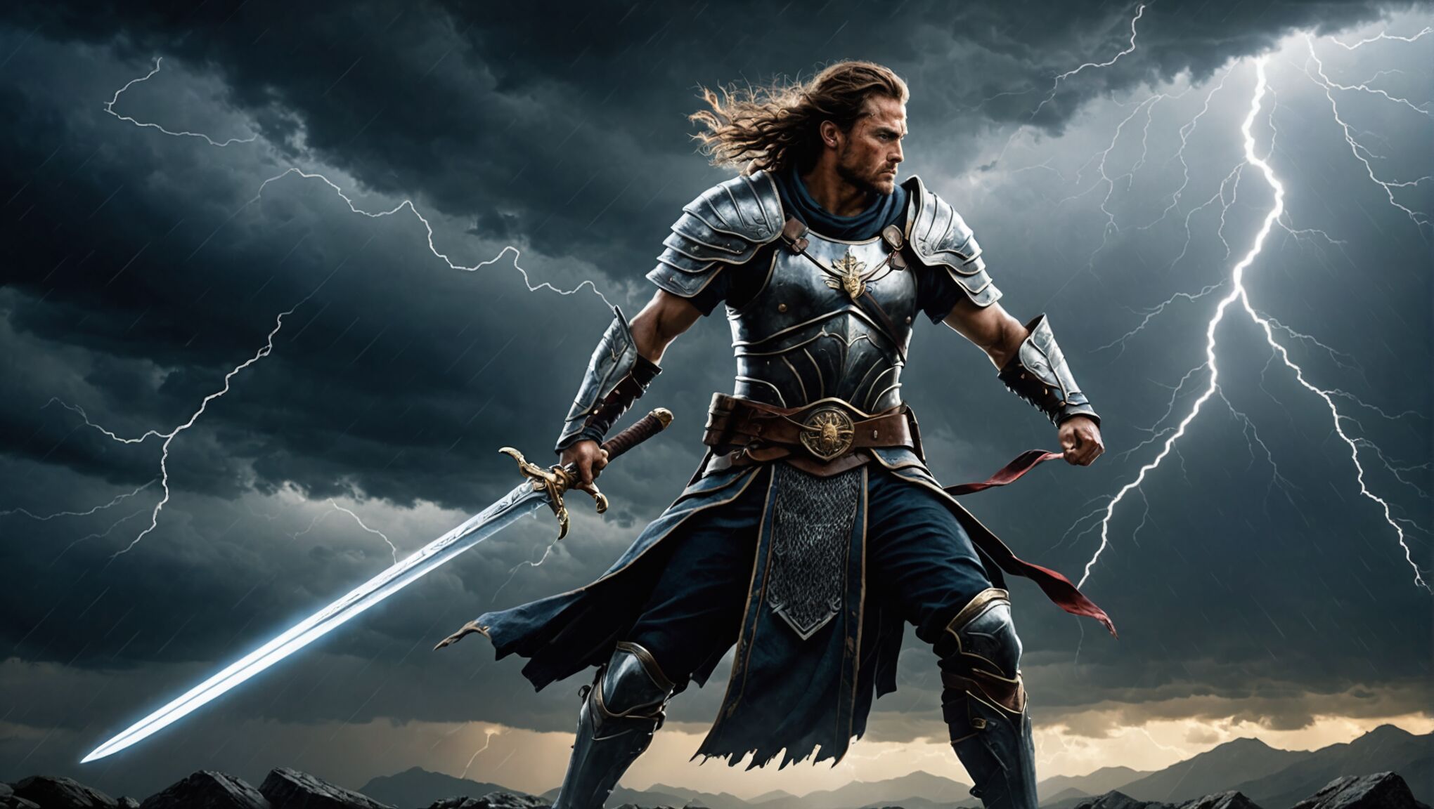
Crafting a captivating fantasy cover that exudes action and excitement requires a careful blend of key elements. At the forefront is the protagonist, often portrayed in a heroic stance or mid-action, wielding a signature weapon or displaying magical abilities. This central figure should immediately draw the viewer’s attention and convey the essence of the story. Equally important is the antagonist or threat, which can be represented by a formidable opponent, a menacing creature, or an ominous force looming in the background. The clash between good and evil is a fundamental aspect that must be visually communicated.
The setting plays a crucial role in establishing the fantasy world and setting the tone for the epic battles to come. Whether it’s a mystical forest, a crumbling castle, or a celestial realm, the environment should be rich in detail and atmosphere. Dramatic lighting effects, such as piercing sunbeams or eerie glows, can heighten the sense of tension and drama. Incorporating fantastical elements like mythical creatures, magical artifacts, or swirling energy adds depth to the cover and reinforces the genre.
Dynamic composition is essential for conveying action and movement. Diagonal lines, swirling patterns, or asymmetrical layouts can create a sense of energy and motion. The use of perspective and scale can emphasize the epic nature of the battle, with larger-than-life characters or sweeping landscapes that hint at the grandeur of the story within. Visual hierarchy is crucial, guiding the viewer’s eye through the various elements of the cover and ensuring that the most important aspects stand out.
Texture and detail contribute to the overall impact of the cover. From the intricate patterns on a character’s armor to the weathered surface of an ancient artifact, these small touches add authenticity and depth to the design. Finally, the strategic use of negative space can provide balance and allow the action elements to breathe, preventing the cover from becoming overly cluttered or chaotic. By skillfully combining these essential elements, designers can create action-packed fantasy covers that instantly captivate readers and promise thrilling adventures within the pages.
Choosing the right color palette for epic battles
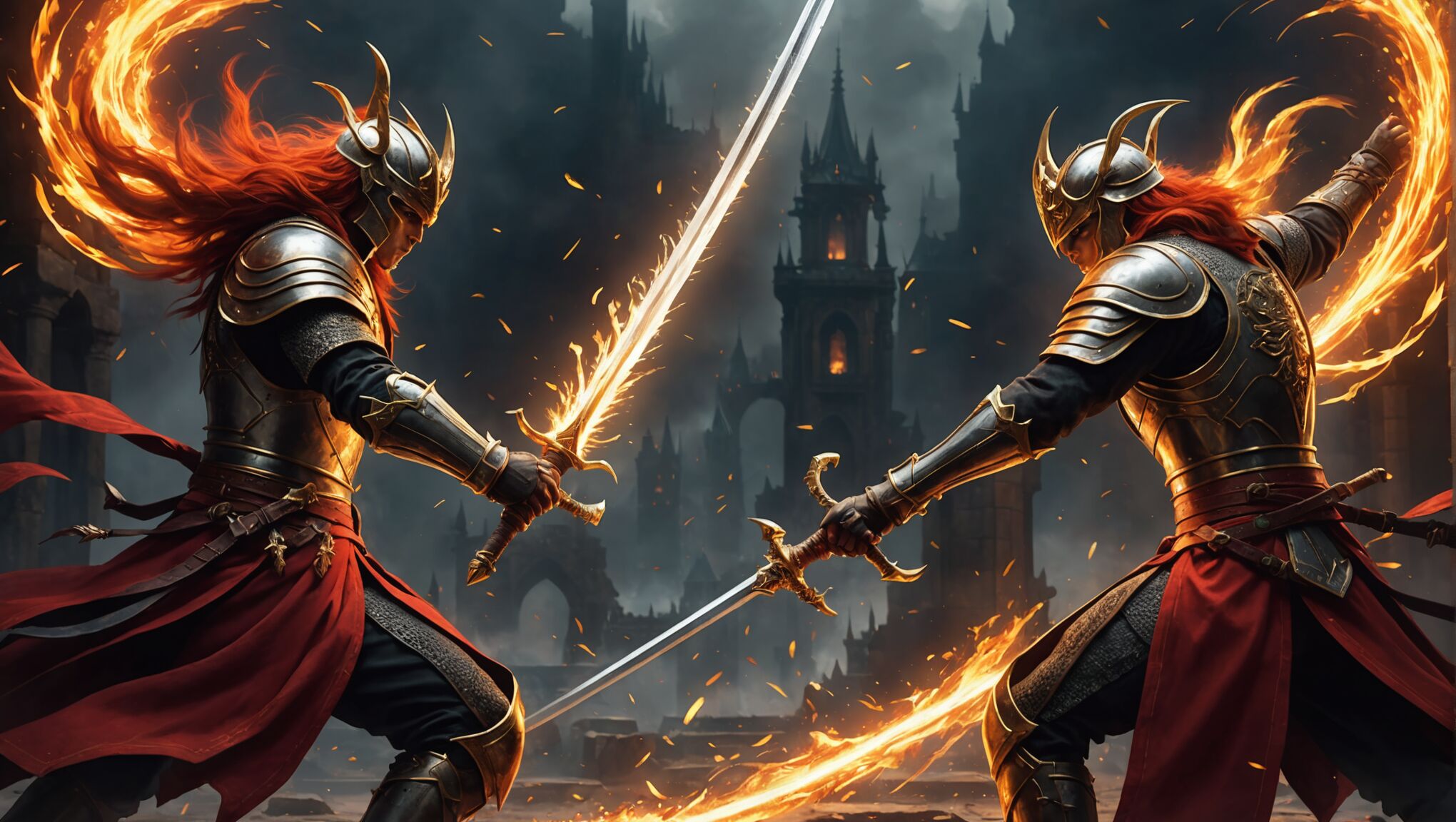 When designing a cover for an epic fantasy battle, the color palette plays a crucial role in setting the mood and capturing the intensity of the action. Bold, contrasting colors can create a sense of drama and conflict, while a more muted palette can evoke a gritty, realistic atmosphere. Warm colors like reds, oranges, and yellows are often used to represent fire, energy, and passion, making them ideal for depicting intense combat scenes or magical explosions.
“Color is a power which directly influences the soul.” – Wassily Kandinsky
Cool colors such as blues and purples can be employed to convey mystery, magic, or otherworldly elements. These hues work well for nighttime scenes or to represent supernatural forces. Greens can be used to depict lush fantasy landscapes or to add an eerie, magical glow to the composition.
Metallic colors, particularly gold and silver, are effective in highlighting important elements like weapons, armor, or magical artifacts. They can add a sense of nobility, power, and value to the cover design. Black is often used to create depth and shadow, enhancing the overall contrast and drama of the scene.
The use of complementary colors can create striking visual effects. For instance, pairing a fiery orange with a deep blue can make both colors appear more vibrant and intense. This technique can be particularly effective in showcasing the clash between opposing forces or magical energies.
Gradients and color overlays can add depth and atmosphere to the cover. A subtle shift from warm to cool tones across the image can create a sense of distance or time passage. Alternatively, a vibrant color overlay can unify the elements of the cover and create a cohesive, stylized look.
It’s important to consider the genre conventions and target audience when selecting a color palette. While high fantasy might lean towards rich, saturated colors, a grimdark fantasy novel might benefit from a more desaturated, gritty palette. The chosen colors should also complement the typography and not overshadow the title or author’s name.
Testing different color combinations and their effects on the overall composition is crucial. What works in theory may not always translate well in practice, so it’s important to experiment and refine the palette until it achieves the desired impact. Digital tools and color theory resources can be invaluable in this process, allowing designers to explore various harmonious color schemes and their emotional associations.
Ultimately, the right color palette for an epic battle scene should enhance the narrative, evoke emotion, and draw the viewer into the fantastical world depicted on the cover. It should work in harmony with other design elements to create a visually stunning and commercially appealing product that stands out on bookshelves and in digital marketplaces.
Composition techniques for dynamic showdowns
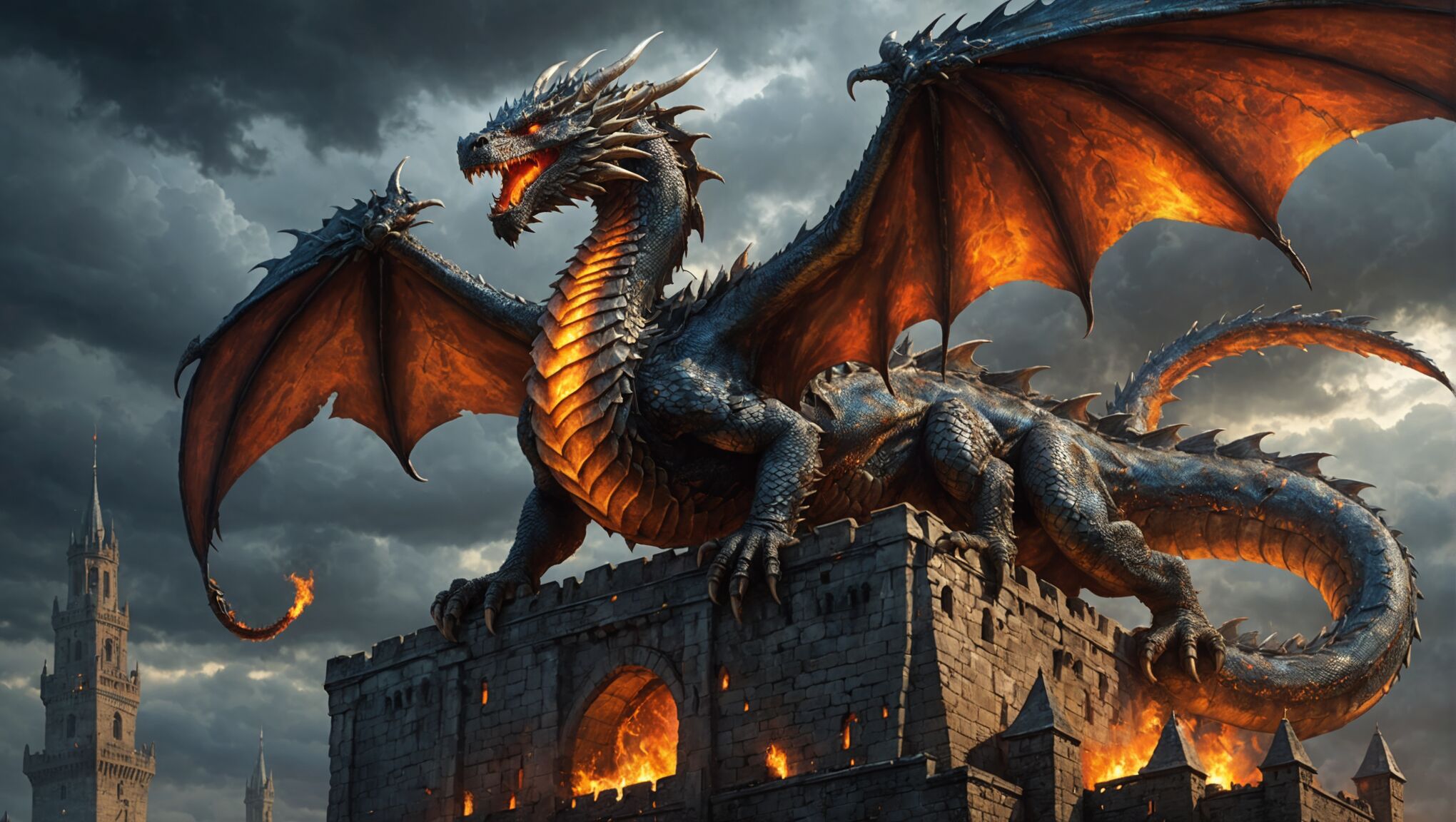
Creating a dynamic composition for fantasy cover art is essential to capture the intensity and excitement of epic showdowns. One effective technique is to utilize diagonal lines and angles to convey movement and energy. Positioning characters or elements along these diagonals can create a sense of action and guide the viewer’s eye across the cover. For instance, a hero lunging forward with a sword or a dragon’s tail sweeping across the image can establish powerful directional forces.
Layering is another crucial aspect of composition for action-filled designs. By arranging elements in foreground, midground, and background layers, designers can create depth and dimension. This technique allows for the incorporation of multiple story elements without overcrowding the space. A foreground character in sharp focus, midground battle scene, and background landscape can work together to tell a complex visual story.
The rule of thirds remains a valuable tool in fantasy cover design. Placing key elements at the intersection points of a grid divided into thirds can create a balanced yet dynamic composition. This approach can be particularly effective when positioning the main character or the focal point of the conflict.
Asymmetry in composition can add tension and unpredictability to the design, mirroring the chaotic nature of battle scenes. By intentionally unbalancing the layout, designers can create visual interest and draw attention to specific areas of the cover. This technique can be particularly effective when combined with a strong focal point to anchor the design.
Add mystery with foreshadowing elements. Find out more.
Utilizing perspective and scale can dramatically enhance the epic feel of a showdown. Extreme angles, such as a low viewpoint looking up at towering figures, can convey power and grandeur. Conversely, a bird’s-eye view of a battlefield can emphasize the scope of the conflict. Manipulating scale, such as juxtaposing a tiny hero against a massive opponent, can create immediate visual impact and storytelling.
Negative space should not be overlooked in action-filled designs. Strategic use of empty areas can provide visual relief and enhance the impact of action elements. It can also be used to create symbolic shapes or silhouettes that add depth to the narrative.
Incorporating motion blur or speed lines can suggest rapid movement and intense action. These elements can be used subtly or prominently, depending on the desired effect and overall style of the cover. When combined with sharp, in-focus elements, they can create a striking contrast that draws the eye to key details.
Overlapping elements can create a sense of chaos and immediacy in battle scenes. By allowing characters, weapons, or magical effects to intersect and interact, designers can convey the frenetic energy of combat. This technique also helps to unify different parts of the composition, creating a cohesive overall design.
The use of leading lines can direct the viewer’s attention to important elements of the cover. These can be created through the positioning of weapons, the direction of a character’s gaze, or environmental features like rocky outcrops or magical energy streams. When skillfully employed, leading lines can create a visual narrative that unfolds as the viewer explores the cover.
Typography and its impact on action-filled designs
Typography plays a crucial role in enhancing the impact of action-filled fantasy cover designs. The choice of font, size, placement, and styling can significantly influence the overall mood and effectiveness of the cover.
When selecting a typeface for an action-packed fantasy cover, it’s essential to choose one that complements the genre and atmosphere of the book. Bold, angular fonts often work well for titles, as they convey strength and dynamism. Serif fonts can add a touch of elegance and tradition, while sans-serif options might provide a more modern or sleek appearance. Custom lettering or modified existing fonts can create a unique identity for the book series or author.
The size and weight of the typography are critical in establishing hierarchy and ensuring readability. The title should be prominent and easily legible from a distance, while the author’s name and any subtitles or taglines can be smaller but still clearly visible. Experimenting with different font weights within the same family can create interesting contrasts without sacrificing cohesion.
| Font Style | Effect on Action-Filled Designs |
| Bold, angular | Conveys strength and dynamism |
| Serif | Adds elegance and traditional feel |
| Sans-serif | Provides modern and sleek appearance |
| Custom lettering | Creates unique identity |
The placement of text elements is crucial in action-filled designs. Integrating the title with the artwork can create a cohesive and visually striking effect. For instance, having characters interact with the text or placing the title within a dynamic visual element can enhance the overall composition. However, it’s important to ensure that this integration doesn’t compromise readability.
Texture and effects applied to typography can reinforce the fantasy and action themes. Metallic or glowing effects can suggest magic or power, while a weathered or etched appearance might evoke an ancient, epic quality. These effects should be used judiciously to avoid overwhelming the design or reducing legibility.
Color plays a significant role in typography for action-filled fantasy covers. High contrast between the text and background is essential for readability, but the color choices should also complement the overall palette of the artwork. Using colors that echo elements in the illustration can tie the typography into the scene effectively.
The arrangement of text can contribute to the sense of action and movement. Tilted or curved text paths can add dynamism, while stacked or interlocking letters can create interesting visual rhythms. However, these techniques should be used carefully to maintain readability and avoid appearing gimmicky.
Negative space around typography is crucial in action-packed designs. Ensuring that there’s enough clear space around the text elements can help them stand out amidst busy or detailed artwork. This can be achieved through strategic placement or by using subtle background elements like glows or shadows to separate the text from the illustration.
Incorporating visual elements from the story or genre into the typography can enhance its thematic relevance. For example, integrating sword-like serifs or magical sparkles into the letterforms can reinforce the fantasy action theme without overpowering the design.
The scale of typography in relation to the cover artwork is another important consideration. Oversized text that interacts with or dominates the visual elements can create a bold, cinematic effect, while smaller, more integrated type might allow the action scene to take center stage.
Lastly, consistency in typography across a series is vital for brand recognition. Establishing a strong typographic style that can be adapted for subsequent books helps create a cohesive visual identity that readers can easily recognize and associate with the epic fantasy action they’ve come to expect.
Incorporating magical and fantastical elements
 Magic and fantasy are the lifeblood of the genre, and incorporating these elements into cover design can elevate a good cover to an extraordinary one. Subtlety is key when weaving magical elements into the composition, as they should enhance rather than overwhelm the main action or characters.
One effective technique is to use magical auras or energy fields around characters or objects. These can be depicted as soft glows, sparkling particles, or swirling mists that suggest otherworldly power. Such effects not only add visual interest but also hint at the magical abilities or significance of the elements they surround.
Mystical symbols and runes can be strategically placed within the design to add depth and intrigue. These can be subtly integrated into the background, etched onto weapons or armor, or floating in the air as if conjured by a spell. Care should be taken to ensure these symbols are consistent with the book’s lore and don’t detract from the overall composition.
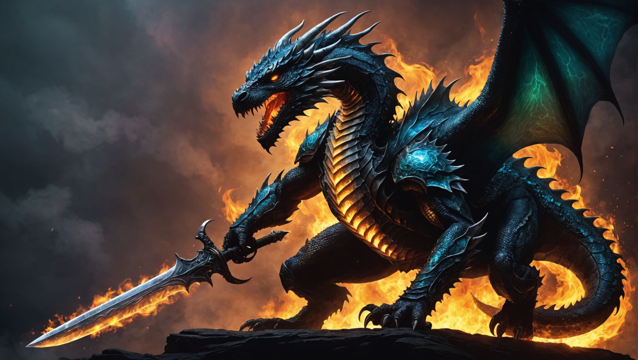
Fantastical creatures play a crucial role in many fantasy narratives and can be powerful additions to cover art. Dragons, phoenixes, or mythical beasts can be incorporated as central figures or as subtle background elements. Their presence immediately signals the fantastical nature of the story and can create dynamic interactions with the human characters.
Magical artifacts or weapons are often central to fantasy plots and can serve as focal points in cover design. A glowing sword, a mysterious amulet, or an ancient tome can draw the eye and spark curiosity about their role in the story. These objects can be given additional emphasis through lighting effects or by positioning them prominently in the composition.
Elemental magic provides rich visual opportunities. Swirling flames, crackling lightning, or flowing water can be used to create dynamic patterns and textures that suggest magical manipulation of the natural world. These elements can frame the action, create barriers between characters, or serve as weapons in depicted battles.
Portals or rifts in reality can add an extra layer of intrigue to a cover. These can be shown as shimmering doorways, tears in the fabric of space, or windows to other realms. Such elements not only hint at the possibility of travel between worlds but also create interesting visual breaks in the composition.
Ethereal beings or spirits can add a ghostly dimension to the artwork. Translucent figures, wisps of sentient smoke, or luminous apparitions can create an air of mystery and suggest a world beyond the physical realm. These elements can be used to fill negative space or to create interesting layering effects within the design.
The manipulation of natural elements in unnatural ways can subtly convey the presence of magic. Floating rocks, impossible plant growth, or strangely behaving weather phenomena can all suggest a world where the laws of physics are bent by magical forces.
Color plays a crucial role in depicting magical elements. Unnatural or heightened color palettes can immediately signal the presence of magic. Glowing, iridescent, or color-shifting effects can be applied to various elements to suggest their magical nature.
When incorporating these fantastical elements, it’s important to maintain a balance with the more realistic aspects of the cover. The magical elements should integrate seamlessly with the overall composition, enhancing the sense of wonder and excitement without detracting from the main focus of the design. By carefully blending these mystical touches with the action and characters, designers can create covers that truly capture the essence of fantasy and ignite the imagination of potential readers.
Balancing realism and stylization in fantasy cover art
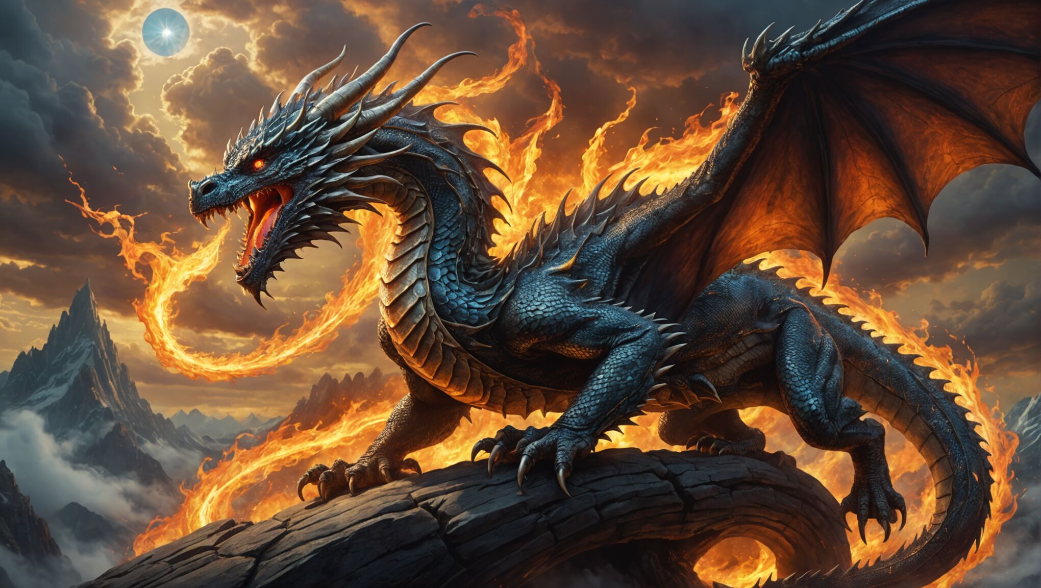
Creating a balanced approach between realism and stylization is crucial in fantasy cover art, as it helps to ground the fantastical elements while maintaining a sense of wonder. Artists must navigate a fine line, ensuring that the cover is visually striking and imaginative without sacrificing believability or relatability for the audience.
One effective technique is to anchor fantastical elements with realistic details. For example, a dragon might be rendered with meticulously detailed scales and musculature, while its surroundings are more stylized or abstract. This contrast can create a focal point and lend credibility to the otherworldly creature.
Lighting plays a pivotal role in blending realism with stylization. Realistic lighting can add depth and dimensionality to stylized forms, making them feel more tangible. Conversely, dramatic or ethereal lighting effects can imbue realistic elements with a sense of magic and mystery.
Texture is another powerful tool for achieving balance. Highly detailed textures on key elements, such as a character’s armor or a mystical artifact, can ground them in reality. Meanwhile, softer or more impressionistic textures in the background can create a dreamlike atmosphere that supports the fantasy setting.
Color palettes can be manipulated to strike a balance between the real and the fantastical. Using naturalistic colors for main characters or foreground elements can make them more relatable, while employing vibrant or unusual hues for magical effects or distant landscapes can emphasize the otherworldly aspects of the scene.
Proportion and anatomy are areas where artists can choose to lean more towards realism or stylization. Characters with realistic proportions can help viewers connect with them emotionally, while slight exaggerations can emphasize heroic qualities or villainous traits without breaking the illusion of reality.
Environmental elements offer opportunities to blend styles. A realistically rendered castle might be set against a sky with stylized, swirling clouds that hint at magical forces at work. This juxtaposition can create visual interest and reinforce the fantasy genre without losing the sense of a tangible world.
When depicting action scenes, artists can use realistic physics as a foundation while incorporating stylized elements to enhance the sense of motion and energy. For example, a warrior’s stance and musculature might be anatomically correct, but the flow of their cape or the trail of their weapon could be exaggerated for dramatic effect.
The level of detail can vary across the composition to guide the viewer’s focus and create a balance between realism and stylization. Areas of high detail can draw attention to important elements, while areas with less definition can suggest mystery or allow the imagination to fill in the gaps.
Ultimately, the key to successfully balancing realism and stylization in fantasy cover art lies in understanding the story’s tone and target audience. A more serious, gritty fantasy might lean heavily towards realism with just touches of the fantastic, while a whimsical, magic-heavy tale might embrace stylization more fully. By carefully considering these factors and applying a thoughtful mix of techniques, artists can create covers that are both believable and enchanting, capturing the essence of the fantasy genre while appealing to a wide range of readers.

