blog
Designing Fantasy Covers with Subtle Magical Elements
Magical symbolism has been a cornerstone of artistic expression for centuries, weaving intricate meanings into visual narratives. Artists often draw upon a rich tapestry of esoteric traditions, mythology, and cultural beliefs to infuse their work with mystical significance. Alchemical symbols, for instance, can be subtly incorporated to represent transformation or the pursuit of perfection. The ouroboros, a serpent eating its own tail, signifies eternal cycles and unity, while the triquetra embodies the concept of trinity in various spiritual contexts. When designing fantasy covers, it’s crucial to research and understand these symbols to effectively communicate the magical themes of the book. Natural elements like trees, mountains, and celestial bodies can also carry potent magical connotations, with the Tree of Life symbolizing interconnectedness and the moon often representing intuition and hidden knowledge. “Symbolism is the language of the Mysteries,” as Manly P. Hall once said, highlighting the importance of these visual cues in conveying deeper meanings. Artists should also consider the cultural context of their symbols, as interpretations can vary widely across different traditions. By thoughtfully selecting and arranging symbolic elements, cover designers can create a visual narrative that resonates with the story’s magical essence, inviting readers to explore the hidden depths of the fantasy world before they even open the book.
Color theory for enchanted atmospheres
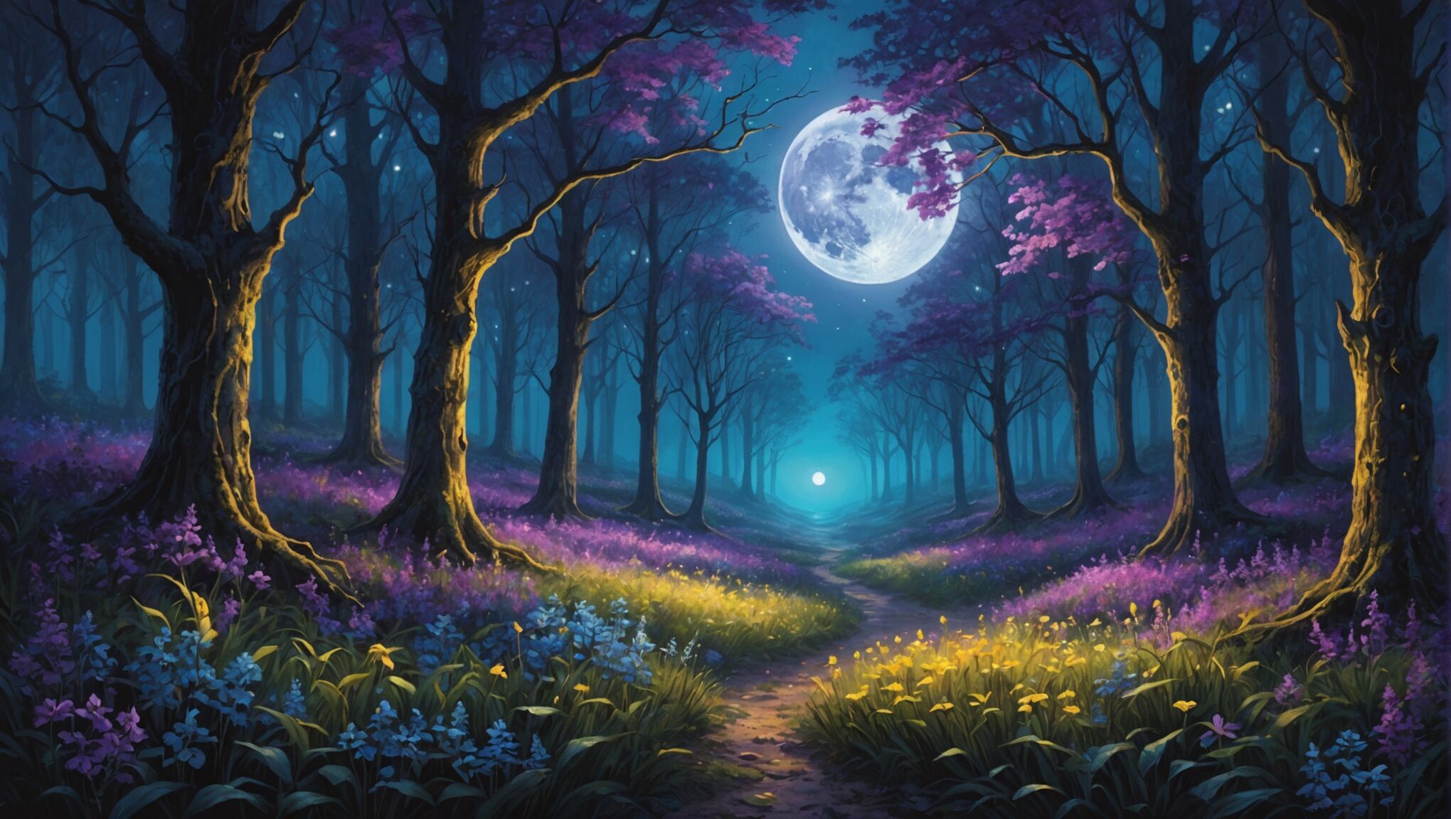 Color plays a pivotal role in evoking magical atmospheres and setting the tone for fantasy book covers. The careful selection and combination of hues can transport viewers to enchanted realms, subtly hinting at the mystical elements within the story. Cool blues and purples often suggest mystery and the arcane, while deep greens can evoke the magic of nature and ancient forests. Warm golds and rich reds might be used to represent power, royalty, or alchemical transformations.
“Color is a power which directly influences the soul.” – Wassily Kandinsky
This quote underscores the emotional and psychological impact that color choices can have on viewers. When designing fantasy covers, it’s essential to consider the psychological associations of different colors. For instance, silver can connote lunar magic or prophecy, while black might represent the unknown or dark arts.
Gradient effects and color blending can create ethereal atmospheres that blur the lines between reality and fantasy. Soft, misty gradients in pastel tones can suggest dreamlike states or the presence of fae creatures, while stark contrasts between light and dark colors can dramatically illustrate the clash between good and evil forces.
The use of complementary colors can create visual tension and energy, drawing the eye to key elements of the cover design. For example, a vibrant purple paired with touches of yellow can make magical elements pop against a more subdued background.
Iridescent or metallic effects can add a layer of magic to the color palette, suggesting the presence of otherworldly materials or enchanted objects. These can be used sparingly to highlight specific elements without overwhelming the overall design.
It’s also important to consider the genre conventions and target audience when selecting colors. Young adult fantasy might lean towards brighter, more saturated colors, while epic fantasy for adult readers might employ a more muted, sophisticated palette.
The interplay of light and shadow within the color scheme can further enhance the magical atmosphere. Glowing effects or areas of luminescence can suggest the presence of magic or supernatural phenomena, guiding the viewer’s eye and creating focal points within the composition.
By carefully orchestrating the color palette, designers can create an enchanted atmosphere that captures the essence of the fantasy world within, enticing readers to explore the magical realms that await them beyond the cover.
Incorporating hidden magical motifs
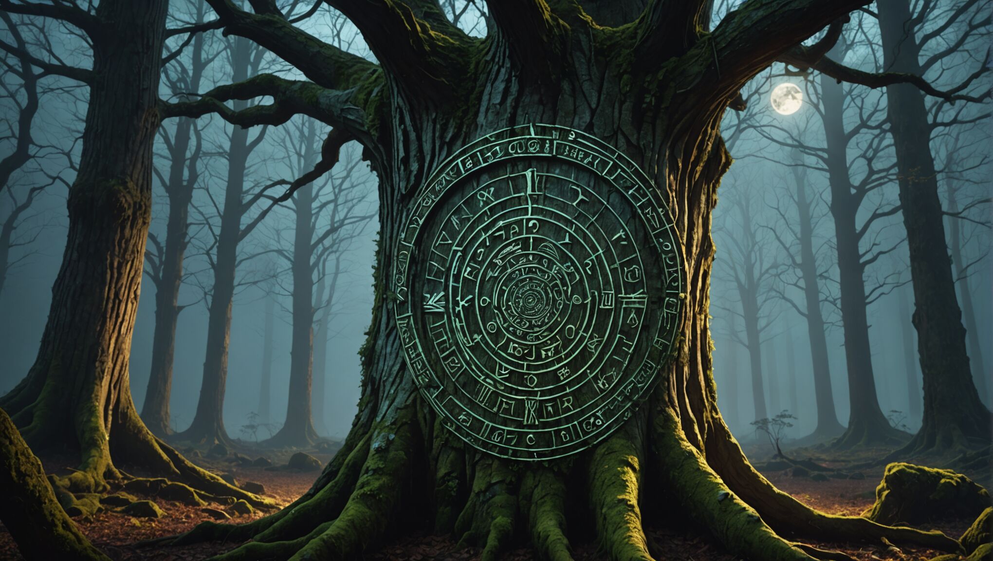
Subtlety is key when incorporating hidden magical motifs into fantasy book covers. These discreet elements can create an intriguing layer of depth, rewarding observant viewers with secret symbols and hidden meanings. One effective technique is to integrate magical patterns into natural textures. For instance, swirling runes could be woven into the bark of a tree, or constellations might form recognizable shapes within a starry sky. These details should be subtle enough to blend seamlessly with the overall design, yet discoverable upon closer inspection.
Another approach is to use negative space creatively. The silhouette of a magical creature or artifact can be formed by the arrangement of other elements in the composition. This technique not only adds an element of mystery but also encourages viewers to engage more deeply with the cover art. For example, the outline of a dragon might be created by the spaces between mountain peaks or the gaps in a forest canopy.
Fractal patterns and sacred geometry can also be incorporated as hidden motifs. These complex, repeating shapes often associated with magic and the cosmos can be subtly integrated into backgrounds or used to form larger images. The Fibonacci spiral, for instance, could be discreetly worked into the flow of a character’s hair or the curl of a wave.
Miniature scenes or vignettes hidden within larger elements of the cover can provide glimpses into the magical world of the story. These could be reflections in water droplets, images contained within crystals, or tiny worlds visible through keyholes or windows. Such details invite the viewer to look closer and discover the magic lurking just beneath the surface.
Optical illusions can be particularly effective in conveying the idea of hidden magic. Designs that can be interpreted in multiple ways or that reveal different images depending on how they’re viewed can create a sense of transformation and enchantment. This could be as simple as a pattern that forms different shapes when rotated or as complex as an illustration that changes entirely when viewed from a different angle.
Incorporating magical symbols or sigils into everyday objects within the cover design is another subtle way to infuse magic into the artwork. A doorknob might bear an ancient rune, or a character’s jewelry could contain hidden alchemical symbols. These details should be integrated naturally, appearing as though they belong in the world of the story rather than being overtly magical.
The use of metallic inks or spot UV coatings can add a literal hidden layer to the cover design. These special finishes can be used to create patterns or symbols that are only visible when the book is tilted at certain angles or under specific lighting conditions, adding an interactive element to the cover that mimics the discovery of hidden magic within the story itself.
By skillfully weaving these hidden magical motifs into fantasy book covers, designers can create artwork that not only captures the essence of the story but also provides an engaging, interactive experience for potential readers. These subtle elements serve to intrigue and delight, hinting at the magical adventures that await within the pages of the book.
Balancing realism and fantasy elements
When designing fantasy book covers, striking the right balance between realism and fantasy elements is crucial for creating a captivating and believable visual narrative. This delicate equilibrium allows readers to connect with familiar aspects while being drawn into the magical world of the story.
One effective approach is to ground fantastical elements in realistic settings. For instance, a dragon might be depicted with anatomically correct features, its scales rendered with photorealistic textures, while soaring over a landscape that adheres to real-world geographical principles. This juxtaposition of the extraordinary with the ordinary creates a sense of wonder and possibility.
Lighting plays a pivotal role in blending realism and fantasy. Natural lighting can be used to illuminate magical elements, giving them a tangible presence within the scene. Conversely, otherworldly light sources can cast realistic shadows, anchoring fantastical beings or objects in a credible environment.
Texture is another powerful tool for balancing these elements. By applying realistic textures to magical creatures or objects, designers can make them feel more substantial and believable. For example, the rough bark of an enchanted tree or the weathered surface of an ancient magical artifact can lend authenticity to fantastical concepts.
Proportion and scale are key considerations when integrating fantasy elements into realistic settings. Maintaining realistic proportions for magical creatures in relation to their surroundings can help viewers accept their presence within the world. Similarly, ensuring that fantastical architecture follows basic structural principles can make even the most imaginative constructions feel plausible.
Color palettes can be strategically employed to distinguish between realistic and fantastical elements while maintaining overall harmony. Realistic elements might be rendered in natural, earthy tones, while magical aspects could feature more vibrant or ethereal hues. The gradual blending of these color schemes can create a seamless transition between the mundane and the magical.
Attention to detail in both realistic and fantastical elements is crucial. Intricate patterns on a wizard’s robe, for instance, can be balanced with the precise rendering of familiar objects like books or candles. This level of detail across both realms helps to unify the composition and maintain visual consistency.
Atmospheric effects can serve as a bridge between realism and fantasy. Mist, fog, or ethereal glows can soften the boundaries between the two, creating an air of mystery that allows the imagination to fill in the gaps.
The use of perspective and composition can guide the viewer’s eye between realistic and fantastical elements, creating a narrative flow that feels natural despite the presence of magical components. Leading lines and focal points can be used to draw attention to key fantasy elements while grounding them in a realistic setting.
By carefully considering these aspects, designers can create fantasy book covers that are both enchanting and credible, inviting readers to step into a world where magic feels like a natural extension of reality.
Typography and fonts for mystical titles
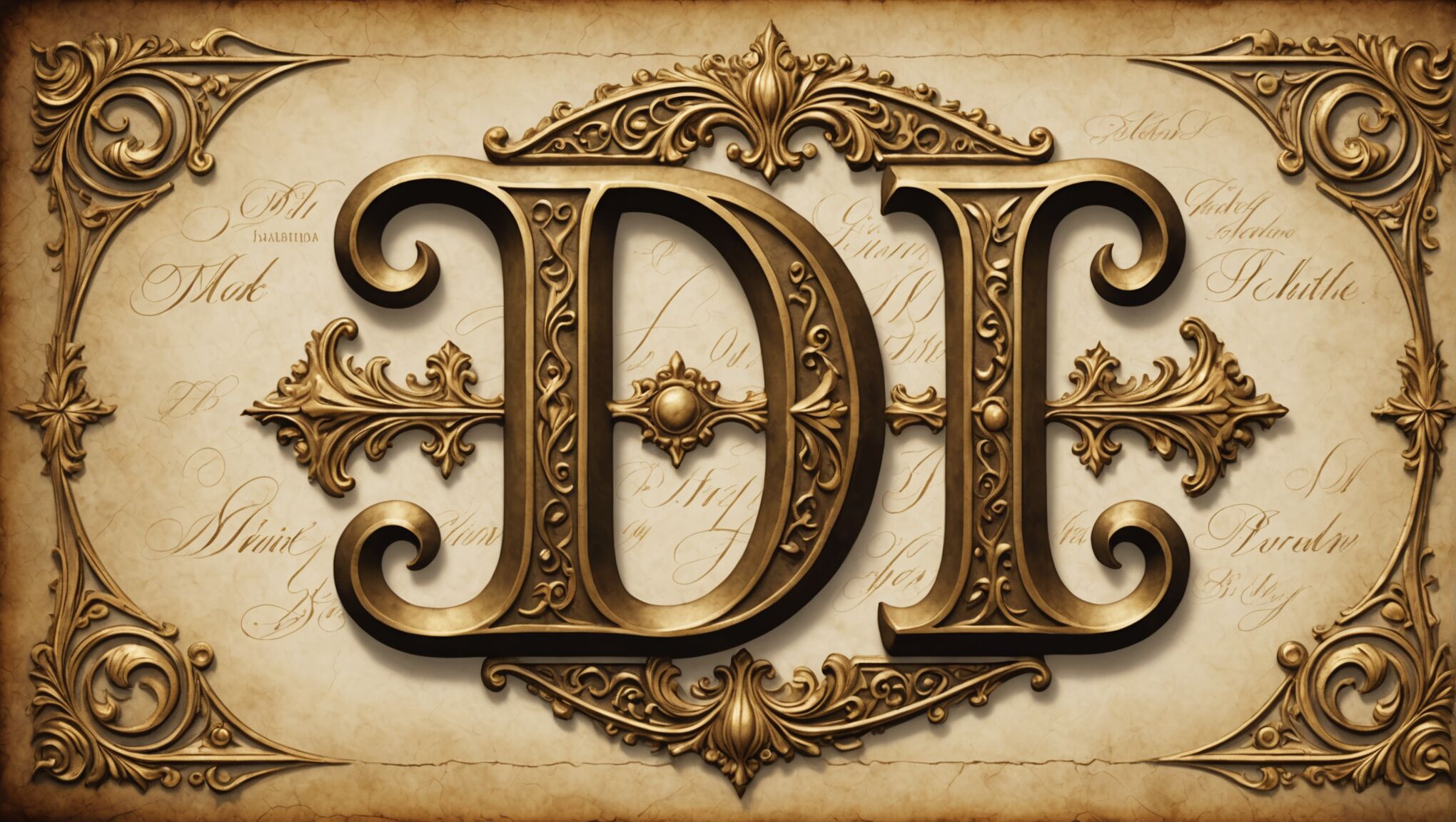 When it comes to typography and fonts for mystical titles, the choice of letterforms can be as powerful as the words themselves in conveying the essence of a fantasy world. Serif fonts often evoke a sense of timelessness and tradition, making them suitable for epic fantasies or stories set in historical magical realms. The intricate details of serifs can be customized to include subtle magical elements, such as small flourishes resembling runes or tiny symbols embedded within the letters.
On the other hand, sans-serif fonts can create a more modern or sleek look, which might be appropriate for urban fantasy or futuristic magical settings. These clean lines can be enhanced with subtle gradients or textures to suggest an otherworldly quality without compromising readability.
Script fonts, when used judiciously, can lend an air of elegance and mystique to a title. They can be particularly effective for stories involving fae, witches, or other magical beings associated with fluid, organic forms. However, it’s crucial to ensure that the chosen script remains legible, as overly ornate designs can detract from the title’s impact.
Custom lettering offers the most flexibility in incorporating magical elements directly into the typography. This approach allows for the creation of unique letterforms that can embody specific magical concepts or creatures from the story. For instance, a letter ‘S’ could be subtly shaped like a serpent, or the letter ‘O’ could contain a miniature portal to another world.
The spacing and arrangement of letters can also contribute to the mystical atmosphere. Kerning can be adjusted to create the illusion of letters floating or being affected by unseen magical forces. Alternating the baseline of characters can suggest a sense of movement or instability, hinting at the dynamic nature of magic within the story.
Incorporating subtle magical symbols or glyphs between letters or as part of ligatures can add an extra layer of mystique to the title. These elements should be designed to complement the overall typography rather than overshadow it.
Make a memorable first impression. Check out the options.
The use of negative space within and around the lettering can be particularly effective in creating magical imagery. Letters could be formed by constellations against a night sky background, or the spaces between characters might reveal hidden scenes or symbols relevant to the story.
Color and texture play crucial roles in enhancing the mystical quality of typography. Metallic or iridescent effects can suggest precious materials or otherworldly substances. Gradients that shift colors in unexpected ways can imply magical transformations or the presence of enchantments.
When considering the overall composition, the relationship between the title typography and other cover elements is paramount. The lettering should interact with illustrations or photographs in ways that enhance the magical atmosphere. For example, magical creatures or elements could be intertwined with the letters, or the typography could appear to be casting shadows or emitting light that affects the surrounding imagery.
Ultimately, the goal is to create typography that not only communicates the title clearly but also serves as a visual gateway into the magical world of the story. By carefully crafting each aspect of the lettering, from the choice of font to the intricate details and arrangements, designers can create titles that captivate readers and set the stage for the enchanting adventures that await within the pages of the book.
Creating depth and dimension in magical scenes
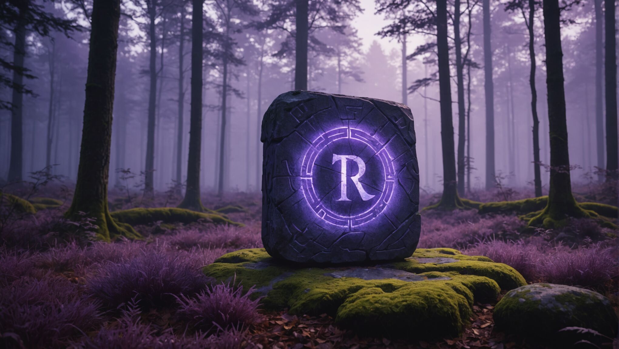
To create depth and dimension in magical scenes for fantasy book covers, artists must employ a variety of techniques that bring the otherworldly to life. Layering is a fundamental approach, where foreground, middle ground, and background elements are carefully arranged to create a sense of space. This can be particularly effective when incorporating magical elements, such as placing a glowing artifact in the foreground against a misty, ethereal background.
Atmospheric perspective plays a crucial role in establishing depth. As objects recede into the distance, they become less distinct and take on the color of the atmosphere. In magical scenes, this effect can be exaggerated to create an enchanted feel. For instance, distant mountains might fade into a purplish haze, suggesting a realm beyond mortal perception.
Lighting is a powerful tool for adding dimension to magical scenes. The interplay of light and shadow can create dramatic contrasts that give form to fantastical elements. Magical light sources, such as glowing runes or mystical fire, can cast unique shadows that interact with the environment in unexpected ways. Rim lighting can be used to outline magical creatures or objects, making them stand out from their surroundings and appear more three-dimensional.
Texture is essential in bringing magical scenes to life. By varying the texture of different elements, artists can create a tactile sense of depth. Smooth, glossy surfaces might be used for magical crystals, while rough, organic textures could represent ancient, enchanted forests. The careful application of texture can make even the most fantastical elements feel tangible and real.
Perspective techniques, such as foreshortening and forced perspective, can be employed to create dynamic compositions that draw the viewer into the magical world. Unusual angles or distorted perspectives can enhance the otherworldly feel of a scene, suggesting that the normal rules of reality don’t apply in this magical realm.
The use of scale can dramatically impact the perception of depth in magical scenes. Juxtaposing elements of vastly different sizes can create a sense of awe and wonder. A tiny fairy floating in the foreground of an enormous, ancient tree can instantly communicate both the magical nature of the scene and its sense of scale and depth.
Reflections and refractions offer unique opportunities to add depth to magical scenes. Mystical portals, shimmering water surfaces, or enchanted mirrors can provide glimpses into other worlds or dimensions, literally adding layers of depth to the composition. These elements can also serve to distort and bend the surrounding environment, reinforcing the magical atmosphere.
Color gradients and transitions can be used to suggest depth and dimension, particularly in scenes with magical atmospheres or ethereal landscapes. Subtle shifts in color can indicate changes in distance or the presence of magical energies, guiding the viewer’s eye through the composition.
Overlap and occlusion are simple yet effective techniques for creating depth. By partially obscuring background elements with foreground objects, artists can establish a clear spatial relationship. In magical scenes, this might involve wisps of enchanted mist partially concealing distant landscapes or magical creatures emerging from behind otherworldly flora.
The strategic use of negative space can enhance the sense of depth in magical scenes. By leaving areas of the composition relatively empty, artists can create a sense of vastness or mystery, allowing the viewer’s imagination to fill in the gaps and reinforcing the magical nature of the scene.

