blog
Designing Fantasy Covers with Limited Text Space
When crafting a captivating fantasy book cover, several crucial elements must come together harmoniously. The centerpiece is often an evocative illustration or image that instantly transports viewers to the magical world within. This visual should encapsulate the essence of the story, whether it’s a lone hero, a mystical creature, or an enchanted landscape. Intricate details and atmospheric effects can further enhance the sense of wonder and mystery. Symbolism plays a vital role, with carefully chosen motifs hinting at the plot or themes without giving too much away. The color palette is equally important, setting the tone and mood of the book while catching the eye of potential readers. Fantasy covers often employ rich, saturated hues or dramatic contrasts to create a sense of otherworldliness. “A great cover is a visual gateway to the imagination,” as many designers often say. Typography is another critical component, with font choices that reflect the genre and complement the overall design. Ornate, hand-drawn lettering or stylized fonts can add to the fantastical feel, while maintaining legibility is paramount. Texture and depth are frequently incorporated through subtle background patterns, magical effects, or the suggestion of different materials like aged parchment or gleaming metal. Finally, negative space should be used strategically to prevent overcrowding and allow the key elements to shine, creating a balanced and visually striking composition that entices readers to pick up the book and dive into its pages.
Working with limited text space
 When designing fantasy book covers with limited text space, it’s crucial to prioritize the most important information while maintaining visual appeal. The author’s name and book title are typically the essential textual elements, and their placement and size must be carefully considered. A common approach is to use a larger, more prominent font for the title, positioning it where it naturally draws the eye, such as the top or center of the cover.
“In design, less is often more. The challenge lies in making every word count,” – Chip Kidd, renowned book cover designer.
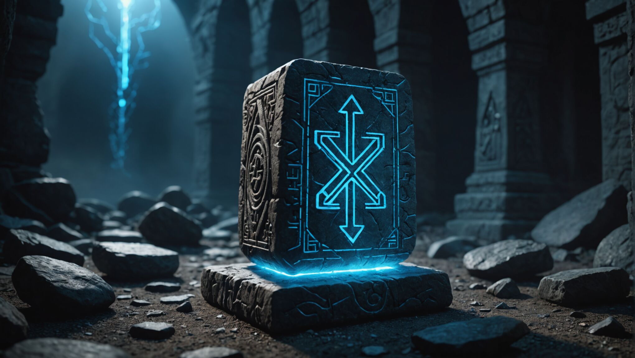
To maximize the impact of limited text, designers often integrate the words into the imagery itself. This can be achieved by having text interact with visual elements, such as wrapping around a magical object or appearing to be carved into stone. Another effective technique is to use negative space creatively, allowing the background image to form letters or create a frame for the text.
Layering is another valuable tool when working with limited space. By placing text on different planes within the image, designers can create depth and hierarchy without cluttering the cover. This might involve subtle shadowing, slight transparency, or even embossing effects to make the text feel like an integral part of the fantastical world depicted.
Abbreviations and simplified subtitles can also help when space is at a premium. For instance, using “Vol. 1” instead of “Volume One” or omitting articles like “The” from titles can free up valuable real estate without losing essential information.
Designers must also consider the spine and back cover as potential spaces for additional text. While the front cover may focus on the title and author, the spine can include series information, and the back cover can house a brief synopsis or review quotes.
Utilizing different font weights and sizes within the same typeface family can create contrast and emphasis without introducing too many competing elements. This approach allows designers to highlight key words or the author’s name while maintaining a cohesive look.
Lastly, it’s important to remember that white space is not wasted space. Allowing breathing room around text elements can actually make them more impactful and easier to read, especially when viewed as thumbnails in online bookstores. By carefully balancing text with imagery and negative space, designers can create covers that are both informative and visually stunning, even with limited text.
Typography techniques for fantasy covers

Selecting the right typography for fantasy book covers is an art form that requires a delicate balance between creativity and readability. Serif fonts often dominate this genre, evoking a sense of tradition and timelessness that aligns well with fantasy themes. Fonts like Trajan, Garamond, or custom-designed serif typefaces can lend an air of elegance and antiquity to a cover. However, sans-serif fonts aren’t off-limits; they can provide a more modern or edgy feel when appropriate for the story’s tone.
Designers frequently employ decorative initials or drop caps for the first letter of titles, drawing inspiration from illuminated manuscripts. This technique not only adds visual interest but also reinforces the fantastical atmosphere. Custom lettering or hand-drawn typography can take this concept further, creating unique letterforms that perfectly match the cover’s illustration and overall mood.
Layering and texturing text can elevate typography from mere words to integral design elements. Applying subtle gradients, bevels, or embossing effects can make titles appear to be forged from metal, carved in stone, or imbued with magical properties. These techniques should be used judiciously to maintain legibility while enhancing the fantasy aesthetic.
Design with your audience in mind. Read our guide.
Contrast is key when working with fantasy cover typography. Pairing a bold, attention-grabbing title font with a more understated choice for the author’s name can create a clear hierarchy. Alternatively, using similar styles for both but varying the size and color can achieve a harmonious yet distinct look.
Integrating typography with imagery is a powerful way to create cohesive designs. Text can be woven into illustrations, emerging from smoke, flowing like water, or shimmering with magical energy. This integration not only saves space but also reinforces the symbiotic relationship between words and visuals in storytelling.
Kerning and tracking deserve special attention in fantasy cover design. Adjusting the space between letters can dramatically affect the mood of the text. Tighter kerning might convey tension or mystery, while looser tracking can suggest an expansive, epic quality. Fine-tuning these aspects ensures that the typography feels purposeful and polished.
Experimenting with vertical or diagonal text placement can add dynamism to a cover, breaking away from traditional horizontal layouts. This approach works particularly well for titles or subtitles, creating visual interest and guiding the eye across the design.
Font pairing is another crucial consideration. Combining a decorative display font for the title with a more readable serif or sans-serif for additional text elements can strike the perfect balance between fantasy flair and functionality. The key is to ensure that the fonts complement each other and the overall design aesthetic.
Designers should consider the scalability of their typography choices. With the rise of e-books and online marketplaces, cover designs must remain legible and impactful when viewed as small thumbnails. Testing typography at various sizes ensures that the cover remains effective across different platforms and formats.
Balancing imagery and text
When designing fantasy book covers, achieving the right balance between imagery and text is crucial for creating a visually appealing and effective design. The imagery should be captivating and representative of the story’s essence, while the text must be clear and legible without overwhelming the visual elements.
One effective approach is to use the rule of thirds, dividing the cover into a 3×3 grid. This helps determine the optimal placement of both imagery and text, ensuring that neither element dominates the composition. For instance, placing the main visual element along one of the grid lines and positioning the title text in the opposite third can create a harmonious balance.
Layering text over imagery can be a powerful technique when done correctly. To maintain readability, designers often use techniques such as adding a subtle gradient or shadow behind the text, or incorporating a semi-transparent overlay between the image and text. This approach allows the text to stand out while still preserving the integrity of the underlying artwork.
Negative space plays a crucial role in balancing imagery and text. By strategically incorporating areas of visual “breathing room,” designers can prevent the cover from feeling cluttered and ensure that both elements have space to shine. This might involve leaving portions of the background unadorned or creating natural breaks in the imagery where text can be placed.
Color contrast is another vital consideration. Selecting text colors that complement the imagery while maintaining high visibility is essential. Sometimes, this might mean using a contrasting color for the text that stands out against the background, or it could involve matching the text color to a prominent hue in the artwork to create cohesion.
| Technique | Purpose |
| Text wrapping | Integrate text with imagery |
| Silhouette text | Create visual interest |
| Texture overlay | Unify text and image |
Designers often use the focal point of the imagery to guide text placement. By aligning text with key visual elements or using the natural flow of the illustration to direct the eye towards the title, a seamless integration between text and image can be achieved.
The size and weight of the text also play a significant role in balancing with imagery. A larger, bolder title might be appropriate for a cover with a simpler or more subdued background, while a cover with intricate artwork might benefit from more delicate typography to avoid competition between elements.
Considering the hierarchy of information is crucial. The title should typically be the most prominent textual element, followed by the author’s name, and then any additional text such as subtitles or series information. This hierarchy should be reflected in the size, placement, and styling of each text element.
Flexibility in design is key, as the balance may need to be adjusted for different formats. What works for a physical book cover might need tweaking for an e-book thumbnail or a promotional banner. Designers should create variations that maintain the essence of the cover while adapting to different aspect ratios and sizes.
By carefully considering these factors and techniques, designers can create fantasy book covers that strike the perfect balance between captivating imagery and essential text, resulting in designs that are both visually stunning and effectively communicative.
Color psychology in fantasy book covers
 Colors have a profound impact on human emotions and perceptions, making them a powerful tool in fantasy book cover design. The right color palette can instantly convey the mood, genre, and themes of a story, drawing readers into the world before they’ve even opened the book.
Deep, rich purples often evoke a sense of mystery and magic, making them popular choices for fantasy covers. They can suggest royalty, power, and the unknown, perfect for tales of sorcery and intrigue. Blues, particularly deeper shades, can represent wisdom, depth, and stability, ideal for epic fantasies or stories set in vast, magical realms.
Vibrant greens can signify nature, growth, and renewal, making them suitable for covers of books featuring forest settings or themes of transformation. Earthy tones like browns and deep reds can ground a fantasy cover, suggesting ancient knowledge or primal forces at work in the story.
Metallic accents, such as gold or silver, can add a touch of luxury and otherworldliness to a cover. These colors catch the light and the eye, hinting at treasure, magical artifacts, or divine intervention within the narrative.
Contrast plays a crucial role in color psychology for fantasy covers. A stark juxtaposition of light and dark colors can create drama and tension, reflecting the conflict within the story. For instance, a bright, fiery orange against a deep, midnight blue can suggest a battle between good and evil or the clash of opposing magical forces.
Designers often use color gradients to create depth and dimension on fantasy covers. A subtle shift from one hue to another can imply transitions between worlds or the blending of different magical elements. This technique can be particularly effective when working with limited text space, as it adds visual interest without cluttering the design.
The saturation and brightness of colors also convey important messages. Highly saturated colors can suggest intensity and passion, while muted tones might indicate a more somber or introspective story. Bright, vivid colors can make a cover pop on the shelf, attracting attention in a crowded marketplace.
Color combinations can evoke specific subgenres within fantasy. Cool blues and silvers might suggest a winter setting or ice magic, while warm oranges and reds could hint at fire magic or desert landscapes. Pastel hues might be used for lighter, more whimsical fantasies, while dark, desaturated colors could indicate a grimdark or horror-tinged fantasy tale.
It’s important to consider cultural associations with colors as well. While red might signify danger or passion in Western cultures, it could represent luck or prosperity in Eastern contexts. Designers must be mindful of these associations when creating covers for global markets.
The psychology of color extends beyond the cover itself to influence how readers perceive the book’s content. A cover with predominantly cool colors might lead readers to expect a more cerebral or introspective story, while warm colors could promise action and adventure.
Ultimately, the most effective use of color in fantasy book covers comes from a deep understanding of the story’s themes, tone, and target audience. By carefully selecting and combining colors, designers can create covers that not only catch the eye but also resonate with the essence of the fantastical worlds within, all while working within the constraints of limited text space.
Creating impact with minimal text

When faced with minimal text space on a fantasy book cover, designers must employ clever techniques to create maximum impact. One effective approach is to integrate the text seamlessly with the cover artwork. This can be achieved by having the title or author’s name emerge from elements in the illustration, such as wisps of smoke, strands of magic, or the texture of a fantastical landscape. By doing so, the text becomes an organic part of the image, saving space while enhancing the overall design.
Utilizing negative space creatively can also make a significant difference. By strategically placing text in areas where the background is less busy, designers can ensure that even minimal text stands out clearly. This might involve positioning the title against a clear sky in the illustration or finding natural breaks in the imagery to insert text elements.
Another powerful technique is to play with scale and perspective. A single, oversized letter from the title can become a focal point of the cover, with the rest of the text scaled down but still legible. This creates visual interest and allows for a bold statement even with limited text. Similarly, using perspective to make the text appear as if it’s receding into the distance or coming forward towards the viewer can add depth to the cover and make the most of the available space.
Designers can also leverage the power of silhouettes and cutouts. By having the text act as a window into the fantasy world depicted on the cover, they can create intrigue and depth. For instance, the title could be cut out from a solid color overlay, revealing glimpses of the detailed artwork beneath. This technique not only saves space but also invites the reader to look closer, enhancing engagement with the cover.
Color and contrast are crucial when working with minimal text. Using a color for the text that stands out sharply against the background can make even small text pop. Alternatively, designers might opt for a more subtle approach, using metallic foils or embossing to add dimension to the text without increasing its size. These tactile elements can create impact through texture and light play, drawing attention even when the text is minimal.
Iconography can be a powerful ally when text space is limited. Small, well-designed icons or symbols related to the story can convey additional information or set the tone without taking up much room. These could represent magical elements, character traits, or key themes from the book, adding layers of meaning to the cover design.
Typography itself can be used creatively to maximize impact. Custom lettering that incorporates fantastical elements, such as dragon scales or magical runes, can turn the text into a piece of art in its own right. This approach allows the text to contribute to the overall aesthetic of the cover while still performing its primary function of conveying information.
Lastly, designers should consider the interplay between the front cover, spine, and back cover. While the front may have limited text, strategic use of the spine for additional information or continuing design elements onto the back cover can create a cohesive and impactful overall design. This holistic approach ensures that every available space is used effectively to create a compelling package that entices readers, even with minimal text on the front cover.

