blog
Designing Covers for High Fantasy vs Low Fantasy Books
The realm of fantasy literature encompasses a wide spectrum, with high fantasy and low fantasy representing two distinct ends. High fantasy typically transports readers to entirely imagined worlds, filled with magical creatures, mythical beings, and epic quests. These stories often feature grand battles between good and evil, with the fate of entire kingdoms or worlds hanging in the balance. “In high fantasy, the impossible becomes possible,” as readers are invited to suspend their disbelief and immerse themselves in fantastical landscapes and extraordinary events.
In contrast, low fantasy incorporates magical or supernatural elements into an otherwise realistic, recognizable world. These stories often take place in familiar settings, with magic existing alongside everyday life. Low fantasy tends to focus on smaller-scale conflicts and personal journeys, rather than world-altering events. The supernatural elements are usually more subtle and limited in scope, creating a sense of wonder within the confines of a recognizable reality. Grounded realism is a key characteristic of low fantasy, as it blends the magical with the mundane in ways that feel believable and relatable to readers.
The narrative scope and worldbuilding approaches differ significantly between these subgenres. High fantasy often requires extensive world-building, with authors creating complex mythologies, languages, and social structures for their imagined realms. Low fantasy, on the other hand, builds upon existing real-world settings, focusing more on character development and the impact of magical elements on everyday life. The tone and themes also vary, with high fantasy leaning towards more epic, heroic narratives, while low fantasy often explores moral ambiguity and the consequences of magical intrusion into ordinary existence.
Character archetypes and plot structures also diverge between high and low fantasy. High fantasy frequently features chosen ones, prophecies, and clearly defined heroes and villains. Low fantasy characters tend to be more morally complex, with protagonists who may be ordinary individuals thrust into extraordinary circumstances. The magic systems in high fantasy are often more elaborate and central to the plot, while in low fantasy, magic may be more subtle or limited, serving as a catalyst for character growth or conflict rather than a primary focus of the story.
Visual elements for high fantasy covers
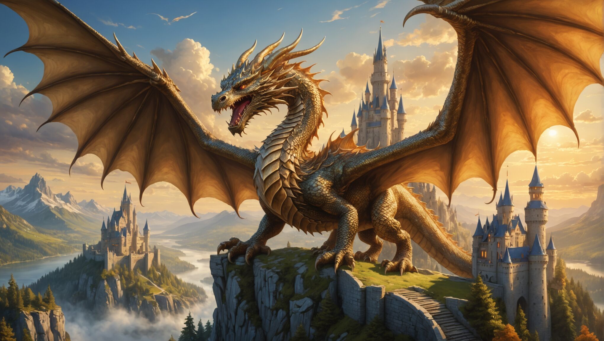 High fantasy book covers serve as portals to extraordinary realms, enticing readers with visual elements that evoke wonder and adventure. These covers often feature sweeping landscapes that showcase the vastness and grandeur of the imagined world. Towering castles, mystical forests, and otherworldly vistas are common backdrops, immediately signaling to readers that they’re about to embark on an epic journey.
Iconic fantasy creatures play a prominent role in high fantasy cover art. Dragons, unicorns, phoenixes, and other mythical beasts are frequently depicted, often in dynamic poses or engaged in dramatic confrontations. These creatures not only capture the imagination but also hint at the magical nature of the story within.
Heroic figures are another staple of high fantasy covers. Protagonists are typically portrayed in heroic stances, wielding magical weapons or displaying supernatural abilities. Their attire and appearance often reflect the unique cultural elements of the fantasy world, with elaborate costumes, armor, and accessories that hint at the richness of the story’s lore.
Magical elements are crucial in conveying the essence of high fantasy. Glowing auras, mystical symbols, and swirling energy effects are commonly used to suggest the presence of powerful magic. These elements can be subtle, like a faint shimmer around a character’s hands, or more overt, such as a dazzling display of arcane power dominating the cover.
“The cover of a fantasy novel is a promise of adventure, a glimpse into a world where anything is possible.” – Michael Whelan, renowned fantasy artist
Symbolism plays a significant role in high fantasy cover design. Emblems, crests, and artifacts featured prominently can represent key factions, prophecies, or plot elements within the story. These symbols not only add visual interest but also provide clues about the narrative’s themes and conflicts.
Atmospheric lighting is a powerful tool in creating a sense of wonder and mystery. Many high fantasy covers employ dramatic lighting effects, such as ethereal glows, ominous shadows, or rays of sunlight breaking through clouds, to enhance the mood and suggest the epic nature of the tale.
Perspective and scale are often manipulated to emphasize the grandiosity of the fantasy world. Covers may feature characters dwarfed by enormous structures or creatures, reinforcing the idea of a vast and awe-inspiring universe. This technique also helps to convey the sense of adventure and the challenges that await the protagonists.
Intricate details and ornate borders are common in high fantasy cover design, reflecting the complexity and richness of the imagined world. These elements can include elaborate filigree work, runic inscriptions, or detailed illustrations of flora and fauna unique to the fantasy setting.
By combining these visual elements, high fantasy book covers create a powerful first impression that promises readers an escape into a world of magic, adventure, and limitless possibilities. The cover becomes not just a protective wrapping for the book, but a visual representation of the wonders that await within its pages.
Crafting atmospheric low fantasy covers
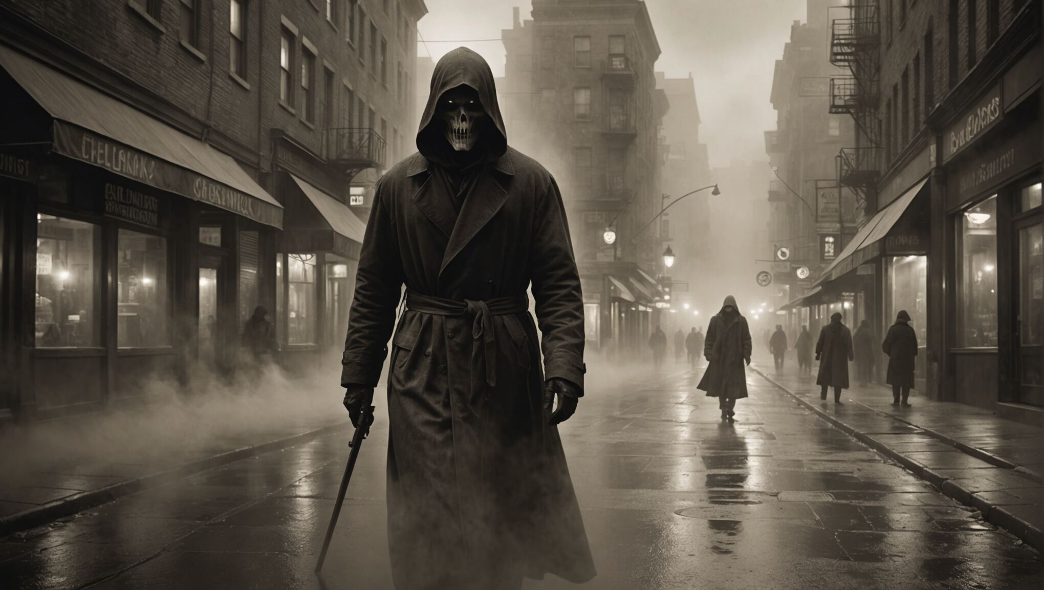
Low fantasy covers require a delicate balance between the ordinary and the extraordinary, crafting an atmosphere that hints at magic lurking just beneath the surface of reality. These covers often feature familiar urban or rural settings, but with subtle elements that suggest something uncanny or supernatural. A dimly lit city street might be the backdrop, with a ghostly figure barely visible in the shadows, or a quaint countryside scene could be subtly distorted to create an air of unease.
Muted color palettes are frequently employed to enhance the atmospheric quality of low fantasy covers. Sepia tones, desaturated hues, and fog effects can create a sense of mystery and ambiguity, reflecting the blurred lines between reality and fantasy that characterize the genre. These subdued colors also help to ground the cover in a more realistic aesthetic, distinguishing it from the vibrant, otherworldly palettes often seen in high fantasy.
Symbolism plays a crucial role in low fantasy cover design, with objects or imagery that carry double meanings. A seemingly ordinary item might be depicted with an unusual glow or placed in an unexpected context, hinting at its magical significance within the story. This approach allows designers to incorporate fantastical elements without breaking the illusion of a recognizable world.
Characters on low fantasy covers are often portrayed in a more grounded, relatable manner. Rather than wielding ornate weapons or donning elaborate costumes, they might appear in contemporary clothing with subtle magical accents. Their expressions and body language can convey a sense of wonder, confusion, or trepidation, reflecting the protagonist’s journey of discovery as they encounter supernatural elements in their otherwise normal lives.
Textural elements are frequently used to add depth and intrigue to low fantasy covers. Weathered surfaces, peeling paint, or cracked stone can suggest the presence of hidden histories or magical undercurrents. These textures not only enhance the visual appeal but also reinforce the idea that magic is interwoven with the fabric of the everyday world.
New to cover design? Get started here.
Negative space is often leveraged effectively in low fantasy cover design to create a sense of mystery and possibility. Large areas of shadow or fog can suggest unseen forces at work, while empty spaces within familiar scenes can imply the presence of invisible entities or parallel realities.
Photographic elements or photo-realistic illustrations are common in low fantasy covers, as they help to establish a connection with the real world. However, these images are often manipulated or combined with illustrated elements to create a subtle sense of the uncanny, blurring the line between photography and fantasy art.
Atmospheric lighting is crucial in setting the mood for low fantasy covers. Soft, diffused light or stark contrasts between light and shadow can create an air of mystery and tension. Moonlight, streetlamps, or the warm glow of windows can be used to dramatic effect, casting eerie shadows or illuminating scenes in unexpected ways.
By carefully blending these elements, designers can craft low fantasy covers that intrigue and unsettle, inviting readers into a world where magic exists just out of sight, waiting to be discovered in the most unexpected places.
Typography choices for fantasy subgenres
Typography plays a crucial role in conveying the essence of different fantasy subgenres, helping to establish the tone and atmosphere of the story before readers even open the book. For high fantasy covers, designers often opt for ornate, serif typefaces that evoke a sense of antiquity and grandeur. These fonts may feature elaborate swashes, ligatures, or decorative elements that mirror the intricate worldbuilding within the pages. Titles are frequently rendered in bold, imposing letterforms, sometimes with metallic or embossed effects to suggest epic stakes and heroic quests.
In contrast, low fantasy covers tend to utilize more contemporary typefaces that bridge the gap between the familiar and the fantastical. Sans-serif fonts or modern serifs with clean lines are common choices, often paired with subtle distortions or texture overlays to hint at the magical elements present in the story. Handwritten or script fonts might be employed to add a personal touch, reflecting the more intimate, character-driven nature of many low fantasy narratives.
Font pairing is another essential consideration in fantasy cover design. High fantasy covers might combine a dramatic display font for the title with a more legible serif for the author’s name and subtitle, creating a hierarchy that emphasizes the epic nature of the story. Low fantasy covers, on the other hand, may opt for more subtle contrasts, using weight variations within the same font family to distinguish between different textual elements.
The placement and integration of typography with cover art also differ between subgenres. High fantasy covers often feature text that interacts with the illustrated elements, such as titles woven into magical energy or emerging from mystical landscapes. Low fantasy covers might take a more restrained approach, with text overlaid on atmospheric backgrounds or integrated into real-world elements like street signs or book spines.
| High Fantasy Typography | Low Fantasy Typography |
| Ornate serif fonts | Modern sans-serif or clean serif fonts |
| Decorative swashes and ligatures | Subtle distortions or texture overlays |
| Bold, imposing letterforms | More understated, contemporary styles |
| Metallic or embossed effects | Matte finishes or subtle gradients |
The scale and proportion of typography on fantasy covers can also signify the subgenre. High fantasy titles often dominate the cover, reflecting the larger-than-life nature of the story. In low fantasy, the title might be more integrated with the overall design, maintaining a balance between the text and visual elements that mirrors the blend of magical and mundane in the narrative.
Color choices for typography are equally important in distinguishing between fantasy subgenres. High fantasy often employs rich, saturated hues or metallic finishes that complement the vibrant cover art. Low fantasy typography might lean towards more muted tones, with occasional pops of color to hint at magical elements.
Designers must also consider the legibility of fonts across various formats, from physical books to thumbnails on digital platforms. While high fantasy covers might have more leeway for elaborate designs, low fantasy typography often prioritizes clarity and readability to appeal to a broader audience.
By carefully selecting and applying typography, designers can create covers that not only capture the essence of different fantasy subgenres but also resonate with their target readership, setting appropriate expectations for the adventures that lie within.
Color palettes and mood in fantasy book design
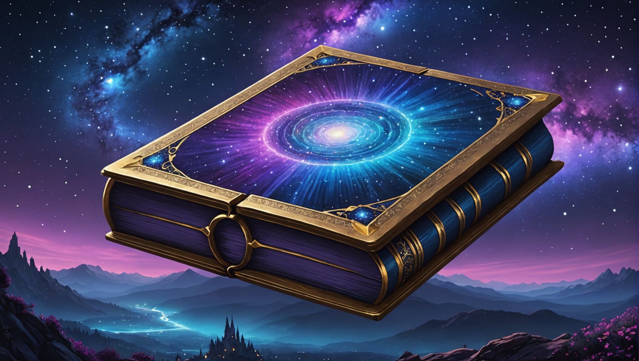 Color plays a pivotal role in establishing the mood and atmosphere of fantasy book covers, acting as a visual shorthand for the story’s tone and themes. In high fantasy, vibrant and saturated colors often dominate the palette, reflecting the larger-than-life nature of the narrative. Rich golds, deep purples, and intense blues can evoke a sense of royalty and magic, while fiery reds and oranges might suggest epic battles or dragon-filled skies. These bold choices immediately signal to readers that they’re about to embark on a grand adventure in an extraordinary world.
Low fantasy covers, in contrast, tend to employ more subdued and naturalistic color schemes. Earthy tones, muted greens, and soft grays can ground the imagery in reality while still allowing for hints of the supernatural. Desaturated colors or sepia tones might be used to create a sense of nostalgia or timelessness, blurring the line between the familiar and the fantastic.
The use of color gradients and light effects can significantly impact the mood of a fantasy cover. High fantasy might feature dramatic lighting, with stark contrasts between light and shadow to create a sense of epic scale and conflict. Glowing auras or magical sparkles in vibrant hues can draw the eye to key elements and emphasize the presence of powerful magic.
In low fantasy design, subtle color shifts and atmospheric effects like mist or fog can add an air of mystery without overtly signaling supernatural elements. Soft, diffused lighting might be used to create an dreamlike quality, suggesting the blending of reality and magic.
Color psychology plays a crucial role in fantasy cover design. Cool blues and greens can evoke a sense of mystery or melancholy, while warm yellows and oranges might suggest adventure or discovery. Dark, moody palettes with splashes of vivid color can create a sense of danger or forbidden knowledge, perfect for darker fantasy tales.
The interplay between colors is just as important as the individual hues chosen. Complementary color schemes can create visual tension and excitement, while analogous palettes can evoke harmony and balance. High fantasy covers might use bold color contrasts to create visual impact, while low fantasy might rely on more subtle tonal variations to build atmosphere.
Texture and finish also contribute to the overall color impact. Metallic accents or glossy effects can enhance the magical feel of high fantasy covers, while matte finishes or weathered textures might better suit the more grounded aesthetic of low fantasy.
As designers and authors consider color choices for fantasy book covers, they should think beyond mere aesthetics. How do the chosen colors reflect the emotional journey of the characters? What cultural or symbolic meanings might certain hues carry within the story’s context? By carefully considering these factors, creators can craft color palettes that not only catch the eye but also resonate deeply with the essence of their fantasy worlds.
Remember, the most effective fantasy book covers use color as a storytelling tool, inviting readers to explore new realms and igniting their imagination before they’ve read a single word. As you encounter fantasy books in the wild, take a moment to analyze their color choices. What do they tell you about the story within? How do they make you feel? This awareness can deepen your appreciation for the artistry behind fantasy cover design and perhaps inspire your own creative endeavors.
Balancing realism and imagination in cover art
Creating an effective fantasy book cover requires a delicate balance between realism and imagination, regardless of whether it’s for high or low fantasy. This balance is crucial in capturing the essence of the story while also appealing to the target audience. For high fantasy covers, the challenge lies in making the impossible seem plausible, while low fantasy covers must subtly hint at magical elements within a recognizable world.
In high fantasy cover design, artists often incorporate realistic details into fantastical scenes to ground them in a sense of believability. For example, a dragon might be rendered with intricate scales and musculature that adheres to real-world anatomy, even if the creature itself is mythical. Landscapes, while otherworldly, may follow natural principles of light and shadow, creating a sense of depth and realism that helps viewers connect with the imaginary world.
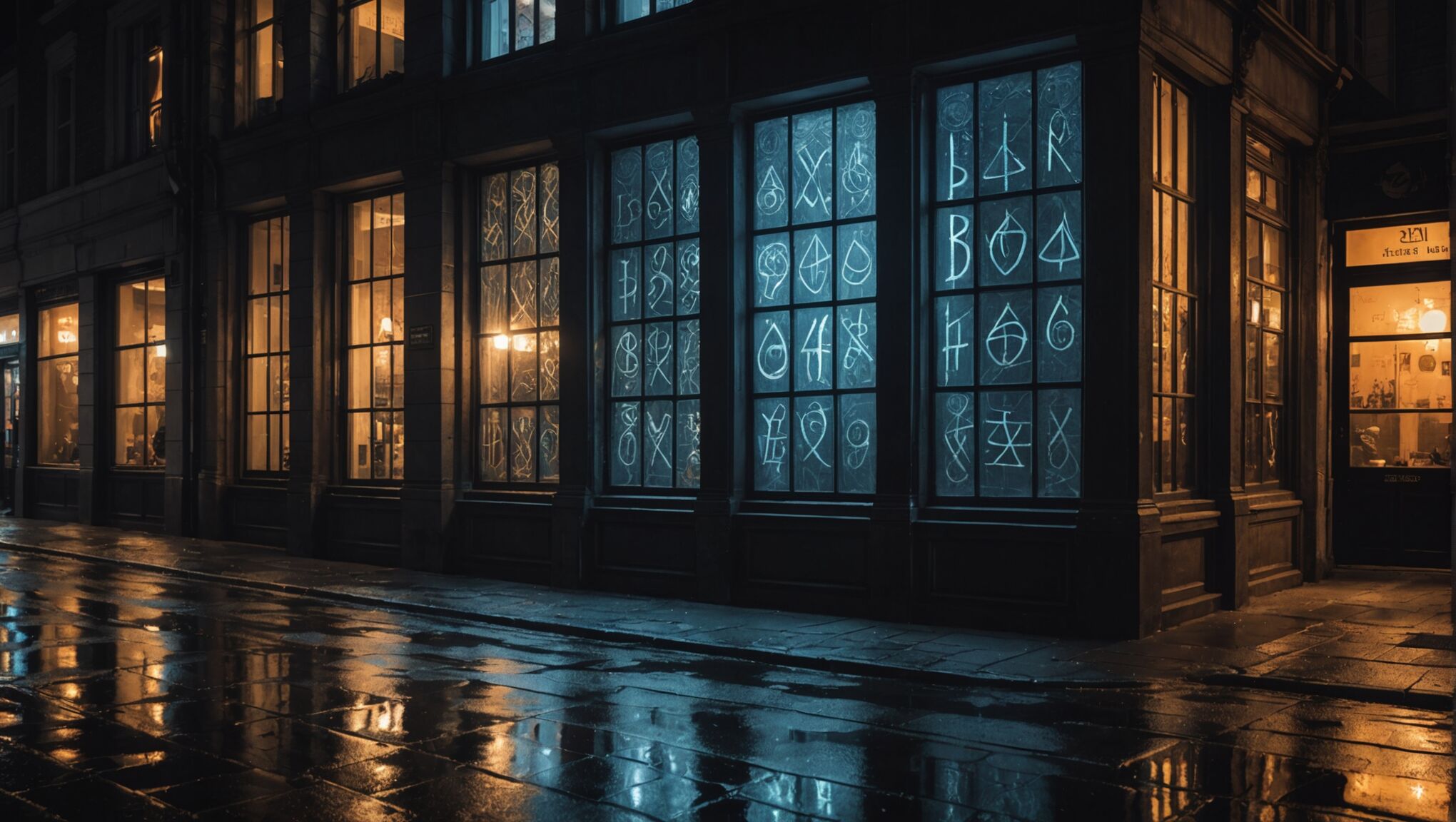
Conversely, low fantasy covers require a more nuanced approach. The goal is to depict familiar settings with just a touch of the extraordinary. This might involve using photorealistic techniques to render an urban landscape, but with subtle magical elements woven in. For instance, a street scene might include a shopfront with mystical symbols barely visible in the window reflection, or a character casting a shadow that doesn’t quite match their human form.
Texture plays a significant role in balancing realism and imagination. High fantasy covers might use hyper-detailed textures for fantastical elements, making them feel tangible and real. In low fantasy, familiar textures might be slightly altered or given an unusual sheen to suggest magical properties. The key is to maintain a level of familiarity while introducing elements that spark curiosity and wonder.
Lighting is another crucial tool in this balancing act. High fantasy covers often employ dramatic, otherworldly lighting effects that, while fantastical, still adhere to basic principles of how light behaves. This creates a sense of realism within the fantasy context. For low fantasy, subtle lighting anomalies can suggest the presence of magic without overtly breaking from reality. A soft, inexplicable glow or shadows that fall in unexpected ways can create an air of mystery and magic.
Character design is particularly important in striking this balance. High fantasy characters, while potentially non-human or possessing magical attributes, should still display relatable emotions and body language. This human connection helps readers relate to even the most fantastical beings. In low fantasy, characters might appear entirely ordinary at first glance, with magical elements subtly incorporated into their design, such as eyes that shimmer unnaturally or clothing that seems to move of its own accord.
Color palettes can significantly impact the balance between realism and imagination. High fantasy covers might use vibrant, saturated colors that don’t typically occur in nature, but apply them in a way that feels cohesive and believable within the context of the imaginary world. Low fantasy covers often stick to more naturalistic color schemes, with occasional pops of unusual color to hint at magical elements.
Ultimately, the goal is to create a cover that intrigues and invites curiosity, regardless of the fantasy subgenre. By carefully blending realistic elements with imaginative ones, designers can create covers that not only accurately represent the story within but also capture the imagination of potential readers, drawing them into the unique world that awaits them beyond the cover.

