blog
Creating Unique Fantasy Covers for Self-Published Authors
Crafting an eye-catching fantasy book cover requires a delicate balance of several key elements. At the forefront is a captivating central image or character that immediately draws the reader’s attention and conveys the essence of the story. This could be a heroic figure, a mythical creature, or a symbolic object that represents the core theme of the book. Equally important is the background, which sets the tone and atmosphere of the fantasy world. Whether it’s a misty forest, a towering castle, or a starry night sky, the background should complement and enhance the main focal point. “The cover is a visual doorway into your story,” as many designers often say.
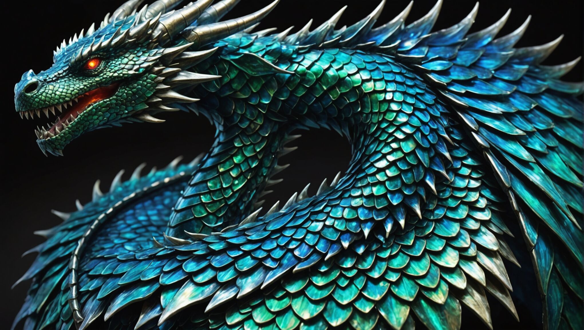
Lighting plays a crucial role in fantasy cover design, often used to create dramatic effects, highlight important elements, or convey a sense of magic or mystery. Clever use of light and shadow can add depth and dimension to the cover, making it more visually appealing. Textures are another vital component, helping to bring the fantastical elements to life. Whether it’s the scales of a dragon, the rough bark of an ancient tree, or the intricate details of a magical artifact, textures add richness and realism to the design.
Color schemes are instrumental in setting the mood and genre expectations. Bold, vibrant colors might suit a high fantasy adventure, while darker, moodier tones could be perfect for a grimdark tale. The composition of these elements is crucial, guiding the viewer’s eye across the cover and creating a harmonious overall design. Finally, typography is an often underestimated element that can make or break a cover. The font choice, size, and placement of the title and author name should complement the visual elements while remaining clearly legible, even at thumbnail size.
Choosing the right imagery
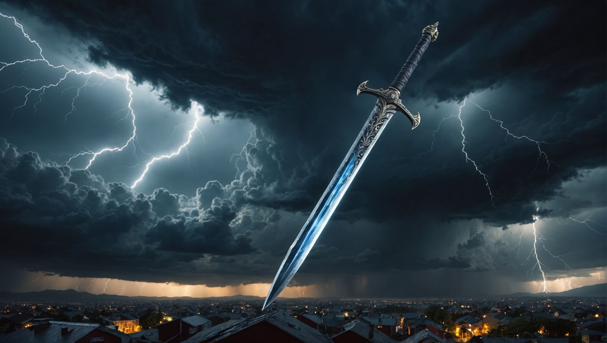 When selecting imagery for a fantasy book cover, it’s crucial to choose visuals that not only capture the essence of your story but also resonate with your target audience. The right image can instantly convey the subgenre, tone, and themes of your book, enticing potential readers to pick it up or click on it.
Consider iconic symbols or elements that are central to your narrative. For instance, if your story revolves around a magical sword, featuring it prominently on the cover can create intrigue. Similarly, if your tale features unique creatures or races, showcasing them can immediately set your book apart from others in the genre.
“A picture is worth a thousand words, but a book cover is worth a thousand sales.” – Unknown
Landscapes can be powerful in fantasy cover design, especially when they represent a key setting in your book. A mysterious forest, a foreboding castle, or a sprawling magical city can all serve as excellent backdrops that hint at the world within your pages. However, be cautious not to overcrowd the cover with too many elements, as this can make it difficult for viewers to focus on the main subject.
Character-focused covers are particularly popular in fantasy, as they allow readers to connect with the protagonist before even opening the book. When featuring characters, consider their most distinctive traits or pivotal moments from the story. A warrior poised for battle, a sorceress wielding her magic, or a group of diverse adventurers can all make for compelling imagery.
It’s also important to consider the emotional tone you want to convey. Dark, shadowy imagery might suit a grim tale of survival, while bright, vibrant visuals could better represent a lighthearted adventure. The imagery should align with the mood and themes of your story to avoid misleading potential readers.
When selecting or creating imagery, keep in mind the technical aspects as well. The image should be high-resolution and scalable, as it will need to look good both as a physical book cover and as a small thumbnail on online bookstores. Ensure that the main elements of the image are clearly visible even when reduced in size.
Lastly, while it’s important to draw inspiration from successful fantasy covers, strive for originality. Unique, eye-catching imagery can help your book stand out in a crowded marketplace. Consider combining unexpected elements or putting a fresh spin on familiar fantasy tropes to create a cover that is both genre-appropriate and distinctively yours.
Color palettes for fantasy genres
Color plays a vital role in setting the mood and expectations for different fantasy subgenres. For epic fantasy, rich, vibrant colors like deep reds, royal blues, and gleaming golds often dominate, evoking a sense of grandeur and adventure. These bold hues can represent the high stakes and larger-than-life elements typical of the subgenre. In contrast, urban fantasy might lean towards cooler, more modern palettes, incorporating sleek silvers, neon accents, and darker backgrounds to reflect the contemporary settings and often grittier storylines.
Dark fantasy and grimdark novels tend to favor moodier, desaturated color schemes. Deep purples, smoky grays, and shadowy blacks can create an atmosphere of foreboding and mystery. Splashes of blood red or sickly green might be used for emphasis, heightening the sense of danger or supernatural elements. On the other hand, whimsical or young adult fantasy often embraces brighter, more playful color combinations. Pastel shades, teal blues, and warm oranges can convey a sense of magic and wonder, appealing to readers seeking lighter, more enchanting tales.
Use symbolism to deepen your cover design. Read more here.
Historical or medieval fantasy covers frequently draw inspiration from illuminated manuscripts and heraldry. Rich jewel tones like emerald green, sapphire blue, and amethyst purple, often paired with metallic accents, can evoke a sense of ancient lore and nobility. For fantasies set in specific cultural contexts, color palettes might be chosen to reflect those influences. For instance, a fantasy inspired by East Asian mythology might incorporate auspicious reds and golds, while a Norse-inspired tale could feature icy blues and earthy browns.
The use of color gradients and overlays can add depth and visual interest to fantasy covers. A subtle shift from warm to cool tones can create a sense of transition or magic, while a gradient overlay can unify disparate elements of a complex cover design. Complementary colors, when used judiciously, can create striking contrasts that draw the eye and emphasize key elements of the cover art.
It’s important to consider how colors will interact with typography and other design elements. High-contrast color combinations can ensure that titles and author names remain legible, even when overlaid on complex imagery. Additionally, the emotional associations of different colors can be leveraged to reinforce the themes of the book. For example, the use of green in a fantasy cover might suggest themes of nature, growth, or envy, depending on the specific shade and context.
Ultimately, while certain color palettes are often associated with specific fantasy subgenres, there’s always room for innovation. Unexpected color choices can help a cover stand out in a crowded marketplace, as long as they still resonate with the book’s content and target audience. The key is to strike a balance between genre expectations and unique, eye-catching design that captures the essence of the story within.
Typography and title placement
Selecting the right typography and placing the title effectively are crucial aspects of creating a compelling fantasy book cover. The font choice should not only be visually appealing but also convey the tone and atmosphere of the story. For epic fantasies, ornate serif fonts with flourishes can evoke a sense of grandeur and ancient lore. In contrast, urban fantasy might benefit from sleek, modern sans-serif typefaces that reflect a contemporary setting.
The size and weight of the font are equally important. The title should be large enough to be easily readable, even in thumbnail format, without overwhelming the cover art. Bold, heavy fonts can convey strength and adventure, while lighter, more delicate typefaces might suit romantic or whimsical fantasy tales.
Consider the following font styles for different fantasy subgenres:
| Fantasy Subgenre | Suggested Font Styles |
| Epic Fantasy | Gothic, Blackletter, Ornate Serif |
| Urban Fantasy | Modern Sans-serif, Grunge, Handwritten |
| Dark Fantasy | Distressed, Spooky, Textured |
| Young Adult Fantasy | Playful Script, Rounded Sans-serif |
The placement of the title is equally crucial. It should be positioned to complement the cover art without obscuring important visual elements. Common placements include the top third of the cover, centered, or aligned to one side. For added visual interest, consider integrating the title with the artwork, such as having it appear to be part of a magical spell or carved into stone.
Contrast is key when it comes to title visibility. Ensure that the font color stands out against the background. This might involve adding a drop shadow, outer glow, or even a semi-transparent overlay behind the text to improve legibility.
For series books, maintaining consistency in typography across covers is important for brand recognition. However, subtle variations in color or effects can help distinguish individual titles while maintaining a cohesive look.
Don’t forget about the author’s name. While it’s typically smaller than the title, it should still be clearly visible. For established authors, a larger font size for the name might be appropriate to capitalize on their recognition.
Experimenting with typography effects can enhance the fantasy feel. Metallic or glowing text effects can suggest magic or otherworldly elements. Texture overlays, such as a parchment or stone texture, can add depth and reinforce the fantasy setting.
Lastly, consider the overall balance of the cover. The typography should work in harmony with the imagery, creating a cohesive design that draws the eye and conveys the essence of the story at a glance.
Creating depth and atmosphere
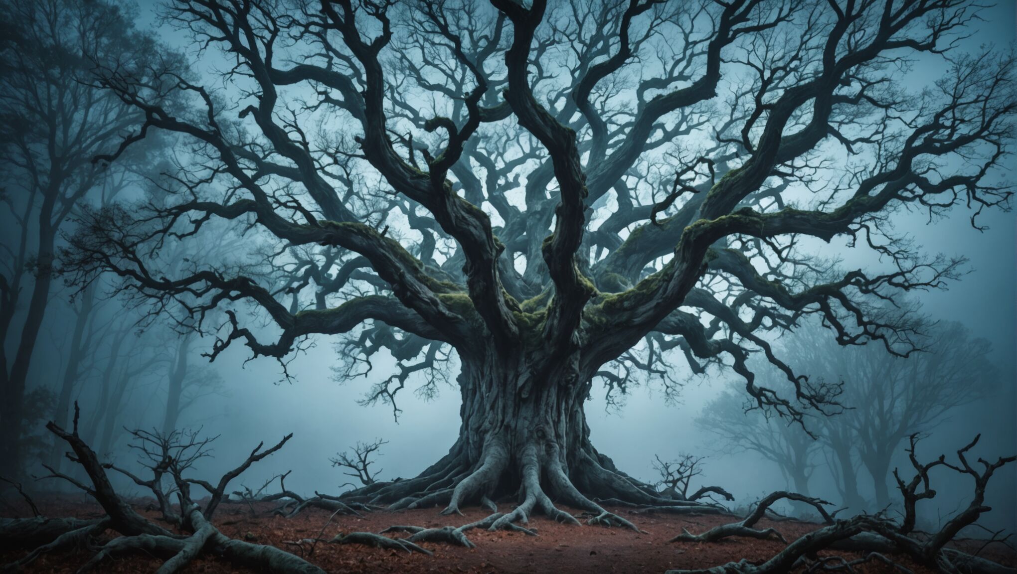 To create depth and atmosphere in a fantasy book cover, consider employing various visual techniques that can transform a flat image into a captivating, three-dimensional world. Start by utilizing layering, where foreground, middle ground, and background elements are carefully arranged to create a sense of space and distance. This can be achieved by overlapping objects, varying their sizes, and adjusting their level of detail.
Lighting plays a crucial role in establishing atmosphere and depth. Experiment with dramatic lighting effects such as chiaroscuro, where strong contrasts between light and dark areas create a sense of volume and mystery. Backlighting can silhouette characters or objects, adding an air of intrigue, while soft, diffused lighting can evoke a dreamlike quality.
Atmospheric perspective is another powerful tool. As objects recede into the distance, they become less distinct, their colors less saturated, and their outlines softer. This natural phenomenon can be exaggerated in fantasy covers to create a sense of vast, magical landscapes or to shroud distant elements in mystery.
Texture plays a significant role in adding depth and realism to fantasy covers. Incorporate a variety of textures – from the rough bark of ancient trees to the smooth scales of a dragon – to engage the viewer’s sense of touch visually. Subtle gradients and color variations can also add depth, especially when used to create the illusion of light falling across curved surfaces.
Consider the use of visual devices like mist, smoke, or magical energy to add layers of depth and intrigue. These elements can partially obscure background details, creating a sense of the unknown and inviting the viewer to imagine what lies beyond.
Perspective and composition are key in guiding the viewer’s eye through the cover. Use leading lines, such as winding paths or beams of light, to draw attention to important elements. Asymmetrical compositions can create tension and visual interest, while symmetry can evoke a sense of balance and power.
Color temperature can significantly impact the mood and depth of a cover. Warm colors tend to advance towards the viewer, while cool colors recede, creating a natural sense of depth. Utilize this principle to emphasize certain elements or create a specific atmosphere.
Don’t underestimate the power of negative space. Strategically placed empty areas can provide contrast, focus attention on key elements, and create a sense of vastness or isolation that’s often present in fantasy worlds.
Finally, consider the emotional impact of your design choices. The depth and atmosphere you create should align with the tone of your story. A cover for a lighthearted adventure might use bright, open spaces and clear sight lines, while a dark fantasy could employ shadows, confined spaces, and obscured details to create tension and unease.
By skillfully combining these techniques, you can create a fantasy book cover that not only captures the eye but also invites the viewer to step into a rich, immersive world. Remember, the goal is to create a visual experience that resonates with the essence of your story and leaves a lasting impression on potential readers.
Tools and resources for DIY cover design

For self-published authors looking to create their own fantasy book covers, there are numerous tools and resources available. One of the most popular options is Canva, a user-friendly graphic design platform that offers a wide range of templates, stock images, and design elements specifically tailored for book covers. Its intuitive interface makes it accessible even for those with limited design experience.
Adobe Photoshop remains the industry standard for professional-grade image editing and design. While it has a steeper learning curve, it offers unparalleled flexibility and control over every aspect of the cover design. For those seeking a middle ground, GIMP is a free, open-source alternative that provides many of Photoshop’s features.
Stock image websites like Shutterstock, Adobe Stock, and Unsplash are invaluable resources for finding high-quality imagery to use in cover designs. Many of these sites offer royalty-free images, but it’s crucial to carefully read the licensing terms to ensure proper usage.
For typography, websites like DaFont, Google Fonts, and Font Squirrel offer a vast selection of free and premium fonts suitable for fantasy book covers. When choosing fonts, ensure they are licensed for commercial use.
3D rendering software like Blender can be a powerful tool for creating unique fantasy elements or entire scenes from scratch. While it requires more technical skill, it allows for complete customization of visual elements.
Online communities and forums such as DeviantArt, ArtStation, and Reddit’s r/fantasyartists can be excellent places to find inspiration, connect with artists, and even commission custom artwork for covers.
For those who prefer a more guided approach, online courses on platforms like Udemy and Skillshare offer comprehensive tutorials on book cover design, often with a focus on specific genres like fantasy.
Color palette generators such as Coolors and Adobe Color can help in selecting harmonious color schemes that align with the mood and genre of the book.
Lastly, mockup generators like Covervault allow authors to visualize how their cover designs will look on actual books, both in physical and digital formats, helping to refine the final product.

