blog
Creating Fantasy Covers that Transport Readers to New Worlds
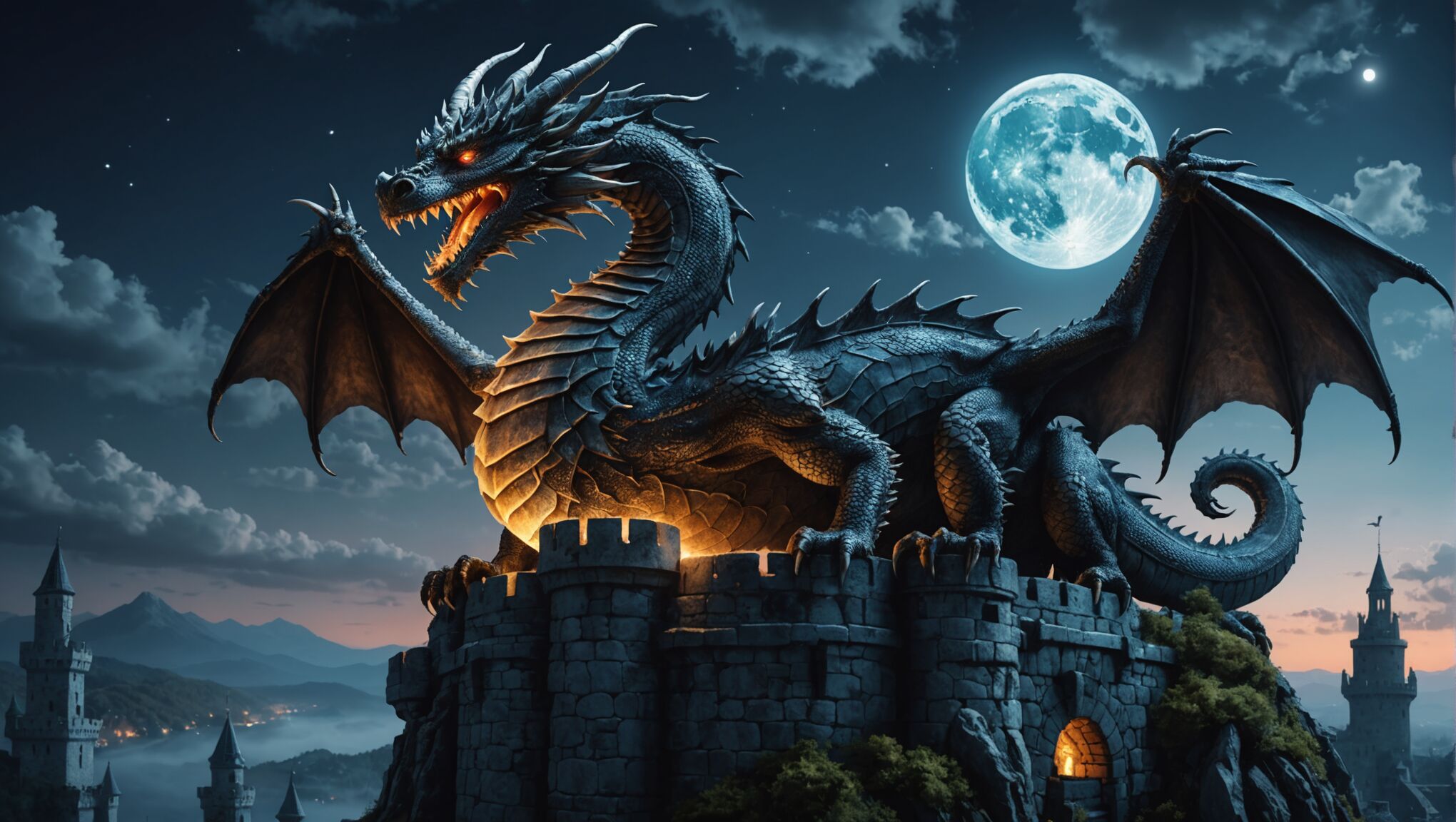
A truly captivating fantasy book cover serves as a portal, inviting readers to step into a world of wonder and adventure. “The cover is a promise,” and for fantasy novels, this promise must be both enticing and authentic to the story within. Central characters often take center stage, their expressions and poses hinting at the epic journey that awaits. Magical elements, such as glowing amulets, swirling mists, or ethereal creatures, can immediately signal the fantastical nature of the tale. Landscapes play a crucial role, whether it’s a looming castle silhouetted against a stormy sky or a lush, otherworldly forest teeming with hidden mysteries. Atmosphere is key in fantasy cover design, with lighting and color choices setting the tone for the entire work. A sense of scale and grandeur can be achieved through dramatic perspectives or the juxtaposition of small figures against vast, awe-inspiring backdrops. Intricate details, such as ornate borders or subtle magical symbols, reward closer inspection and hint at the depth of the world inside. The title treatment itself becomes an integral part of the artwork, often incorporating fantastical elements or custom lettering that reinforces the genre. Ultimately, a successful fantasy cover should leave potential readers with a sense of curiosity and a burning desire to open the book and discover the wonders that lie within.
Choosing the right color palette
 Color plays a pivotal role in creating the right atmosphere and emotional resonance for a fantasy book cover. The chosen palette can instantly convey the mood, setting, and even the subgenre of the story. Warm, golden hues might evoke a sense of ancient magic and epic quests, while cool blues and purples can suggest mystery and otherworldliness. Vibrant, saturated colors often work well for young adult fantasy, capturing the energy and excitement of coming-of-age adventures. In contrast, muted, earthy tones can ground high fantasy in a sense of historical authenticity.
“Color is a power which directly influences the soul.” – Wassily Kandinsky
Consider the symbolism associated with different colors. Deep reds might represent passion, danger, or royalty, while greens can suggest nature, growth, or envy. Black, often used for shadows or negative space, can create drama and emphasize lighter elements. White or silver can represent purity, magic, or celestial themes.
Contrasting colors can be used to create visual interest and draw the eye to important elements of the cover. A pop of bright color against a largely monochromatic background can instantly highlight a crucial magical artifact or character. Gradients and color overlays can add depth and dimension, creating the illusion of magical light sources or atmospheric effects.
Create stunning covers without breaking the bank. Check it out today.
It’s also important to consider how colors will appear in different formats. What looks stunning in a large, printed hardcover may not have the same impact as a small thumbnail image online. Testing color combinations in various sizes and on different devices can ensure the cover remains effective across all platforms.
Ultimately, the color palette should harmonize with the book’s content. A dark, brooding fantasy might call for deep, saturated colors, while a lighthearted magical romp could benefit from a brighter, more playful scheme. By carefully selecting and combining colors, designers can create a visual shorthand that instantly communicates the essence of the fantasy world within, enticing readers to embark on the adventure that awaits.
Incorporating symbolic imagery

Symbolic imagery serves as a powerful tool in fantasy cover design, offering a visual shorthand that can convey complex themes, foreshadow plot elements, and evoke emotional responses. Ancient symbols like the ouroboros or the tree of life can instantly imbue a cover with a sense of timeless mythology. Alchemical symbols might hint at magical systems or transformative journeys within the story. Natural elements such as mountains, rivers, or celestial bodies often carry deeper meanings, representing obstacles, life forces, or cosmic influences.
Animal imagery is particularly potent in fantasy, with creatures like dragons, phoenixes, or wolves serving as emblems of power, rebirth, or primal instincts. Even more subtle choices, like a raven perched on a sword, can speak volumes about the story’s tone and themes. Artifacts and objects can also function as powerful symbols – a broken crown might suggest a fallen kingdom, while an ancient map could promise adventure and hidden treasures.
The arrangement of symbolic elements on the cover can create additional layers of meaning. Symmetry might suggest balance or duality, while asymmetrical designs can convey tension or dynamism. The scale and positioning of symbols can also influence their impact – a tiny key placed in a corner might hint at secrets, while a dominant, centrally placed symbol demands immediate attention.
It’s crucial to strike a balance between obvious symbolism and subtlety. While some symbols should be immediately recognizable to draw in readers, others can be more nuanced, rewarding closer inspection and multiple viewings. This layered approach can create a cover that continues to reveal new details and meanings even after the book has been read.
When incorporating symbolic imagery, designers must also consider cultural context. Symbols can have different meanings across cultures, and what might be powerful in one market could be confusing or even offensive in another. Research and sensitivity are key to ensuring that the chosen symbols resonate positively with the intended audience.
Ultimately, the most effective use of symbolic imagery on a fantasy cover creates a visual puzzle that intrigues potential readers, giving them just enough information to spark their curiosity without revealing too much. When done well, these symbols become a silent language between the book and the reader, promising a rich, multilayered story waiting to be discovered within the pages.
Typography and font selection
The choice of typography and font selection plays a crucial role in creating a cohesive and captivating fantasy book cover. The right font can instantly convey the tone, era, and style of the story, while also ensuring readability across various formats.
For fantasy titles, custom lettering or highly stylized fonts are often favored to create a unique and memorable visual identity. These can range from ornate, calligraphic styles reminiscent of medieval manuscripts to more modern, edgy designs for contemporary urban fantasy. The key is to select a font that complements the overall aesthetic of the cover while remaining legible, even when scaled down to thumbnail size.
Consider the following aspects when choosing typography for a fantasy cover:
1. Mood and Atmosphere: Serif fonts often evoke a sense of tradition and timelessness, making them suitable for classic or high fantasy. Sans-serif fonts can feel more modern, fitting for contemporary or sci-fi-tinged fantasy. Script fonts can add elegance or whimsy, depending on their style.
2. Legibility: While decorative fonts can be attractive, they must be balanced with readability. The title should be easily discernible at a glance, even in small sizes.
3. Contrast: Ensure the font color and weight stand out against the background imagery. Consider using effects like drop shadows, outlines, or glows to improve visibility.
4. Hierarchy: If including subtitles or author names, use different font sizes, weights, or styles to create a clear visual hierarchy.
5. Thematic Fit: Some fonts can directly reference elements of the story. For instance, a font with leaf-like serifs might suit a forest-based fantasy, while one with sharp, angular letters could evoke ice or crystals.
6. Cultural and Historical Accuracy: If the fantasy world is based on a specific historical period or culture, choose fonts that reflect those influences accurately.
7. Flexibility: Consider how the font will appear across different formats, from large hardcover prints to small digital thumbnails.
Here’s a table showcasing some popular font styles for different fantasy subgenres:
| Fantasy Subgenre | Font Style | Example |
| Epic/High Fantasy | Ornate Serif | Aniron, Luminari |
| Urban Fantasy | Modern Sans-serif | Bebas Neue, Futura |
| Whimsical Fantasy | Playful Script | Candy Script, Fontleroy Brown |
| Dark Fantasy | Gothic or Distressed | Ravenscroft, Blackmoor |
It’s also worth considering custom lettering or modifications to existing fonts to create a truly unique title treatment. This can involve adding flourishes, textures, or integrating magical elements directly into the letterforms.
Remember that typography should work in harmony with the other elements of the cover design. The font should complement, not compete with, the imagery and color palette. When done right, the typography becomes an integral part of the cover art, enhancing the overall impact and drawing readers into the fantastical world promised within the pages.
Balancing realism and magic
 Creating a balance between realism and magic is a delicate art that can elevate a fantasy book cover from good to extraordinary. This balance is crucial in capturing the essence of the story and enticing readers who are looking for that perfect blend of the familiar and the fantastical.
Realism grounds the fantastical elements, making them more believable and relatable to the reader. It provides a point of reference, allowing the audience to connect with the world on a deeper level. This might be achieved through detailed, lifelike textures in clothing or landscapes, or through accurate portrayal of human emotions in character expressions.
On the other hand, magical elements are what set fantasy apart. They create wonder and intrigue, promising readers an escape from the mundane. These can be subtle, like an otherworldly glow or impossible flora, or more overt, such as mythical creatures or visible manifestations of magic.
The key lies in finding the sweet spot where these elements intertwine seamlessly. Consider a cover where a realistically rendered medieval castle is juxtaposed against a sky filled with floating islands. The castle provides a familiar anchor, while the islands immediately signal that this world operates under different rules.
Lighting plays a crucial role in this balancing act. Natural light sources can be used to illuminate realistic elements, while magical light – perhaps in unusual colors or with impossible properties – can highlight the fantastical aspects. This creates a visual hierarchy that guides the eye and emphasizes the interplay between the real and the magical.
Texture is another powerful tool. Highly detailed, tactile textures can lend realism to fantastical elements, making them feel more tangible and believable. Conversely, giving realistic objects a slightly ethereal quality can hint at hidden magic within the mundane.
Color saturation and palette choices can also help strike this balance. More naturalistic colors might be used for realistic elements, while bolder, more vibrant hues can signify magical aspects. The transition between these color schemes can create areas of visual interest where reality and fantasy meet.
It’s important to consider the expectations of the target audience. Some readers prefer a heavier emphasis on realism with just a touch of magic, while others seek out covers that are dominated by fantastical elements. Understanding the specific subgenre and readership can guide decisions on where to place the balance.
Ultimately, the goal is to create a cover that feels both grounded and wondrous, inviting readers into a world that is at once familiar and extraordinary. This balance should reflect the tone and content of the book itself, serving as a visual promise of the adventure that awaits within its pages.
As you contemplate these ideas, consider how different fantasy worlds might approach this balance. How might a cover for a low-fantasy historical novel differ from one set in a completely imagined realm? What visual cues could signal the level of magic present in the story? By exploring these questions, designers and authors can create covers that not only capture attention but also accurately represent the unique blend of realism and magic within their stories.
Designing for different fantasy subgenres
Different fantasy subgenres require unique approaches to cover design, as each has its own set of conventions, themes, and reader expectations. For epic fantasy, covers often feature sweeping landscapes, mythical creatures, and heroic figures. These designs tend to be rich in detail, with intricate borders or frames that hint at the complex world-building within. Color palettes are often bold and dramatic, with deep jewel tones or metallic accents to convey a sense of grandeur.
Urban fantasy covers, in contrast, typically blend modern cityscapes with magical elements. These might include a skyline with supernatural creatures lurking in the shadows or everyday objects imbued with magical properties. The color scheme often leans towards darker, moodier tones, with splashes of neon or electric colors to represent the collision of magic and technology.
For young adult fantasy, covers frequently feature youthful protagonists in dynamic poses, often mid-action or displaying magical abilities. The designs tend to be more stylized, with vibrant colors and contemporary typography that appeals to a younger audience. Symbolic elements that represent coming-of-age themes or magical transformations are common.
Historical fantasy covers blend period-appropriate imagery with fantastical elements. This might involve accurate costume design from a specific era, combined with magical artifacts or creatures. The color palette and artistic style often mimic the art of the historical period in question, lending authenticity to the fantasy elements.
Dark fantasy or grimdark covers typically employ a more somber aesthetic. Muted colors, heavy shadows, and ominous imagery create a sense of foreboding. Covers in this subgenre might feature anti-heroes, morally ambiguous characters, or symbols of corruption and decay.
Romantic fantasy covers often highlight the relationship between characters, placing them in intimate or tension-filled poses. Soft, dreamy color palettes with touches of luminous magic are common. These covers might incorporate elements from both the fantasy and romance genres, such as mystical forests or castles alongside more sensual imagery.
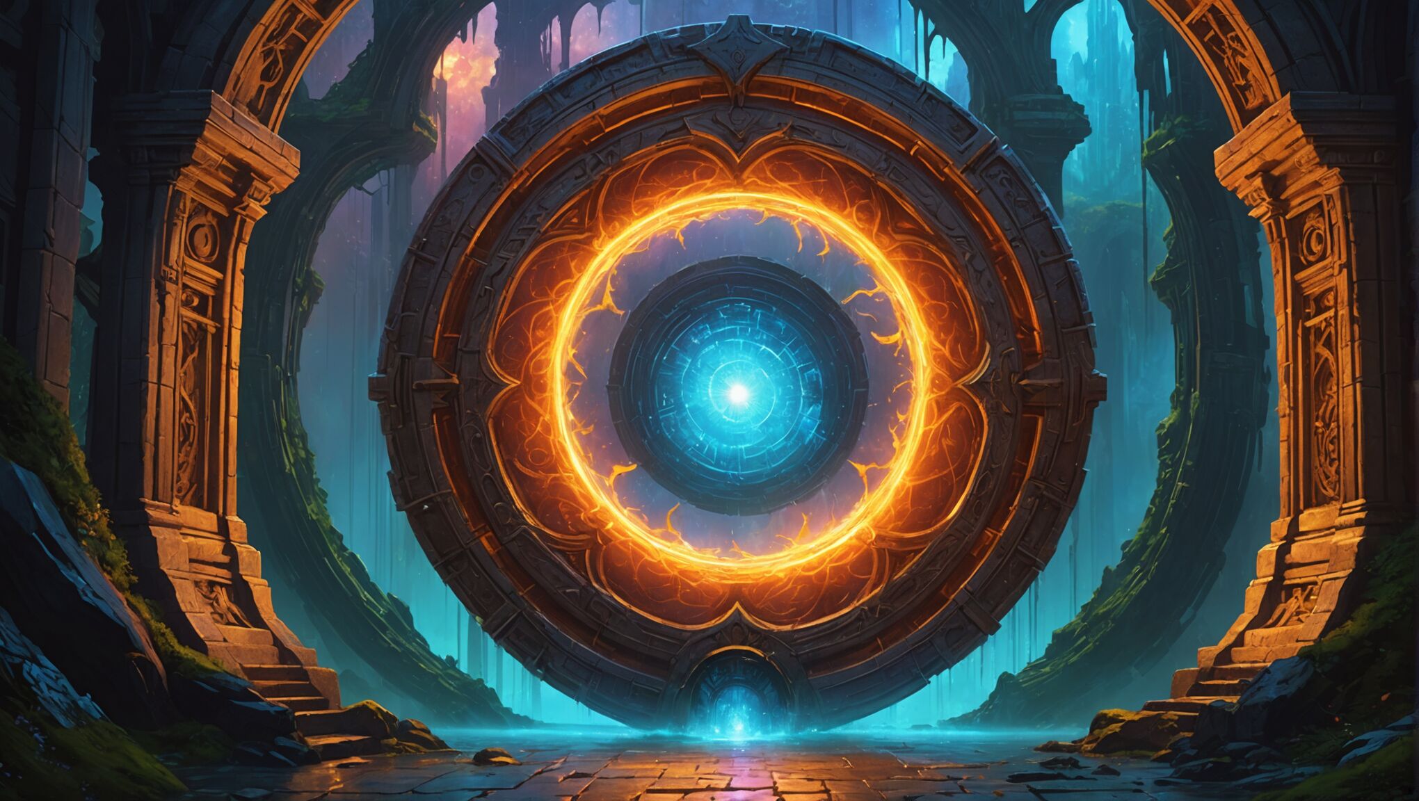
When designing for portal fantasy, covers often depict the moment of transition between worlds. This could be a physical gateway, a magical object that serves as a conduit, or characters caught between realities. The design might be split to show contrasting worlds or use visual effects to blur the boundaries between them.
For fairy tale retellings or mythological fantasy, covers often incorporate recognizable symbols or motifs from the original stories, but with a fresh twist. These designs might play with scale, perspective, or unexpected color choices to signal that this is a new take on a familiar tale.
Regardless of the subgenre, it’s crucial to research current trends and bestsellers in that specific category. This ensures that the cover will resonate with the target audience while still standing out in a crowded marketplace. Balancing genre conventions with innovative design elements allows for covers that are both familiar enough to attract fans of the subgenre and unique enough to capture attention.

