blog
Creating a Sense of Mystery in Fantasy Book Covers
Crafting an aura of mystery in fantasy book covers requires a delicate balance of visual elements that intrigue and captivate potential readers. Subtle shadows and silhouettes can create an air of enigma, inviting viewers to imagine what lies beyond the visible. Obscured or partially revealed characters or objects pique curiosity, encouraging readers to delve deeper into the story. Negative space plays a crucial role in fostering a sense of the unknown, allowing imagination to fill in the gaps. Layered imagery and textures can hint at hidden depths, suggesting that there’s more to the story than meets the eye. Unusual perspectives or distorted visuals can disorient viewers in an enticing way, mimicking the otherworldly nature of fantasy realms. “A picture is worth a thousand words, but the right book cover is worth a thousand questions.” Incorporating elements like mist, smoke, or ethereal light can add an air of mystique, blurring the lines between reality and fantasy. Juxtaposing contrasting elements, such as light and dark or the familiar with the strange, can create visual tension that draws the eye and sparks intrigue. Strategic use of reflections or refractions can suggest alternate realities or hidden truths within the narrative. By carefully selecting and combining these elements, designers can craft covers that not only catch the eye but also ignite the imagination, promising readers an adventure shrouded in mystery.
Color psychology for enigmatic atmospheres
 The psychological impact of color in creating enigmatic atmospheres for fantasy book covers cannot be overstated. Dark, muted tones such as deep purples, midnight blues, and rich burgundies evoke a sense of the unknown and the mysterious. These colors tap into our subconscious associations with nighttime, secrets, and hidden realms. Conversely, using unexpected pops of bright colors against a dark background can create an unsettling yet intriguing contrast that draws the eye and suggests magical elements.
Cool colors like deep greens and teals can evoke feelings of tranquility tinged with otherworldliness, perfect for fantasy settings with enchanted forests or underwater kingdoms. Warm colors used sparingly, such as glowing ambers or rich golds, can hint at hidden treasures or magical artifacts within the story.
The use of color gradients and fades can be particularly effective in creating an atmosphere of mystery. A cover that transitions from light to dark or shifts between complementary colors can suggest a journey from the known to the unknown, or the blending of different magical realms.
Metallic and iridescent effects can add an extra layer of intrigue, suggesting something precious or magical that changes depending on how you look at it. This can be particularly effective when used for titles or key imagery, drawing the reader’s eye and inviting them to look closer.
“Color is a power which directly influences the soul.” – Wassily Kandinsky
Monochromatic color schemes, when used skillfully, can create a powerful sense of atmosphere and mood. A cover rendered entirely in shades of blue, for example, can evoke feelings of melancholy, mystery, and depth that perfectly complement certain fantasy narratives.
The absence of color can be just as impactful. A primarily black and white cover with a single element in color can create a striking focal point that immediately draws attention and suggests significance. This technique can be used to highlight a crucial magical element or character in the story.
Transparency and opacity play crucial roles in color application for mysterious atmospheres. Semi-transparent overlays of color can create the illusion of mist, magic, or multiple dimensions, adding depth and intrigue to the cover design.
Ultimately, the key to using color psychology effectively in fantasy book covers lies in understanding the emotional and psychological responses different colors and combinations evoke. By carefully selecting and applying colors, designers can create covers that not only capture the essence of the story but also create an irresistible aura of mystery that compels potential readers to pick up the book and discover its secrets.
Symbolic imagery and hidden meanings

Symbolic imagery and hidden meanings are powerful tools in creating mysterious fantasy book covers that captivate potential readers. Alchemical symbols, for instance, can add layers of esoteric knowledge and ancient wisdom to a cover design. The ouroboros, a serpent eating its own tail, suggests cycles of renewal and hidden truths, while the philosopher’s stone hints at transformation and the quest for immortality. Astrological and celestial imagery, such as constellations or phases of the moon, can evoke a sense of cosmic mystery and destiny.
Mythological creatures like dragons, phoenixes, or chimeras serve as potent symbols, each carrying its own set of meanings and associations that can intrigue readers familiar with folklore. Incorporating these beings subtly or partially can create an air of the unknown, prompting viewers to question what other magical entities might exist within the story’s pages.
Fractals and geometric patterns can represent complex magical systems or the intricate nature of fantasy worlds. The Fibonacci spiral, for example, might suggest natural magic or the unfolding of a grand design. Labyrinths and mazes symbolize journeys, confusion, and the search for hidden knowledge, perfect for stories involving quests or enigmatic plots.
Everyday objects imbued with mystical significance can be particularly effective. A key might represent access to secret realms, while an hourglass could symbolize time manipulation or impending doom. Mirrors often signify alternate realities or self-reflection, adding depth to the cover’s narrative.
Hidden faces or figures within landscapes or other elements can create a delightful “aha” moment for observant viewers, rewarding closer inspection and hinting at deeper layers within the story. Similarly, optical illusions or double imagery can suggest duality, transformation, or the unreliable nature of reality in the fantasy world.
Define your genre through design. Learn more here.
Ancient scripts, runes, or invented alphabets scattered across the cover can imply secret messages or lost knowledge, inviting the reader to decipher their meaning. Even if indecipherable, these elements add an air of authenticity and depth to the fantasy setting.
Natural elements like trees, water, or fire can be stylized to suggest magical properties or sentience. A forest silhouette might contain hidden faces, or flame patterns could resemble magical creatures, blurring the line between the mundane and the mystical.
The use of negative space to create secondary images is a sophisticated technique that rewards careful observation. A seemingly simple design might reveal hidden figures or symbols when viewed from a different perspective, mirroring the layered nature of many fantasy narratives.
By carefully selecting and integrating these symbolic elements and hidden meanings, cover designers can create a visual tapestry that not only reflects the book’s content but also engages the viewer’s imagination, promising a story rich with mystery and discovery.
Typography and its role in intrigue
The choice of typography in fantasy book covers plays a crucial role in creating intrigue and setting the tone for the mysterious elements within the story. Fonts can evoke specific emotions, time periods, or magical qualities, subtly influencing the reader’s perception of the book before they even open it.
Ornate, calligraphic scripts can suggest ancient knowledge or arcane secrets, perfect for stories involving old magic or forgotten lore. These fonts, when used sparingly, add an air of elegance and mystique to the cover. Conversely, stark, modern typefaces can create a sense of otherworldliness or futuristic fantasy, hinting at unconventional narrative elements.
The manipulation of letter spacing and kerning can create visual tension or harmony. Widely spaced letters might evoke a sense of isolation or vastness, while tightly packed characters can suggest hidden information or compressed energy waiting to be released.
Incorporating subtle textural elements within the typography itself can add depth and intrigue. Letters that appear to be made of smoke, water, or even celestial bodies can reinforce the magical themes of the book while captivating the viewer’s attention.
The positioning of text on the cover can also contribute to the mysterious atmosphere. Words that appear to fade into the background or emerge from shadows can create a sense of revelation or concealment. Arranging text in unconventional patterns or shapes can suggest magical sigils or secret codes, inviting closer inspection.
Layering text with imagery or other textual elements can create a sense of depth and hidden meaning. This technique can be particularly effective when revealing part of a word or phrase beneath another, hinting at deeper layers within the story.
The use of contrasting fonts within the same cover design can create visual interest and suggest duality or conflict within the narrative. For example, pairing a flowing script with a sharp, angular typeface might represent the clash between ancient magic and modern elements in the story.
Incorporating symbols or glyphs within the typography itself can add an extra layer of meaning. Custom-designed letters that subtly include magical symbols or creatures can reward observant viewers and hint at the fantasy elements within the book.
The color and treatment of typography also play a significant role in creating intrigue. Metallic or iridescent finishes can suggest preciousness or magical properties, while gradient effects can imply transformation or the blending of different realms.
| Typography Technique | Effect on Mystery |
| Handwritten or brush scripts | Adds a personal, mysterious touch; suggests hidden knowledge |
| Distressed or weathered fonts | Evokes age, history, and secrets waiting to be uncovered |
| Illuminated or decorated initials | Hints at magical elements and ancient traditions |
| Negative space within letters | Creates hidden imagery or symbols, rewarding closer inspection |
Finally, the interplay between the typography and other cover elements is crucial in maintaining the mysterious atmosphere. Text that interacts with or is partially obscured by imagery can create a sense of depth and encourage the viewer to look closer, unraveling the secrets hidden within the design.
Balancing reveal and concealment
 When crafting a fantasy book cover that exudes mystery, the art of balancing reveal and concealment is paramount. This delicate equilibrium requires careful consideration of what to show and what to hide, creating a tantalizing glimpse into the story that leaves readers craving more.
One effective technique is the strategic use of partial imagery. By revealing only a portion of a character, creature, or magical artifact, designers can spark curiosity and encourage viewers to fill in the blanks with their imagination. This approach not only preserves the mystery but also engages the reader in an interactive experience with the cover.
Layering elements can create depth and intrigue. Overlapping imagery, textures, or translucent effects can suggest hidden realms or secrets waiting to be uncovered. This technique can be particularly effective when combined with die-cut covers or embossing, adding a tactile dimension to the mystery.
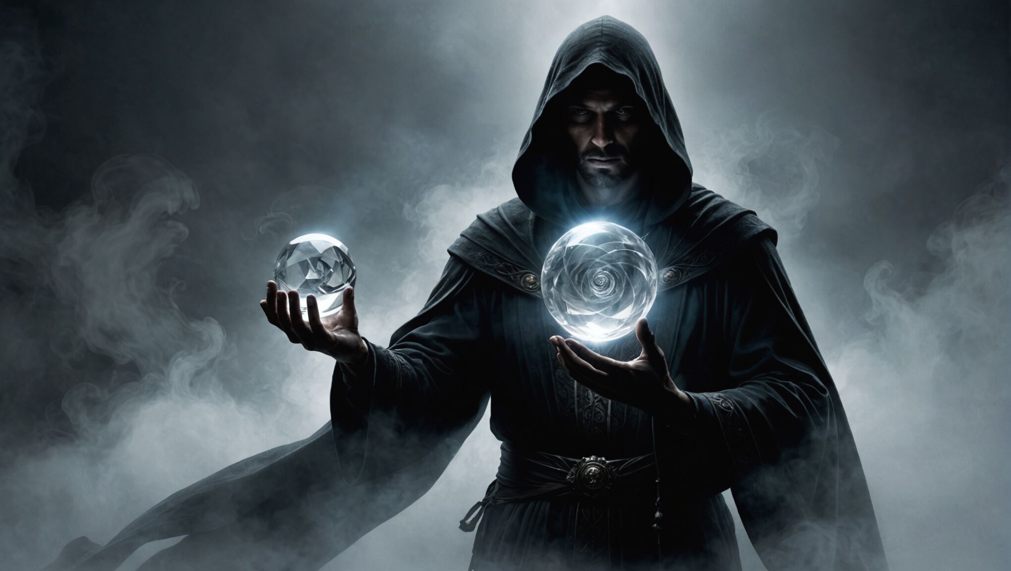
The interplay of light and shadow is crucial in balancing reveal and concealment. Dramatic lighting can highlight certain elements while shrouding others in darkness, creating a sense of the unknown and inviting closer inspection. Silhouettes can be powerful tools, offering just enough information to intrigue without giving away too much.
Negative space can be as important as positive space in creating mystery. What’s left unseen can often be more intriguing than what’s shown. Clever use of negative space can create dual imagery or hidden symbols that reward careful observation and hint at deeper layers within the story.
Color gradients and fades can be employed to suggest transitions between worlds or the blurring of reality and fantasy. This technique can be used to partially obscure elements of the cover, creating a sense of emergence or disappearance that leaves viewers wondering what lies beyond.
Incorporating elements that extend beyond the cover’s edges can imply a larger world beyond what’s immediately visible. This can be achieved through imagery that appears to be cropped or text that seems to continue off the page, hinting at expansive fantasy realms or untold stories.
Textural elements like mist, smoke, or magical energy can be used to partially obscure and reveal different aspects of the cover design. These elements not only add visual interest but also create a sense of movement and transformation, key themes in many fantasy narratives.
The placement of the title and author name can also play a role in balancing reveal and concealment. Integrating text with imagery in unexpected ways, such as having characters interact with the letters or hiding words within landscape elements, can add an extra layer of intrigue.
Ultimately, the goal is to create a cover that raises questions rather than providing answers. It should offer enough to captivate potential readers while leaving them with a burning desire to open the book and discover its secrets. This balance of reveal and concealment is not just about aesthetics; it’s about creating an emotional connection and promising an adventure that begins the moment one lays eyes on the cover.
As you consider these techniques, reflect on how they might apply to your own creative projects or how they influence your perception of book covers. What elements draw you in, and what makes you want to uncover more? How might you apply these principles to other areas of design or storytelling? The art of mystery is not confined to book covers alone; it permeates many aspects of creativity and communication. By understanding and mastering the balance between reveal and concealment, you open up new possibilities for engagement and intrigue in various forms of expression.
Incorporating genre-specific mystery tropes

When designing fantasy book covers, incorporating genre-specific mystery tropes can significantly enhance the overall sense of intrigue. One effective approach is to include subtle references to classic fantasy elements, such as ancient prophecies or magical artifacts. For instance, a partially visible scroll with cryptic symbols or a dimly lit crystal ball can instantly evoke a sense of mystical secrets waiting to be uncovered.
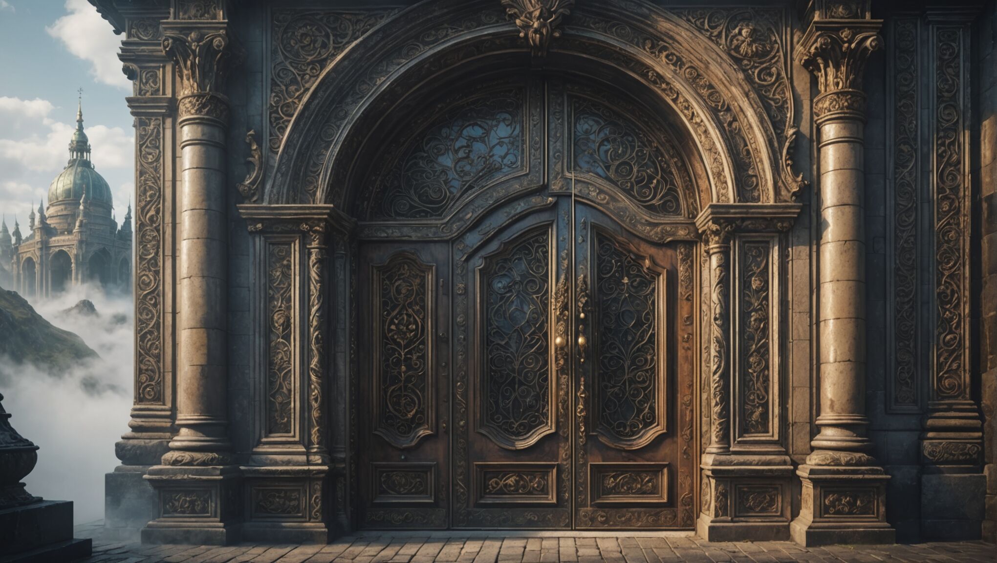
Mysterious doorways or portals are another popular trope that can be utilized to great effect. A cover featuring an ornate door slightly ajar, revealing a glimpse of an otherworldly realm beyond, can spark curiosity and invite readers to explore further. Similarly, incorporating shadowy figures or silhouettes of mythical creatures can hint at the fantastical beings that populate the story without fully revealing their nature.
The concept of hidden kingdoms or lost civilizations is a staple of fantasy literature that translates well to cover design. Distant, misty citadels perched atop impossible mountains or glimpses of submerged ruins beneath turbulent waters can suggest vast, unexplored worlds teeming with secrets. These elements not only create visual interest but also promise adventure and discovery within the pages.
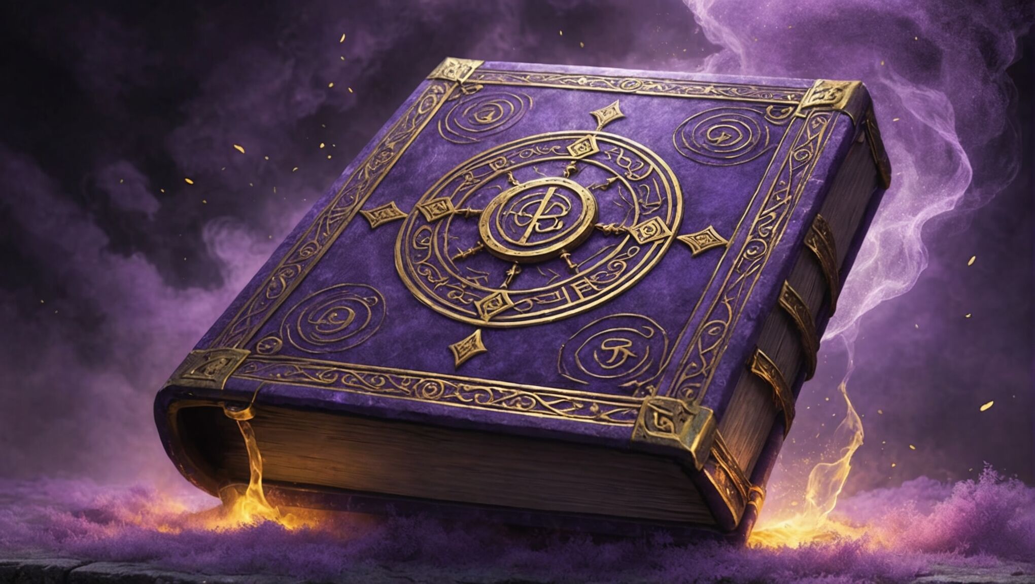
Magical tomes or spell books are another trope that can add an air of mystery to fantasy covers. A weathered grimoire with glowing runes or a book that appears to be opening of its own accord can imply forbidden knowledge and arcane powers. This imagery taps into the reader’s curiosity about the magical systems and lore contained within the story.
Incorporating elements of nature imbued with magical properties can also create an atmosphere of mystery. A forest where the trees seem to whisper secrets, or a night sky where the stars form unusual patterns, can suggest a world where the very fabric of reality is woven with magic and mystery.
The use of symbolic animals or familiars can add depth to the cover’s mysterious elements. A watchful raven, a ghostly wolf, or a phoenix rising from ashes can serve as powerful metaphors for themes within the book while maintaining an air of enigma about their true significance.
Time manipulation, a common theme in fantasy, can be visually represented through fragmented or distorted imagery. Shattered clock faces, intertwined timelines, or characters caught between different ages can hint at temporal mysteries and paradoxes that await the reader.
Lastly, the concept of prophecy and destiny can be subtly incorporated into cover design. Constellation-like patterns that form meaningful shapes, or characters whose reflections show different versions of themselves, can suggest predestined paths and the weight of fate—key elements in many fantasy narratives.
By thoughtfully integrating these genre-specific mystery tropes into fantasy book covers, designers can create visually compelling images that not only capture the essence of the story but also resonate with fans of the genre, promising the kind of enigmatic and magical experience they crave.

