blog
Cover Design Magic: Tips for New Fantasy Authors
When crafting a captivating fantasy book cover, several key elements come into play. The central image or character is often the focal point, drawing readers into the magical world within. This could be a mysterious figure, a mythical creature, or a symbolic object that represents the story’s essence. “A book cover is a promise,” and in fantasy, that promise often involves adventure and wonder. Landscapes play a crucial role, whether it’s a misty forest, a towering castle, or a starlit sky, setting the stage for the epic tale to unfold. Magical elements like glowing runes, swirling energy, or ethereal light effects can add a sense of the supernatural. Texture and depth are important considerations, achieved through layering techniques or intricate detailing that invites closer inspection. Atmosphere and mood are paramount in fantasy covers, often conveyed through lighting effects, color gradients, or weather phenomena. Borders or frames can lend an air of antiquity or importance, reminiscent of old tomes or prophecies. Lastly, the integration of genre-specific symbols or motifs, such as swords, dragons, or magical artifacts, can instantly communicate the book’s fantasy nature to potential readers.
Choosing the right imagery
 When selecting imagery for your fantasy book cover, it’s crucial to choose visuals that not only capture the essence of your story but also resonate with your target audience. Start by identifying the most iconic or compelling elements of your narrative. Is there a unique magical creature, a powerful artifact, or a distinctive landscape that plays a central role? These elements can serve as powerful focal points for your cover.
Consider the tone and subgenre of your fantasy work. A dark fantasy might benefit from moody, shadowy imagery, while a whimsical tale could feature brighter, more fantastical visuals. The chosen imagery should align with the emotional experience readers can expect from your book.
“Your book cover is a visual haiku of your story.” – Chip Kidd
Character representation on the cover can be a powerful tool, but it requires careful consideration. If you decide to feature a character, ensure that their appearance leaves room for readers’ imagination while still conveying key attributes. Silhouettes or partial views can be effective in maintaining mystery while still providing a strong visual anchor.
Symbolic imagery can be particularly effective in fantasy cover design. Consider using metaphorical representations of themes or conflicts within your story. For example, a single rose with thorns might represent beauty and danger, while an hourglass could symbolize a race against time.
Don’t underestimate the power of negative space in your imagery. Sometimes, what’s not shown can be just as impactful as what is. A minimalist approach with a single, striking image against a clean background can create a memorable and intriguing cover.
Remember to consider the scalability of your chosen imagery. In today’s digital marketplace, your cover needs to be recognizable and appealing both as a full-sized book jacket and as a small thumbnail on online platforms.
Lastly, ensure that your imagery is original or properly licensed. Using stock photos can be risky, as they may appear on other book covers. If budget allows, consider commissioning original artwork that can truly set your book apart and provide a unique visual identity for your fantasy world.
Color palette and mood
The color palette you choose for your fantasy book cover plays a crucial role in setting the mood and attracting your target audience. Warm, rich tones like deep reds, golds, and bronzes can evoke a sense of adventure and ancient magic, perfect for epic fantasies. Cooler hues such as midnight blues, emerald greens, and misty grays often suit stories with a more mysterious or ethereal atmosphere.
Consider the emotional impact of colors. Purple, long associated with royalty and mysticism, can lend an air of majesty to your cover. Earthy browns and greens might be ideal for tales set in forests or involving nature-based magic. For darker fantasies, a palette of blacks, deep purples, and blood reds can create an ominous and thrilling visual.
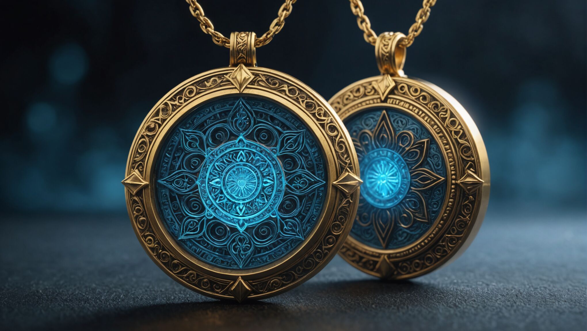
Contrast is key in making your cover stand out. A pop of bright color against a more subdued background can draw the eye and create visual interest. For instance, a gleaming magical amulet in vibrant blue against a shadowy backdrop can be striking.
The mood of your story should be reflected in the overall tone of your color choices. A light-hearted fantasy adventure might use brighter, more saturated colors, while a gritty, realistic fantasy world could benefit from a more muted, desaturated palette.
Don’t forget about the power of metallics. Gold foil accents or silver embossing can add a touch of luxury and magic to your cover, making it feel special and collectible. However, use these elements judiciously, as they can increase production costs.
Consider color psychology when making your choices. Blue can evoke calmness and trust, red signifies passion and danger, while green might represent growth or envy. Use these associations to subtly reinforce themes from your story.
Gradients and color blending can create depth and dimension on your cover. A skyline transitioning from deep purple to fiery orange can suggest a world between day and night, perfect for stories involving twilight realms or time manipulation.
Remember that your color palette should work harmoniously with your chosen imagery and typography. Test different combinations to find the perfect balance that captures the essence of your fantasy world and entices readers to dive in.
Typography and title placement
The font you choose for your title can make or break your cover’s impact. Opt for a typeface that complements your story’s tone and genre. Ornate, serif fonts often work well for high fantasy or historical settings, while sleek, modern sans-serif fonts might suit urban fantasy or futuristic themes. Custom lettering can create a unique identity for your book series, but ensure it remains legible at smaller sizes.
Consider the weight and style of your font. Bold, thick letters can convey strength and adventure, while thinner, more delicate fonts might suggest mystery or elegance. Experiment with different variations of your chosen font family to find the perfect balance.
The placement of your title is crucial for both aesthetic appeal and readability. Generally, titles work best when placed in the upper third or center of the cover. This positioning allows for easy reading when the book is displayed on shelves or as a thumbnail online. However, don’t be afraid to break convention if an alternative placement enhances your overall design concept.
Size matters when it comes to title typography. Your title should be large enough to be read easily but not so dominating that it overwhelms the cover art. A good rule of thumb is to ensure your title is visible and legible when your cover is reduced to thumbnail size.
Consider the interplay between your title and the cover imagery. The text should complement the visual elements rather than compete with them. Techniques like text wrapping around objects or integrating the title into the scenery can create a cohesive and engaging design.
Color choice for your typography is equally important. Ensure there’s sufficient contrast between the text and the background for optimal readability. White or light-colored text on dark backgrounds often pops, while dark text on lighter backgrounds can appear more classic.
Don’t forget about your author name. While it’s typically smaller than the title, it should still be clearly visible. For debut authors, the title usually takes precedence, but established authors might want their name more prominently displayed.
Special effects can enhance your typography, but use them judiciously. Subtle shadows, glows, or textures can add depth and interest to your title without compromising readability. However, avoid overuse of effects that can make your text appear amateurish or difficult to read.
| Typography Element | Consideration |
| Font Style | Match genre and tone |
| Font Size | Readable at thumbnail size |
| Placement | Upper third or center for visibility |
| Color | High contrast with background |
| Effects | Use sparingly for enhancement |
Remember, your typography should work in harmony with all other elements of your cover design to create a cohesive and appealing package that effectively represents your fantasy world.
Balancing detail and simplicity
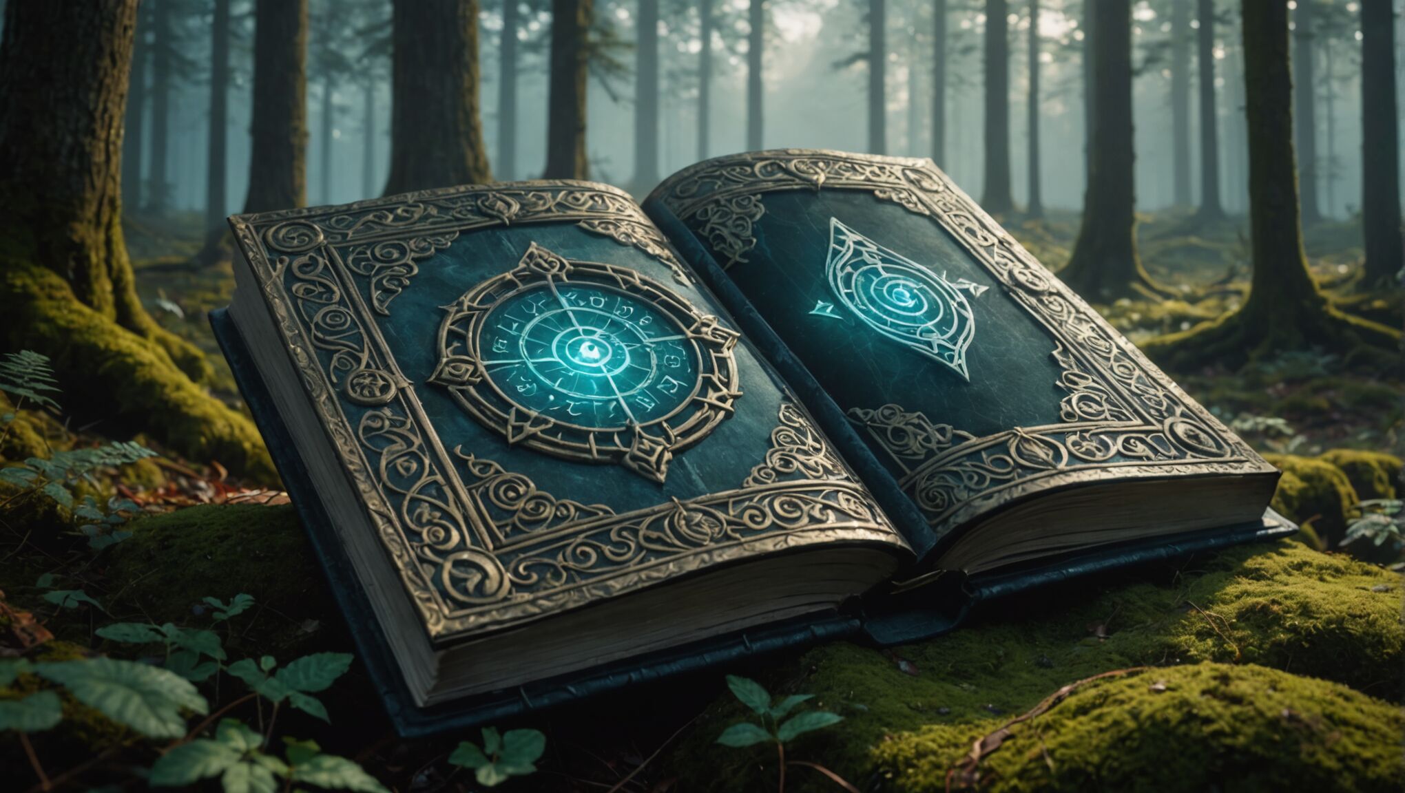 When it comes to creating a captivating fantasy book cover, striking the right balance between intricate details and simplicity is crucial. Too much detail can overwhelm the viewer, while too little might fail to capture the richness of your fantasy world. The key is to create a focal point that draws the eye and tells a story, while allowing enough breathing room for the design to be easily digestible.
Consider using a single, powerful image as your main focus. This could be a detailed illustration of a magical creature, a mystical artifact, or a key character. Surround this central element with subtler, supporting details that add depth without cluttering the composition. For instance, a majestic dragon might be the centerpiece, with delicate wisps of smoke or distant mountains providing context and atmosphere.
Negative space is your ally in achieving balance. Don’t feel compelled to fill every inch of the cover. Strategic use of empty space can actually enhance the impact of your detailed elements, creating a sense of mystery and inviting the reader to imagine what lies beyond.
Color can play a significant role in balancing complexity and simplicity. A limited color palette can unify an intricate design, while bold color choices can make a simple composition pop. Consider using a monochromatic scheme with one or two accent colors to create a cohesive look that’s both striking and easy on the eyes.
Layering is another technique to consider. By using subtle gradients or textures in the background, you can add depth without overwhelming the main elements. This approach can create a sense of dimensionality that enhances the fantasy aspect without requiring intricate detailing throughout the entire cover.
Remember that your cover needs to be effective at various sizes, from full-size physical books to small online thumbnails. Details that look stunning on a large scale might become muddled when reduced. Test your design at different sizes to ensure it remains impactful and legible across all formats.
Typography can also contribute to the balance. A clean, simple font can offset a more detailed background, while an ornate typeface might be best paired with a minimalist design. The key is to ensure that the text complements rather than competes with the visual elements.
Ultimately, the goal is to create a cover that intrigues potential readers and gives them a taste of your fantasy world without giving everything away. It should hint at the magic and wonder within your pages, inviting curiosity and prompting the viewer to pick up the book and dive in.
As you work on your cover design, continually step back and assess the overall impact. Does it capture the essence of your story? Does it stand out while still fitting within the fantasy genre? Is it memorable? These questions will guide you towards a design that strikes the perfect balance between detail and simplicity, creating a cover that’s both visually appealing and effective in conveying the spirit of your fantasy novel.
Professional resources and tools
For new fantasy authors venturing into cover design, there’s a wealth of professional resources and tools available to help create stunning book covers. Online platforms like Canva and Adobe Spark offer user-friendly interfaces with templates specifically designed for book covers, allowing authors to experiment with layouts and designs even without extensive graphic design experience.
For those seeking more advanced tools, Adobe Photoshop and Illustrator remain industry standards. These powerful software options provide complete creative control, though they come with steeper learning curves. Affinity Designer and Photo are excellent, more affordable alternatives that offer professional-grade capabilities.
Detailed backgrounds add richness. See what’s new.
Stock image websites such as Shutterstock, Adobe Stock, and Unsplash can be invaluable sources for high-quality imagery. These platforms offer a vast array of photographs, illustrations, and textures that can serve as the foundation for your cover design or as elements to enhance your composition.
Font resources are crucial for typography-driven covers. Websites like Google Fonts, Adobe Fonts, and FontSquirrel offer a wide selection of free and premium typefaces. For fantasy-specific fonts, Creative Market and MyFonts often feature unique, atmospheric options that can add character to your cover.
When it comes to color selection, tools like Adobe Color (formerly Kuler) and Coolors can help you create harmonious color palettes that evoke the right mood for your fantasy novel. These tools allow you to experiment with different color combinations and save your favorites for future use.
For authors who prefer to leave the design to professionals, freelance marketplaces like 99designs, Reedsy, and Fiverr connect authors with experienced book cover designers. These platforms offer a range of pricing options and allow you to review portfolios to find a designer whose style aligns with your vision.
Online communities and forums such as KBoards and the Cover Design subforum on AbsoluteWrite can be excellent resources for feedback and advice from fellow authors and designers. Sharing your work-in-progress covers in these spaces can provide valuable insights and help you refine your design.
YouTube tutorials and online courses on platforms like Skillshare and Udemy offer in-depth guidance on book cover design principles and software techniques. These resources can be particularly helpful for authors looking to develop their design skills over time.
Lastly, don’t underestimate the value of studying successful fantasy book covers in your subgenre. Websites like Goodreads and Amazon’s bestseller lists can serve as inspiration galleries, helping you identify trends and effective design elements in current fantasy publishing.

