blog
Cover Art Inspiration: 5 Fantasy Genres to Explore
Fantasy literature transports readers to extraordinary worlds filled with magic, mythical creatures, and epic quests. This genre has captivated audiences for centuries, offering an escape from reality and a chance to explore the limits of imagination. From sprawling landscapes to hidden magical realms existing alongside our own, fantasy encompasses a vast array of subgenres and themes. “Fantasy is hardly an escape from reality. It’s a way of understanding it,” as Lloyd Alexander famously stated, highlighting the genre’s ability to reflect real-world issues through fantastical lenses. Each subgenre within fantasy brings its own unique flavor to the table, whether it’s the grand scale of epic fantasy or the gritty realism of urban fantasy. These diverse categories offer artists and designers a wealth of inspiration for creating captivating cover art that instantly communicates the essence of the story within. By understanding the key elements and atmospheres of different fantasy subgenres, illustrators can craft visuals that not only entice potential readers but also accurately represent the magical worlds waiting to be discovered between the pages.
Epic fantasy
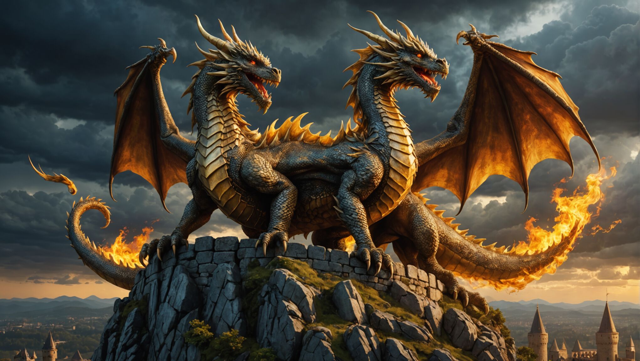 Epic fantasy, often considered the cornerstone of the genre, is characterized by its vast, intricate worlds, heroic quests, and the eternal struggle between good and evil. These narratives typically unfold across multiple books, allowing for deep world-building and complex character development. The settings are usually medieval or pseudo-medieval, filled with mythical creatures, ancient prophecies, and powerful magic systems.
When designing cover art for epic fantasy, artists should focus on capturing the grandeur and scope of the story. Sweeping landscapes, imposing castles, and dramatic battle scenes are common elements that can immediately convey the epic nature of the tale. Characters are often depicted in heroic poses, wielding magical artifacts or facing off against formidable foes.
Color palettes for epic fantasy covers tend to be rich and dramatic, with deep jewel tones or muted earth colors that evoke a sense of history and legend. Gold accents can add a touch of regality and hint at the high stakes involved in these stories.
Iconic symbols play a crucial role in epic fantasy cover design. A legendary sword, a mystic amulet, or a fearsome dragon can serve as a focal point, instantly communicating key themes or plot elements to potential readers. These symbols can be integrated into elaborate border designs or used as central images, often set against a backdrop of sprawling landscapes or ominous skies.
Typography in epic fantasy covers often leans towards ornate, serif fonts that echo medieval manuscripts or rune-like scripts. The title should command attention, sometimes incorporating metallic effects or textured overlays to enhance its visual impact.
In epic fantasy, the fate of entire worlds often hangs in the balance, and the cover art should reflect this monumental scale. As J.R.R. Tolkien, the father of modern epic fantasy, once said, “All we have to decide is what to do with the time that is given us.” This sentiment of choice and destiny can be powerfully conveyed through thoughtful cover design.
Artists might also consider including elements that hint at the story’s mythology or magic system. Constellations, ancient runes, or swirling magical energies can add depth and intrigue to the composition, inviting viewers to imagine the complex world within.
Lastly, the use of perspective in epic fantasy covers can be particularly effective. Depicting characters as small figures against vast, awe-inspiring backgrounds can emphasize the epic scale of their journey and the challenges they face. This approach not only creates visually striking images but also resonates with the themes of personal growth and transformation often found in these narratives.
Urban fantasy
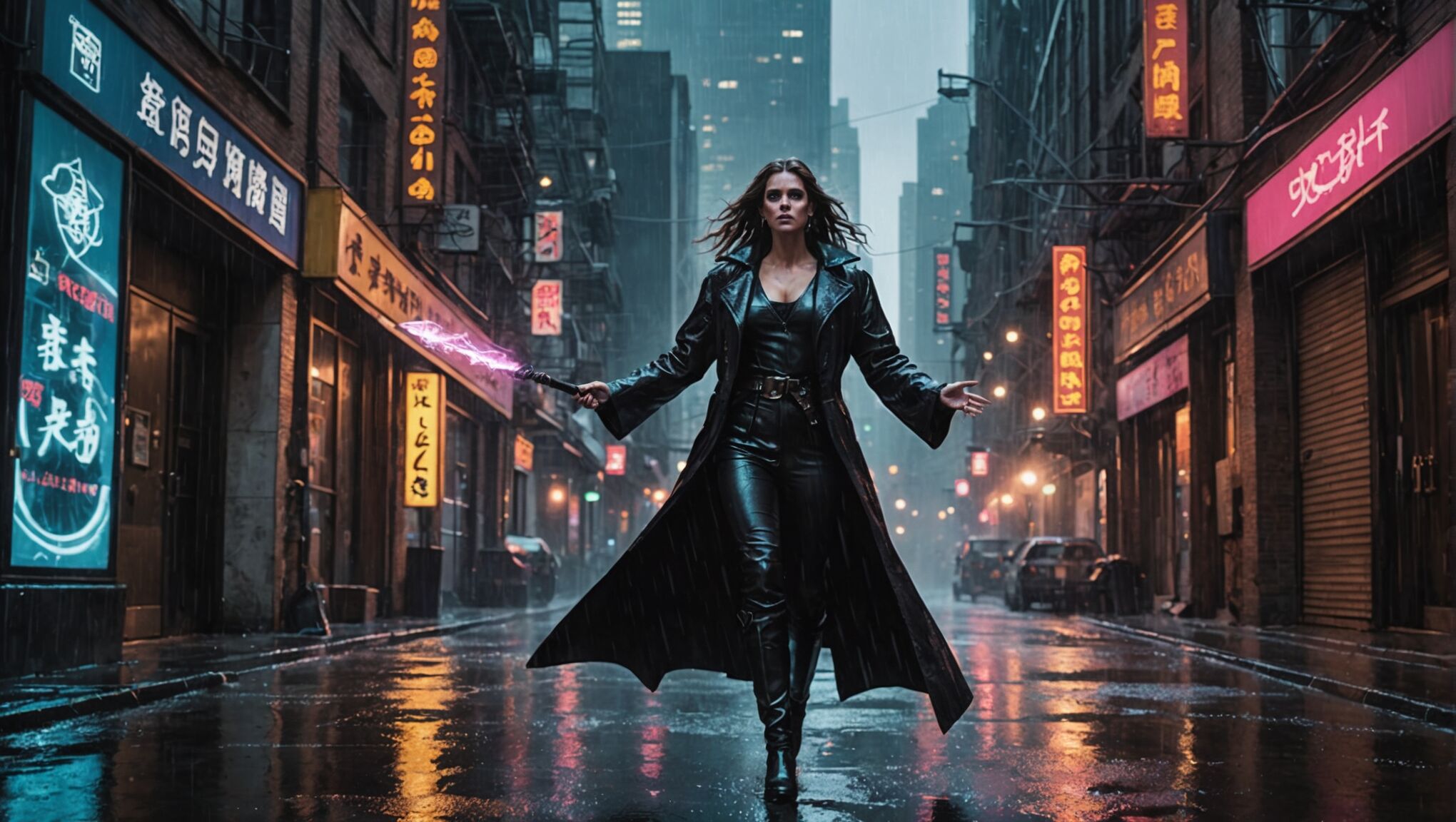
In urban fantasy, the magical and mundane collide in modern city settings, creating a unique blend of supernatural elements and contemporary life. This subgenre brings mythical creatures, ancient magic, and otherworldly beings into bustling metropolises, hidden just beneath the surface of everyday reality. Cover art for urban fantasy should capture this juxtaposition, showcasing the gritty, noir-inspired atmosphere alongside fantastical elements.
Artists working on urban fantasy covers often opt for nighttime cityscapes as backgrounds, with glowing streetlights, neon signs, and towering skyscrapers creating a moody ambiance. The color palette typically leans towards cool, dark tones – deep blues, purples, and greys – punctuated by vibrant splashes of color to represent magical elements or supernatural beings.
Character depiction is crucial in urban fantasy cover design. Protagonists are frequently shown as tough, street-smart individuals, often wielding both modern weapons and magical artifacts. Leather jackets, tattoos, and an air of defiance are common visual tropes that instantly communicate the genre’s edgy aesthetic. These characters might be positioned in action poses, confronting supernatural threats or navigating through shadowy alleyways.
Incorporating familiar urban elements with a fantastical twist can create compelling visuals. For instance, a subway entrance might glow with otherworldly light, or gargoyles on old buildings could come to life. Mystical symbols or runes can be subtly integrated into the cityscape, hinting at the hidden magical world.
Typography for urban fantasy covers often employs sleek, modern fonts with a hint of edge or grunge. Titles might be rendered with metallic effects or appear to be carved into concrete, further emphasizing the blend of magic and modernity. Attention-grabbing taglines or series information can be incorporated to give potential readers a quick sense of the story’s premise.
Use landscapes to draw in readers. Explore options.
The use of contrasting elements is key in urban fantasy cover design. Juxtaposing the hard lines of city architecture with the fluid, organic forms of magical creatures or energy can create visually striking compositions. This contrast not only catches the eye but also encapsulates the genre’s core theme of two worlds colliding.
Artists might also consider incorporating reflections or double exposures in their designs, symbolizing the dual nature of the urban fantasy world. A character’s reflection might reveal their magical alter ego, or a city skyline could morph into a fantastical realm when mirrored in a puddle or window.
Iconic urban fantasy creatures like vampires, werewolves, or fae can be subtly integrated into the cover design. Rather than dominating the composition, these elements might be hinted at through glowing eyes in the shadows or ethereal silhouettes blending with the city’s architecture.
Ultimately, successful urban fantasy cover art should evoke a sense of mystery and excitement, inviting readers to explore a world where magic lurks just around the corner of their familiar urban landscape. It should promise adventure, danger, and the thrill of discovering the extraordinary hidden within the ordinary.
Dark fantasy
Venturing into the realm of dark fantasy, we encounter a subgenre that delves into the shadows, exploring the grittier, more ominous aspects of magical worlds. This style of fantasy often blends elements of horror, creating atmospheres thick with tension and moral ambiguity. Cover art for dark fantasy should evoke a sense of unease and intrigue, drawing viewers into a world where danger lurks in every shadow.
Color palettes for dark fantasy covers typically lean towards muted, somber tones. Deep blacks, midnight blues, blood reds, and smoky greys dominate, occasionally punctuated by sickly greens or eerie purples to heighten the unsettling atmosphere. Splashes of brighter colors might be used sparingly to draw attention to key elements or to represent a glimmer of hope amidst the darkness.
Imagery in dark fantasy cover art often features twisted landscapes, decaying architecture, or foreboding forests. Gnarled trees, crumbling castles, and mist-shrouded mountains can serve as powerful backdrops, setting the stage for the sinister tales within. Artists might incorporate elements of body horror or grotesque transformations to hint at the darker themes explored in the narrative.
Character depiction in dark fantasy covers tends to be more nuanced than in other fantasy subgenres. Protagonists are often portrayed with conflicted expressions or in vulnerable poses, reflecting the moral complexities they face. Antagonists might be represented through looming shadows, partial glimpses of monstrous features, or symbolic imagery rather than full portraits, leaving much to the imagination.
Symbolic elements play a crucial role in dark fantasy cover design. Occult symbols, ancient runes, or corrupted religious iconography can be woven into the composition, hinting at forbidden knowledge or malevolent forces at work. These symbols might be subtly integrated into border designs or used as central focal points, drawing the eye and piquing curiosity.
Typography for dark fantasy covers often employs distressed or gothic-inspired fonts. Titles might appear to be carved into stone, dripping with blood, or formed from twisted vines or bones. The text should complement the overall mood of the artwork without overpowering the visual elements.
Texture is particularly important in dark fantasy cover art. Rough, gritty textures can evoke a sense of decay or corruption, while smooth, oily surfaces might suggest something unnaturally perfect and therefore unsettling. Artists can experiment with various textural elements to add depth and tactile interest to their designs.
Incorporating elements of classic horror can enhance the dark fantasy aesthetic. Skulls, demons, or otherworldly creatures emerging from shadows can create powerful focal points. However, subtlety is often more effective than overt gore, allowing the viewer’s imagination to fill in the most terrifying details.
Contrast between light and dark is a powerful tool in dark fantasy cover design. A single source of light in an otherwise dark scene can create dramatic shadows and highlight key elements. This technique not only adds visual interest but also symbolizes the interplay between good and evil often explored in dark fantasy narratives.
Successful dark fantasy cover art should leave viewers with a sense of unease and a burning curiosity to uncover the secrets hidden within the pages. It should promise a journey into the darker aspects of human nature and the supernatural, where the lines between hero and villain blur, and where magic comes at a terrible price.
Historical fantasy
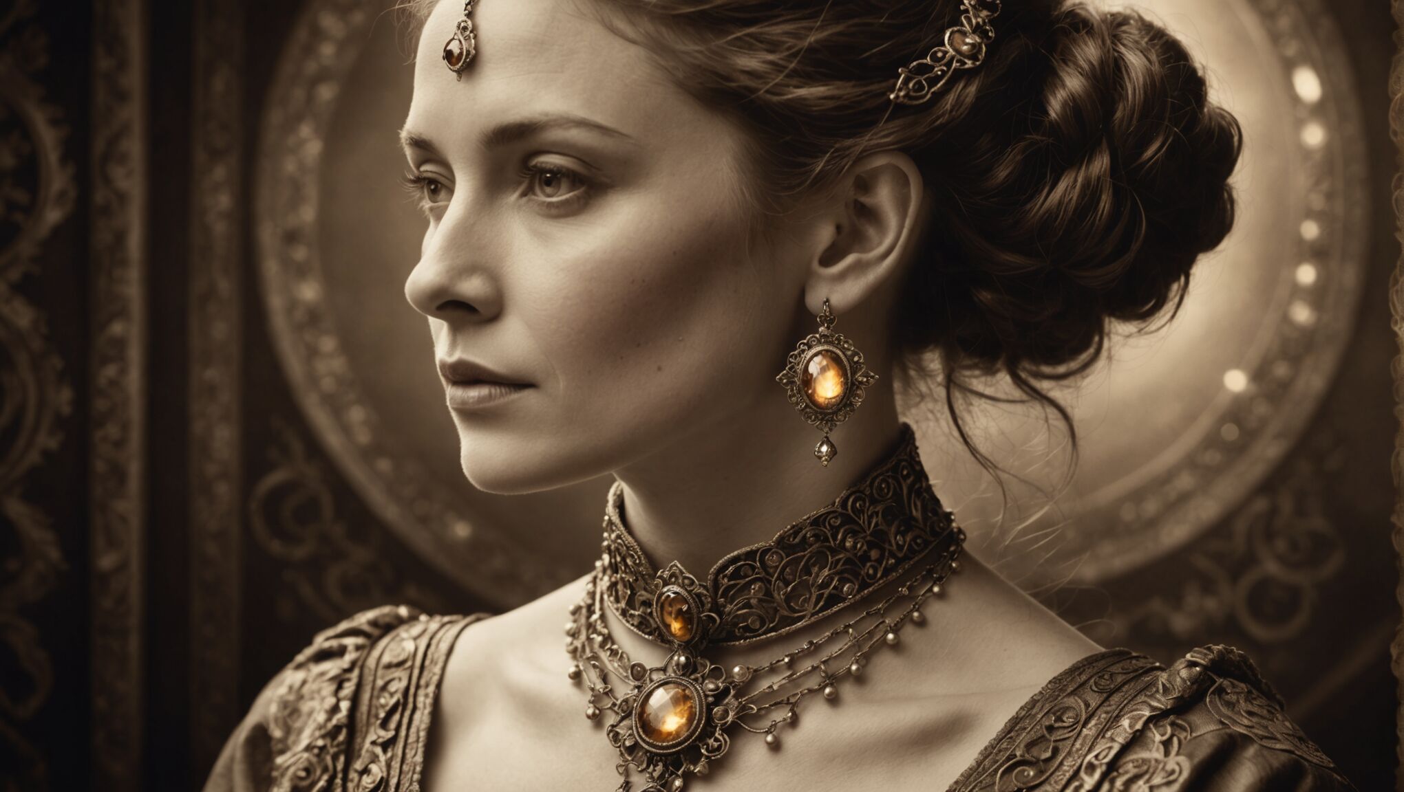 Blending historical fact with fantastical elements, historical fantasy offers a unique canvas for cover art that bridges the gap between reality and imagination. This subgenre transports readers to familiar historical periods, infusing them with magic, mythical creatures, or alternate realities. When designing cover art for historical fantasy, artists have the exciting challenge of combining period-accurate details with fantastical elements to create a compelling visual narrative.
To capture the essence of historical fantasy, cover artists should start by researching the specific time period in which the story is set. Authentic costumes, architecture, and cultural symbols from the era provide a solid foundation for the artwork. These elements can then be juxtaposed with magical or supernatural imagery to create an intriguing blend of the real and the imaginary.
Color palettes for historical fantasy covers often draw inspiration from the art styles prevalent during the depicted time period. For instance, a story set in Renaissance Italy might utilize rich, warm tones reminiscent of paintings from that era, while a tale based in Victorian England could employ muted, sepia-tinted hues to evoke a sense of nostalgia. These period-appropriate color schemes can then be enhanced with pops of vibrant, otherworldly colors to represent magical elements.
Character portrayal in historical fantasy cover art requires a delicate balance. Figures should be dressed in historically accurate attire, but with subtle fantastical touches. A noble lady might wear a perfectly period gown, but with an amulet glowing with magical energy. A knight could brandish a historically accurate sword that gleams with an impossible light. These details hint at the merging of history and fantasy within the story.
Incorporating recognizable historical landmarks or artifacts into the cover design can immediately ground the viewer in a specific time and place. However, these familiar elements should be altered or enhanced in some way to suggest the presence of magic or alternate realities. For example, a well-known castle might be depicted with impossible architecture or surrounded by mythical creatures.
Typography for historical fantasy covers often draws inspiration from the letterforms of the depicted era. Ornate scripts for Renaissance-set stories, or Art Nouveau-inspired fonts for tales set in the early 20th century, can enhance the period feel. However, these historical styles should be balanced with more modern, legible fonts to ensure the title remains easily readable.
Symbolic elements play a crucial role in historical fantasy cover design. Ancient symbols, alchemical diagrams, or period-appropriate mystical imagery can be woven into the composition to hint at the magical aspects of the story. These elements can be subtle, rewarding closer inspection and hinting at the depths of the world-building within the novel.
Artists might also consider incorporating anachronistic elements in clever ways to highlight the fantasy aspects of the story. A steampunk-style airship floating above a medieval city, or a dragon perched atop a World War II era tank, can create visually striking contrasts that immediately communicate the genre-blending nature of historical fantasy.
The use of light and shadow in historical fantasy covers can be particularly effective in creating an atmosphere of mystery and magic. Chiaroscuro techniques reminiscent of old master paintings can lend gravitas to the imagery, while ethereal glows or impossible light sources can suggest the presence of supernatural forces.
Ultimately, successful historical fantasy cover art should transport viewers to a familiar yet altered past, sparking their imagination and inviting them to explore a world where history and magic intertwine. It should promise an adventure that both educates and enchants, offering a fresh perspective on well-known historical periods through the lens of fantasy.
Fairy tale retellings
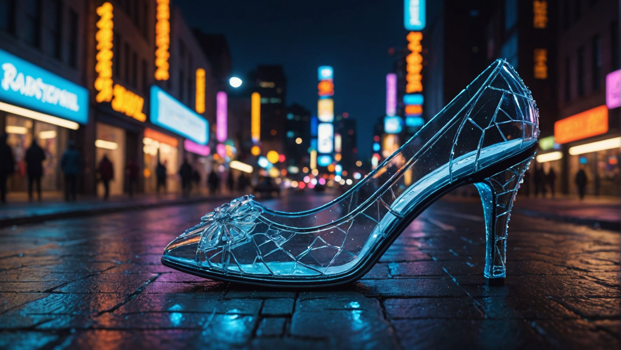
Fairy tale retellings breathe new life into classic stories, offering fresh perspectives on beloved narratives. Cover art for this subgenre should strike a delicate balance between the familiar and the innovative, hinting at the original tale while showcasing the unique twist of the retelling. Artists have the opportunity to play with iconic imagery, subverting expectations and creating visually arresting designs that capture the essence of both the original story and its reimagining.
When designing covers for fairy tale retellings, artists often incorporate recognizable symbols or motifs from the original tales. These could include glass slippers, poison apples, or enchanted roses, depending on the story being retold. However, these elements should be presented in unexpected ways or with modern twists to signal the fresh interpretation within the pages.
Color palettes for fairy tale retelling covers can vary widely, depending on the tone of the new narrative. Traditional, whimsical retellings might embrace vibrant, saturated colors reminiscent of classic storybook illustrations. In contrast, darker or more mature reinterpretations could opt for moodier, more subdued color schemes that hint at the complexities explored in the retelling.
Character depiction is crucial in fairy tale retelling cover art. Protagonists should be portrayed in ways that both evoke their classic counterparts and showcase their reimagined personas. For instance, a modernized Cinderella might be shown in a power suit instead of a ball gown, or a gender-swapped Sleeping Beauty could be depicted as a young man surrounded by thorny vines.
Juxtaposition of modern and traditional elements can create compelling visuals that immediately communicate the nature of the retelling. A Red Riding Hood figure wearing headphones while facing off against a shadowy wolf, or a mermaid tail emerging from a bustling city harbor, can effectively blend the fantastical with the contemporary.
Typography for fairy tale retelling covers often plays with the contrast between classic and modern styles. Ornate, storybook-inspired fonts might be paired with sleek, minimalist typefaces to represent the blending of old and new. Title treatments can incorporate visual elements from the story, such as vines wrapping around letters or text that appears to be carved from ice.
Symbolic imagery beyond the most obvious fairy tale motifs can add depth to the cover design. Artists might incorporate elements that hint at themes explored in the retelling, such as broken chains to represent liberation or mirrors to suggest self-reflection and identity.
The use of negative space and silhouettes can be particularly effective in fairy tale retelling covers. A familiar fairy tale scene rendered as a silhouette with unexpected details visible within can create an intriguing visual that invites closer inspection.
Artists should also consider the target audience when designing covers for fairy tale retellings. Young adult retellings might lean into more dramatic, romance-tinged imagery, while middle-grade versions could emphasize adventure and whimsy. Adult retellings often benefit from subtler, more sophisticated designs that hint at the maturity and complexity of the narrative.
Ultimately, cover art for fairy tale retellings should evoke a sense of nostalgia while promising something new and exciting. It should invite readers to rediscover stories they thought they knew, hinting at the fresh perspectives and unexpected twists waiting within the pages.

