
blog
Consistency in Fantasy Series Covers
When it comes to designing covers for fantasy series, certain principles are essential to ensure series consistency. One of the primary design principles involves maintaining a cohesive visual language across all books. This means that the general layout, style, and theme should remain uniform, creating a recognizable and unified brand for the series.
Another vital principle is the use of a consistent color palette. By carefully selecting and adhering to specific colors, designers can provoke particular emotions and establish a visual connection between different books in the series. For example, a dark, moody palette can evoke feelings of mystery and suspense, which can be integral to many fantasy narratives.
The layout of elements on the cover also plays a significant role in achieving series consistency. This includes the placement of the title, author’s name, and key imagery. Uniformity in layout not only helps with brand recognition but also ensures that each cover looks like an integral part of the whole set.
Additionally, the choice of imagery must remain consistent to convey a seamless narrative continuity. Utilizing recurrent symbols, settings, or character depictions helps maintain a visual storyline that readers can easily follow from one book to the next.
Lastly, paying attention to details like texture and finish, which may include matte versus glossy backgrounds or embossed titles, can further enhance the uniform appearance of a series. These tactile elements, while subtle, contribute significantly to the overall look and feel, ensuring that each book stands out as part of a cohesive set.
As a designer aptly put it, “The cover of a book is like a promise to the reader.” Ensuring that design principles are adhered to across a fantasy series reinforces that promise, offering a satisfying and immersive visual journey that complements the written one.
Color palette considerations
The selection of colors in fantasy series covers is not just a matter of aesthetics; it serves a crucial psychological and emotional function. Different colors can evoke varied feelings, and tapping into these can deepen the reader’s connection to the series. For instance, a predominant use of rich, dark colors like deep blues, purples, and blacks can evoke a sense of mystery and dread, setting the stage for a narrative filled with dark magic or epic battles against formidable antagonists.
Conversely, a lighter palette with natural hues like greens and earth tones might suggest a world steeped in nature, full of adventure and discovery. This can be particularly effective for series that revolve around quests or journeys through enchanted forests and mystical lands. Consistency in color palette contributes significantly to series consistency by establishing a visual thread that ties each installment together, making it clear at a glance that these books belong to the same world.
Indeed, color can also signify shifts in tone or plot developments within the same series. For example, early books might employ warmer, hopeful colors, symbolizing the protagonist’s growth and optimistic outlook. As the series progresses and conflicts intensify, the palette might shift to darker, more oppressive tones to reflect the narrative’s escalating tensions and stakes.
Moreover, the targeted demographic can influence palette choices. Darker, more subdued colors may appeal to a mature audience, while brighter and more vivid colors might attract younger readers. This is essential for marketing efforts, ensuring that the books’ covers align with the expectations and preferences of their intended audience.
“Color in design is very subjective. What evokes one kind of reaction in one person may evoke a different reaction in someone else. But when used consistently, it can create a recognizable and emotionally resonant brand.”
Each color palette chosen for a fantasy series should also harmonize with the genre and the world-building elements within the narrative. If a series features a world where the primary setting is an icy, desolate landscape, then cool tones of blue, white, and grey could dominate the palette to reinforce this environment visually. On the other hand, a series set in a fiery, desert-like world might use shades of red, orange, and yellow to convey heat and danger.
The ultimate goal is to create a unified and immersive visual experience. Consistent color usage across covers can instantly make a series recognizable on bookstore shelves, enhancing its aesthetic appeal and marketability. By carefully considering color palette choices and applying them systematically, designers not only maintain series consistency but also deepen the reader’s immersion into the fantasy world, making the visual journey as enchanting as the story itself.
Typography and fonts
Typography and fonts play a crucial role in ensuring series consistency for fantasy book covers. The fonts selected must be carefully chosen to reflect the tone and style of the series while maintaining coherence across all volumes. This begins with the primary typeface used for the series title and the author’s name, which should possess a unique yet legible quality that captures the essence of the fantasy genre.
For instance, serif fonts often evoke a sense of timelessness and grandeur, which can be particularly effective for epic fantasy series. These fonts, with their elegant and intricate details, lend a classic and traditional feel, aligning well with narratives steeped in ancient lore and mythical elements. On the other hand, sans-serif fonts might be more suitable for contemporary or urban fantasy series, offering a sleek and modern aesthetic that mirrors the storyline’s environment.
Beyond the primary typeface, secondary fonts used for subtitles, taglines, or other text elements also need to maintain harmony with the overall design. These secondary fonts should complement the main typeface rather than compete with it. Consistent use of these fonts helps in crafting a cohesive identity that readers can easily recognize.
A consistent typographical hierarchy is another vital consideration. Ensuring that headers, subheaders, and body text follow a uniform structure across all covers enhances readability and visual appeal. This hierarchical consistency aids readers in navigating the information presented on the cover, from the series title to supplementary details like book number and tagline.
Moreover, typography can serve as a narrative tool. The style and embellishment of fonts can communicate the story’s mood or a character’s arc. For example, distressed or weathered fonts might hint at an old, war-torn world, whereas ornate and decorative fonts could suggest a magical or regal element within the story. Such deliberate choices in font design can significantly enhance the thematic storytelling aspect of the cover.
The placement and alignment of text are equally important. Consistent positioning of the title, author’s name, and other textual elements ensures that each cover not only looks visually aligned but also adheres to the established brand identity. Proper alignment and spacing also contribute to the overall balance and prevent the cover from appearing cluttered or disjointed.
Typography isn’t limited to just letters and numbers; it can also include special characters and symbols relevant to the series. Integrating custom glyphs or icons that resonate with the book’s themes (such as dragon icons in a dragon-themed series) into the typography further solidifies the series’ visual identity. These elements provide an extra layer of detail that can captivate discerning readers and collectors.
Lastly, the technological advancements in digital typography provide designers with more creative freedom than ever before. Innovations such as variable fonts, which adjust weight and style seamlessly, offer designers the flexibility to create dynamic and responsive typography that remains consistent across various formats and devices, from printed books to digital e-readers.
Typography and fonts are not merely decorative but integral components of series consistency in fantasy book covers. By carefully selecting and consistently applying typographical elements, designers can forge a distinctive and memorable visual identity that enhances the reader’s connection to the fantasy world, making each book an essential piece of the collective narrative, in this weblink.
Symbolism and imagery
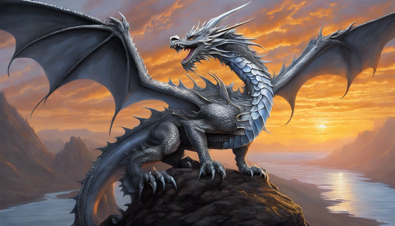
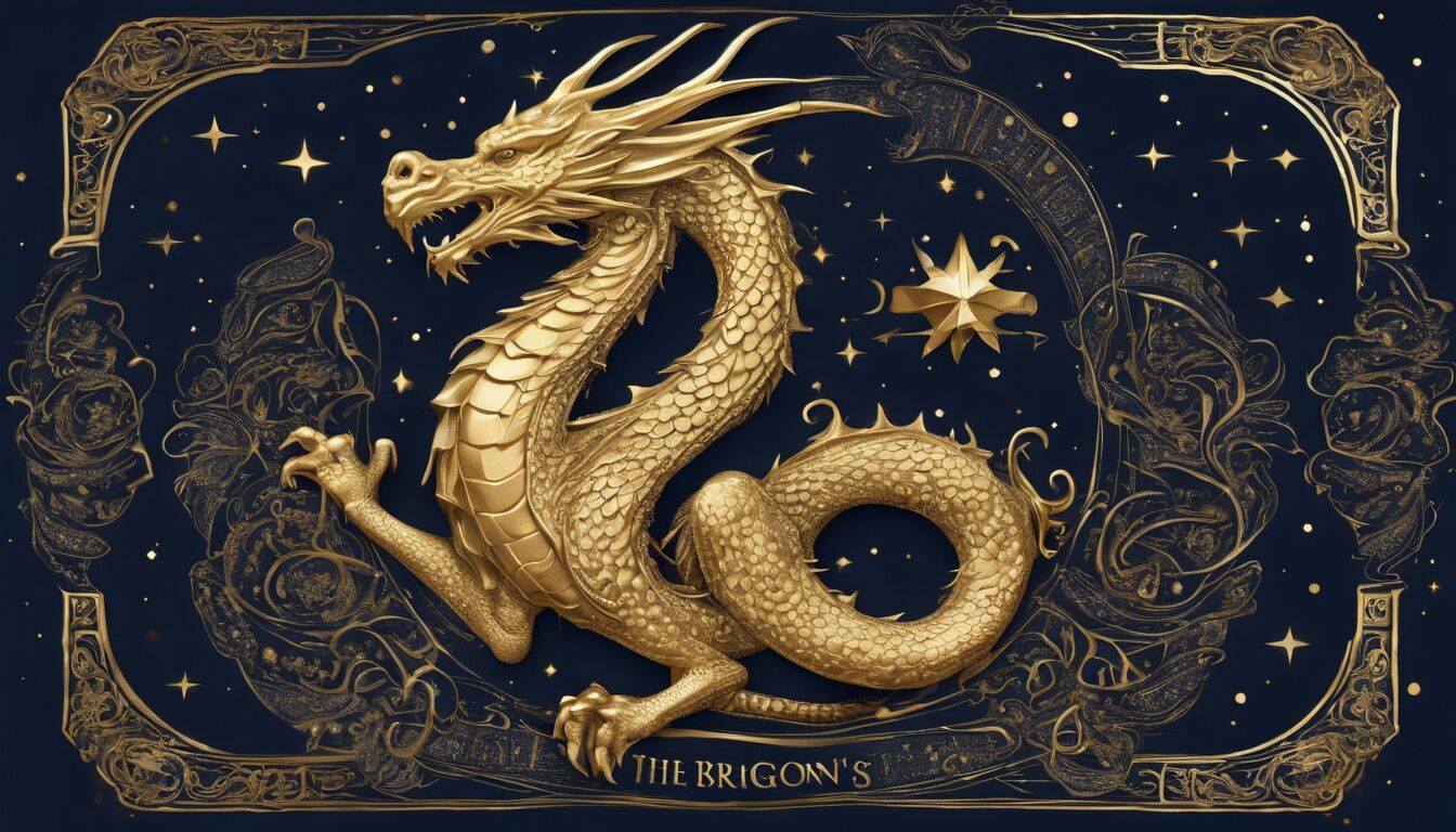
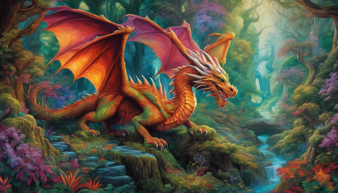
Symbolism and imagery form the backbone of fantasy series covers, weaving a tapestry of visual storytelling that echoes the themes and narratives within the pages. Consistent use of symbols across a series reinforces thematic continuity and provides readers with visual anchors that enhance their immersion into the fantasy world. For example, if a series revolves around a mythical kingdom and its royal lineage, images of crowns, swords, and heraldic crests can be employed repetitively yet innovatively across the covers to establish a firm sense of identity and lineage throughout the series.
Imagery chosen for the covers should resonate deeply with the fantasy elements of the narrative. Dragons, runes, enchanted forests, and other archetypal fantasy images can be skillfully integrated to visually depict the realm they represent. These images need not be overly complex; sometimes, a single powerful symbol can convey more than an intricate illustration. For instance, a phoenix could symbolize rebirth and immortality, while an hourglass might represent the passage of time—a recurring theme in many epic fantasies.
One aspect to consider in symbolism and imagery is the balance between uniqueness and series consistency. While each cover should have its own unique elements to reflect the individual book’s plot and progression, there should be overarching symbols that tie the series together. This connection could be achieved through background elements that remain constant, motifs that recur in each cover, or even through color symbolism that evolves with the story. These elements act like visual leitmotifs, subconsciously linking the books in the minds of readers.
Table of Common Fantasy Symbols and Their Meanings:
| Symbol | Meaning |
| Dragon | Power, Wisdom, and Magic |
| Sword | Honor, Valor, and Conflict |
| Crown | Authority, Leadership, and Royalty |
| Griffin | Guardianship and Vengeance |
| Phoenix | Rebirth and Immortality |
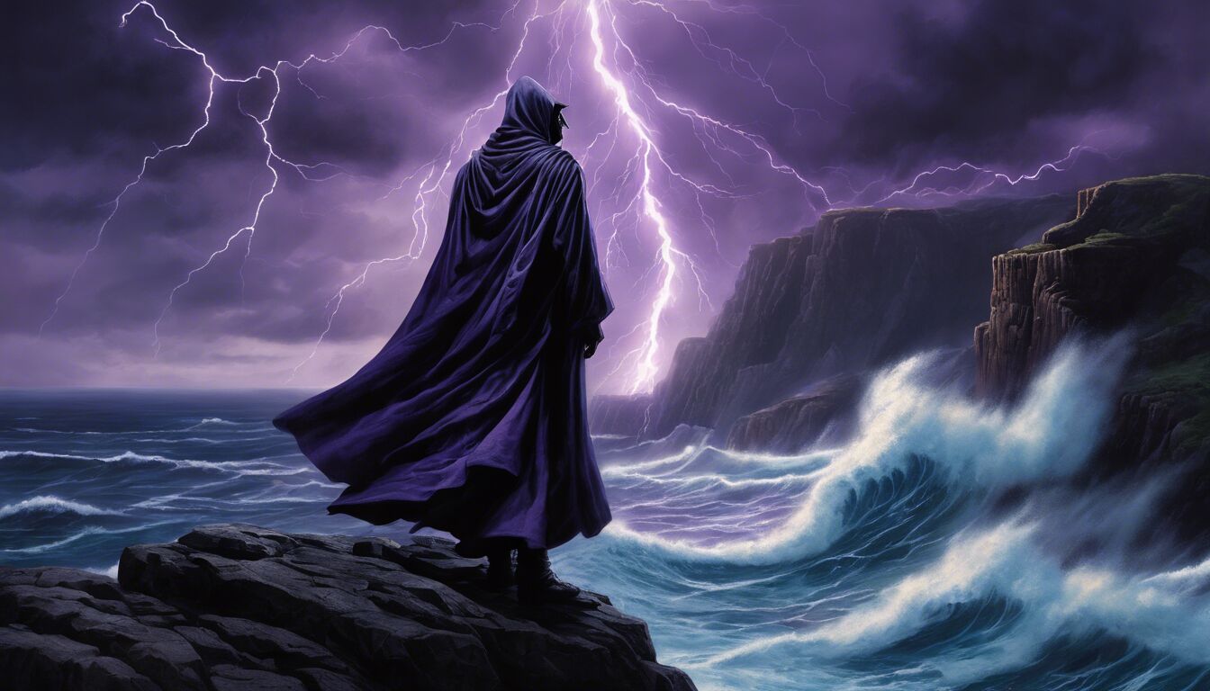
Consistency in character representation is equally important. Characters featured on the covers should be depicted in a manner faithful to their descriptions within the books. This might extend to their attire, expressions, and even the weapons or magical items they carry. When characters are portrayed inconsistently, it can disrupt the reader’s immersion, making it challenging to mentally align their vision of the character with what they see on the covers.
Moreover, the use of landscapes and architectural elements can effectively symbolize the setting and scope of the fantasy world. Enchanted castles, sprawling kingdoms, dark forests, and mystic lands can all be depicted to provide a vivid backdrop that hints at the adventure within. These environmental cues are essential in setting the scene and drawing the reader into the fantasy realm right from the onset. The consistent depiction of these environments can gradually build a complete and detailed visual map of the world as the series progresses.
Another powerful tool is the integration of mythical and cultural symbols that resonate with the story’s lore. These can be specially designed runes, ancient artifacts, or mystical creatures native to the book’s world. Such elements do more than just decorate the cover; they provide additional layers of meaning and intrigue. For instance, a series set in a fantasy world inspired by Norse mythology might repeatedly utilize symbols like Yggdrasil, the World Tree, or the runes of the Elder Futhark, enriching the series consistency.
Texture and style of imagery also play a crucial role in maintaining consistency. Whether the covers employ a painted, illustrated style or a more modern digital art approach, this stylistic choice needs to be uniform. Mixing styles can create a jarring effect, disrupting the visual fluidity of the series. Thus, designers must choose an artistic direction that aligns with the genre and narrative, and stick with it consistently across all covers.
When symbolism and imagery are used thoughtfully and consistently, they not only enhance the aesthetic appeal of fantasy book covers but also deepen the reader’s connection to the story. These visual elements work in harmony to create a seamless and immersive experience, reinforcing the themes and narratives woven into the series, and ensuring that each book stands as a testament to the fantastical world it represents.
Character representation
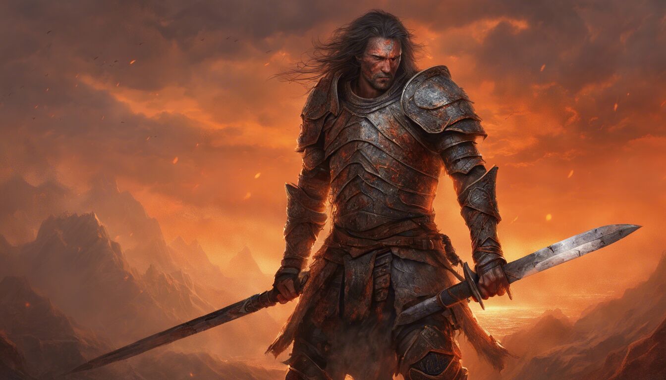
In the realm of character representation, maintaining series consistency on fantasy book covers is essential in forging a lasting connection between the reader and the narrative. Characters must be depicted in a manner consistent with their descriptions and roles throughout the series. This means that the protagonist’s visage, attire, and overall demeanor should evolve in alignment with the storyline yet remain recognizable across all installments. Such consistency aids in cementing the reader’s mental image of the character, enhancing their emotional investment in the journey.
When characters are portrayed inconsistently, it can create a dissonance that disrupts the reader’s experience. Imagine a scenario where the hero’s appearance changes drastically from one cover to the next without a narrative reason. This inconsistency can jar the reader, making it difficult to maintain the suspension of disbelief necessary for full immersion into the fantasy world. Thus, a meticulous approach to character representation is paramount.
To achieve this, collaboration between authors and cover designers is often essential. Authors provide nuanced descriptions, while designers bring these characters to life visually. Attention must be paid to detail, such as facial features, hairstyle, and distinctive items like weapons or magical artifacts. For instance, if a character wields a legendary sword known for its unique design, this weapon should appear consistently on covers, serving as a visual anchor for the reader.
Importantly, character representation must also reflect the character’s emotional and narrative arcs. A hero who starts as an innocent farm boy but grows into a battle-hardened warrior over the course of the series should visually evolve to reflect this transformation—perhaps through changes in posture, expression, or even armor and weaponry. These visual cues provide readers with an immediate sense of progression and development, enhancing their engagement with the story.
Character groups and relationships can also be depicted to reinforce connections and themes throughout the series. Group portraits on covers can highlight key alliances or conflicts, further drawing readers into the intricate web of relationships within the narrative. For example, a series focusing on a fellowship of diverse characters might show the group together in various settings, emphasizing their journey and camaraderie.
Furthermore, diversity in character representation is becoming increasingly important in modern fantasy. Accurate and respectful portrayal of characters from varied backgrounds can enrich the series and broaden its appeal. This includes consideration of different ethnicities, body types, abilities, and genders, ensuring that a broader audience sees themselves reflected in the world of the book. Such inclusivity adds depth and resonance to the narrative, inviting a wider readership to engage with the series.
Moreover, the use of stylistic elements such as art techniques and visual motifs in character depiction can significantly impact series consistency. A uniform artistic style, whether it be hyper-realistic, stylized, or illustrative, ensures that each character image aligns well with others in the series. This consistency in style not only pleases the eye but also helps in solidifying the visual brand of the series.
In addition, cover designers often employ symbolic aspects of character representation to convey deeper meanings. For instance, a character’s attire might change colors to symbolize shifts in their moral alignment or inner struggles. Subtle details like the state of the character’s attire—pristine or battle-worn—can convey a wealth of story context at a glance. Such symbolic representation enriches the reader’s understanding and anticipation of the narrative.
Ultimately, character representation on fantasy book covers serves as the bridge between the narrative world and the reader’s imagination. It is through consistent, detailed, and thoughtful portrayal that characters transcend the pages, leaving a lasting impression that resonates throughout the series. By maintaining a coherent and evocative visual language, designers and authors can ensure that every cover acts as a visual chapter in the grand tapestry of the fantasy narrative, making the overall story more compelling and unforgettable.
Evolution of cover art techniques
The progression of cover art techniques in fantasy series mirrors the broader advancements in graphic design and publishing technology. In the early days of mass-market paperbacks, fantasy book covers were often hand-painted illustrations, meticulously crafted by artists to capture the essence of the story. These covers were characterized by their detailed and often elaborate depictions of fantastical elements, from dragons and enchanted forests to heroic characters and mythical artifacts. The artistry of these covers was limited only by the skill and imagination of the artist, and each piece was a labor of love.
As printing technology evolved, so did the techniques used in cover design. The introduction of computer-based design tools in the 1980s and 1990s revolutionized the field. Artists could now blend traditional hand-painted elements with digital enhancements, achieving a level of detail and polish that was previously unattainable. This hybrid approach allowed for greater experimentation and innovation, as designers could manipulate images with precision and efficiency, creating dynamic compositions that were both visually striking and thematically rich.
The rise of digital illustration in the late 20th and early 21st centuries marked another significant shift in cover art techniques. With advanced software like Adobe Photoshop and Illustrator, artists could create entirely digital artworks, offering unparalleled flexibility and control. This transition facilitated the production of more intricate and complex designs, incorporating layers of texture, lighting effects, and fine details that would have been exceedingly difficult to achieve by hand. As a result, fantasy book covers became more vibrant and immersive, capable of conveying a richer sense of the world within the pages.
Moreover, the digital era brought about the proliferation of 3D modeling and rendering software. These tools enabled designers to craft hyper-realistic covers that could depict fantastical creatures, sprawling landscapes, and intricate artifacts with astonishing clarity and depth. Through 3D rendering, artists could manipulate perspective and lighting to create compositions that felt dynamic and lifelike, further enhancing the reader’s sense of immersion. This technique also allowed for consistency in character representation, as 3D models could be reused and adapted across multiple covers while maintaining a coherent look and feel.
Recent innovations have continued to push the boundaries of what is possible in cover art design. Augmented reality (AR) and virtual reality (VR) technologies are beginning to make their mark, offering interactive and immersive cover experiences. Imagine a fantasy book cover that, when viewed through an AR app, comes to life with animated elements or hidden details that reveal themselves. Such advancements are not only a testament to the rapid pace of technological development but also a beacon for the future of cover design, promising ever more engaging and innovative ways to captivate readers.
Throughout these technological advancements, one constant has remained: the importance of series consistency. As techniques have evolved, so too has the capability to maintain a cohesive visual identity across a series. Digital tools allow designers to easily replicate and modify elements, ensuring that each volume in a series adheres to the established aesthetic while reflecting its unique narrative arc. This consistency is crucial in building a recognizable brand and ensuring that the series stands out amid a crowded market.
Ultimately, the evolution of cover art techniques reflects both the technological advancements in the field and the enduring need for creative expression. From hand-painted illustrations to digital masterpieces and beyond, the journey of cover art in fantasy series showcases the endless possibilities for visual storytelling. As new technologies continue to emerge, they will undoubtedly inspire fresh approaches and techniques, continuing to shape the way we experience and engage with fantasy literature.