blog
Capturing the Imagination: Fantasy Cover Design Essentials
Fantasy book covers serve as gateways to enchanted realms, capturing the reader’s imagination with a single glance. Key elements that define these captivating designs include striking imagery, evocative landscapes, and iconic symbols. “A great cover is a visual gateway to the story within,” as many designers often say. Characters, whether mysterious silhouettes or detailed portraits, play a crucial role in conveying the essence of the narrative. Magical artifacts, such as wands, amulets, or ancient tomes, can instantly communicate the fantastical nature of the story. Ethereal lighting effects, like glowing runes or shimmering auras, add an air of mystery and wonder. Fantastical creatures, from majestic dragons to mischievous faeries, can serve as powerful focal points. Architectural elements, such as towering castles or otherworldly structures, help establish the setting and scale of the fantasy world. Intricate borders or frames can enhance the magical feel, creating a window into another realm. Atmosphere is paramount, whether it’s the misty depths of an enchanted forest or the swirling cosmos of a magical dimension. By skillfully combining these elements, cover designers can create a visual feast that not only represents the story but also ignites the reader’s imagination, compelling them to dive into the pages within.
Color palettes and mood creation
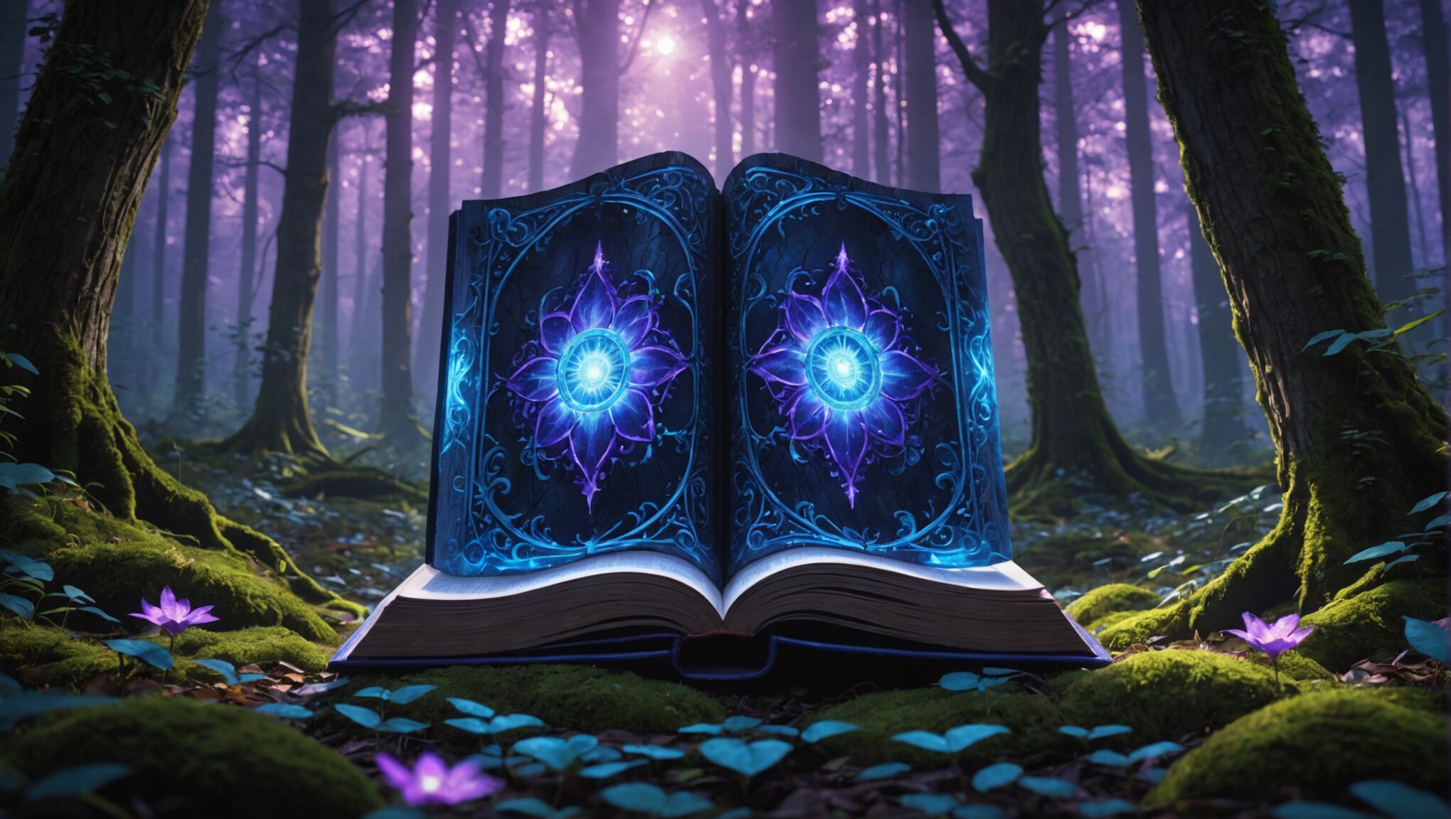 The color palette chosen for a fantasy book cover is a powerful tool in setting the mood and evoking emotions that align with the story’s themes. Vibrant, saturated hues can convey energy and adventure, while muted tones might suggest mystery or melancholy. Deep blues and purples often denote magic and the unknown, while earthy greens and browns can ground the fantasy in a more natural setting.
“Color is a power which directly influences the soul,” as noted by the artist Wassily Kandinsky, and this principle is particularly relevant in fantasy cover design.
For epic fantasies, designers might opt for bold, contrasting colors to create a sense of drama and conflict. Gold and crimson, for instance, can evoke royalty and bloodshed, perfect for tales of warring kingdoms. Conversely, pastel shades might be employed for whimsical or young adult fantasies, creating a softer, more approachable aesthetic.
The use of light and shadow in the color scheme is crucial in fantasy cover design. A radiant glow emanating from a central figure or object can suggest divine power or magical energy, while deep shadows can hint at lurking dangers or hidden secrets. Gradients and color transitions can be particularly effective in creating depth and dimension, drawing the eye into the fantastical world depicted on the cover.
Color harmony is essential in creating a cohesive and visually pleasing design. Complementary colors can be used to make certain elements pop, while analogous color schemes can create a sense of unity and flow. Monochromatic designs, using variations of a single hue, can be strikingly effective in conveying a specific mood or atmosphere.
Master Photoshop for fantasy covers. See all details.
The emotional associations of colors play a significant role in mood creation. Red might signify passion or danger, while blue can evoke tranquility or sadness. Green often represents nature or growth, and purple is frequently associated with royalty and mysticism. By carefully selecting and combining these colors, designers can create an immediate emotional response in potential readers.
Texture in color application adds another layer of depth to fantasy covers. Metallic finishes can lend a sense of preciousness or antiquity, while matte colors might evoke a more grounded, earthy feel. Iridescent or holographic effects can enhance the magical quality of the design, suggesting shifting realities or otherworldly phenomena.
The overall saturation and brightness of the color palette also contribute significantly to mood creation. High-contrast, bright colors can create a sense of optimism and adventure, while desaturated or dark tones might suggest a grittier, more somber tale. The interplay between light and dark areas on the cover can guide the viewer’s eye and create focal points that highlight key elements of the design.
Typography and font selection for fantasy genres

The selection of typography for fantasy book covers is a critical aspect that can make or break the overall design. Fonts chosen for titles and author names must not only be legible but also convey the essence of the story and its genre. Serif fonts, with their classic and timeless appeal, often work well for epic or historical fantasies, lending an air of antiquity and tradition. On the other hand, sans-serif fonts can give a more modern or streamlined look, suitable for urban fantasy or futuristic magical worlds.
Custom lettering or hand-drawn typography can add a unique and personal touch to fantasy covers. These bespoke designs can incorporate magical elements, such as swirls, flames, or ice crystals, directly into the letterforms, enhancing the thematic connection between text and image. Designers might also consider adapting existing fonts, adding flourishes or texture to create a more fantastical appearance.
The weight and style of the font play a crucial role in setting the tone. Bold, heavy fonts can suggest power and drama, while lighter, more delicate typefaces might be appropriate for more whimsical or romantic fantasy tales. Italic or script fonts can lend an air of elegance or mysticism, perfect for stories involving courtly intrigue or ancient prophecies.
Consideration must also be given to the hierarchy of information on the cover. The title typically takes center stage, with the author’s name and any subtitles or series information in supporting roles. The size and placement of these elements should guide the reader’s eye and create a balanced composition.
Texture and effects applied to the typography can further enhance its impact. Metallic or glossy finishes can suggest preciousness or magic, while a weathered or distressed look might be suitable for grittier fantasy worlds. Subtle gradients or shadows can add depth and dimension to the text, making it feel more integrated with the cover art.
The color of the typography is another crucial factor. It must contrast sufficiently with the background to ensure readability while also complementing the overall color scheme of the cover. Sometimes, unexpected color choices for typography can create striking and memorable designs that stand out on bookshelves.
Designers should also consider the cultural and historical connotations of certain fonts. For example, Gothic or Blackletter styles might evoke medieval European settings, while more ornate, curving scripts could suggest Middle Eastern or Asian-inspired fantasies. This attention to detail can help reinforce the world-building aspect of the story before the book is even opened.
Lastly, it’s important to remember that while creativity in typography is encouraged, legibility should never be sacrificed. The title and author’s name must be easily readable even at thumbnail size, as many potential readers will first encounter the cover online. Striking the right balance between artistic expression and practical considerations is key to creating a truly effective fantasy book cover design.
Integrating magical and mythical imagery
Incorporating magical and mythical imagery into fantasy book covers is an art form that requires both creativity and strategic thinking. These visual elements serve as powerful symbols that instantly communicate the genre and themes of the book to potential readers.
One of the most effective ways to integrate magical imagery is through the use of iconic symbols associated with fantasy and magic. Wands, crystal balls, ancient runes, and mystical amulets are all recognizable elements that can instantly set the tone. These symbols can be subtly woven into the background or prominently featured as central focal points, depending on their importance to the story.
Mythical creatures are another staple of fantasy cover design. Dragons, unicorns, phoenixes, and griffins not only capture the imagination but also hint at the richness of the world within the pages. These creatures can be depicted in various ways, from realistic renderings to stylized silhouettes, each approach offering a different feel to the cover.
| Creature | Symbolic Meaning |
| Dragon | Power, wisdom, danger |
| Unicorn | Purity, innocence, magic |
| Phoenix | Rebirth, transformation, immortality |
| Griffin | Strength, nobility, guardianship |
Magical environments play a crucial role in setting the stage for fantasy stories. Enchanted forests with luminescent flora, floating islands defying gravity, or cities nestled within impossible landscapes all serve to transport the viewer into a world of wonder. These settings can be depicted through intricate details or broad, atmospheric brushstrokes, depending on the desired effect.
The use of light and energy in fantasy cover design is particularly effective in conveying magical elements. Glowing auras, crackling energy fields, or streams of sparkling magic can add dynamism and a sense of the supernatural to the composition. These effects can be used to highlight key characters or objects, drawing the eye and creating focal points.
Portals and gateways are common motifs in fantasy literature and can be powerfully represented on book covers. Whether it’s a shimmering doorway between worlds or a swirling vortex of magic, these elements suggest adventure and the unknown, inviting the reader to step through.
Celestial imagery, such as starry skies, mystical constellations, or otherworldly planets, can add a cosmic dimension to fantasy covers. These elements can suggest themes of destiny, ancient powers, or the vastness of magical realms.
Incorporating mythological symbols and artifacts from various cultures can add depth and intrigue to fantasy cover designs. Ancient Egyptian hieroglyphs, Norse runes, or Celtic knots can hint at the inspiration behind the fantasy world or the magical systems within it.
The integration of magical and mythical imagery should always serve the story and target audience. For young adult fantasies, the imagery might be more whimsical and approachable, while adult epic fantasies might feature darker, more complex visuals. The key is to strike a balance between fantastical elements and relatable imagery that allows readers to connect with the cover emotionally.
Texture and materiality can enhance the magical quality of cover art. Incorporating elements that suggest ancient parchment, weathered stone, or shimmering metals can add tactile appeal and reinforce the fantastical nature of the imagery.
Finally, negative space can be just as important as the magical elements themselves. Strategic use of empty areas can create a sense of mystery or vastness, allowing the viewer’s imagination to fill in the gaps and inviting them to explore further by opening the book.
Composition and layout techniques
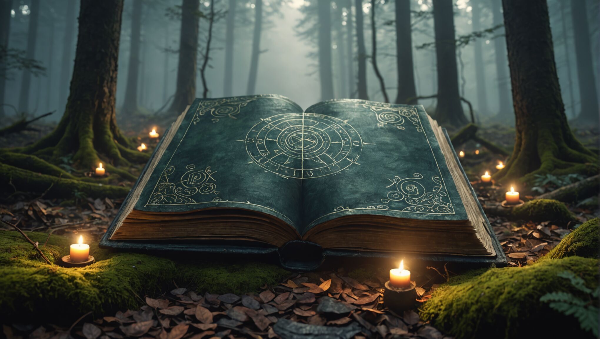 When designing a fantasy book cover, the composition and layout are crucial elements that can make or break the overall impact. A well-structured layout guides the viewer’s eye through the cover, highlighting key elements and creating a sense of balance and harmony.
One fundamental principle to consider is the rule of thirds. Dividing the cover into a 3×3 grid and placing important elements along these lines or at their intersections can create a visually pleasing and dynamic composition. This technique can be particularly effective for positioning characters, magical artifacts, or focal points of interest.
The use of leading lines is another powerful tool in fantasy cover design. These can be created through the arrangement of characters, the flow of magical energy, or architectural elements within the scene. Leading lines draw the viewer’s attention to specific areas of the cover, such as the title or a central character, creating a sense of movement and depth.
Layering is an essential technique for creating depth and dimension in fantasy covers. By incorporating foreground, middle ground, and background elements, designers can craft a rich, immersive scene that invites exploration. This layering can be further enhanced through the use of atmospheric perspective, where distant objects appear less detailed and more muted in color.
The concept of visual hierarchy is crucial in ensuring that the most important elements of the cover stand out. This can be achieved through size, color contrast, and positioning. Typically, the title and author’s name should be prominently displayed, with supporting elements arranged to complement rather than compete with these key pieces of information.
Negative space, or the areas of the cover left empty, can be just as important as the filled areas. Strategic use of negative space can create breathing room, emphasize certain elements, and contribute to the overall balance of the composition. In fantasy covers, negative space can also evoke a sense of mystery or the unknown.
Symmetry and asymmetry both have their place in fantasy cover design. Symmetrical compositions can convey a sense of order, power, or formality, while asymmetrical layouts can create tension, dynamism, and a more organic feel. The choice between these approaches should be guided by the tone and themes of the book.
The use of framing devices can help to contain and focus the viewer’s attention. This might involve ornate borders reminiscent of ancient tomes, or more subtle framing techniques using light, shadow, or environmental elements from the fantasy world.
Scale and proportion play a significant role in conveying the epic nature of many fantasy stories. Juxtaposing small figures against vast landscapes or towering magical constructs can create a sense of awe and adventure. Conversely, focusing on intimate details can draw the viewer into the intricate magic systems or character relationships within the story.
The integration of text elements with the visual components is a delicate balance. The title and author’s name should be legible and prominent, but also feel like an organic part of the overall design. This might involve intertwining text with magical effects or incorporating it into the landscape itself.
Designers should also consider the impact of their composition at various sizes, from large display posters to small online thumbnails. Ensuring that the key elements remain clear and impactful at different scales is crucial in today’s diverse marketing landscape.
Finally, the overall flow of the composition should guide the viewer’s eye in a way that tells a visual story. This might involve creating a circular path that keeps the eye moving around the cover, or a more linear progression that mirrors the narrative journey of the book.
By mastering these composition and layout techniques, designers can create fantasy book covers that not only capture the imagination but also effectively communicate the essence of the story within. The goal is to create a visual experience that is as enchanting and immersive as the fantasy world contained within the pages of the book.
Balancing intrigue and marketability

Creating a fantasy book cover that captivates potential readers while also appealing to market trends requires a delicate balance. The cover must intrigue and spark curiosity, yet remain accessible and recognizable within the genre. To achieve this, designers often start by researching current bestsellers and popular motifs in fantasy literature, identifying elements that resonate with readers while looking for opportunities to add unique twists.
One effective strategy is to focus on a single, powerful image that encapsulates the essence of the story. This could be an iconic character, a magical artifact, or a pivotal scene from the book. By presenting this central element in a striking and memorable way, the cover can stand out on crowded shelves or digital marketplaces while still conveying the fantasy genre.
Incorporating subtle details and Easter eggs that relate to the story can add depth for those who look closer, rewarding potential readers who take the time to examine the cover. These details can create intrigue without overwhelming the overall design, encouraging viewers to pick up the book and learn more.
The use of negative space can be particularly effective in balancing intrigue and marketability. A clean, uncluttered design with strategic use of empty areas can create a sense of mystery and sophistication, appealing to both dedicated fantasy readers and those new to the genre.
Color psychology plays a crucial role in this balancing act. While vibrant, fantastical colors can capture attention, they should be used judiciously to avoid appearing garish or amateurish. A carefully chosen color palette that aligns with the book’s themes can evoke the right emotions and set appropriate expectations for the story within.
Typography is another key element in striking this balance. The font choice should be legible and genre-appropriate, but with enough unique character to stand out. Custom lettering or subtle modifications to existing fonts can add a touch of originality without sacrificing readability or marketability.
Designers must also consider the book’s target audience when balancing intrigue and marketability. A cover for a young adult fantasy novel might lean more towards bright, dynamic imagery, while an adult epic fantasy might benefit from a more subdued, sophisticated approach. Understanding the expectations and preferences of the intended readership is crucial for creating a cover that both intrigues and sells.
The composition of the cover should guide the viewer’s eye towards key selling points, such as the author’s name (particularly important for established writers) or any awards or accolades the book has received. These elements should be integrated seamlessly into the overall design, enhancing rather than detracting from the fantastical elements.
It’s important to consider how the cover will appear in various formats, from physical bookstores to online thumbnails. Ensuring that the key elements of the design remain clear and impactful at different scales is essential for maintaining both intrigue and marketability across all platforms.

