blog
Blending Genres: Creating Hybrid Fantasy Covers
Elements of effective fantasy cover design
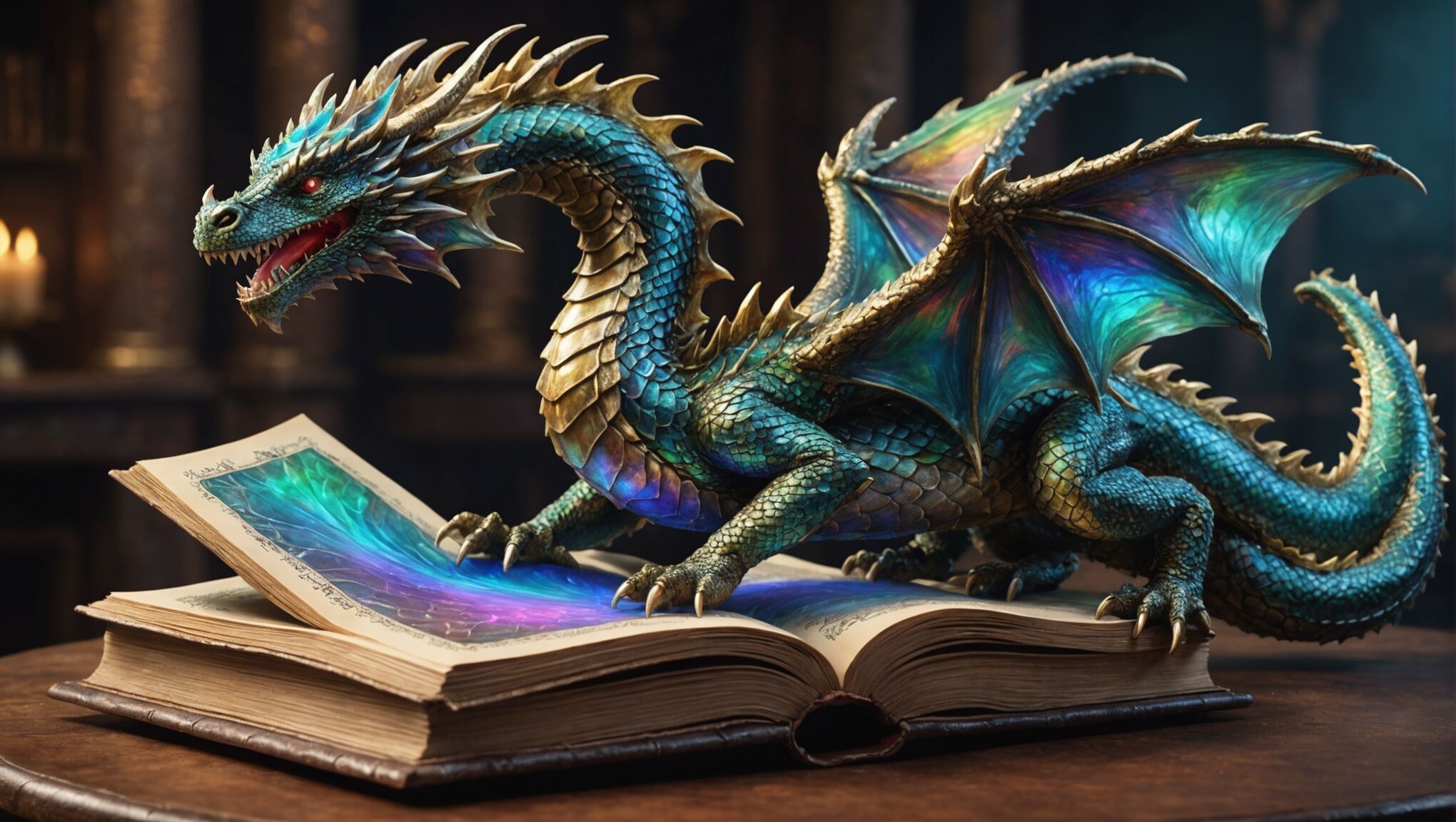
 Fantasy book covers are a crucial element in capturing readers’ attention and conveying the essence of the story within. Effective fantasy cover design incorporates several key elements that resonate with the genre’s audience. Imagery plays a significant role, often featuring mythical creatures, magical landscapes, or iconic symbols that represent the fantasy world. These visual cues instantly communicate the genre and set expectations for the reader.
“A book cover is a distillation of the story inside, a visual representation of the world the author has created.” – Chip Kidd, graphic designer and author
Character depiction is another vital aspect of fantasy cover design. Featuring the protagonist or a pivotal scene from the story can create an immediate connection with potential readers. The character’s appearance, clothing, and posture should reflect the tone and setting of the book, whether it’s a gritty, realistic fantasy or a whimsical, lighthearted tale.
Color palette selection is crucial in evoking the right mood and atmosphere. Rich, vibrant colors often signify epic adventures, while darker, muted tones may suggest a more somber or mysterious narrative. The use of contrasting colors can create visual interest and draw the eye to important elements of the design.
Texture and detail are essential in bringing fantasy covers to life. Intricate patterns, ornate borders, or subtle background details can add depth and complexity to the overall design, inviting readers to explore the cover more closely.
Typography is a critical component that should complement the visual elements without overshadowing them. Font choice can convey genre, tone, and even the time period or setting of the story. Fantasy covers often feature custom lettering or stylized fonts that enhance the magical or otherworldly feel of the design.
Composition is key to guiding the viewer’s eye and creating a hierarchy of visual elements. A well-balanced layout ensures that the title, author name, and key imagery work together harmoniously, rather than competing for attention.
Lastly, symbolism and metaphor can be powerful tools in fantasy cover design. Incorporating elements that represent themes or key plot points can intrigue readers and provide subtle hints about the story’s content without giving too much away.
Identifying complementary genres for blending

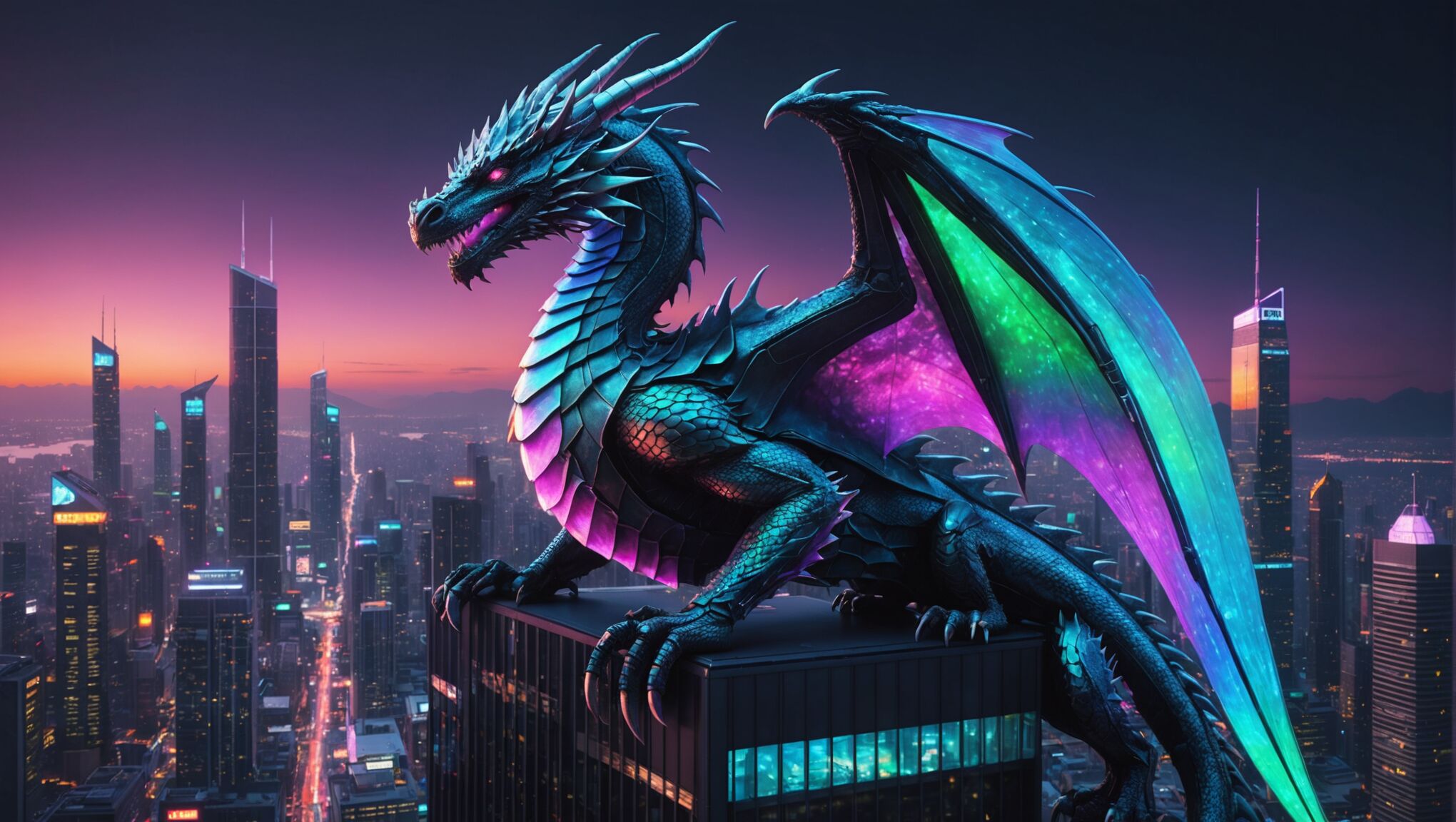
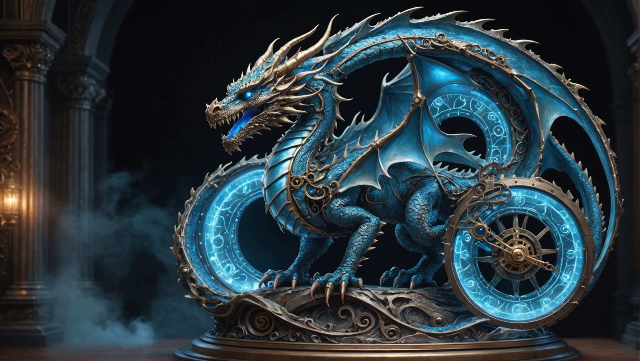
When blending genres for fantasy cover art, it’s essential to choose complementary styles that enhance rather than clash with the core fantasy elements. Science fiction and fantasy often make a natural pairing, as both genres deal with speculative worlds and extraordinary concepts. This combination can result in captivating “science fantasy” covers that blend futuristic technology with magical elements, appealing to readers who enjoy both genres.
Horror is another genre that meshes well with fantasy, creating dark fantasy or gothic fantasy hybrids. These covers might incorporate eerie atmospheres, supernatural creatures, and a sense of foreboding alongside traditional fantasy imagery. The result can be particularly striking, attracting readers who crave a mix of wonder and dread in their stories.
Historical fiction and fantasy can also blend seamlessly, giving rise to historical fantasy or alternate history covers. This combination allows for the integration of period-specific details with fantastical elements, creating visually rich designs that appeal to history buffs and fantasy enthusiasts alike.
Romance is a versatile genre that can be woven into fantasy cover designs to target readers who enjoy both magical worlds and love stories. These covers might feature romantic couples alongside mystical backgrounds or incorporate symbols of both love and magic.
For a more action-packed approach, blending fantasy with thriller or adventure genres can result in dynamic covers that promise high-stakes quests and intense plot lines. These hybrids often feature dramatic scenes or characters in motion, combined with fantasy elements to create an sense of urgency and excitement.
Contemporary or urban settings can also be effectively merged with fantasy, resulting in urban fantasy covers. These designs might juxtapose modern cityscapes with magical creatures or phenomena, appealing to readers who enjoy seeing fantastical elements in familiar, real-world contexts.
When considering genre blends, it’s crucial to understand the target audience and ensure that the chosen combination aligns with the story’s content. The most successful hybrid covers will strike a balance between the conventions of each genre while creating a unique visual identity that sets the book apart in a crowded marketplace.
Techniques for merging visual styles
When merging visual styles to create hybrid fantasy covers, artists employ various techniques to seamlessly blend elements from different genres. One effective approach is layering, where components from each genre are strategically placed on top of one another. This method allows for the creation of depth and complexity, with fantasy elements intertwining with those of the complementary genre.
Stay updated with the latest trends. Get the latest here.
Opacity manipulation is another powerful tool in the artist’s arsenal. By adjusting the transparency of different elements, designers can create a sense of ethereal blending between genres. For instance, a ghostly historical figure might appear partially transparent against a solid fantasy landscape, merging the historical and fantastical aspects of the cover.
Color grading plays a crucial role in unifying disparate elements. By applying a consistent color palette or filter across all components of the cover, artists can create a cohesive look that bridges the gap between genres. This technique is particularly useful when combining elements with vastly different original color schemes.
Texture blending is essential for creating a seamless transition between genre-specific elements. By carefully matching and blending textures, artists can make disparate objects appear as if they belong in the same world. This might involve adding a magical shimmer to a sci-fi spaceship or giving a fantasy creature a more realistic, gritty texture to fit a horror theme.
The use of transitional elements can smoothly connect different genre styles. These could be objects or effects that have characteristics of both genres, serving as a visual bridge. For example, a trail of magical energy might morph into futuristic data streams, connecting fantasy and science fiction elements.
Perspective and scale manipulation can create intriguing juxtapositions that blend genres effectively. By playing with the size and positioning of elements from different genres, artists can create surreal and captivating compositions that challenge viewers’ expectations.
Symbolic integration is a subtle yet powerful technique for merging styles. By incorporating symbols or motifs from one genre into the visual language of another, artists can create a harmonious blend that speaks to both genres simultaneously.
| Technique | Application |
| Layering | Overlapping elements from different genres |
| Opacity Manipulation | Adjusting transparency for ethereal blending |
| Color Grading | Unifying palette across genre elements |
| Texture Blending | Matching textures for seamless integration |
| Transitional Elements | Using bridging objects or effects |
| Perspective Manipulation | Playing with scale and positioning |
| Symbolic Integration | Incorporating cross-genre symbols and motifs |
Digital compositing techniques are invaluable for achieving seamless blends. Advanced software allows for precise control over every aspect of the image, from fine-tuning edge blending to applying complex layer effects that merge elements in ways that would be impossible with traditional media.
Experimentation with different art styles can also yield unique results. For instance, combining photorealistic elements with stylized illustrations can create a striking contrast that highlights the genre blend. Alternatively, adopting a unified art style that draws from multiple genres can result in a cohesive yet innovative look.
Ultimately, the key to successful genre blending in cover design lies in finding the right balance. The final image should be harmonious and engaging, clearly communicating the book’s genre fusion while remaining aesthetically pleasing and commercially appealing.
Typography and color choices in hybrid covers
 When crafting hybrid fantasy covers, typography and color choices play a pivotal role in harmonizing diverse genre elements and creating a cohesive visual narrative. The selection of fonts can bridge the gap between contrasting styles, with designers often opting for typefaces that embody characteristics of both genres. For instance, a serif font with futuristic embellishments might perfectly capture the essence of a science fantasy novel, while a hand-drawn script with gothic undertones could suit a dark fantasy romance.
Color palettes are equally crucial in establishing the mood and atmosphere of the hybrid cover. By carefully selecting hues that resonate with both genres, designers can create a visual language that speaks to multiple audiences. For example, blending the rich, earthy tones often associated with traditional fantasy with the neon accents of cyberpunk can result in a striking and unique color scheme that immediately communicates the genre fusion.
Contrast and hierarchy in typography are essential for guiding the reader’s eye and emphasizing key information. Designers may use color to differentiate between the title, author name, and any taglines or series information. The interplay between light and dark, warm and cool colors can create depth and dimension, enhancing the overall impact of the cover.
Texture in typography can also reinforce the genre blend. Weathered or distressed fonts might be appropriate for a historical fantasy, while sleek, metallic finishes could work well for a fantasy-sci-fi crossover. The texture of the text can be further enhanced by incorporating genre-specific elements, such as magical glows, technological circuits, or organic tendrils.
Layering text with imagery is another technique that can reinforce the hybrid nature of the cover. By integrating typography with visual elements from both genres, designers can create a seamless fusion that tells a story at a glance. This might involve wrapping text around fantastical creatures or having letters interact with genre-specific symbols and motifs.
Color psychology plays a significant role in evoking emotions and setting expectations. Designers must consider how different color combinations are perceived across genres and cultures. For instance, while deep purples and blues might convey mystery and magic in a fantasy context, they could also suggest the vast expanse of space in a sci-fi setting.
The use of gradients and color transitions can symbolize the blending of genres. A subtle shift from one genre’s typical color palette to another’s can visually represent the story’s progression or the melding of different worlds within the narrative.
Negative space and color blocking are powerful tools for creating balance and emphasizing the duality of hybrid genres. By juxtaposing areas of solid color with more detailed imagery, designers can create a visual rhythm that reflects the interplay between different genre elements.
Ultimately, the typography and color choices should work in concert to create a cover that is not only visually appealing but also accurately represents the unique blend of genres within the book. This requires a deep understanding of genre conventions, current design trends, and the specific story being told.
As readers explore these hybrid covers, they should consider how the typography and color choices influence their perception of the book. How do these elements work together to convey the genre blend? What emotions or expectations do they evoke? By analyzing these aspects, readers can gain a deeper appreciation for the artistry involved in creating effective hybrid fantasy covers and perhaps discover new genres that pique their interest.
Marketing considerations for genre-blending artwork

When marketing genre-blending fantasy covers, it’s crucial to consider the diverse audience you’re targeting. These hybrid designs have the potential to attract readers from multiple genre fandoms, but they also present unique challenges in positioning and promotion. One key strategy is to emphasize the innovative nature of the blend, highlighting how the combination offers a fresh and exciting reading experience.
Social media platforms play a pivotal role in showcasing hybrid covers. Utilizing platforms like Instagram and Pinterest, which are visually oriented, can be particularly effective. Creating engaging content that breaks down the cover’s elements and explains the genre fusion can help educate potential readers about what to expect from the book. This approach not only markets the cover but also builds anticipation for the story itself.
Collaborating with influencers and book bloggers who specialize in the individual genres being blended can expand the reach of the marketing efforts. These partnerships can lead to cross-pollination of audiences, introducing the hybrid cover to readers who might typically stick to one genre. Encouraging these influencers to discuss how the cover reflects the genre blend can spark curiosity and dialogue among their followers.
Book fairs and conventions offer excellent opportunities to showcase hybrid covers. Creating eye-catching displays that highlight the genre-blending aspects can draw attention from attendees who might be intrigued by the unique combination. Offering promotional materials that explain the concept behind the cover design can further engage potential readers and booksellers alike.
Online advertising should be carefully targeted to reach fans of both genres represented in the hybrid cover. Utilizing advanced targeting options on platforms like Facebook and Amazon can ensure that the cover is seen by readers who have shown interest in similar genre combinations or who follow authors known for genre-blending works.
Engaging with online communities dedicated to cover art appreciation can generate buzz around the hybrid design. Participating in discussions about cover trends and sharing insights into the creative process can build interest among cover art enthusiasts, who often influence broader reader opinions.
When it comes to bookstore placement, advocating for strategic positioning that allows the hybrid cover to be visible in multiple genre sections can increase exposure. This might involve working with booksellers to create special displays or cross-promotion areas that highlight genre-blending titles.
Creating a compelling narrative around the cover’s design process can be a powerful marketing tool. Sharing behind-the-scenes content, such as artist interviews or time-lapse videos of the cover’s creation, can generate interest and appreciation for the artistry involved in blending genres visually.
Ultimately, the success of marketing genre-blending fantasy covers lies in embracing their unique position in the market. By highlighting the innovation and creativity behind these designs, marketers can appeal to readers seeking fresh and exciting literary experiences that push the boundaries of traditional genre classifications.
