blog
Best Color Palettes for Fantasy Book Cover Designs
Color plays a pivotal role in capturing readers’ attention and conveying the essence of a fantasy story. “Colors are the smiles of nature,” as Leigh Hunt once said, and this rings especially true for fantasy book covers. Each hue evokes specific emotions and associations, making it a powerful tool for authors and designers. For instance, deep purples often suggest mystery and magic, while vibrant greens can represent growth, nature, and otherworldly realms. Reds may signify passion, danger, or adventure, while blues can evoke tranquility or vast, unexplored territories. Gold and silver tones frequently represent nobility, wealth, or celestial elements, perfect for high fantasy or epic sagas. Understanding these psychological impacts allows creators to craft covers that resonate with their target audience and accurately represent the book’s content. It’s crucial to consider the primary themes, characters, and settings of the story when selecting a color palette. A dark, brooding tale might benefit from deep, rich colors, while a lighthearted adventure could shine with brighter, more whimsical hues. By leveraging color psychology, designers can create an immediate emotional connection with potential readers, enticing them to pick up the book and delve into its fantastical world.
Traditional fantasy color schemes
 When it comes to traditional fantasy color schemes, certain combinations have stood the test of time, becoming iconic in their representation of the genre. Rich, deep colors often dominate these palettes, evoking a sense of antiquity, mystery, and grandeur. Deep forest greens, royal purples, and midnight blues are frequently used to create an atmosphere of enchantment and otherworldliness. These darker tones are often accented with metallic golds or silvers, adding a touch of magic and nobility to the overall design.
Earthy browns and warm reds also play a significant role in traditional fantasy color schemes. These colors can represent ancient tomes, weathered leather, and the warmth of flickering torchlight in dark castles. They ground the fantastical elements in a sense of history and authenticity, appealing to readers’ imagination of medieval-inspired settings.
Muted jewel tones are another staple of classic fantasy covers. Sapphire blues, emerald greens, and ruby reds, when used in their more subdued forms, can create a rich tapestry that hints at hidden treasures and arcane knowledge. These colors often work in harmony to create depth and intrigue, drawing the eye across the cover and inviting the reader to explore further.
“Fantasy is hardly an escape from reality. It’s a way of understanding it.” – Lloyd Alexander
This quote reflects the idea that traditional fantasy color schemes are not merely decorative, but serve to bridge our world with the imagined one. The colors chosen often have roots in real-world symbolism and historical significance, which resonates with readers on a subconscious level.
Black is frequently used as a backdrop in traditional fantasy covers, providing a dramatic canvas for other colors to pop against. It can represent the unknown, the void from which magic springs, or the darkness that the hero must overcome. When paired with glowing oranges or ethereal whites, it creates a striking contrast that captures the eternal struggle between light and dark so common in fantasy narratives.
Designers often incorporate gradients and color blending techniques to add depth and dimension to traditional fantasy covers. This can create the illusion of mist, magical auras, or the shifting nature of fantastical realms. By skillfully blending colors, artists can suggest movement and transformation, key elements in many fantasy stories.
While these color schemes are considered traditional, they remain effective and popular choices for fantasy book covers. They tap into readers’ expectations and immediately signal the genre, creating a visual shorthand that communicates the essence of the story before a single word is read. When used thoughtfully, these time-honored color combinations continue to captivate audiences and set the stage for epic adventures within the pages.
Modern and trendy fantasy palettes

As fantasy literature evolves, so do the color palettes used in cover designs. Contemporary fantasy book covers often embrace bolder, more vibrant hues that break away from traditional schemes. Neon colors, once reserved for science fiction, are now making their way into fantasy realms, creating eye-catching designs that stand out on both physical and digital shelves. Electric blues, acid greens, and hot pinks are being used to represent magical energy, otherworldly phenomena, and the merging of fantasy with modern elements.
Pastel colors have also gained popularity, especially in young adult fantasy and romantic fantasy subgenres. Soft lavenders, mint greens, and pale yellows create a dreamy, ethereal atmosphere that appeals to readers seeking lighter, more whimsical tales. These gentler tones can still convey magic and wonder while offering a fresh alternative to darker, more traditional palettes.
Make your fantasy creatures stand out. Visit site for tips.
Designers are increasingly experimenting with unexpected color combinations to create unique and memorable covers. For instance, teal and coral pairings or mustard yellow with deep plum can offer a contemporary twist on fantasy themes. These unconventional choices reflect the genre’s expanding boundaries and appeal to readers looking for something different.
Metallics are being reimagined in modern fantasy cover designs. While gold and silver remain popular, rose gold, copper, and iridescent finishes are being incorporated to add a touch of glamour and mystique. These metallic accents work well with both vibrant and muted color schemes, adding depth and visual interest to the overall design.
Gradient effects are becoming more sophisticated, with designers using subtle color transitions to create atmospheric backgrounds that suggest magical realms or shifting realities. These gradients often blend unexpected colors, such as turquoise fading into peach, or violet melting into a deep sea green, creating visually striking covers that capture the imagination.
Minimalist color schemes are also gaining traction in fantasy cover design. Instead of complex, multi-colored illustrations, some modern covers opt for a limited palette of two or three colors. This approach can be particularly effective when paired with bold typography and simple, iconic imagery, creating a powerful visual impact that stands out in a crowded marketplace.
The influence of digital art and gaming aesthetics is evident in many contemporary fantasy covers. Vibrant, almost luminous colors that seem to glow on the page are becoming more common, mirroring the visual language of fantasy video games and digital illustrations. These intense colors can create a sense of energy and magic that resonates with readers accustomed to digital media.
Nature-inspired palettes are also being reinterpreted for modern fantasy covers. Instead of traditional forest greens and earth tones, designers are opting for more vivid interpretations. Tropical greens, sunset oranges, and ocean blues are being used to represent fantastical landscapes and creatures, bringing a fresh, contemporary feel to nature-based fantasy stories.
As diversity in fantasy literature grows, color palettes are expanding to reflect a wider range of cultural influences. Rich, saturated colors inspired by various global traditions are being incorporated into cover designs, celebrating the genre’s increasing inclusivity and broadening its visual language.
These modern and trendy color palettes are not just about following fashion; they reflect the evolving nature of fantasy literature itself. As the genre continues to push boundaries and blend with other styles, cover designs are adapting to represent these new directions, ensuring that the visual appeal of fantasy books remains as enchanting and diverse as the stories within.
Complementary colors for magical themes
Harnessing the power of complementary colors can create visually striking and magically-themed book covers that captivate potential readers. Complementary colors, which sit opposite each other on the color wheel, create a dynamic contrast that can represent the duality often found in fantasy stories – light versus dark, good versus evil, or the mortal world versus the magical realm.
One classic complementary pairing for magical themes is purple and yellow. Purple, long associated with royalty and mysticism, pairs beautifully with golden yellows that can represent magical energy, celestial bodies, or precious treasures. This combination can evoke images of wizards’ robes adorned with glowing runes or mystical artifacts shimmering against a twilight sky.
Blue and orange form another powerful complementary pair that can be effectively used in fantasy cover designs. Deep, midnight blues can represent the vast unknown or the depths of magical oceans, while vibrant oranges can symbolize magical fire, transformative energy, or the warm glow of enchanted realms. This pairing is particularly effective for stories involving elemental magic or epic journeys through contrasting landscapes.
For a more ethereal and nature-based magical theme, green and magenta can create a captivating visual. Lush greens represent forests, growth, and earthy magic, while magenta accents can suggest otherworldly flowers, mystical portals, or the aura of supernatural beings. This combination works well for covers of books featuring fae creatures, enchanted forests, or nature-based magic systems.
Red and cyan, though less commonly used, can create a bold and modern magical aesthetic. Cyan, a bright bluish-green, can represent icy magic or futuristic elements in urban fantasy, while red accents can symbolize passion, danger, or powerful magical forces. This pairing is particularly suited for covers of contemporary fantasy or magical realism genres.
When working with complementary colors, it’s important to consider the balance and proportion of each hue. Often, using one color as the dominant shade and the other as an accent can create a more harmonious and visually pleasing design. For instance, a cover primarily in shades of green with carefully placed touches of magenta can be more effective than an equal split between the two colors.
Designers can also explore split-complementary color schemes for more nuanced magical themes. This involves using one base color and the two colors adjacent to its complement on the color wheel. For example, a palette of blue with red-orange and yellow-orange can create a rich, magical atmosphere while offering more flexibility in tone and mood.
To further enhance the magical feel, designers often incorporate metallic or iridescent effects into complementary color schemes. Gold foiling on a deep purple background, or silver accents on a rich blue cover, can add a layer of mystique and luxury to the design, appealing to readers’ sense of wonder and the extraordinary.
It’s worth noting that the intensity and shade of complementary colors can greatly affect the mood of the cover. Bright, saturated complementary colors can create a sense of energy and vibrancy suitable for action-packed magical adventures, while muted or pastel versions of these colors can evoke a more subtle, mysterious atmosphere perfect for intricate magical systems or character-driven fantasy narratives.
| Complementary Pair | Magical Theme | Mood |
|---|---|---|
| Purple & Yellow | Royalty, Celestial Magic | Majestic, Mystical |
| Blue & Orange | Elemental Magic, Epic Journeys | Adventurous, Dynamic |
| Green & Magenta | Nature Magic, Fae Realms | Enchanting, Otherworldly |
| Red & Cyan | Urban Fantasy, Modern Magic | Bold, Contemporary |
By thoughtfully applying complementary color theory to fantasy book cover designs, artists and authors can create visually arresting images that not only catch the eye but also convey the essence of the magical worlds within. These color combinations can set the tone for the reader’s journey before they even open the book, promising adventure, wonder, and the allure of the unknown that is at the heart of fantasy literature.
Monochromatic and gradient options
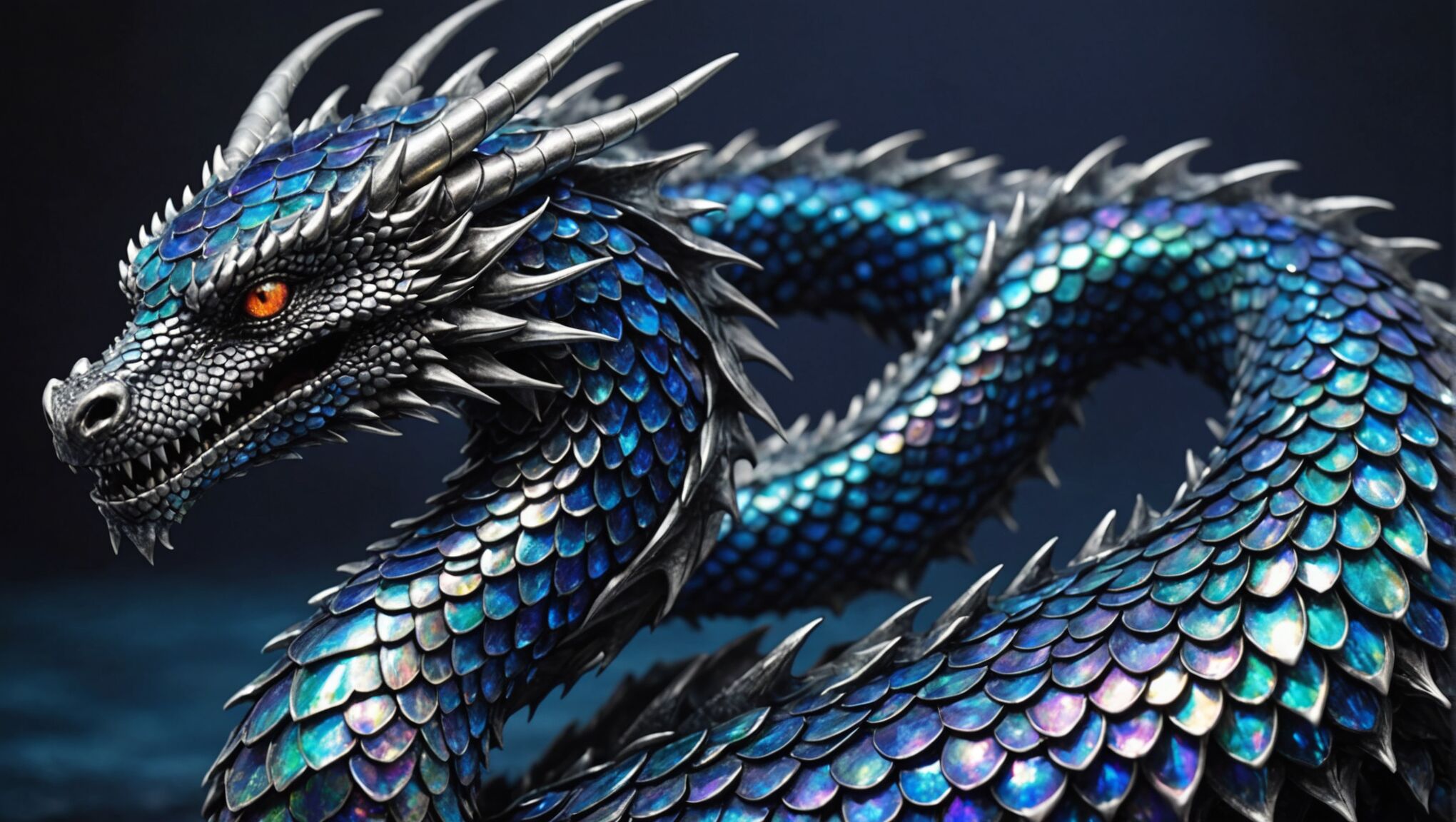 Monochromatic and gradient options offer a unique approach to fantasy book cover design, providing a sophisticated and cohesive look that can be both striking and subtle. These techniques allow designers to create depth and visual interest while maintaining a unified color scheme that can effectively convey the mood and theme of a fantasy novel.
Monochromatic color schemes use variations in lightness and saturation of a single hue. This approach can be particularly effective for fantasy covers as it can create a sense of otherworldliness or focus on a specific element of the story. For instance, a cover designed in shades of blue can evoke feelings of mystery, depth, and tranquility, perfect for a fantasy novel set in an underwater kingdom or featuring ice magic. The varying tones of blue can represent different aspects of the aquatic world, from the lightest foam of waves to the darkest ocean depths.
Similarly, a monochromatic scheme in shades of purple can suggest royalty, magic, and mysticism. By using a range from pale lavender to deep aubergine, a designer can create a cover that hints at the complexity of a magical system or the layers of intrigue in a royal court. This technique can be particularly effective when combined with metallic accents, such as silver or gold, to add a touch of magic and luxury to the design.
Gradient options, on the other hand, offer a smooth transition between colors or shades, creating a dynamic and often ethereal effect. This technique can be used to represent magical auras, the merging of different realms, or the transformation of characters or landscapes. A gradient from deep forest green to a brilliant emerald, for example, could symbolize a journey from the known world into a magical forest, with the intensifying color representing the increasing presence of magic.
One particularly effective use of gradients in fantasy cover design is the twilight effect, blending rich blues with warm oranges or pinks. This can evoke the magical ‘between’ times of dawn and dusk, often associated with the thinning of barriers between worlds in fantasy literature. It also creates a visually striking contrast that can make cover text and imagery stand out.
Designers can also use gradients to create a sense of depth and perspective. A cover featuring a gradient from dark at the bottom to light at the top can give the impression of looking up at a towering castle or magical construct, drawing the reader’s eye upward and creating a sense of awe and scale.
The subtlety of monochromatic and gradient designs can be particularly effective in conveying complex themes or atmospheric tones. For instance, a gradient from warm sepia tones to cool grays could represent the blurring of lines between past and present in a time-travel fantasy, or the transition from the mundane world to a magical one.
These techniques also lend themselves well to minimalist designs, where the color itself becomes the primary visual element. A simple, bold gradient can be incredibly impactful, especially when paired with well-chosen typography. This approach can be particularly effective for high-concept fantasy or speculative fiction, where the ideas are as important as the action.
It’s worth noting that monochromatic and gradient designs can be combined with other techniques for even more striking effects. For example, a predominantly monochromatic cover could feature a small element in a contrasting color to draw attention to a crucial aspect of the story. Or a gradient could be overlaid with intricate patterns or textures to add depth and interest to the design.
As you consider these options for fantasy book covers, think about how color can be used not just decoratively, but as a storytelling tool in itself. How might a carefully chosen monochromatic scheme or a subtle gradient convey the essence of a fantasy world before the reader even opens the book? How can the interplay of light and shadow within a single color create a sense of mystery or magic?
Remember that the effectiveness of these techniques often lies in their ability to evoke emotion and atmosphere rather than literal representation. A well-executed monochromatic or gradient design can create a mood, suggest a theme, or hint at the magical elements of a story in ways that more complex, multi-colored designs might not.
As you explore these color options, consider how they might be applied to different subgenres of fantasy. How might a monochromatic scheme in earth tones work for a gritty, low-fantasy novel? How could a gradient from midnight blue to starry silver capture the essence of a space fantasy?
By understanding and creatively applying these color techniques, designers and authors can create book covers that not only catch the eye but also resonate with the core themes and atmosphere of their fantasy worlds, inviting readers to explore the magic within.
Choosing colors based on subgenres

Fantasy literature encompasses a wide array of subgenres, each with its own unique themes, atmospheres, and reader expectations. Selecting the right color palette for a book cover can significantly impact its appeal to the target audience. For epic fantasy, rich, deep colors like royal blues, forest greens, and deep purples often work well, conveying a sense of grandeur and ancient magic. These can be accented with metallic golds or silvers to suggest nobility and legendary artifacts.
Urban fantasy covers, on the other hand, often benefit from more contemporary color schemes. Neon hues against dark backgrounds can evoke the gritty, nocturnal cityscape where many of these stories take place. Teals, electric blues, and vibrant purples can represent the collision of magic with modernity. Adding pops of red or orange can suggest danger or the supernatural elements lurking in urban settings.
For young adult fantasy, brighter and more energetic color palettes are often effective. Vibrant teals, corals, and sunny yellows can appeal to younger readers while still maintaining a magical feel. Pastels are also gaining popularity in this subgenre, offering a softer, more whimsical approach to fantasy themes.
Dark fantasy or grimdark novels usually call for moodier color schemes. Deep crimsons, charcoal grays, and midnight blues can create an ominous atmosphere. Accents of sickly greens or pale yellows can add an unsettling touch, hinting at the darker themes within the story.
Romantic fantasy often employs softer, more sensual color palettes. Dusty roses, lavenders, and peach tones can evoke a sense of romance and enchantment. These can be paired with silver or pearl accents to add a magical shimmer to the design.
For historical fantasy, consider color schemes that reflect the time period the story draws from. Earthy tones like burnt siennas, ochres, and deep greens can evoke a sense of the past, while touches of gold or rich jewel tones can add the fantasy element.
Fairy tale retellings and whimsical fantasy stories often benefit from dreamy, ethereal color palettes. Soft, misty blues, mint greens, and pale pinks can create an enchanted atmosphere. Adding iridescent or pearlescent effects can enhance the magical feel.
Science fantasy, which blends elements of science fiction with fantasy, might use color schemes that bridge both genres. Deep space blues paired with mystical purples or otherworldly greens can suggest a universe where technology and magic coexist.
When designing covers for portal fantasy, consider using contrasting color schemes to represent the different worlds. The “real” world might be depicted in more muted tones, while the fantasy realm explodes with vivid, saturated colors.
Ultimately, while these guidelines can provide a starting point, it’s important to remember that innovative color choices can help a book stand out in a crowded market. The key is to select a palette that not only reflects the subgenre but also captures the unique essence of the specific story being told.

