
blog
Creating a Strong Visual Identity for Your Fantasy Book
To successfully create a strong visual identity for your fantasy book, it’s crucial to have a deep understanding of your target audience. Knowing who your readers are will guide your design choices, ensuring that every element resonates with them. Start by identifying your audience’s age group, gender, reading preferences, and even their favorite genres. For instance, younger readers may appreciate more vibrant and whimsical designs, while older audiences might prefer something darker or more sophisticated.
Conducting surveys, participating in fantasy book forums, and analyzing the social media profiles of potential readers can provide valuable insights. Understanding their likes and dislikes will help you create a visual identity that appeals directly to them. As J.K. Rowling once said, “You must ruthlessly prioritize.” In the context of visual identity, this means prioritizing the elements that will most strongly resonate with your audience.
Another effective strategy is to examine successful fantasy books within your target market. What color palettes do they use? How are their covers and logos designed? While you shouldn’t copy these elements, analyzing them can help you understand what types of visuals attract your audience. This awareness will enable you to tailor your visual concepts to meet their expectations while still standing out in a competitive market, more in this content.
Choosing the right color palette
 Once you have a thorough understanding of your audience, the next critical step in creating a strong visual identity for your fantasy book is choosing the right color palette. Colors are not just arbitrary choices; they carry deep psychological significance and can evoke specific emotions that align with your book’s themes and tone. Therefore, it is essential to pick colors that not only appeal to your audience but also enhance the storytelling experience.
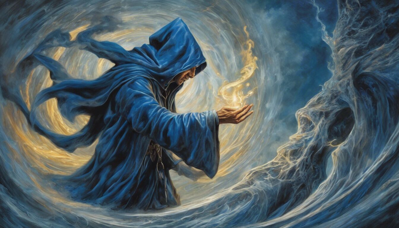
For instance, dark, rich hues like deep blues, purples, and blacks can evoke a sense of mystery, magic, and suspense, making them ideal for a high-fantasy novel filled with dark magicians and perilous quests. On the other hand, lighter, more whimsical shades like pastels or brighter colors like teal and gold can suggest a more light-hearted, adventurous tale. An excellent example is the “Harry Potter” series, where the color palette of the covers evolves from light and inviting to dark and foreboding as the story progresses.
When selecting your color palette, consider the following key aspects:
1. Emotional Impact: Different colors evoke different emotions. Warm colors like red, orange, and yellow can create an energetic and passionate feel, while cool colors like blue, green, and purple often evoke calmness and majesty. Consider what emotions you want your readers to feel when they look at your book cover.
2. Genre Alignment: Ensure the colors you choose are appropriate for the fantasy sub-genre you are targeting. High fantasies with epic battles might benefit from darker, more intense colors, whereas urban fantasies could use more modern, eclectic palettes.
3. Contrast and Complement: Your color scheme should include a mix of contrasting and complementary colors to ensure that key elements stand out. This can make your book more visually appealing and ensure important details are not lost.
As author and illustrator Maurice Sendak once said:
“I refuse to lie to children. I refuse to cater to the bullshit of innocence.”
Incorporate this honesty in your visual identity. Select colors that tell the truth about the mood and content of your story rather than arbitrarily choosing colors that may mislead or stereotypically fit a genre.
4. Cultural Significance: Be mindful of cultural connotations linked to certain colors. What might appear energetic and vibrant in one culture could be interpreted very differently in another. Researching these aspects can provide an added layer of depth and relevance to your visual identity.
5. Testing and Feedback: Once you’ve narrowed down a few color palettes, create mock-ups of your book cover and solicit feedback. This can be through focus groups, online polls, or advice from design professionals. This iterative process will help you fine-tune your color choices and ensure they make the right impact.
Remember, your color palette does more than just make your book look good on a shelf. It forms a visual bridge to the world you’ve intricately crafted within your pages, resonating with the readers on an emotional and psychological level. Whether you’re invoking fear, curiosity, or wonder, the right color palette can serve as a powerful tool in solidifying your book’s visual identity and ensuring it stands out in a crowded market.
Designing a memorable logo
Designing a memorable logo is a vital aspect of establishing a strong visual identity for your fantasy book. A logo serves as the visual cornerstone of your brand, a symbol that readers can instantly recognize and associate with the unique world you’ve created. This visual cue can be as powerful as the story itself, setting the tone and hinting at the adventure that awaits within the pages.
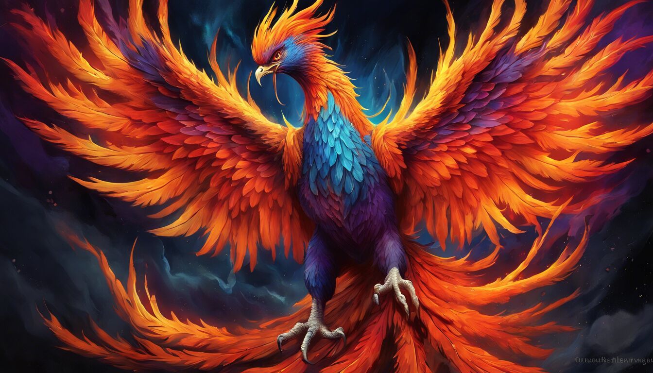
When conceptualizing your logo, start with the core elements of your book. Identify key symbols, motifs, or themes that are central to your story. For instance, if your fantasy novel revolves around a mythical phoenix rising from the ashes, integrating a stylized phoenix into your logo can create a potent visual connection. Simplicity is key here; a logo that is too intricate can become muddled and lose its impact when scaled down for print or digital media.
Another critical factor to consider is the uniqueness of your logo. In a genre crowded with dragons, swords, and mystical runes, strive for originality that differentiates your brand. While it’s tempting to lean into common fantasy tropes, adding unique twists or combining elements in non-traditional ways can make your logo stand out. Take inspiration from historical symbols, cultural motifs, or even abstract representations that resonate with your book’s world.
Color plays a significant role in making your logo memorable. The color palette you choose should harmonize with the overall color scheme of your book cover and marketing materials. If your book cover features cool, dark tones to evoke a sense of mystery, your logo should reflect that mood. Conversely, if your book is set in a bright, enchanted forest, your logo might incorporate more vibrant, earthy colors.
Typography is another element that can significantly affect the memorability of your logo. The font you choose should complement your visual identity and align with the broader aesthetic of your book cover. For a high-fantasy epic, a serif font with elaborate flourishes might be appropriate, while a more modern, urban fantasy might benefit from a sleek, sans-serif font. Ensure that the typography is legible and scales well across different media formats.
Once you have a draft of your logo, it’s crucial to test its effectiveness. Create various mock-ups and see how the logo looks in different contexts—on the book cover, in social media avatars, on merchandise, etc. A successful logo should be versatile enough to retain its impact regardless of where it appears. Gather feedback from beta readers, design professionals, or even through social media polls to gauge the logo’s effectiveness and appeal.
Furthermore, consider the cultural and psychological aspects of your logo design. Ensure that your logo does not inadvertently offend or alienate any part of your audience. Research cultural symbols to avoid potential misinterpretations. Psychological responses to shapes and colors are also important; for example, circular logos can evoke feelings of community and completeness, while angular designs may be more dynamic and edgy.
A well-designed logo, infused with the essence of your story, can significantly enhance your fantasy book’s visual identity. It acts as a beacon, drawing readers into the magical realm you’ve crafted while providing a lasting symbol that they can connect with long after they’ve turned the final page. By investing time and creativity into designing a logo that encapsulates your book’s spirit, you’ll forge a stronger bond with your audience and solidify your place in the literary landscape.
Crafting compelling cover art
Cover art is often the first interaction a potential reader will have with your fantasy book, making it a crucial element of your book’s visual identity. A compelling cover can convey the essence of your story in an instant, drawing readers into the world you’ve created and enticing them to explore further.
Begin by identifying the core themes and elements of your story. Is your book a high-fantasy epic filled with sprawling landscapes and ancient battles? Or is it a dark, urban fantasy set in a gritty, modern city? Understanding the thematic core of your story will guide your design decisions and ensure that your cover art effectively represents the narrative within.
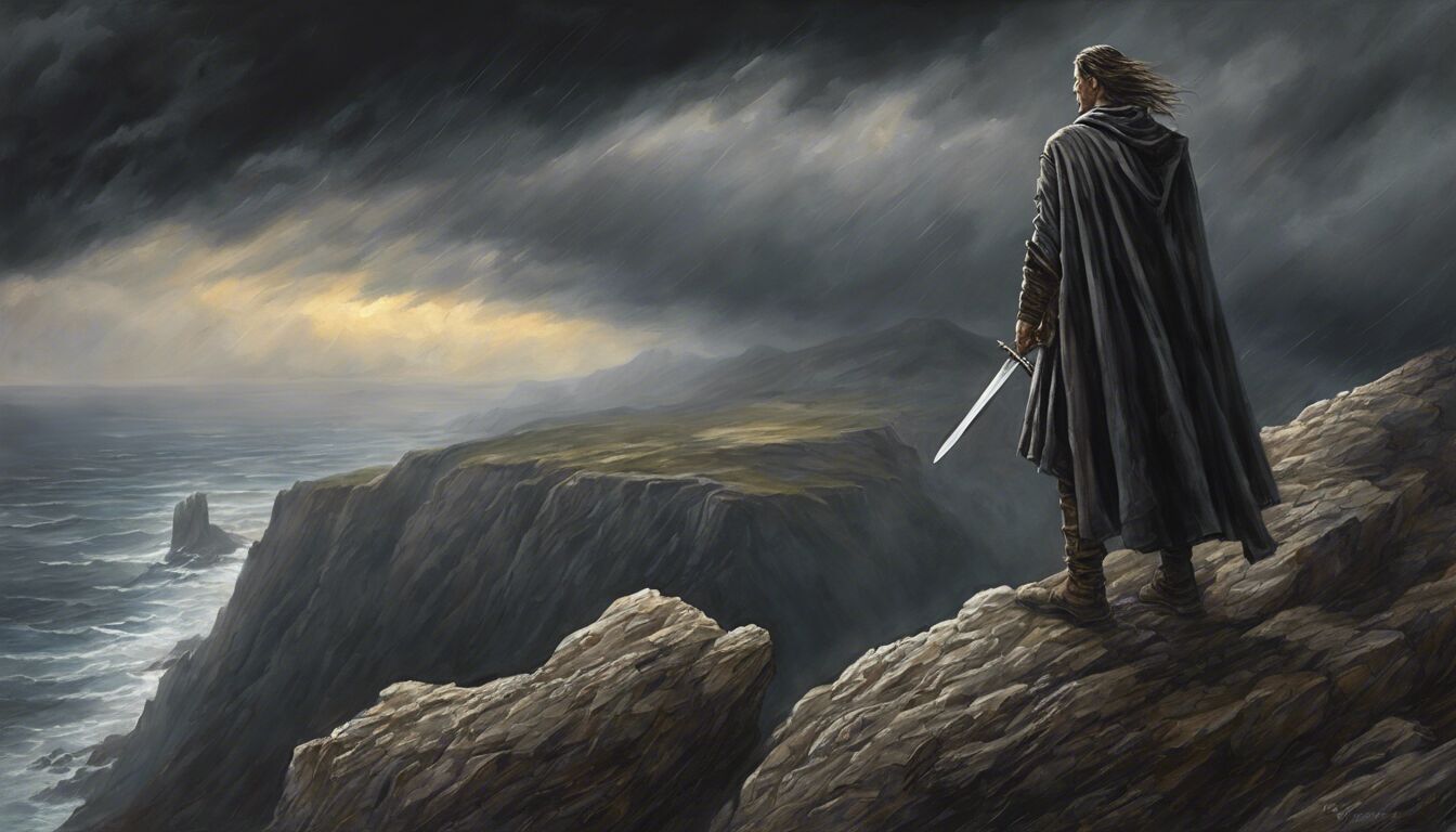
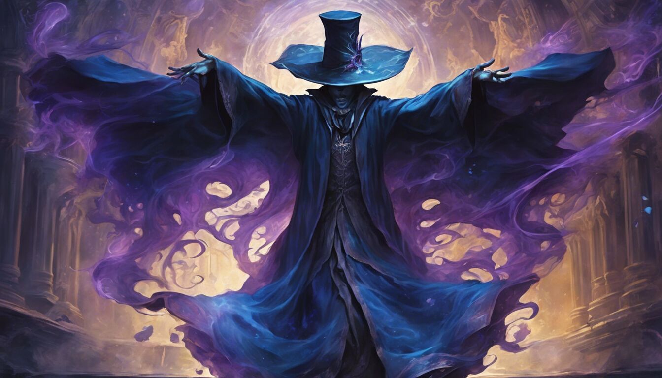
One key aspect to consider is the main focal point of your cover. This could be a character, an iconic scene, or a symbolic object that encapsulates the heart of your story. Characters are a popular choice for focal points as they give readers a glimpse of who they will be journeying with. If you decide to feature a character, ensure that their appearance, pose, and expression align with their role in your story. For instance, a stoic, battle-ready warrior in full armor sets a different tone than a whimsical, wide-eyed elf holding a magical artifact.
Effective cover art also relies heavily on composition. A well-composed cover directs the viewer’s eye toward important elements without overwhelming them. Utilize techniques such as the rule of thirds, leading lines, and juxtaposition to create a balanced and visually appealing layout. Consider how different elements interact and draw attention. For example, placing a bright, glowing artifact in the hands of a shadowy figure can create a dynamic and intriguing visual tension.
The background of your cover is equally important and should complement the main focal point without detracting from it. For a high-fantasy setting, sprawling landscapes filled with castles, forests, and mountains can provide a sense of scale and grandeur. In contrast, a minimalist background might be more effective for a character-centric cover, allowing the character to stand out against a simpler backdrop. Textures and patterns can also add depth and interest to your background, creating a rich and immersive visual experience.
Lighting plays a crucial role in crafting compelling cover art. The way light and shadow interact can set the mood and tone of your cover. Dramatic lighting with sharp contrasts can create a sense of mystery and tension, while softer, diffused light can evoke a more ethereal, dreamlike quality. Pay attention to light sources within your cover art and how they affect the colors and details of the elements. This will not only enhance realism but also help guide the viewer’s eye to important areas.
Typography is another critical element of cover art. The title, author’s name, and any additional text need to be legible and harmonious with your overall design. Choose fonts that reflect the genre and tone of your book. Elegant serif fonts might suit a medieval fantasy, while sleek, modern typefaces could work for urban fantasy settings. Ensure that the text contrasts effectively with the background, making it easy to read at a glance. Placement is key; titles are usually placed at the top or bottom of the cover where they can be quickly identified.
Color schemes should not only be visually appealing but also resonate with the themes of your story. Dark, moody colors such as deep blues, purples, and blacks can convey a sense of mystery and danger, while bright, vivid hues like golds, teal, and emerald can suggest adventure and enchantment. Ensure that your color choices align with the emotional tone and genre of your book to create a cohesive visual identity.
Finally, once your cover art is created, it’s essential to gather feedback. Share your design with beta readers, fellow authors, and professional designers to gain insights and perspectives. Be open to constructive criticism and be willing to make adjustments. A successful cover resonates with the audience, draws them in, and compels them to pick up the book and dive into the world you’ve created.
In summary, crafting compelling cover art involves careful consideration of thematic elements, composition, focal points, background, lighting, typography, and color schemes. Each element should work together harmoniously to create a captivating and cohesive visual identity that captures the essence of your fantasy book and entices readers to explore the adventure within.
Selecting the perfect typography
 Selecting the perfect typography is an art form in itself, playing a critical role in establishing a strong visual identity for your fantasy book. Typography is not merely about choosing an aesthetically pleasing font; it’s about conveying the mood, setting, and even the historical context of your story. It should complement your cover art, color palette, and overall design to create a unified and compelling visual narrative.
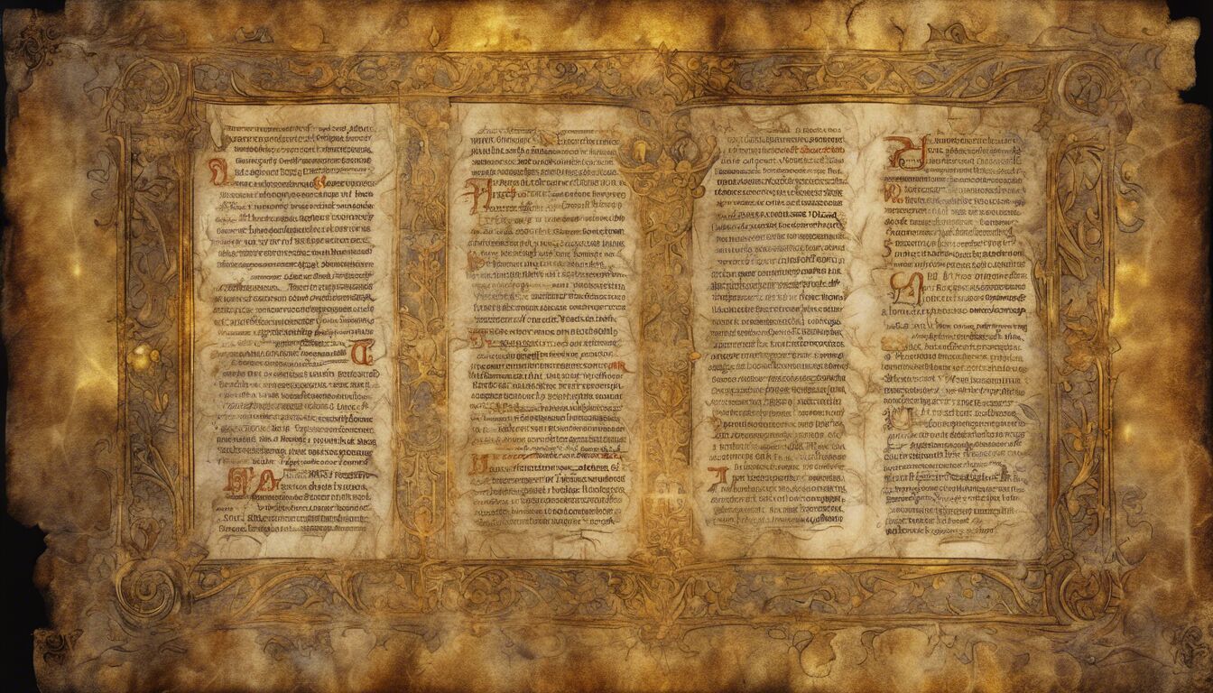
Firstly, consider the genre and tone of your book. High-fantasy novels often benefit from traditional, serif fonts that evoke a sense of history and grandeur. Think of the embellished scripts of medieval manuscripts, which can imbue your book with an antiquated, epic feel. On the other hand, urban fantasy works might opt for sleeker, sans-serif fonts that convey modernity and edginess, aligning with contemporary settings and characters. This choice sets the stage for the story and gives potential readers a taste of what to expect.
Furthermore, the legibility of the typography is paramount. While an ornate font might look appealing, it can be a double-edged sword if it becomes difficult to read at a smaller scale. Ensure that your chosen font maintains clarity both on a full-sized cover and in smaller formats, such as ebook thumbnails, social media posts, or promotional materials. A quick way to test this is to view the text at various sizes and in different contexts to ensure it remains comprehensible and impactful.
Another essential aspect is how the typography integrates with other elements of your book’s cover. It should harmonize with the imagery, enhancing rather than detracting from the visual appeal. Consider the balance of text and image; titles often draw the viewer’s eye and should therefore be placed strategically to create a cohesive design. Experiment with different placements, such as overlaying the text over a darkened area of the image or positioning it within a decorative frame, to see what works best.
In addition to the primary font for your title, consider the typographic hierarchy. This includes the size, weight, and style differences between the title, author name, and any subheadings or taglines. Each element should have a distinct but complementary style, guiding the reader through the information without causing visual confusion. For example, if your title is in a dramatic, bold typeface, you might choose a simpler, lighter font for your author name to create contrast and ensure readability.
Color choice within typography is also influential. Ensure that the color of your text stands out against your cover’s background. High contrast between the text and background can ensure that your title and other textual elements are quickly legible. If your cover art features a dark, moody palette, lighter text colors like white, gold, or silver can provide excellent contrast. Conversely, dark text on a lighter background can offer a clean and striking appearance.
Typography also has a psychological impact on readers. Serif fonts, with their classic and elegant shapes, can convey trustworthiness and tradition, making them ideal for high-fantasy sagas. Sans-serif fonts, characterized by their clean lines and modern feel, can suggest innovation and straightforwardness, fitting well with contemporary or urban fantasy narratives. Script fonts can introduce a sense of whimsy and magic but must be used sparingly to avoid overwhelming the design.
Incorporating customized or hand-drawn typography can add a unique touch to your book’s visual identity. Custom typography ensures that your book stands out and isn’t mistaken for another title. It reflects the care and effort put into the book, resonating with readers who appreciate unique, handcrafted details. Commissioning a typographer or learning to create your custom type can significantly enhance your book’s presentation.
Finally, gather feedback on your typographic choices. Show your cover design to a diverse group of beta readers, fantasy enthusiasts, and design professionals. Pay attention to their reactions and be open to making adjustments based on constructive criticism. The goal is to ensure that your typography not only looks good but effectively communicates the essence of your story.
Selecting the perfect typography is an intricate process that intertwines art and psychology, requiring keen attention to detail and an understanding of how visual elements communicate with readers. By carefully choosing and integrating appropriate fonts, you can reinforce your book’s visual identity and enhance its appeal, ensuring that it captures the imagination and curiosity of potential readers at first glance.
Integrating visual elements in marketing materials
The journey doesn’t end with nailing the perfect cover art and typography; your fantasy book’s visual identity must extend seamlessly into your marketing materials. This holistic approach ensures that every point of contact with your audience reinforces the thematic and aesthetic elements of your story, making your book not just a one-time read but a memorable experience etched into the reader’s mind.
Start with your social media presence, which acts as the front line of your marketing strategy. Each platform—be it Instagram, Twitter, Facebook, or TikTok—should feature cohesive visual elements that echo your book’s design. Use the same color palette, similar typography, and thematic imagery across all your social media profiles. This consistency builds brand recognition and creates a professional appearance that potential readers will trust. For instance, if your book cover prominently features deep blues and silvers, let those colors dominate your social media graphics.
Consider creating a series of branded templates for posts and stories. Tools like Canva or Adobe Spark allow you to customize templates with your chosen color palette, fonts, and imagery, making it easy to maintain a consistent look and feel. Use these templates to announce book launches, share quotes, reveal behind-the-scenes content, or spotlight reader reviews. Each post should serve as a visual reminder of your book, strengthening your audience’s connection to it.
Email newsletters are another touchpoint worth tailoring to match your book’s visual identity. Your email header should reflect your book’s cover art, perhaps even incorporating a small version of your logo. The color scheme and typography used in the body of the email should align with those on your cover and social media. This unity helps to establish a professional and cohesive presentation. Employ captivating visuals, such as illustrations or photographs that resonate with your book’s theme, to break up text and maintain reader engagement.
Book trailers provide a powerful medium for expressing your book’s essence visually and audibly. Ensure that the visual cues in your trailer, such as colors, fonts, and imagery, are coherent with your book’s design. Consider incorporating elements of your cover art or key thematic visuals. Soundtracks also play a significant role in these trailers; choose music that complements the mood and tone of your book, enhancing the overall impact. An integrated approach ensures that your audience experiences a seamless transition from the trailer to the actual book.
Physical marketing materials like bookmarks, posters, business cards, and flyers also present an opportunity to reinforce your book’s visual identity. Use elements from your cover art and logo, ensuring they are prominently showcased. For example, if your book features a mythical creature or an emblematic symbol, these can be used as motifs in your physical marketing materials. Rich textures, such as embossed text or metallic finishes, can add a tactile dimension that echoes the richness of your fantasy world.
Participate in conventions, book fairs, and author signings with well-designed booths and banners that convey your book’s visual identity at a glance. Large, eye-catching banners featuring your book cover, along with complementary colors and typography, can attract potential readers to your booth. Offer giveaways like branded bookmarks, postcards, or buttons that people can take home as mementos. The goal is to create an immersive experience that stays with your audience long after the event.
Merchandise also plays a substantial role in expanding your book’s visual footprint. From t-shirts and tote bags to mugs and phone cases, merchandise provides fans with tangible connections to your book. Ensure that designs are consistent with your visual identity. High-quality illustrations, quotes from your book, or symbolically significant icons can make these items desirable. Partnering with artists for unique, limited-edition merchandise can create buzz and additional avenues for engagement.
Consider the design of your author website. This digital hub should epitomize your book’s visual identity, acting as a cohesive extension of your brand. Use your color palette throughout the site, from background colors to call-to-action buttons. Your typography choices should align with those used in your book and marketing materials, providing a harmonious reading experience as visitors browse through content. High-resolution images, graphics, and illustrations should enhance the visual appeal and keep visitors engaged. Consistency across all these touchpoints strengthens your book’s brand, making it an integral part of the reader’s journey through your fantasy world.