
blog
How Covers Influence Reader Choices

The allure of a book cover often lies in its ability to tap into the subconscious mind, influencing reader perception through carefully curated visual elements. Human psychology plays a crucial role here, with certain shapes, colors, and compositions evoking specific emotions and responses. For instance, circular shapes can create a sense of unity and completeness, while angular shapes might evoke feelings of tension or excitement. This is rooted in our evolutionary background, where different visual cues were essential for survival.
Moreover, the placement and balance of elements on a cover can significantly affect a reader’s initial reaction. A well-balanced composition, where elements are symmetrically arranged, tends to be more aesthetically pleasing and instills a sense of calm and order. Conversely, asymmetrical designs can capture attention by introducing a dynamic and intriguing focal point.
Psychologically, first impressions are powerful and often formed within seconds. A cover that resonates on an emotional level can compel a potential reader to pick up the book, outweighing other considerations like title or author familiarity. As Michael Bierut, a renowned graphic designer, famously said, “People decide what they’re buying based on feelings.” This phenomenon showcases the importance of visual appeal in the marketing and ultimate success of a book. Ensuring that a cover immediately communicates the right tone and essence of the story can make a profound difference in its reception.
Color theory in book covers
 Color theory is a fundamental aspect of book cover design that deeply influences reader perception. Colors evoke emotions, symbolize concepts, and create specific atmospheres, all of which contribute to a potential reader’s first impression of a book. For example, warm colors like red and orange tend to draw attention and can evoke feelings of excitement, passion, or warmth. These colors are often used in genres that want to communicate intensity, such as thrillers or romance novels. On the other hand, cooler colors like blue and green can create a sense of calm, serenity, or even melancholy, making them suitable for more reflective or intellectual genres such as literary fiction or non-fiction.
The strategic use of color combinations also plays a significant role in making a book cover stand out. Complementary colors, which are opposites on the color wheel, like blue and orange, create high visual contrast and can make elements pop, drawing the reader’s gaze. Analogous colors, which sit next to each other on the color wheel, like blue and green, offer a more harmonious and subtle visual experience.
Color is not simply a matter of personal preference; it’s a tool that designers wield to elicit specific responses. As Josef Albers, a pioneering color theorist, aptly stated, “Color is the most relative medium in art.”
Colors can also signal the genre of the book, guiding reader perception even before they read the title or synopsis. For instance, dark colors and muted tones are often associated with mystery and suspense, while bright, vibrant shades may indicate a lighthearted, comedic, or young adult theme.
Furthermore, cultural connotations of colors should not be overlooked, as they can vary widely. In Western cultures, white is often associated with purity and innocence, making it a popular choice for wedding-themed books or clean, minimalist designs. In contrast, in some Eastern cultures, white can symbolize mourning and loss, which might be more appropriate for a somber or reflective narrative.
Ultimately, the choice of color on a book cover is a powerful tool that can convey mood, genre, and emotional intensity at a glance. By understanding and applying color theory, designers can craft covers that not only catch the eye but also resonate with potential readers on a deeper, more intuitive level.
Typography and its impact
Typography is another crucial element in book cover design that profoundly affects reader perception. The typeface chosen for a book’s title, author’s name, and other text on the cover can significantly influence how the book is perceived and whether it will capture the attention of potential readers. Fonts evoke different feelings, and using the right typography aligns the book’s visual appeal with its content and intended audience.
Serif fonts, characterized by small lines or strokes regularly attached to the end of a larger stroke in a letter or symbol within the font, are often associated with tradition and reliability. These fonts lend themselves well to classical literature, historical novels, and non-fiction works that aim to be perceived as authoritative or trustworthy. On the other hand, sans-serif fonts, which lack these strokes, exude a modern, clean, and straightforward feel, making them a favorite for contemporary fiction, self-help books, and minimalist cover designs.
Moreover, the size and spacing of the typography can drastically alter a reader’s perception of the cover. Large, bold fonts immediately grab attention and can imbue a sense of urgency or importance. This is why thrillers or suspense novels often use bold typography to amplify the tension suggested by the cover art. Conversely, elegant script fonts or intricately designed typefaces might be used for romance novels or literary fiction, suggesting a more sophisticated or delicate narrative.
The arrangement of typography is another subtle yet impactful factor. Center-aligned text can create a balanced and formal look, often employed in covers designed to convey calmness and order. Justified text might give a structured, almost journalistic feel, while loose, staggered arrangements introduce a sense of dynamism and playfulness, suitable for more eclectic or experimental works.
Color and typography work hand in hand on book covers. A typeface in strong contrast to the background color can make the title stand out and be instantly readable from a distance, which is pivotal in crowded bookstore shelves or when browsing online thumbnails. For example, white text on a dark background pops out distinctly, whereas a harmonious combination like pastel blues and creams can suggest a soothing or nostalgic tone.
In addition, custom typography or hand-lettering can provide a unique identity to a book cover, distinguishing it from others in a visually saturated market. This approach can be particularly effective in genres where individuality and uniqueness are prized, such as indie publications or artistic works. A hand-lettered title can suggest a personal touch, creativity, and authenticity, qualities that are increasingly valued by modern readers.
Ultimately, the choice and implementation of typography in book cover design are not merely about aesthetic choices; they are strategic decisions that can influence reader perception profoundly. By thoughtfully selecting fonts, sizes, colors, and arrangements, designers can ensure that a book’s cover communicates its essence effectively, capturing the right audience and enhancing the reader’s overall experience from the very first glance.
Imagery and themes
Imagery lies at the heart of book cover design, serving as one of the most immediate and profound ways to communicate the book’s themes and essence to potential readers. The right imagery can evoke emotions, hint at the narrative, and ultimately influence reader perception in powerful ways.
Selecting the appropriate images involves an intricate balance of symbolism, genre alignment, and audience expectations. For example, a cover for a fantasy novel might feature majestic landscapes, mythical creatures, or enchanted symbols to immediately transport the reader into an otherworldly realm. This not only sets the stage for the story but also attracts readers who are drawn to fantasy worlds. In contrast, a mystery novel might use dark, shadowy imagery, looming figures, or enigmatic objects to create an air of suspense and intrigue, appealing to those who relish solving puzzles and uncovering secrets.
Thematic consistency is crucial when choosing imagery for a book cover. Images should resonate with the book’s content and message, providing a visual shorthand for what the reader can expect. A romance novel might feature images of couples, love letters, or idyllic settings, evoking feelings of love and intimacy. Meanwhile, a science fiction novel may benefit from images of futuristic cities, advanced technology, or space scenes, suggesting adventure and innovation.
Another essential consideration is the use of metaphors and symbols within the imagery. Symbolic imagery can encapsulate complex themes and emotions succinctly. For instance, a solitary tree on a barren landscape might symbolize isolation or resilience in a literary fiction cover, while a shattered mirror could hint at disintegration or duality in a psychological thriller. These symbols can create layers of meaning, encouraging readers to delve deeper into the book’s content upon seeing the cover.
The interplay of text and imagery is another element that can make or break a cover’s appeal. The placement of images in relation to the title, author name, and other text elements needs to be harmonious, ensuring that the cover is both visually engaging and easy to read. Overlapping image and text borders can create a dynamic sense of depth, drawing the eye and inviting closer inspection. Alternatively, using whitespace effectively can make key elements pop, lending a clean and organized look that can be particularly effective in nonfiction or guidebooks.
Imagery also contributes to the overall tone of the book cover. Bright, colorful images can impart a sense of joy, whimsy, or excitement, suitable for children’s books or comedies. Duller, more subdued images might convey a serious, contemplative, or somber mood, which can be fitting for historical or dramatic narratives. The chosen imagery acts as a signal to the reader, setting their expectations before they even open the book.
| Genre | Common Imagery |
| Fantasy | Mythical creatures, enchanted landscapes |
| Mystery | Shadowy figures, enigmatic objects |
| Romance | Couples, idyllic settings |
| Science Fiction | Futuristic cities, space scenes |
| Literary Fiction | Symbolic objects, solitary figures |
Ultimately, the choice of imagery on a book cover is a strategic decision that can significantly sway reader choices. By selecting images that are not only visually striking but also deeply connected to the book’s themes and genres, designers can craft covers that capture the essence of the story, pique curiosity, and, most importantly, resonate with the target audience. This careful curation of imagery ensures that the book cover serves not only as an eye-catching marketing tool but also as a gateway into the world the author has created.
The role of genre-specific designs
The alignment of book cover designs with genre-specific characteristics is an essential strategy in influencing reader perception. Each literary genre carries its own set of conventions and expectations that experienced readers unconsciously look for when browsing potential reads. These conventions extend beyond just the content within the pages to how the book is presented on the outside, with the cover serving as a crucial signpost that signals the genre and draws the right audience.
For instance, consider the stark differences between the cover designs of romance novels and horror stories. Romance novels often feature soft, warm color palettes like pinks and purples, alongside imagery of couples entwined in intimate embraces or idyllic romantic settings. This visual cue immediately informs the reader that they can expect themes of love, passion, and emotional connections. The typography used in romance covers is usually cursive or serif to emphasize a sense of elegance and affection, further enhancing the reader’s anticipation of a heartfelt narrative.
In contrast, horror stories leverage darker, more ominous color schemes such as blacks, deep reds, and grays to evoke fear and suspense. Imagery on horror covers often includes eerie landscapes, ghostly apparitions, or chilling scenes that hint at the terror lurking within the pages. The choice of sharp, jagged fonts or distressed lettering adds to the unsettling atmosphere, making it clear that the book is designed to provoke a visceral reaction. These visual and typographic elements come together to align potential readers with the intense, spine-chilling experiences they seek.
Science fiction covers, on the other hand, tend to feature futuristic imagery—spaceships, otherworldly landscapes, and advanced technologies. The color schemes often include metallic hues, blues, and silvers that evoke a sense of the future and the unknown. Additionally, clean, sans-serif fonts are typically used to convey a modern and sleek aesthetic. This visual language speaks directly to readers eager for adventures beyond the current realm of possibilities, promising them innovative concepts and speculative narratives.
Alternatively, historical fiction covers capitalize on period-specific imagery and textures to transport the reader back in time. Earthy tones, sepia filters, and classical, serif typography are common choices that evoke nostalgia and authenticity. Images might include period costumes, historical landmarks, or illustrative art that resembles old portraits or documents, signaling to the reader that the story will provide a richly detailed glimpse into the past.
Similarly, young adult (YA) fiction often embraces vibrant, eye-popping designs with bold typography and captivating character illustrations to resonate with a teenage audience. Bright, dynamic colors and energetic compositions make these covers stand out, reflecting the coming-of-age themes and high-stakes adventures that define the genre. The aesthetic is deliberately modern and engaging, designed to capture the quick, digital-centric gaze of younger readers.
By adhering to these genre-specific design elements, book covers do more than just look aesthetically pleasing—they facilitate a form of visual shorthand that immediately communicates the book’s content and tone. This immediate recognition helps potential readers make quick decisions about whether a book aligns with their interests and preferences. Consequently, genre-specific designs do not just define the visual landscape of a book cover; they play a pivotal role in shaping reader perception and expectations, ultimately guiding their choices amidst a sea of literary options.
Through these visual strategies, designers craft covers that are not only eye-catching but also deeply resonant with the intended audience, encouraging readers to delve deeper into the stories that await them. This deliberate alignment of cover design with genre signals a profound understanding of reader psychology and market dynamics, ensuring that a book’s first impression is as compelling and accurate as the narrative it encloses.
Case studies: successful cover redesigns
In the realm of book design, successful cover redesigns serve as compelling case studies for understanding how thoughtful visual changes can significantly influence reader perception and market performance. By analyzing these transformations, we can glean insights into the elements that resonate with audiences and drive sales.
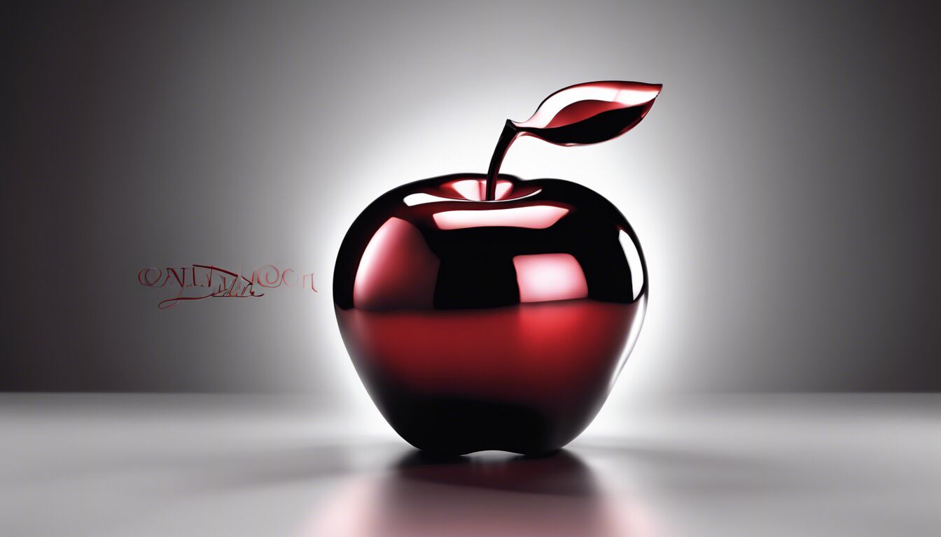
One notable example is the redesign of the “Twilight” series by Stephenie Meyer. The original covers, featuring moody color schemes with iconic imagery like the apple and chess piece, effectively captured the essence of supernatural romance. However, the market evolved, and a redesign was undertaken to freshen the appeal for new readers. The updated covers emphasized dynamic compositions and a more modern aesthetic, incorporating sleeker fonts and vibrant colors. This not only rejuvenated interest among existing fans but also attracted a younger, more diverse audience, demonstrating the power of visual reinvention in maintaining relevance in a changing market.
Another striking example is the redesign of Agatha Christie’s mystery novels. Historically, the covers showcased traditional, understated designs that exuded a classic British charm. While these resonated with long-time fans, they struggled to capture the attention of newer generations of readers. The redesigned covers took a bold approach, featuring stylized, contemporary graphics and vivid colors, which breathed new life into the timeless tales. These changes made the books stand out on shelves and online listings, successfully introducing Christie’s work to millennial readers with a penchant for retro yet trendy aesthetics.
The case of George Orwell’s “1984” provides further insight into the impact of cover design. The original cover, characterized by its stark and utilitarian design, mirrored the dystopian themes of the narrative but failed to engage a broader audience visually. The redesign adopted a more visual and symbolic approach, utilizing bold imagery and a striking color palette to convey the intense and thought-provoking nature of the story. This transformation not only boosted sales but also reinforced the book’s cultural and political relevance in modern times, appealing to readers who may have overlooked it previously.
A different yet equally educational example is the redesign of the “Harry Potter” series by J.K. Rowling. While the original covers are iconic and beloved, they were aimed primarily at children. As the series gained literary acclaim and a broader, multi-generational audience, a new set of covers was introduced. These editions featured sophisticated artwork and muted tones, appealing to adult readers who either grew up with the series or were new to it. The success of these redesigns underscores how cover art can be adapted to broaden a book’s market appeal without alienating core fans, check this page.
Further illustrating the importance of reader perception is the redesign of the “Percy Jackson & the Olympians” series by Rick Riordan. The original covers were colorful and action-packed, designed to captivate younger readers. As the series matured and aimed to retain its fan base while appealing to older audiences, the redesigns adopted a more refined and less cartoonish style. These new covers drew in teenage readers who might have dismissed the earlier designs as too juvenile, thus extending the series’ life span and market reach.
Lastly, consider the redesign of “The Great Gatsby” by F. Scott Fitzgerald. The original cover, with its Art Deco theme and melancholic visage, matched the book’s Jazz Age setting and themes. However, to commemorate the release of the star-studded film adaptation, a new cover was developed featuring the movie’s lead actors. While this approach can be polarizing, it effectively generated renewed interest in this literary classic, highlighting the symbiotic relationship between visual media and literature marketing.
These case studies illustrate that successful cover redesigns are not superficial alterations but strategic recalibrations that can breathe new life into a book and expand its reach. By carefully considering elements such as color, typography, and imagery, designers can craft covers that resonate deeply with current and potential readers, ensuring that the book not only catches the eye but also aligns with contemporary tastes and sensibilities. This, in turn, demonstrates the significant role that thoughtful cover design plays in shaping reader perception and driving the success of literary works.