blog
Typography Tips for Fantasy Novels
When it comes to crafting the perfect fantasy book covers, selecting the appropriate typeface is crucial in setting the tone of the story. The right font can transport your readers into the realms of dragons, wizards, and mythical landscapes. A classic serif typeface, such as Palatino or Garamond, often works well for fantasy narratives because it evokes a sense of history and tradition. These fonts can be both elegant and formal, providing a timeless quality that complements the genre.
For those looking to add a unique flair, consider exploring more ornate options. Typeface families like Goudy Old Style or Minion Pro strike a balance between readability and decorative elegance. However, while it’s tempting to dive into the wild world of elaborate fantasy fonts with excessive flourishes, it’s essential to remember that readability should never be sacrificed. Keep your primary font clean and legible, while you can reserve the more fantastical type choices for chapter titles or headers.
If you decide to use a special font for elements like chapter headings or subheadings, make sure it pairs well with the main text. Contrasting styles can work, but they should still feel cohesive when viewed together. For instance, combining a simple, readable body text with a medieval-styled header can create an intriguing contrast without overpowering the content.
Remember, the key is to enhance the reader’s experience through typography, not distract them. As one author sagely puts it, “A good typeface is like a good costume—it sets the scene but doesn’t steal the show.” Your typeface choice will not only shape the visual appeal of your book but also play a significant role in how immersive and enjoyable your fantasy world becomes to your readers.
Creating immersive chapter headers
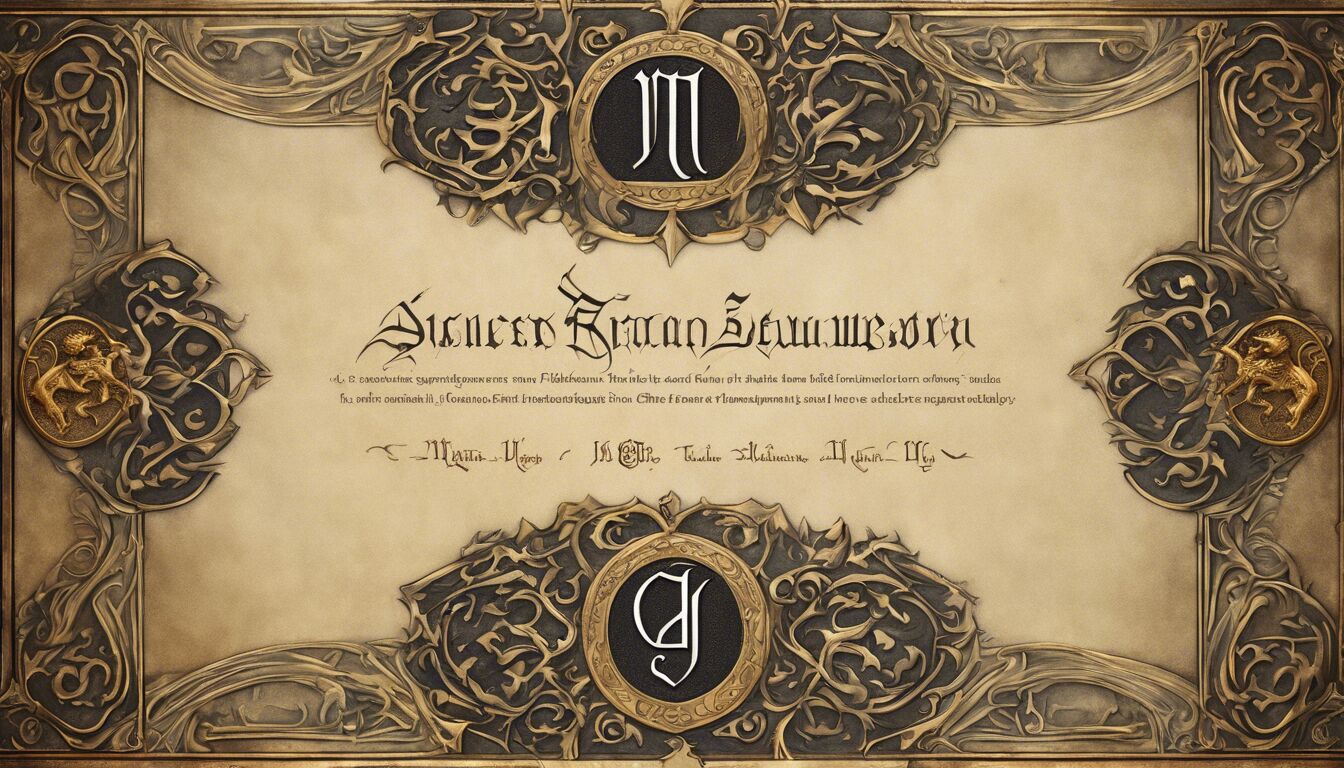 Ensuring that chapter headers in your fantasy novel are distinctive yet complementary to the main text is a delicate balancing act. These headers are not just organizational tools; they act as portals, setting the stage for the new scenes and adventures that lie ahead. Adding an immersive flair to your chapter headers can significantly enhance the reader’s journey into your fantastical world.
First, consider the thematic elements of your story. If your narrative is steeped in ancient lore and mythical traditions, chapter headers should reflect that atmosphere. Gothic or medieval typefaces, such as Blackletter or Lombardic capitals, can immediately evoke an old-world feel. Combine these with subtle embellishments, like elaborate border lines or mystical iconography, to create a cohesive visual theme that echoes your narrative’s essence.
However, balance is crucial. Overly ornate headers might look splendid on their own but can become visually overwhelming if they clash with the main text. To avoid this, ensure that the decorative elements you choose are consistent with the overall design of the book. This alignment extends beyond typography to encompass color schemes, page layouts, and even the physical feel of the paper. Consistency in these elements will make your chapter headings a seamless part of the reader’s experience rather than a jarring interruption.
Additionally, the scale of chapter headings should be carefully considered. Headers that are too large can dominate the page, whereas those that are too small can fail to capture attention. Striking the right balance is key. A slightly larger point size than the body text, combined with unique stylistic elements like increased letter spacing (tracking), can make the chapter headings stand out without overshadowing the text.
Incorporating thematic symbols alongside your chapter titles is another effective way to immerse readers. These symbols, whether they are alchemical signs, mythological creatures, or arcane runes, should be relevant to your story’s universe. Subtle integration of these icons can add layers of meaning and intrigue. For instance, a dragon emblem at each chapter’s beginning can serve as a reminder of the ever-present threat in your tale, subtly heightening tension and anticipation.
“Typography is not just about choosing a font; it’s about how text communicates tone and emotion. The right headers can enchant readers, pulling them deeper into the world you’ve lovingly crafted.”
Remember, simplicity often travels further than complexity. A clear, well-designed chapter header can captivate readers and guide them smoothly from one chapter to the next, enhancing their immersion in your fantastical realm.
Utilizing decorative drop caps
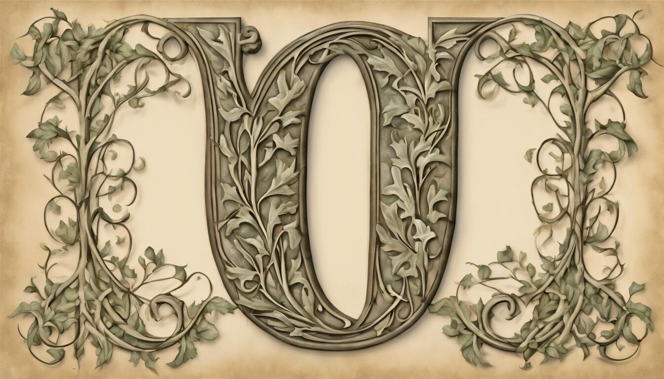
Decorative drop caps—those large, elaborately designed initial letters at the beginning of a paragraph—are a small but significant detail that can elevate the visual appeal of your fantasy novel. When implemented thoughtfully, they can draw readers into the text and set the tone for the unfolding narrative. The use of a drop cap can turn an ordinary first letter into a focal point, immediately grabbing the reader’s attention and providing a visual anchor. This is particularly useful in fantasy novels, where every element of design contributes to world-building.
When choosing a drop cap style, consider the overall aesthetic of your book. A highly decorative drop cap with intricate designs can echo the magical and mystical qualities of your story, especially if it complements the themes and settings of your narrative. For example, if your story is set in an enchanted forest, a drop cap adorned with vines and leaves can enhance the thematic immersion. Similarly, if your tale has elements of arcane magic, a drop cap featuring alchemical symbols or celestial motifs might be appropriate.
However, it’s important to maintain balance and avoid overwhelming your readers. The drop cap should be a striking element, but it should not detract from the readability of the text. Opt for designs that are eye-catching yet harmonious with the body text. The typeface for the drop cap can either match or slightly contrast with the main text for added visual interest. If your body text is set in a serif font like Garamond, a slightly more ornate serif for the drop cap can provide a subtle but elegant contrast.
In terms of scale, drop caps should be large enough to stand out but not so large that they dwarf the surrounding text. Typically, a height of three to four lines of body text is effective. This proportion ensures that the drop cap is prominent without overwhelming the paragraph. Pay attention to the spacing around the drop cap as well. There should be enough white space to prevent the initial letter from crowding the adjacent text, maintaining a clean and readable layout.
A thoughtful approach to color can also enhance the impact of your drop caps. Use colors that align with the palette of your book cover and other design elements. Muted tones can lend a vintage, timeless feel, while brighter colors can inject an element of playfulness or magic. Ensure that the color chosen for the drop cap does not clash with the text color, maintaining readability and visual coherence.
Incorporating thematic symbols or visual elements within the drop cap itself can add another layer of depth to your typography. A dragon’s tail curling around an ornate “D” or a sword integrated into an “S” can tie directly into your story’s themes and symbolism. These additions, while minor, enrich the reader’s experience and make the opening of each chapter a moment of visual delight.
Ultimately, the key to effective decorative drop caps is subtlety and coherence within the larger typographic design of your book. When used appropriately, they can enhance the reader’s journey, making each new chapter a visually enchanting gateway into your fantastical world. Thoughtful typography, including the use of drop caps, not only serves a functional purpose but also adds to the immersive quality of your fantasy novel.
Balancing readability and style
Considering the delicate balance between readability and aesthetically pleasing typography is essential for crafting an immersive fantasy novel. As you design your book, it’s crucial to ensure that the text remains easy on the eyes while still reflecting the magical themes of your story. This balance often requires a careful selection of font size, letter spacing, and line height to make your book enjoyable to read.
One of the first aspects to consider is font size. A common pitfall is opting for a smaller font size to fit more text on a page, which can strain the reader’s eyes. Conversely, a font that is too large can disrupt the visual flow and make the book feel juvenile. Generally, a font size between 11 and 13 points tends to be ideal for print novels.
Next, look at the line height, or leading. Too tight of a leading can make the text feel cramped, whereas too loose can cause disjointed reading. A good rule of thumb is to set the line height at about 1.2 to 1.5 times the font size. This range provides enough spacing for the eyes to move smoothly from one line to the next without losing their place, which is especially crucial in dense fantasy narratives.
Letter spacing, or tracking, also plays a significant role in readability. While fantasy novels can benefit from slightly increased tracking for that airy, ethereal feel, it’s important not to overdo it. Excessive letter spacing can disrupt word recognition, slowing down the reading pace.
Here are some general recommendations in an HTML table format to help balance readability and style:
| Element | Recommendation |
| Font Size | 11 to 13 points |
| Line Height | 1.2 to 1.5 times the font size |
| Tracking | 0 to +20 (depending on the typeface) |
In addition to these technical settings, the overall layout and width of the text block significantly affect readability. Margin sizes should allow for sufficient whitespace around the text. This whitespace frames the content, making it less taxing on the reader’s eyes. Similarly, avoid lines of text that are too wide, as they can be difficult to scan. Aim for an average of 50-75 characters per line.
It’s also worth considering how different typefaces interact in your design. Combining too many different fonts can create visual chaos, distracting readers rather than immersing them in your world. As a rule of thumb, limit yourself to two or three typefaces: one for body text, one for headings, and potentially one for special decorative purposes, such as chapter openings or selected quotations.
Furthermore, consider the contrast between the text and its background. Dark text on a light background is most common and generally the easiest to read. However, if you choose to inverse this for stylistic reasons—such as during night scenes or in dream sequences—ensure that the contrast is high enough to maintain legibility.
Lastly, while styling elements such as italics and bold can emphasize certain parts of your text, use them sparingly. Overuse can lead to visual clutter and diminish their impact. Utilize these styles judiciously to highlight critical moments or magical terms, thereby guiding the reader’s eye through the narrative without overwhelming them.
By paying close attention to these typographic details—font size, line height, letter spacing, margins, and contrast—you can create a beautiful, readable fantasy novel that keeps your readers captivated from beginning to end. The goal is to make the text an inviting gateway to the fantastical world you’ve created, striking the perfect balance between readability and enchanting style.
Implementing thematic symbols and ornaments
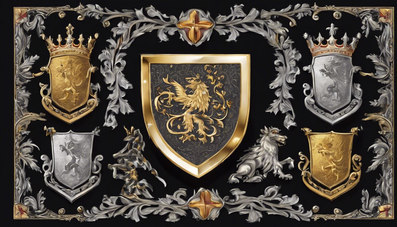 Typography plays an instrumental role in enhancing the reader’s journey through your fantasy novel. By thoughtfully integrating thematic symbols and ornaments, you can create a multi-layered experience that resonates with the fantastical elements of your story. These additional design details act as visual cues, guiding readers deeper into the universe you’ve constructed, while also adding a unique touch that differentiates your book from others on the shelf.
Consider incorporating symbols that directly relate to the lore of your novel. A well-placed crest or emblem at the beginning of each chapter can serve as a subtle reminder of key elements within your narrative. For instance, an ongoing saga involving royal houses might benefit from heraldic symbols adorning the chapter openers. Such symbols not only add a layer of authenticity to your world but also provide readers with visual touchpoints that reinforce the story’s themes.
Ornaments can also be weaved into the text’s layout to enhance the narrative flow and create visual interest. Intricate dividers between sections can mimic medieval manuscripts or ancient scrolls, establishing a vintage tone that complements the fantasy setting. Alternatively, periodic ornate flourishes at the tops or bottoms of pages can draw a reader’s gaze, encouraging a slower, more contemplative reading pace—ideal for absorbing complex fantasy lore.
However, restraint is key. Overuse of these elements can clutter the page and divert attention from the text itself. The goal is to enrich, not overwhelm. Choose a few specific symbols or ornaments that have significant relevance to your story and use them sparingly. This approach maintains a harmonious balance between decoration and readability, ensuring that your embellishments enhance rather than distract.
Additionally, think about the integration of these elements within the broader typographic design. Themed ornaments or symbols should align with the typeface choices and other stylistic decisions you’ve made for the book. Cohesion is crucial to create a seamless reading experience. For example, if your main text uses a classic serif font with historical undertones, the ornaments should reflect a similar aesthetic to maintain visual unity.
Color is another vital aspect to consider when implementing thematic symbols and ornaments. A cohesive color palette that aligns with your cover art and other design elements can create a unified look. Metallic tones like gold and silver can impart a sense of opulence and mysticism, while earthier hues can ground the narrative in a more ancient or rustic setting. Always ensure that the colors used for symbols and ornaments do not clash with the text, preserving readability.
Finally, the physical placement of these decorative elements should be thoughtfully planned. Symbols inserted within margins, chapter openings, or even as watermarks can contribute to a rich, atmospheric presentation of your text. Strategic placement can guide reader focus, creating moments of visual respite that enhance the rhythm and pace of your narrative.
In conclusion, the careful implementation of thematic symbols and ornaments can deeply enrich your fantasy novel, providing layers of visual and symbolic depth that draw readers closer into the world you’ve created. Thoughtful typography design, including the integration of relevant symbols and ornaments, transforms the book from a mere vessel for words into an evocative, immersive experience—each page a portal to a realm of enchantment and wonder.
Choosing appropriate line spacing and margins

Another critical aspect of typography for your fantasy novel is the consideration of line spacing and margins. These elements, though often overlooked, play a significant role in how your text is perceived and how comfortably it is read. Adjusting line spacing and margins appropriately can enhance readability while maintaining the immersive experience for your readers.
Line spacing, or leading, is essential in ensuring that text does not appear too cramped or too sparse. In print, a comfortable line spacing can be set between 1.2 to 1.5 times the font size. For example, if your font size is 12 points, your line spacing should be between 14.4 and 18 points. Proper line spacing prevents text from looking cluttered, making it easier for readers to track lines of text and facilitating a smoother reading experience. This is especially important in fantasy novels, where dense blocks of descriptive prose are common and can quickly become overwhelming without adequate spacing.
Margins are another critical element that affects readability. Sufficient margin space frames your text, providing a resting place for the reader’s eyes and preventing the page from appearing too busy. Standard margins typically range from 0.75 to 1 inch on all sides for printed books. This spacing is enough to create a clean, professional look while ensuring that your text remains the focal point.
An often-underestimated element of typography is the gutter, the inner margins where the book is bound. Ensuring a substantial gutter margin (typically about 0.75 inches) is crucial as it prevents text from vanishing into the binding, making it difficult to read. A well-set gutter margin provides a comfortable reading experience, allowing readers to fully enjoy the intricate details of your fantasy world without struggling to make out words near the book’s spine.
Apart from these physical dimensions, the balance between the aesthetic appeal and practicality of your design must be carefully managed. Decorative elements such as drop caps and thematic symbols can add flair, but they should not intrude into the margins or disrupt the flow of main text. These embellishments should be harmoniously integrated, ensuring they enhance rather than hinder readability. Using subtle guidelines invisible to the reader, you can align these elements with your text blocks, maintaining a polished, organized appearance.
Whitespace is another powerful tool in designing book layouts, and it relates directly to margins and line spacing. Adequate whitespace can give your text room to ‘breathe,’ reducing reader fatigue and improving overall comprehension. In fantasy novels, which often feature complex world-building and intricate plots, the strategic use of whitespace can be particularly beneficial. It allows readers to pause and absorb the narrative between sections, keeping them engaged without overwhelming them.
Remember that the goal is to create a layout that is both beautiful and functional. While it may be tempting to add small margins and tight line spacing to fit more content per page, this can result in a cramped and uninviting layout. Instead, aim for a balanced approach that prioritizes an enjoyable reading experience. Margins and line spacing are not merely technical details; they are key components of your book’s overall typography strategy, contributing to the creation of an engaging and immersive fantasy world.
In sum, appropriate line spacing and margins are fundamental elements of typography that significantly impact the readability and aesthetics of your fantasy novel. By paying careful attention to these details, you can ensure that your book is both visually appealing and reader-friendly, providing a seamless gateway for your audience to step into the fantastical realms you have so meticulously crafted.

