blog
How to Tell a Story Through Fantasy Cover Art
Fantasy cover art is a captivating blend of imagination and artistic skill, designed to entice readers and transport them to otherworldly realms. The key elements that make up a compelling fantasy cover include a central focal point, often a character or magical object, surrounded by a richly detailed background that hints at the story’s setting. Composition plays a crucial role in guiding the viewer’s eye across the artwork, creating a sense of movement and excitement. Lighting is another essential component, with dramatic contrasts between light and shadow adding depth and mystery to the scene.
Artists often incorporate fantastical creatures, mythical beasts, or magical phenomena to instantly convey the genre and spark curiosity. Intricate details such as elaborate costumes, unique weaponry, and mystical artifacts help to flesh out the world and characters. “Cover art is the first chapter of the story,” as many publishers say, emphasizing the importance of these visual elements in capturing the essence of the narrative. Scale and perspective are frequently manipulated to create a sense of wonder or danger, with towering landscapes or looming threats dwarfing the protagonists.
Texture is another vital element, whether it’s the rough bark of an ancient tree, the gleaming scales of a dragon, or the ethereal glow of magic. Artists may use various techniques to add tactile quality to their work, making the cover feel almost three-dimensional. Negative space can be equally important, allowing certain elements to stand out and giving the viewer’s imagination room to fill in the gaps. By carefully balancing these elements, fantasy cover artists create a visual story that beckons readers to open the book and dive into the adventure within.
Choosing the right scene or moment
 Selecting the perfect scene or moment for a fantasy cover is a critical decision that can make or break a book’s initial appeal. The chosen image should encapsulate the essence of the story, offering a tantalizing glimpse into the world within the pages. It’s crucial to identify a pivotal moment that’s both visually striking and emotionally resonant, capturing the imagination of potential readers.
“A picture is worth a thousand words, but a book cover is worth a thousand pictures.” – Chip Kidd
Often, the most effective covers depict a moment of tension or wonder. This could be a protagonist facing a formidable foe, discovering a magical artifact, or standing at the threshold of a fantastical realm. The scene should raise questions in the viewer’s mind, prompting them to seek answers within the book.
Consider the story’s unique selling points when selecting the cover scene. If the novel boasts an innovative magic system, showcasing this visually can set it apart from other fantasy titles. For character-driven narratives, focusing on a powerful emotional moment between key figures can be particularly effective.
It’s also important to balance specificity with universality. While the scene should be directly related to the story, it should also have broader appeal within the fantasy genre. This might involve incorporating recognizable fantasy tropes in fresh, unexpected ways.
Timing is another crucial factor. The chosen moment should occur early enough in the story to avoid major spoilers, yet be significant enough to represent the book’s core themes and conflicts. Some artists and authors prefer to create a composite scene that doesn’t directly appear in the book but synthesizes multiple elements to represent the overall story.
Collaboration between the author, artist, and publisher is key in this process. Authors can provide a list of potential scenes, while artists can offer insights into what translates well visually. Publishers can contribute their understanding of market trends and reader expectations.
Remember that the scene should work harmoniously with other cover elements like typography and color palette. It should leave room for the title and author’s name without feeling cluttered or obscuring crucial visual elements.
Ultimately, the right scene will create an emotional connection with the viewer, promising adventure, mystery, or wonder that compels them to pick up the book and start reading. It should be a window into the story’s world, inviting readers to step through and explore the pages beyond.
Character design and portrayal

Character design and portrayal on fantasy book covers are crucial elements that can instantly connect with potential readers. The protagonist or key characters featured should embody the essence of the story, conveying their personality, strengths, and conflicts through visual cues. Artists must strike a balance between creating unique, memorable characters and adhering to genre expectations that help readers quickly identify the type of story they’re exploring.
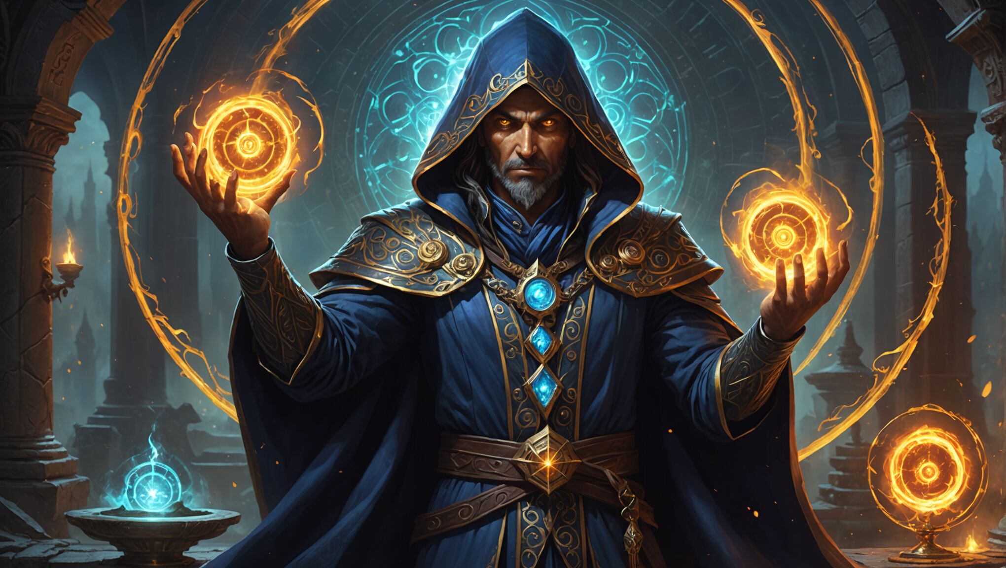
When designing characters for cover art, consider their physical attributes, clothing, and posture. A warrior might be depicted in battle-worn armor, while a mage could be shown wielding arcane symbols or surrounded by magical energy. The character’s expression is particularly important, as it can convey determination, fear, wonder, or any emotion central to their journey. Eyes are often a focal point, drawing the viewer into the character’s world and hinting at their inner thoughts.
Positioning of characters on the cover tells its own story. A solitary figure facing an unseen threat suggests a personal quest or internal struggle. Multiple characters grouped together might indicate an ensemble cast or complex relationships. The scale of characters relative to their surroundings can also speak volumes – a tiny silhouette against a vast landscape evokes themes of exploration and discovery.
Use lighting to set the mood. See how it works.
Details matter immensely in character portrayal. Scars, tattoos, or unique accessories can hint at a character’s backstory or special abilities. The weapons or tools they carry should be distinctive and reflective of the world they inhabit. Even the way fabric moves or hair flows can add dynamism and life to the image.
Diversity in character representation is increasingly important, reflecting the rich tapestry of readers and the worlds they want to explore. This includes varied body types, skin tones, ages, and cultural influences that can make the fantasy world feel more inclusive and expansive.
Artists often work closely with authors to ensure that the character portrayal aligns with the written description while still leaving room for visual interpretation. This collaboration can lead to surprising and delightful results that enhance both the cover art and the reader’s experience of the story.
Remember that character design on a cover isn’t just about accurate representation – it’s about creating an iconic image that will stick in readers’ minds long after they’ve finished the book. The best fantasy cover characters become visual shorthand for entire series or even subgenres, instantly recognizable and deeply associated with the stories they represent.
Symbolism and foreshadowing
Symbolism and foreshadowing in fantasy cover art are powerful tools that can add depth and intrigue to the visual narrative. These elements serve as subtle hints, teasing the story’s themes, conflicts, and potential plot twists without giving away too much. When skillfully incorporated, they create a layered experience that rewards viewers who take the time to analyze the artwork closely.
Symbolic objects or imagery can convey complex ideas or represent key story elements. For instance, a broken crown might symbolize a fallen kingdom, while a blooming flower in a desolate landscape could represent hope or resilience. Artists often use archetypal symbols that resonate across cultures, such as serpents for temptation or birds for freedom, adapting them to fit the specific context of the story.
Color symbolism plays a significant role in cover art. Different hues can evoke specific emotions or represent abstract concepts:
| Color | Symbolism |
| Red | Passion, danger, power |
| Blue | Tranquility, mystery, wisdom |
| Green | Growth, nature, envy |
| Gold | Wealth, divinity, corruption |
The positioning of elements within the artwork can also carry symbolic weight. Objects or characters placed in the foreground might represent immediate concerns, while those in the background could hint at future challenges or overarching themes. The use of reflection, shadows, or distorted images can suggest duality or hidden aspects of characters or the plot.
Foreshadowing in cover art requires a delicate balance. It should pique curiosity without spoiling major plot points. This might involve depicting a character with a shadowy duplicate, hinting at an inner struggle or a future confrontation. Alternatively, it could be as subtle as including a small, seemingly insignificant object that will later prove crucial to the story.
Atmospheric elements like weather conditions or celestial bodies can serve both symbolic and foreshadowing purposes. A storm brewing on the horizon might represent impending conflict, while a blood-red moon could foreshadow supernatural events or momentous changes.
Artists may incorporate hidden details or Easter eggs that become apparent only after reading the book, encouraging readers to revisit the cover art with newfound understanding. This could include camouflaged faces in a landscape, animals that represent key characters, or patterns that echo important motifs from the story.
The interplay between light and shadow is another effective tool for symbolism and foreshadowing. Characters partially obscured in darkness might suggest hidden motivations or unknown aspects of their nature. Conversely, a beam of light illuminating a specific area or object can draw attention to elements of particular significance.
When crafting symbolism and foreshadowing in fantasy cover art, it’s essential to ensure that these elements enhance rather than overshadow the main focal points. They should integrate seamlessly with the overall composition, contributing to a cohesive and intriguing visual narrative that complements the written story within.
Color palette and mood
 The color palette and mood of a fantasy book cover are crucial elements that instantly set the tone for the story within. A carefully chosen palette can evoke specific emotions, create atmosphere, and hint at the genre’s subtype or the story’s themes. Cool blues and purples might suggest mystery and magic, while warm oranges and reds could indicate action and adventure. Earthy tones might be used for more grounded, low-fantasy settings, while vibrant, otherworldly colors could signify high fantasy or science fiction elements.
Consider the psychological impact of colors. For instance, green can represent growth, nature, or envy, depending on its shade and context. Black, when used prominently, can convey darkness, elegance, or power. The interplay between light and dark areas of the cover can create dramatic contrasts that draw the eye and suggest conflict or duality within the story.
Mood is closely tied to color choices but also involves other artistic elements such as composition, lighting, and texture. A cover with sharp angles and high contrast might create a sense of tension or urgency, while soft edges and diffused light could evoke a dreamlike or nostalgic atmosphere. The overall mood should align with the book’s content – a light-hearted adventure would likely have a different visual feel than a gritty, dark fantasy.
Artists often use color gradients or overlays to add depth and complexity to the mood. A seemingly cheerful scene might be tinged with an ominous undertone through the subtle use of shadow or an unexpected color accent. This technique can create intrigue and suggest that all is not as it seems, prompting potential readers to investigate further.
The time of day depicted on the cover can significantly influence the mood. A twilight scene with rich purples and deep blues can create a sense of magic and possibility, while a harsh midday sun might suggest unforgiving challenges ahead. Night scenes often incorporate sources of light – be it magical glows, celestial bodies, or firelight – to create focal points and add to the mystical atmosphere.
Weather conditions represented through color can be powerful mood-setters. Storm clouds might be rendered in deep grays and purples to create a foreboding atmosphere, while a clear sky with touches of gold could suggest hope or triumph. The way light interacts with the environment – reflecting off water, filtering through trees, or illuminating mist – can add layers of complexity to the mood.
When considering color and mood, it’s important to think about how the cover will appear in different formats – from thumbnail images online to physical books on store shelves. Colors should be vibrant enough to catch the eye even when scaled down, while still maintaining their intended emotional impact when viewed up close.
Experimentation with unexpected color combinations can lead to striking and memorable covers. A fantasy story doesn’t always have to rely on traditional color schemes – a bold, unconventional palette can set a book apart and challenge reader expectations in intriguing ways.
The mood established by the cover should serve as a promise to the reader about the experience that awaits them. It should resonate with the target audience’s desires and expectations while offering something unique that captures their imagination. By thoughtfully crafting the color palette and mood, artists and designers can create a visual doorway that beckons readers into the fantastical world within the pages.
Typography and title integration

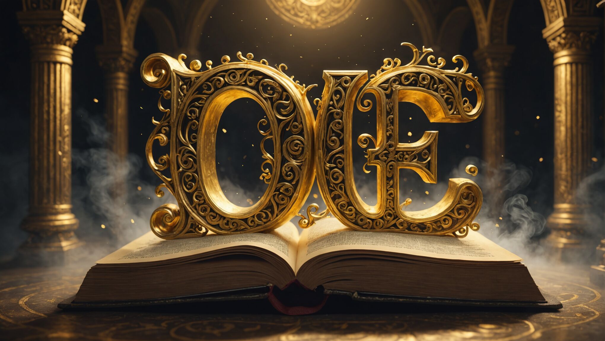
Typography and title integration are crucial elements in fantasy cover art, serving as the bridge between visual storytelling and written narrative. The font choice can significantly impact the overall mood and genre expectations. Ornate, flowing scripts might evoke a sense of magic and elegance, while bold, rugged typefaces could suggest adventure and conflict. It’s essential to select a font that not only complements the artwork but also remains legible across various sizes and formats.
The placement of the title and author’s name requires careful consideration. They should be prominent enough to be easily read but not overshadow the artwork. Many designers opt to integrate the text with the visual elements, such as having it interact with the landscape or characters. This could involve wrapping text around a magical artifact or having it appear to be carved into stone, enhancing the immersive quality of the cover.
Color plays a vital role in typography integration. The text color should contrast with the background for readability while still harmonizing with the overall palette. Sometimes, designers use gradients or textures within the letters to add depth and tie them more closely to the artwork. Effects like glowing edges or metallic sheens can further reinforce the fantasy theme.
The scale of the typography in relation to the cover art is another important factor. A large, dominant title might be appropriate for an epic saga, while a more subtle approach could suit a intimate character-driven story. Designers often play with the spacing and arrangement of letters to create interesting shapes or to echo elements in the artwork.
Subtitle placement and design also require attention. They should be distinct from the main title but not compete with it. Often, subtitles are used to provide additional genre cues or series information, helping potential readers quickly understand what type of story they’re looking at.
Some covers incorporate symbols or glyphs into the typography, either as standalone elements or integrated into the letters themselves. These can serve as visual shorthand for magical systems or cultural elements within the story, adding an extra layer of intrigue for viewers.
The interplay between typography and negative space is crucial. Leaving adequate breathing room around the text ensures it doesn’t feel cramped or lost in busy artwork. Sometimes, designers create subtle frames or shapes within the composition specifically to house the text elements.
Adaptability is key when designing typography for fantasy covers. The text should work well across different formats, from physical books to digital thumbnails. This often involves creating variations of the cover with adjusted text placement or size to suit different aspect ratios and viewing contexts.
Ultimately, successful typography and title integration in fantasy cover art should feel like an organic part of the overall design, enhancing the story’s appeal and drawing potential readers into the magical world promised within the pages.

