blog
Typography Secrets for Powerful Fantasy Titles
When crafting fantasy titles, the right font can transport readers to mythical worlds before they even delve into the story. Serif fonts with elaborate swashes and ornate details, such as Luminari or Enchanted Land, can evoke a sense of ancient magic and timeless legends. For a more rugged, medieval feel, consider blackletter or gothic-inspired typefaces like Kingthings Petrock or Pieces of Eight. Handwritten scripts can lend an air of personal enchantment, as if penned by a wizard’s quill. Fonts with organic, flowing lines like Elvish Ring NFI or Aniron can suggest elven realms or nature-based magic systems.
For a more contemporary fantasy look, combine a decorative display font for the main title with a clean, modern sans-serif for subtitles or author names. This juxtaposition creates visual interest while maintaining readability. Don’t shy away from custom-designed letterforms for key words or character names, as these can become iconic symbols associated with your fantasy world. Remember that “Typography is the voice of the written word”, so choose a font that speaks in the tone of your fantasy narrative, whether it’s whimsical, dark, ethereal, or epic in nature.
Experiment with layering fonts or adding subtle textures to enhance the fantastical feel. A slightly rough or parchment-like background can give the impression of an ancient tome, while a smooth gradient might suggest a magical aura. Pay attention to the weight and spacing of your chosen fonts; heavier weights can convey power and importance, while lighter, more spaced-out letters might imply mystery or airiness. Ultimately, the font should not only be visually appealing but also align with the mood and setting of your fantasy world, creating an immediate and lasting impression on your audience.
Color combinations for magical impact
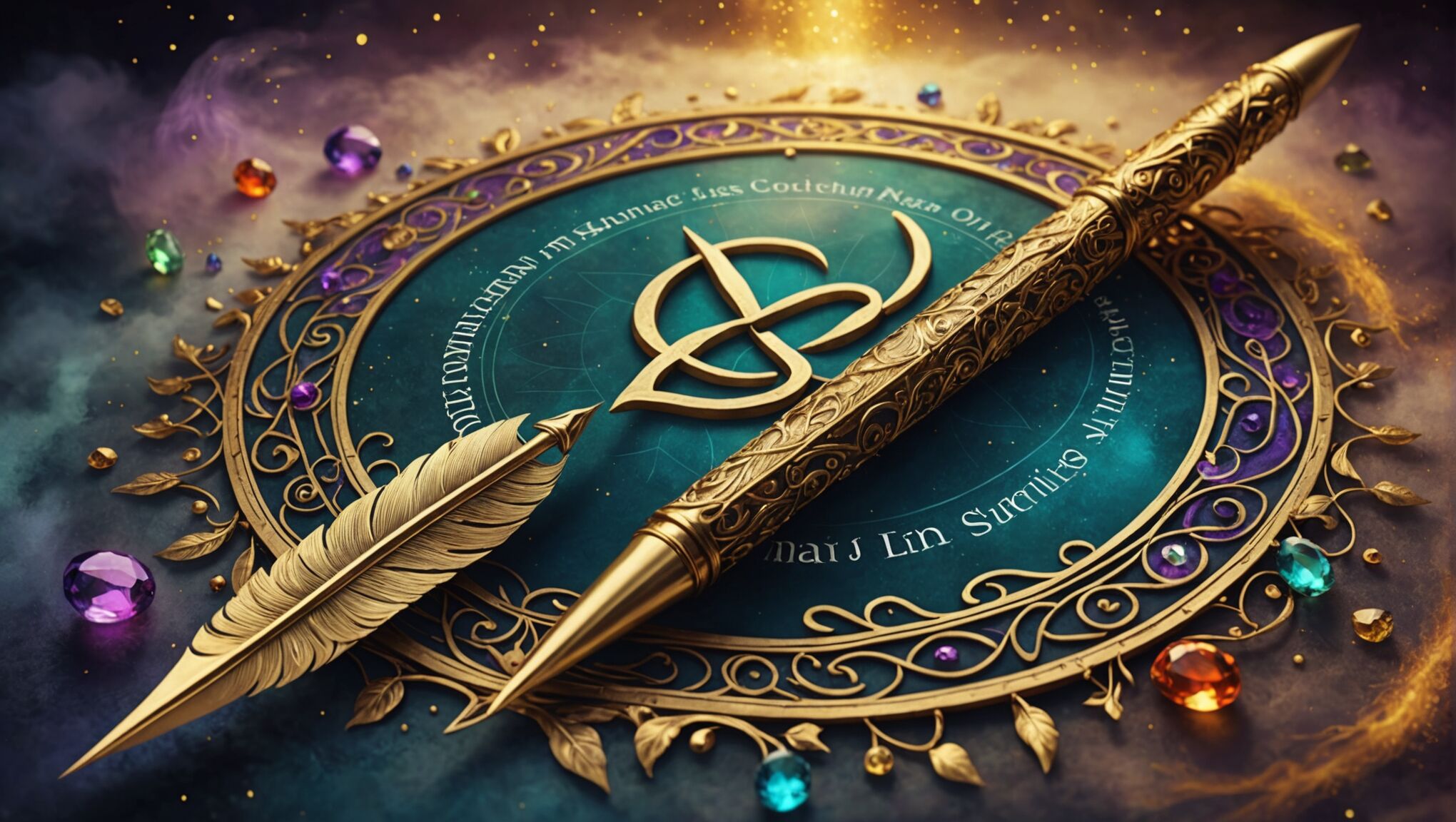 The color palette you choose for your fantasy title can be as powerful as the words themselves, casting a spell on readers before they even open the book. Rich, jewel tones like deep purples, emerald greens, and sapphire blues evoke a sense of royalty and magic, perfect for tales of noble quests and arcane powers. For darker fantasies, consider a combination of deep crimson and obsidian black, suggesting danger and mystery.
Metallic accents can add a touch of otherworldly glamour to your title. Gold leaf effects paired with a deep forest green can create an elven aesthetic, while silver or copper tones might suggest dwarven craftsmanship or steampunk elements. Don’t be afraid to experiment with unconventional color combinations; a clash of neon pink and electric blue could perfectly capture the essence of a modern urban fantasy.
“Color is a power which directly influences the soul.” – Wassily Kandinsky
Consider the psychology of color when making your choices. Warm oranges and reds can convey energy and passion, ideal for action-packed adventures, while cool blues and greens might better suit contemplative, magical journeys. Pastels can work well for whimsical or young adult fantasies, creating a softer, more approachable feel.
Gradients and color transitions can add depth and dimension to your title, suggesting magical transformations or the blending of different realms. A shift from a deep midnight blue to a sparkling gold could symbolize the journey from darkness to light that many fantasy heroes undertake.
Don’t forget the importance of contrast in your color scheme. Ensure that your title stands out against its background, whether that’s the cover art or a solid color. High contrast not only improves readability but can also create a striking visual impact that catches the eye.
Utilize color to highlight specific elements of your title. For instance, you might use a different color for a single letter or word to emphasize its importance or magical nature. This technique can draw attention to key themes or characters in your story.
Design covers for urban fantasy readers. Check the details.
Remember that color can also be used to create consistency across a series. Establishing a signature color palette that evolves slightly with each book can help readers instantly recognize your work while also suggesting the progression of the overarching narrative.
Lastly, consider how your color choices will translate across different mediums. What looks stunning on a physical book cover may not have the same impact on a small digital thumbnail. Test your color combinations in various formats to ensure they maintain their magical allure regardless of how they’re viewed.
Enhancing readability in ornate designs
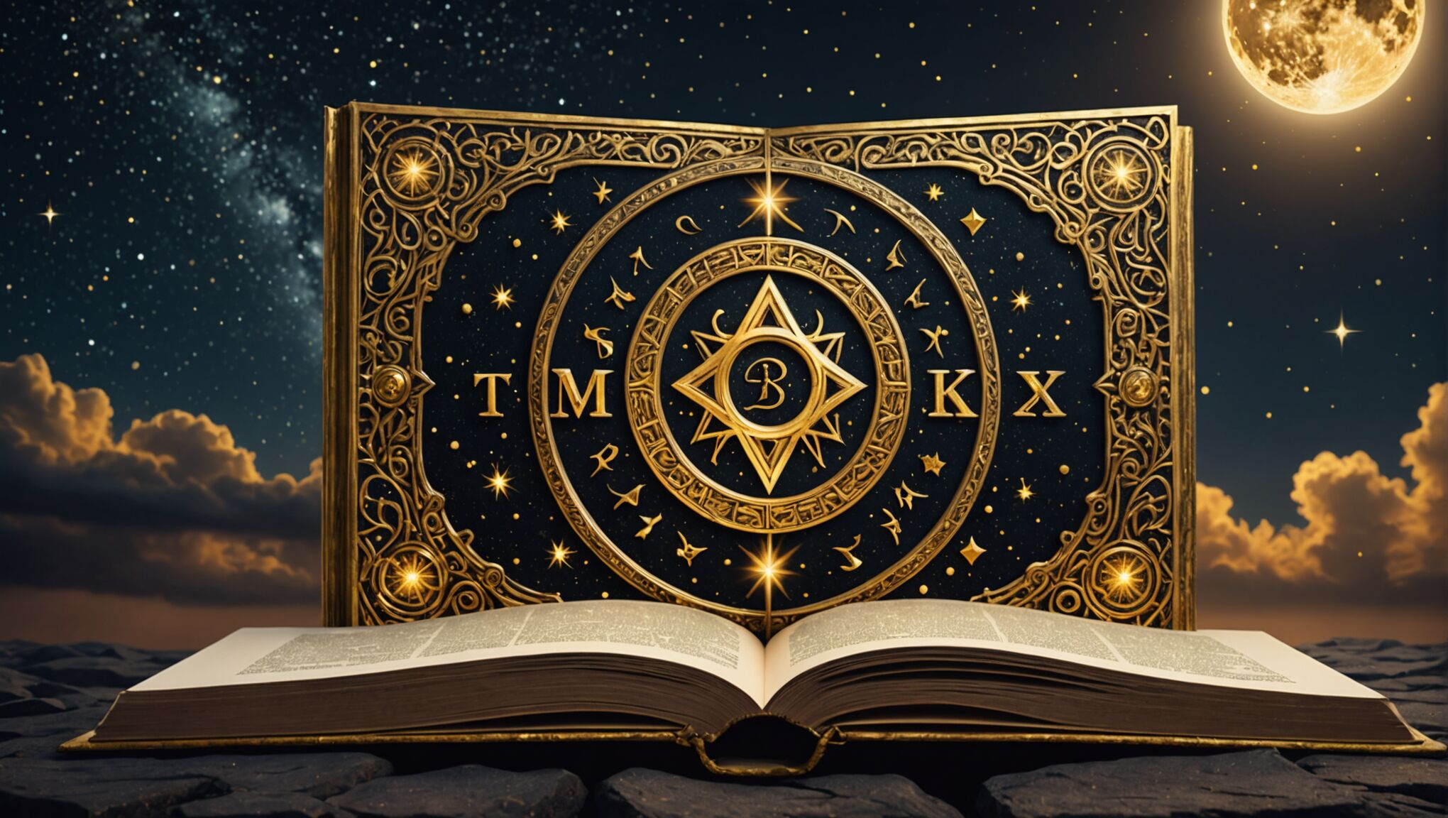
While ornate designs can captivate the eye, they must never compromise legibility. Start by ensuring adequate contrast between the text and background. If using a detailed or textured backdrop, consider adding a subtle shadow or glow to your lettering to make it pop. Experiment with letter spacing, or tracking, to prevent intricate characters from bleeding into one another. For longer titles, increasing the leading (line spacing) can prevent overcrowding and improve readability.
Consider the scale of your design elements carefully. Ornate flourishes should complement rather than overpower the main text. Use them sparingly to accent key letters or frame the title, allowing the words themselves to remain the focal point. When working with highly decorative fonts, simplify other design elements to maintain balance and prevent visual overwhelm.
Layering can be an effective technique to enhance both the fantasy aesthetic and readability. Place a simplified version of your title beneath the ornate layer to create depth and ensure legibility from a distance. This approach allows you to maintain the intricate details up close while providing a clear silhouette for instant recognition.
Don’t overlook the importance of negative space in your design. Allowing breathing room around your title can make even the most elaborate typography more digestible. This space can also serve as a canvas for subtle magical effects or textures that enhance the overall theme without interfering with the text itself.
When incorporating illustrative elements into your typography, ensure they align with the natural flow of reading. Guide the eye along the text rather than away from it. Consider using these elements to lead into the first letter or emerge from the final character, creating a sense of movement that enhances rather than hinders comprehension.
Test your design at various sizes and on different devices to ensure it remains readable across all platforms. What looks stunning on a large book cover may lose its impact when shrunk down to a thumbnail size for online stores. Be prepared to create simplified versions of your title for smaller applications while maintaining the essence of your original design.
Remember that readability doesn’t mean sacrificing creativity. By thoughtfully balancing ornate elements with clear communication, you can create fantasy titles that are both visually stunning and easily understood, capturing the imagination of readers from the very first glance.
Incorporating symbolic elements into lettering
Integrating symbolic elements into your lettering can elevate your fantasy title from mere text to a visual representation of your story’s essence. Consider incorporating mystical symbols, runes, or glyphs that relate to your narrative’s themes or magic system. These can be subtly woven into the letterforms or used as decorative accents around the title.
For instance, you might replace the letter ‘O’ with a stylized moon or sun symbol, or integrate a small dragon silhouette into the crossbar of a letter ‘T’. Celtic knots, alchemical symbols, or astrological signs can be artfully embedded within or between letters to add layers of meaning and intrigue.
When using symbolic elements, ensure they don’t overwhelm the text or compromise legibility. A delicate balance is key. You might consider using these symbols more prominently in initial capitals or as flourishes at the beginning or end of words.
Elements from nature can also serve as powerful symbols in fantasy typography. Vines or branches can form letters or intertwine with them, suggesting a connection to natural magic or forest realms. Flame-like tendrils emerging from letters could hint at fire magic or dragon lore.
Geometric shapes and patterns can be equally effective, especially for titles related to cosmic or abstract magic systems. Sacred geometry, such as the Flower of Life or spirals, can be subtly integrated into the background or used to form parts of letters.
Consider the cultural context of your fantasy world when selecting symbols. If your story draws inspiration from specific mythologies or historical periods, incorporate relevant iconography. This not only enhances the visual appeal but also provides readers with subtle clues about the story’s setting.
Animated typography for digital platforms offers unique opportunities to incorporate dynamic symbolic elements. Letters could shimmer with magical energy, transform into creatures, or reveal hidden symbols when interacted with, creating an immersive experience for potential readers.
Remember that consistency is crucial when incorporating symbolic elements. Develop a cohesive visual language that can be applied across your title, chapter headings, and even marketing materials to create a unified brand for your fantasy work.
Here’s a table showcasing some common symbolic elements and their potential meanings in fantasy contexts:
| Symbol | Potential Meaning |
| Pentagram | Magic, protection, elements |
| Tree of Life | Interconnectedness, growth, wisdom |
| Ouroboros | Eternal cycle, infinity, rebirth |
| Triquetra | Trinity, unity, protection |
| Eye of Horus | Protection, royal power, good health |
Lastly, consider creating a custom symbol or glyph that becomes synonymous with your fantasy series. This could be used as a standalone emblem or integrated into the title typography, serving as a recognizable brand mark across various media platforms and merchandise.
Balancing decorative and functional typography
 When it comes to fantasy titles, striking the perfect balance between decorative allure and functional clarity is crucial. While intricate designs can captivate the imagination, they must not come at the cost of readability. The key lies in harmonizing aesthetics with practicality, ensuring that your title not only looks magical but also communicates effectively.
Consider using a combination of fonts to achieve this balance. A more ornate typeface can be employed for key words or the main title, while a cleaner, simpler font can be used for subtitles or author names. This approach allows you to maintain the fantasy aesthetic while preserving legibility.
Layering is another powerful technique. You can create depth by placing a simplified version of your title beneath a more decorative layer. This not only adds visual interest but also ensures that the title remains readable even at a glance or from a distance.
Pay close attention to the scale and proportion of decorative elements. Flourishes and embellishments should enhance the overall design without overwhelming the text itself. Use them strategically to draw attention to specific parts of the title or to frame the entire text, rather than cluttering every available space.
Negative space is your ally in balancing decorative and functional elements. Allow breathing room around your typography to prevent visual fatigue and improve overall readability. This space can also serve as a canvas for subtle textures or effects that complement the fantasy theme without interfering with the text.
Consider the weight and contrast of your typography. Heavier weights can convey power and importance, but they may require more spacing to maintain readability. Ensure sufficient contrast between the text and background, especially when working with complex designs or textures.
Experiment with color to enhance both the decorative and functional aspects of your title. Use color strategically to highlight important words or create visual hierarchy. However, be mindful of color combinations that may reduce readability, especially when viewed on different devices or in print.
Remember that your title needs to work across various formats and sizes. What looks stunning on a large book cover may lose its impact when shrunk down to a thumbnail for online stores. Create variations of your design that maintain the core aesthetic while optimizing for different applications.
Incorporate symbolic elements or custom letterforms judiciously. These can add unique character to your title but should be used sparingly to avoid confusion. Ensure that any custom elements are still recognizable as letters and don’t hinder quick reading.
Consider the overall mood and tone of your fantasy work. The balance between decorative and functional elements should reflect the nature of your story. A whimsical tale might allow for more playful, ornate typography, while a darker fantasy might benefit from a starker, more dramatic balance.
Test your design with potential readers. Gather feedback on both the visual appeal and readability of your title. Sometimes, fresh eyes can spot issues or opportunities that you might have overlooked.
As you work on balancing decorative and functional typography, challenge yourself to think beyond conventional designs. How can you push the boundaries while still maintaining clarity? Could animated typography for digital platforms offer new ways to balance these elements?
Remember, the goal is to create a title that not only captures the essence of your fantasy world but also invites readers to explore it. A well-balanced design serves as a portal, enticing the eye while clearly communicating what lies beyond.
Creating depth and dimension in fantasy titles
Adding depth and dimension to fantasy titles can transform them from flat text into captivating visual elements that draw readers into your magical world. One effective technique is to employ layering, where you create multiple levels within your typography. This can be achieved by duplicating your text, offsetting the layers slightly, and applying different effects or colors to each layer. For instance, you might have a solid base layer, a slightly offset shadow layer, and a top layer with a glowing or metallic effect.
Texture plays a crucial role in creating depth. Consider incorporating subtle textures that mimic materials found in fantasy realms, such as weathered stone, ancient parchment, or dragon scales. These can be applied to the letters themselves or used as a background that interacts with the typography. When using textures, ensure they enhance rather than overpower the legibility of your title.
Lighting effects can dramatically increase the sense of dimension in your typography. Experiment with directional lighting to create highlights and shadows within your letterforms. This technique can make your title appear as if it’s carved into stone or floating above the page. Combine this with a subtle gradient background to further enhance the illusion of depth.
3D effects are particularly effective for fantasy titles. Software like Adobe Illustrator or Blender can help you create extruded letterforms that appear to leap off the page. Consider how your title might look if it were forged from metal, carved from crystal, or grown from living vines. These 3D elements can be further enhanced with appropriate textures and lighting.
Incorporate fantastical elements that interact with your typography to add both depth and storytelling. Imagine wisps of magic curling around letters, roots growing through them, or mythical creatures perched on or flying around the text. These elements can extend beyond the boundaries of the letters, creating a sense of space and dimension.
Perspective can be a powerful tool in your typographic arsenal. By applying perspective to your title, you can create the illusion that it recedes into the distance or emerges from a portal. This technique works particularly well for titles that suggest epic journeys or vast fantasy landscapes.
Consider the use of negative space within and around your letters. Carving out intricate designs or scenes within the letterforms themselves can create a captivating depth effect. This approach allows you to tell a mini-story within the title itself, inviting closer inspection and engagement from potential readers.
Animation, when used for digital platforms, can take your dimensional typography to the next level. Subtle movements, such as floating particles, shimmering effects, or slowly rotating 3D elements, can bring your title to life and create a truly immersive experience.
Remember that while adding depth and dimension can create stunning visual effects, it’s crucial to maintain the readability of your title. Always test your design at various sizes and on different backgrounds to ensure it remains clear and impactful in all contexts.

