blog
How to Design Covers for Epic Fantasy Series
When crafting covers for epic fantasy series, several key elements must be carefully considered to captivate potential readers and convey the essence of the story. Iconic imagery is crucial, often featuring mythical creatures, magical artifacts, or heroic figures that represent the core themes of the narrative. Landscapes play a vital role, showcasing vast, otherworldly realms that spark the imagination and hint at the epic scale of the adventures within. Atmospheric effects, such as dramatic lighting, swirling mists, or ominous storm clouds, can heighten the sense of mystery and magic inherent in the genre. “A picture is worth a thousand words” rings especially true for fantasy covers, where intricate details and hidden symbols can provide tantalizing clues about the plot and characters. The composition should guide the viewer’s eye, creating a focal point that draws them into the world of the book. Textures, whether they mimic weathered leather, aged parchment, or gleaming metal, add depth and tactile appeal to the design. Finally, the integration of series branding elements, such as a distinctive emblem or recurring motif, helps establish visual continuity across multiple volumes while allowing each book to maintain its unique identity within the overarching saga.
Choosing the right imagery and symbolism
 Selecting the right imagery and symbolism for an epic fantasy series cover is a delicate art that requires a deep understanding of the story’s themes, characters, and world-building elements. The chosen visuals should not only capture the essence of the narrative but also resonate with the target audience and stand out in a crowded marketplace.
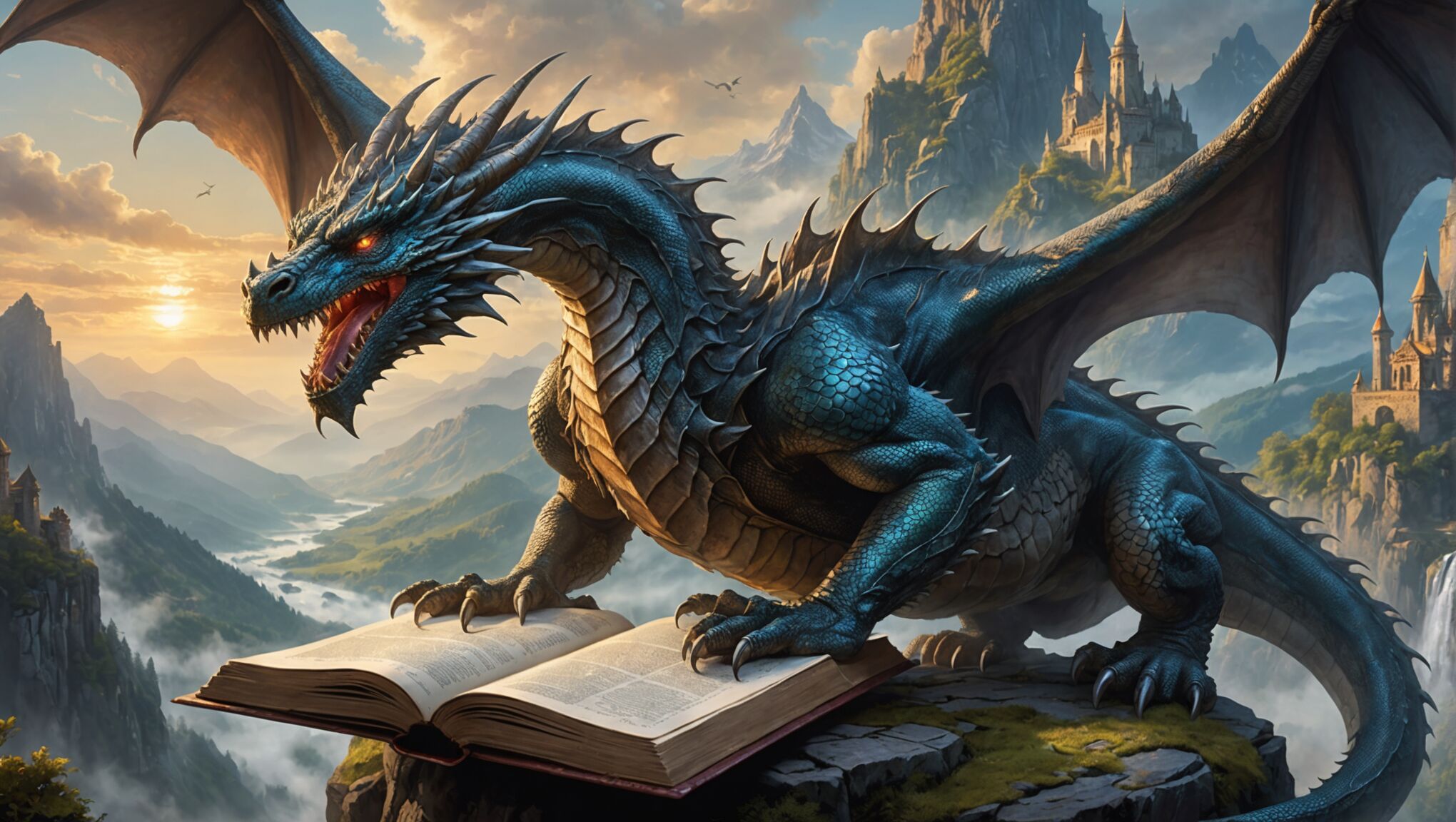
Central to this process is the identification of key symbols that represent the core concepts of the series. These might include magical artifacts, such as enchanted swords, mystical amulets, or ancient tomes, which often play pivotal roles in epic fantasy plots. Alternatively, the symbol could be a unique creature or being that is integral to the story, like a dragon, phoenix, or otherworldly entity.
“A good book cover is a visual sales pitch. It’s your 3-second elevator pitch to get the reader to pick up the book and read the synopsis.” – Joel Friedlander, Book Designer
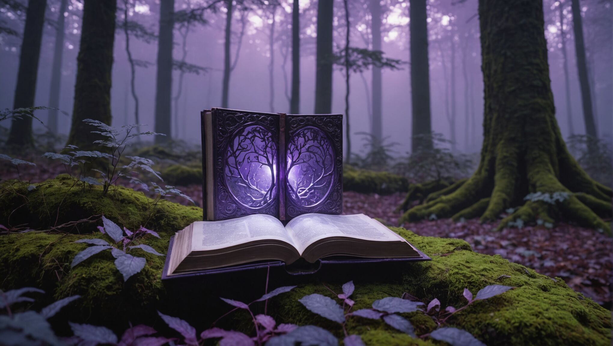
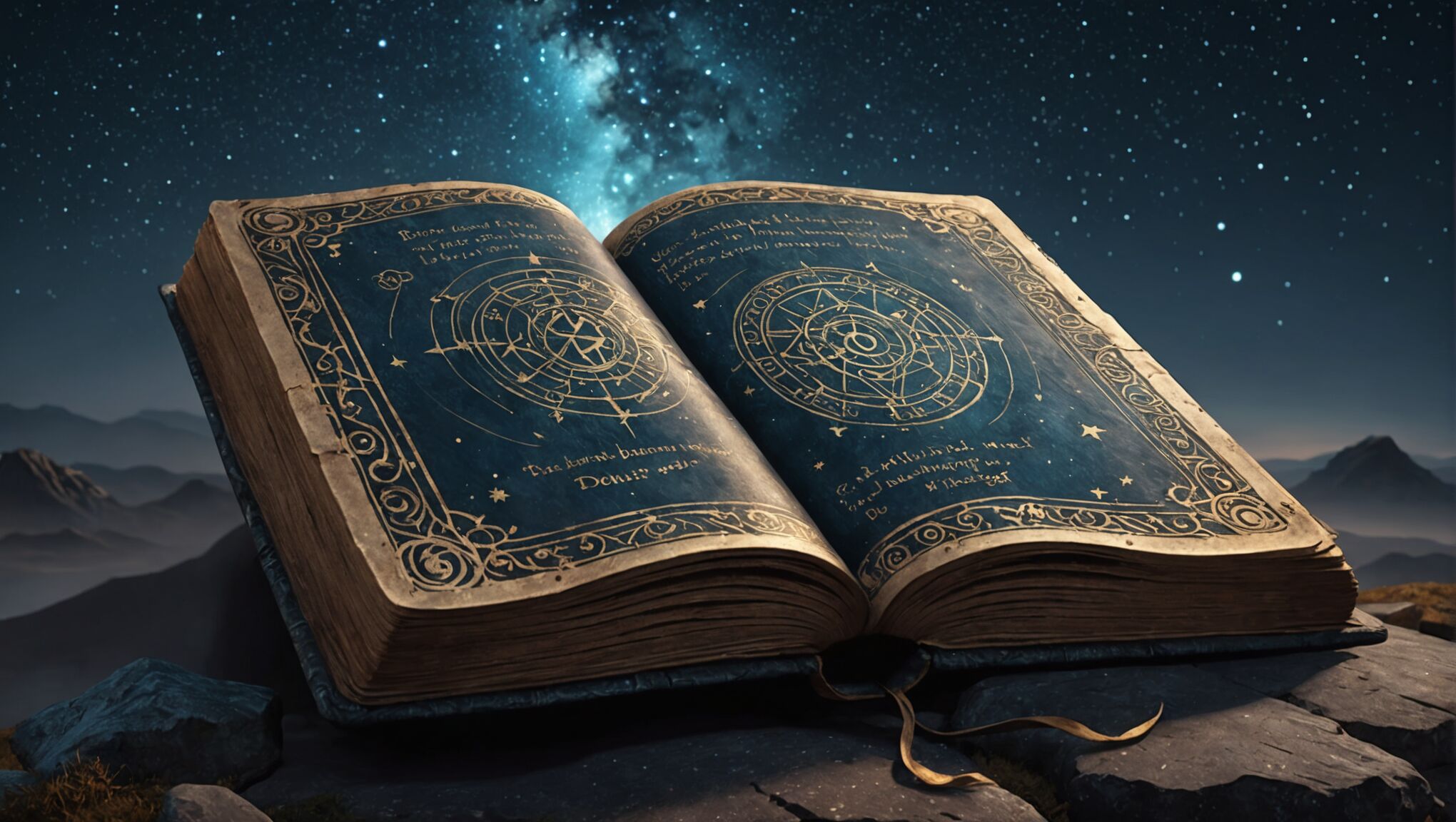
Landscape elements can serve as powerful symbols as well. A looming mountain range might represent the challenges the protagonists must overcome, while a dark forest could symbolize the unknown dangers that await. Celestial bodies, such as moons, stars, or eclipses, often carry symbolic weight in fantasy narratives and can make for striking cover imagery.
Character representation on covers should be approached thoughtfully. While featuring characters can help readers connect with the story, it’s important to leave room for imagination. Silhouettes or partial views can be more effective than fully detailed portraits, allowing readers to form their own mental images of the heroes and villains.
Incorporating cultural and mythological references relevant to the story’s setting can add depth and authenticity to the cover design. This might involve the use of Celtic knots, Norse runes, or Eastern mandalas, depending on the fantasy world’s inspirations.
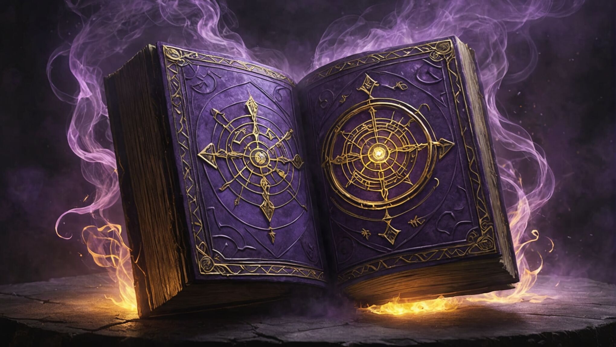
Symbolic color choices can also convey important information about the book’s tone and themes. For instance, deep purples might suggest royalty and magic, while fiery reds could hint at conflict and passion.
Layering multiple symbolic elements can create a rich, intriguing composition that rewards closer inspection. This technique can be particularly effective for epic fantasy, where complex world-building is often a key feature.
It’s crucial to strike a balance between symbolism and clarity. While fantasy readers often appreciate intricate designs, the cover should still be visually appealing and comprehensible at a glance, especially when viewed as a thumbnail online.
Consistency in symbolism across a series is vital for brand recognition, but each book should also have unique elements that reflect its individual story. This can be achieved by maintaining a central symbol or style while introducing new elements for each installment.
Ultimately, the chosen imagery and symbols should work together to create an emotional response in potential readers, promising adventure, wonder, and the immersive experience that epic fantasy fans crave.
Color palettes for fantasy worlds

Color palettes play a crucial role in setting the tone and atmosphere for epic fantasy worlds. The right combination of hues can transport readers to otherworldly realms, evoke powerful emotions, and reinforce the themes of the story. Rich, deep colors often dominate fantasy cover designs, with jewel tones like sapphire blue, emerald green, and amethyst purple conveying a sense of magic and nobility. These can be balanced with metallic accents in gold, silver, or bronze to suggest precious treasures or ancient artifacts.
Earthy tones such as deep forest greens, russet browns, and stormy grays can ground the fantasy elements in a more relatable world, hinting at the natural landscapes that often play a significant role in epic quests. For darker, more ominous themes, a palette of midnight blues, shadowy purples, and smoky blacks can create a sense of mystery and danger. Conversely, covers featuring realms of light and hope might incorporate radiant golds, soft whites, and ethereal pastels.
It’s essential to consider the interplay of colors and how they affect the overall composition. High contrast between light and dark elements can create dramatic focal points, while complementary colors can make certain elements pop. For example, a fiery orange dragon against a deep blue sky will immediately draw the eye. Gradients and color blending techniques can add depth and dimension to the cover, suggesting magical auras or the merging of different realms.
When designing for a series, establishing a cohesive color scheme across multiple books is crucial. This can be achieved by using a consistent base color and varying the accent colors for each installment, or by shifting the dominant color along a spectrum as the series progresses. For instance, a trilogy might start with cool blues, transition to purples, and conclude with warm reds, visually representing the story’s arc.
Cultural associations with colors should also be considered, especially if the fantasy world draws inspiration from specific real-world cultures. For example, red might symbolize good fortune in one context but danger in another. Understanding these nuances can add layers of meaning to the cover design that resonate with knowledgeable readers.
Digital tools and techniques allow for sophisticated color manipulation, enabling designers to create unique effects that were once difficult to achieve. Luminous glows, iridescent sheens, and subtle color shifts can all contribute to the magical quality of a fantasy cover. However, it’s important to ensure that these effects translate well to print and maintain their impact across different viewing platforms.
Ultimately, the chosen color palette should work in harmony with the other design elements to create a cohesive and captivating visual representation of the epic fantasy world within the pages. It should entice potential readers, giving them a glimpse into the adventures that await and promising an immersive experience that begins the moment they lay eyes on the cover.
Typography and font selection
Typography and font selection are crucial elements in creating a compelling cover for an epic fantasy series. The right typeface can evoke the mood, setting, and era of the story, while also ensuring readability and visual appeal.
Choose the best color palette for your theme. Visit site.
When selecting fonts for fantasy covers, designers often gravitate towards serif typefaces, which can lend an air of antiquity and tradition to the design. Ornate, calligraphic fonts may be used for titles, evoking a sense of handwritten manuscripts or ancient tomes. However, it’s essential to balance decorative elements with legibility, especially when the cover will be viewed as a thumbnail online.
For series titles, a custom-designed logotype can create a strong brand identity. This unique lettering can incorporate elements from the story, such as subtle nods to magical symbols or the shape of significant objects from the narrative. The logotype should be versatile enough to work across different background colors and compositions as the series progresses.
Subtitles or author names often benefit from a simpler, more modern sans-serif font that contrasts with the main title. This contrast can help hierarchy and ensure that all text elements are easily readable at various sizes.
Font pairing is an art in itself. A good rule of thumb is to combine a more decorative font for the title with a cleaner, simpler font for secondary text. For example:
| Title Font | Secondary Font |
| Trajan Pro | Optima |
| Cinzel | Lato |
| Luminari | Avenir |
The weight and size of the font are also crucial considerations. Bold, heavy typefaces can convey power and drama, while lighter weights might suggest elegance or mystery. The size of the text should be balanced with the cover’s imagery, ensuring that neither overpowers the other.
Texture and effects applied to typography can enhance the fantasy feel. Metallic finishes, embossing, or subtle glows can make the text feel magical or otherworldly. However, these effects should be used judiciously to maintain readability and avoid a cluttered appearance.
Kerning and leading (the space between letters and lines) require careful attention. Proper spacing can make the difference between a professional-looking cover and one that appears amateurish. For fantasy titles, slightly increased letter spacing can create a more epic, expansive feel.
Consider the placement of text elements carefully. The title should typically be the most prominent text on the cover, but its position can vary depending on the overall composition. Some designers opt for centered text for a classic look, while others might use asymmetrical placement for a more dynamic feel.
Localization is another factor to consider when selecting fonts. If the series is likely to be translated, choose typefaces that support multiple languages and character sets to maintain consistency across different editions.
Finally, it’s crucial to test the typography in various contexts. A font that looks great on a large hardcover might not work as well on a paperback spine or as a small online thumbnail. Ensure that the chosen typography remains effective across all potential formats and sizes.
Balancing series continuity with individual book identity
 When designing covers for an epic fantasy series, striking the right balance between series continuity and individual book identity is crucial. This delicate equilibrium ensures that each volume stands out while still being recognizable as part of a cohesive whole.
One effective approach is to establish a consistent visual framework that runs throughout the series. This could be a recurring layout structure, a distinctive color palette, or a signature graphic element that appears on each cover. For instance, you might use a specific border design or a recurring emblem that represents the overarching theme of the series.
Within this framework, introduce unique elements for each book that reflect its specific story. This could be achieved through variations in the central imagery, color shifts, or the introduction of new symbolic elements. For example, if each book focuses on a different magical artifact, that artifact could be prominently featured on its respective cover.
The typography can play a significant role in maintaining continuity. Use the same font for the series title and author name across all books, but vary the treatment of individual book titles. This might involve changing the color, size, or effects applied to the title text to match the mood of each installment.
Color is another powerful tool for balancing continuity and individuality. Consider using a consistent base color throughout the series but introduce unique accent colors for each book. Alternatively, you could employ a color progression that evolves with the narrative arc of the series, subtly shifting from cool to warm tones, or light to dark, as the story intensifies.
Composition can also help strike this balance. Maintain a consistent overall layout structure but vary the positioning of key elements. For instance, you might always place the central image in the same area but change its orientation or the direction it faces from book to book.
When it comes to character representation, if you choose to feature characters on the covers, consider using a consistent style of portrayal but focus on different characters or groupings for each book. This allows readers to connect with the evolving cast while maintaining a familiar aesthetic.
For longer series, you might consider creating mini-arcs within the overall design scheme. This could involve subtle design shifts every few books to reflect major plot developments or changes in the story’s focus, while still maintaining overarching visual themes.
Remember that the spine and back cover designs are also important in creating a cohesive series look. Develop a consistent spine design that allows the books to look striking when displayed together on a shelf, while still incorporating elements that distinguish each volume.
It’s crucial to think ahead when planning the series design. Create a flexible system that can accommodate future books without becoming repetitive or losing impact. This might involve developing a range of complementary design elements that can be mixed and matched as the series progresses.
Consider how the covers will evolve if the series extends beyond its initial planned length. Establish design principles that can be applied to potential spin-offs, prequels, or related works within the same universe.
Ultimately, the goal is to create a visual narrative that parallels the written one. Each cover should feel like a new chapter in an ongoing visual story, familiar yet fresh, inviting readers to continue their journey through the epic fantasy world you’ve created.
Creating a visual hook for potential readers

In the competitive world of book marketing, creating a visual hook for potential readers is paramount. The cover must instantly grab attention and spark curiosity, compelling browsers to pick up the book or click for more information. To achieve this, focus on a single, striking element that encapsulates the essence of the story. This could be an intriguing character silhouette, a unique magical artifact, or a breathtaking landscape that defines the fantasy world.
Consider using unexpected color combinations or bold contrasts to make the cover stand out on crowded shelves or busy online marketplaces. A vibrant splash of color against a muted background can draw the eye effectively. Alternatively, a minimalist approach with a single, powerful image set against negative space can create an air of mystery that begs further investigation.
Incorporate dynamic elements that suggest movement or action. This could be achieved through swirling magical effects, flowing capes, or creatures in mid-flight. Such dynamic visuals not only capture attention but also hint at the exciting adventures within the pages.
Utilize the power of perspective and scale to create awe-inspiring imagery. A tiny figure dwarfed by colossal structures or mythical beasts can evoke a sense of wonder and epic scope that is irresistible to fantasy readers. Similarly, close-up details of intricate magical symbols or weathered textures can pique curiosity and invite closer inspection.
Experiment with unconventional framing or composition techniques. Breaking the traditional boundaries of the cover space with elements that extend beyond the edges can create a sense of a world too vast to be contained. This approach can be particularly effective in digital formats where covers are often displayed alongside many others.
Consider incorporating subtle, interactive elements for digital formats. Animated covers with subtle movements or parallax effects can captivate potential readers scrolling through online bookstores. However, ensure that these enhancements don’t detract from the core design, which should remain impactful in static form.
Leverage the power of negative space to create intriguing shapes or hidden images. This technique can reward careful observation and create a sense of discovery that mirrors the journey readers will embark upon within the book. A cleverly concealed face or creature within the landscape elements can provide that extra hook to engage potential readers.
Don’t underestimate the impact of well-crafted typography. A uniquely stylized title that integrates seamlessly with the cover art can become a visual hook in its own right. Consider custom lettering that reflects the tone and setting of your fantasy world, perhaps incorporating elements that hint at the magic system or cultural influences within the story.

