blog
Making Fantasy Villains the Centerpiece of Your Book Cover
When selecting the perfect antagonist to feature on your book cover, consider the villain’s iconic status within your story. The chosen character should be instantly recognizable and evoke a strong emotional response from potential readers. “A great villain is the hero of their own story,” and this should be reflected in their visual representation. Opt for a villain with distinctive physical characteristics or unique accessories that can be easily translated into a striking visual element. Consider their role in the plot and how their presence on the cover can hint at the central conflict without giving away too much. It’s also crucial to ensure that the villain’s appearance aligns with your target audience’s expectations and preferences. For young adult fantasy, a brooding, mysterious figure might be more appealing, while epic fantasy readers might gravitate towards a more imposing, armor-clad antagonist. Remember that the villain you choose will set the tone for your entire cover, so select one that embodies the core themes and atmosphere of your story. Additionally, consider how the villain’s visual representation can be used to create intrigue and spark curiosity about your book’s plot. Visual storytelling through your cover villain can be a powerful tool to draw readers in and compel them to pick up your book.
Designing a visually striking antagonist
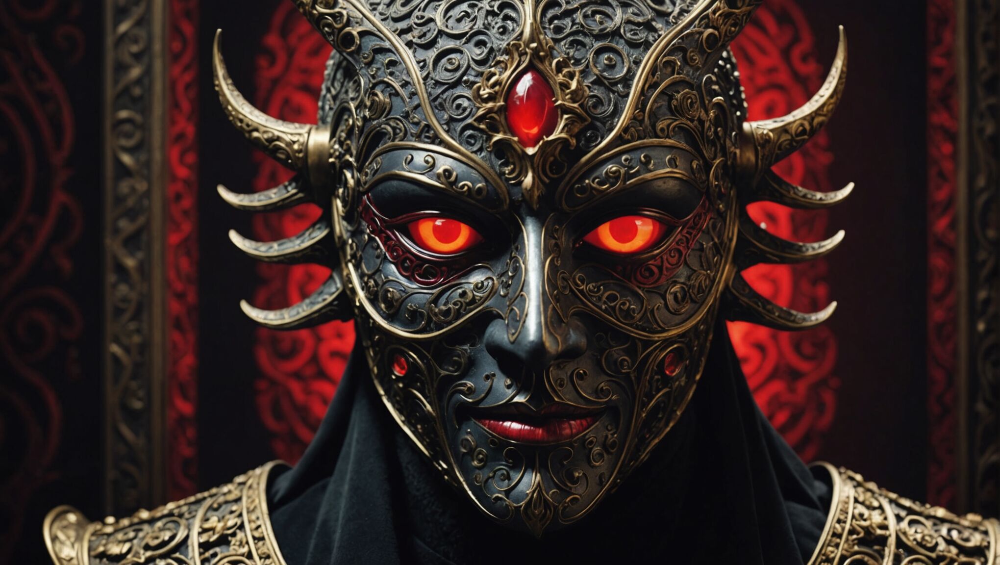 To create a visually striking antagonist for your book cover, focus on exaggerating their most distinctive features and characteristics. Amplify their menacing presence through dramatic lighting, bold colors, and dynamic poses. Consider incorporating symbolic elements that represent their power or motivations, such as a unique weapon, magical artifact, or environmental effects that showcase their abilities.
“The greatest trick the devil ever pulled was convincing the world he didn’t exist.” – Charles Baudelaire
Use this concept to play with the villain’s visibility on the cover. A partially obscured face or a silhouette can create an air of mystery and intrigue, leaving readers curious about the full extent of the antagonist’s appearance and capabilities.
Texture and detail are crucial in making your villain stand out. If your antagonist is a creature, emphasize scales, fur, or other unique physical attributes. For humanoid villains, focus on intricate costume design, incorporating elements that hint at their backstory or motivations. Consider adding scars, tattoos, or other distinguishing marks that make them memorable and hint at their past.
Facial expressions are powerful tools for conveying emotion and intent. A subtle smirk, a piercing gaze, or a contorted expression of rage can speak volumes about your villain’s personality and the threat they pose. Pay special attention to the eyes, as they are often considered the windows to the soul and can be particularly impactful in conveying malevolence or complexity.
Contrast is key in making your antagonist pop on the cover. Consider placing them against a backdrop that emphasizes their presence, such as a dark figure looming over a bright landscape or a fiery villain set against a cool, muted background. This contrast not only makes the antagonist visually striking but also symbolizes their opposition to the story’s heroes and the world they threaten.
Incorporate movement and energy into the design to create a sense of action and impending conflict. This can be achieved through flowing capes, swirling magic, or dynamic poses that suggest the villain is about to leap off the cover and into the reader’s world.
Finally, consider the scale of your villain on the cover. An oversized representation can emphasize their power and the magnitude of the threat they pose, while a smaller, more subtle presence can create an atmosphere of pervasive danger and manipulation.
By focusing on these elements, you can create a visually arresting antagonist that not only captures attention but also communicates the essence of your story’s conflict and the formidable challenge your heroes must face.
Use contrast to make your cover pop. Discover more here.
Balancing villain prominence with other elements
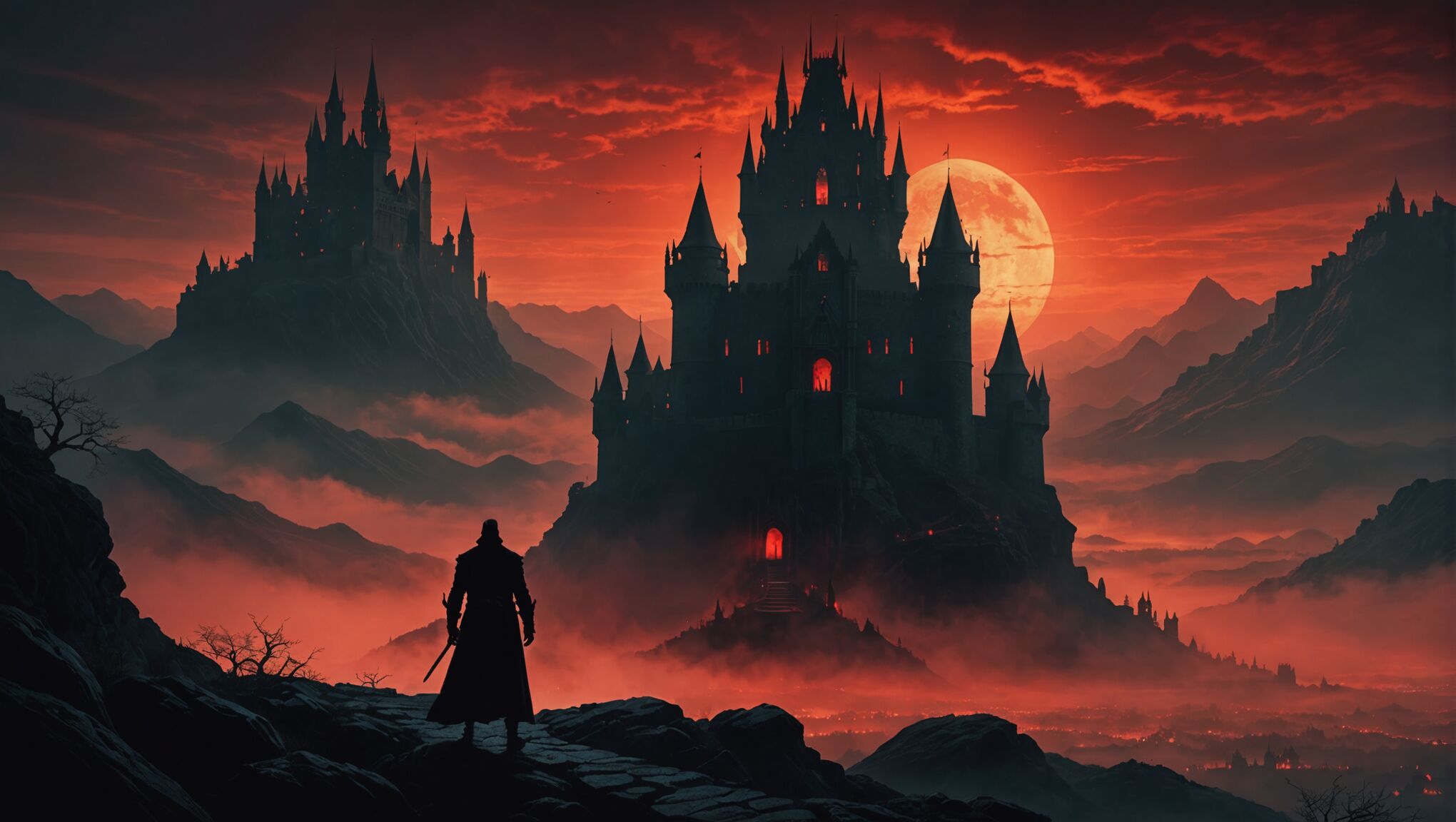
While featuring the villain prominently on your book cover can create a powerful impact, it’s crucial to strike a balance with other key elements. The antagonist should dominate without overwhelming the entire composition. Consider incorporating subtle references to the protagonist or other important characters through silhouettes, symbols, or small details that hint at their presence and the conflict between good and evil.
Landscape elements can provide context and atmosphere, enhancing the villain’s presence rather than competing with it. A foreboding castle in the background or a stormy sky can complement the antagonist’s menacing aura. Similarly, magical elements or artifacts relevant to the plot can be strategically placed to add depth to the cover’s narrative without detracting from the villain’s prominence.
The book’s title and author name are essential components that must be integrated harmoniously with the villain-centric design. Experiment with placement, size, and color to ensure these textual elements are easily readable while complementing the overall composition. Consider how the typography interacts with the villain’s image – perhaps the letters could be partially obscured or affected by the antagonist’s presence, further emphasizing their power and influence.
Genre-specific elements should also be thoughtfully incorporated. For fantasy covers, include subtle magical effects, mystical creatures, or iconic weapons that speak to the story’s world without overshadowing the villain. These elements can frame the antagonist or be integrated into their design, creating a cohesive and immersive cover that accurately represents the book’s content.
Color balance is another critical factor. While the villain may dominate the palette, ensure that other elements are not completely lost. Use complementary or contrasting colors to create visual interest and guide the viewer’s eye across the entire cover. This technique can help establish a visual hierarchy that prioritizes the villain while still acknowledging other important aspects of the story.
Negative space can be a powerful tool in achieving balance. By strategically leaving areas of the cover relatively empty, you can draw more attention to the villain and other key elements. This approach can create a sense of isolation or impending doom, further emphasizing the antagonist’s significance in the narrative.
Lastly, consider the scale and perspective of the cover design. A close-up of the villain’s face might be impactful, but it may leave little room for other elements. Conversely, a full-body shot might allow for more contextual details but could diminish the villain’s immediate impact. Experiment with different compositions to find the perfect balance that showcases the antagonist while still telling a complete visual story that will intrigue potential readers.
Creating tension through villain placement
The strategic placement of your villain on the book cover can significantly impact the overall tension and intrigue of the design. Consider positioning the antagonist in a way that creates a sense of impending threat or omnipresence. For instance, placing the villain looming over a cityscape or landscape can convey their power and the scope of their influence.
Asymmetrical compositions often create more dynamic and tense visuals. Try positioning your villain off-center, perhaps emerging from one side of the cover. This approach can generate a feeling of unease and anticipation, as if the antagonist is about to step fully into view or invade the reader’s space.
Utilize the principle of directional cues to guide the viewer’s eye and build tension. The villain’s gaze, gesture, or even the flow of their clothing can direct attention to other elements on the cover, creating a visual narrative. For example, if the antagonist is looking or pointing towards the book title, it can subtly suggest that they are the focus of the story.
Depth and layering can also contribute to tension. Consider placing the villain in the foreground with hints of conflict or the story’s world in the background. This technique can create a sense of depth and suggest that the antagonist is a formidable obstacle between the reader and the broader narrative.
Negative space can be a powerful tool in creating tension. A villain partially obscured or emerging from shadows can be more menacing than one fully visible. This approach leaves room for the reader’s imagination and can make the antagonist seem more mysterious and threatening.
The use of scale can dramatically affect the perceived threat level of your villain. An oversized representation can make them seem insurmountable, while a smaller, more subtle presence can create an atmosphere of pervasive danger. Consider how different scales might impact the overall tension of your cover.
Interaction between the villain and other cover elements can also build tension. For instance, the antagonist’s hand reaching for a magical artifact or their shadow falling across the title can create a sense of immediacy and conflict.
Here’s a table summarizing some effective villain placement strategies:
| Placement Strategy | Effect on Tension |
| Looming over landscape | Conveys power and scope of threat |
| Asymmetrical positioning | Creates unease and dynamic visuals |
| Emerging from edges | Builds anticipation and intrigue |
| Layered with background elements | Suggests depth and obstacles |
| Partially obscured | Enhances mystery and threat |
| Interacting with other elements | Creates immediacy and conflict |
Remember that the goal is to create a cover that not only showcases your villain but also tells a visual story that compels potential readers to pick up your book. Experiment with different placements and compositions to find the one that best captures the essence of your antagonist and the tension they bring to your narrative.
Color psychology for villainous book covers
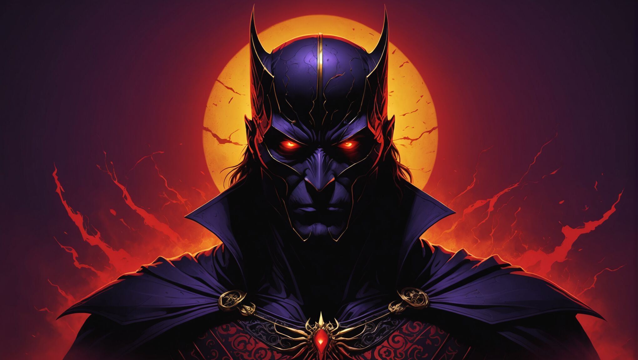 The psychology of color plays a crucial role in conveying the mood and character of your villainous book cover. Each hue carries its own emotional weight and symbolic meaning, which can be harnessed to enhance the impact of your antagonist.
Dark, rich colors like deep purples, midnight blues, and blood reds are often associated with power, mystery, and danger. These colors can create an ominous atmosphere, perfect for depicting a formidable villain. Consider using a gradient of these colors to add depth and complexity to your cover’s background or the villain’s attire.
Black is a classic choice for villainous themes, symbolizing darkness, evil, and the unknown. However, be cautious not to overuse it, as too much black can make your cover appear flat or generic. Instead, use it strategically to create striking silhouettes or as a backdrop to make other colors pop.
Contrasting colors can be particularly effective in villain-centric covers. A splash of vibrant green against a dark background can evoke feelings of envy, poison, or supernatural power. Similarly, a touch of golden yellow can represent greed, corruption, or a twisted form of royalty.
Cool colors like icy blues and steely grays can convey a sense of detachment, calculation, or inhuman qualities in your villain. These colors work well for portraying villains who are more cerebral or emotionally distant.
Warm colors, when used in moderation, can add layers to your villain’s character. A touch of fiery orange or smoldering amber can suggest passion, rage, or destructive power lurking beneath the surface.
Consider the psychological impact of color combinations. For instance, pairing purple (associated with royalty and magic) with green (often linked to envy and the unnatural) can create a visually striking and thematically rich palette for a villainous sorcerer or corrupt ruler.
Don’t underestimate the power of desaturated or muted colors. A palette of washed-out tones can create a feeling of decay, despair, or a world drained of life by the villain’s influence.
Metallic accents, such as silver or bronze, can add a touch of sophistication or hint at the technological or magical prowess of your antagonist. These can be particularly effective when used sparingly to highlight specific elements of the villain’s design.
Remember that color associations can vary across cultures, so consider your target audience when making color choices. What might be ominous in one culture could have different connotations in another.
Experiment with color overlays or filters to unify your cover’s elements while adding to the overall mood. A subtle red tint over the entire image can suggest a world bathed in blood or seen through the villain’s vengeful eyes.
Lastly, don’t be afraid to subvert expectations. While dark colors are traditional for villainous themes, a cover dominated by light, pastel colors could be unsettling and intriguing if used to depict a particularly insidious or deceptive antagonist.
By thoughtfully applying color psychology to your villain-centric book cover, you can create a visual experience that not only captures attention but also resonates with the reader on a deeper, emotional level. The right color choices can make your villain leap off the page, hinting at their complexity and the dark journey that awaits within the pages of your book.
Typography and font choices for villain-centric covers
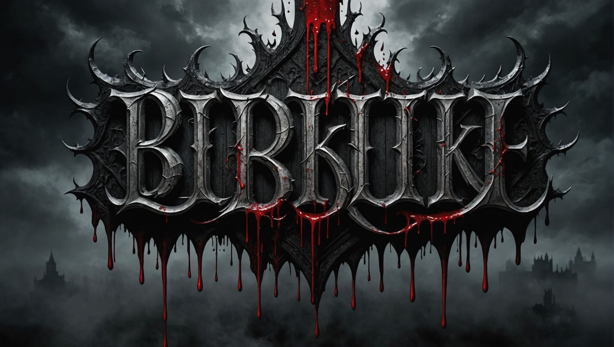
The typography and font choices for villain-centric book covers play a crucial role in conveying the tone and atmosphere of your story. Opt for fonts that exude power, menace, or mystery to complement your antagonist’s presence. Gothic or blackletter styles can evoke a sense of ancient evil or dark magic, while sharp, angular fonts might suggest a more modern, technological threat.
Consider custom lettering or modified existing fonts to create a unique look that aligns with your villain’s character. Incorporate elements from the antagonist’s design into the typography, such as claw marks, dripping blood, or magical runes. This integration can make the title feel like an extension of the villain’s presence on the cover.
The size and placement of your title are equally important. A large, imposing title can mirror the villain’s dominance, while smaller, more discreet lettering might hint at a subtle, insidious evil. Experiment with unconventional placements, such as having the title partially obscured by the villain or interacting with other cover elements to create visual interest.
Font weight can significantly impact the mood of your cover. Bold, heavy fonts can convey strength and intimidation, while thinner, more delicate typefaces might suggest a more cunning or ethereal villain. Consider using a combination of weights to create contrast and hierarchy within your title and subtitle.
Texture and effects can enhance the villainous atmosphere of your typography. Weathered or distressed fonts can imply a long-standing evil, while glossy or metallic effects might suit a more sleek, modern antagonist. Subtle gradients or color shifts within the lettering can add depth and intrigue.
The color of your typography should complement the overall color scheme of your cover while ensuring readability. High contrast is often key for villain-centric covers, so consider how your font color interacts with the background and other elements. Dark typography on a light background can be striking, while lighter text on a dark background can create a ghostly, ominous effect.
Don’t forget about the author’s name and any taglines or subtitles. These elements should be cohesive with the main title but not compete for attention. Choose complementary fonts that maintain the villainous theme without overwhelming the design.
Lastly, consider the negative space around your typography. The way the text interacts with the empty areas of your cover can create powerful visual effects, such as a sense of isolation or impending doom. Use this space strategically to draw focus to your villain and create a balanced, impactful design.

