blog
The Importance of Atmosphere in Fantasy Book Covers
Color and lighting are powerful tools in the arsenal of fantasy book cover designers, capable of evoking specific emotions and setting the tone for the entire story. “Color is a power which directly influences the soul,” as noted by the artist Wassily Kandinsky, and this principle is particularly relevant in cover design. Warm, vibrant hues like deep reds and oranges can convey passion, danger, or adventure, while cool blues and purples might suggest mystery or magic. The strategic use of contrasting colors can create visual tension, drawing the eye to key elements of the cover.
Lighting plays an equally crucial role in establishing atmosphere. A cover bathed in soft, golden light might evoke a sense of warmth and nostalgia, perfect for a coming-of-age fantasy tale. Conversely, harsh shadows and dramatic chiaroscuro can hint at darker themes or impending conflict. Backlighting can create silhouettes that add an air of mystery or heroism, while diffused light can lend an ethereal quality to fantastical scenes.
The interplay between color and light can be particularly potent. A moonlit scene rendered in shades of blue and silver can transport viewers to a world of night-time enchantment, while a fiery sunset palette can signal epic battles or world-altering events. Designers often use gradients to subtle effect, transitioning between colors to guide the viewer’s eye or suggest a shift in mood or setting.
Atmospheric perspective, achieved through the careful manipulation of color and light, can create a sense of depth and scale on a two-dimensional cover. By fading colors and reducing contrast in the background, designers can simulate distance, making fantastical landscapes appear vast and inviting exploration.
The emotional impact of color and lighting choices cannot be overstated. A cover that effectively utilizes these elements can instantly communicate genre, mood, and theme, enticing potential readers and setting appropriate expectations for the story within. Whether it’s the warm glow of a magical artifact or the cold gleam of a dragon’s scales, thoughtful application of color and light can transform a simple image into a portal to another world.
Elements of atmosphere in fantasy book cover design
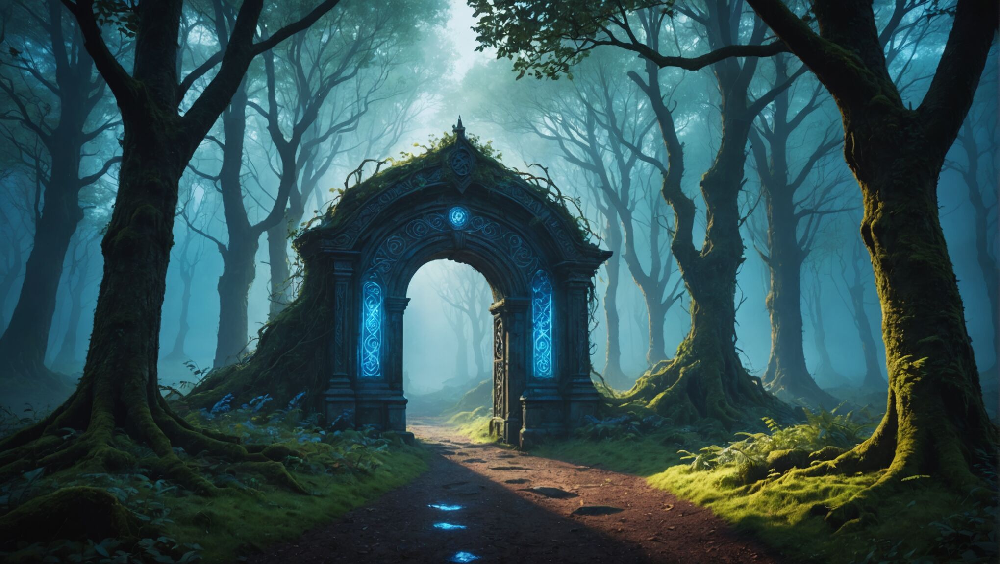 When designing a fantasy book cover, several key elements work together to create a captivating atmosphere that draws readers into the world within. One crucial aspect is the composition, which guides the viewer’s eye and establishes the hierarchy of visual elements. A well-structured composition can create a sense of balance or tension, depending on the story’s tone.
Texture plays a significant role in conveying the tactile qualities of the fantasy world. Rough, gritty textures might suggest a harsh, unforgiving environment, while smooth, glossy surfaces could indicate a world of refined magic or advanced technology. The judicious use of texture can make a cover feel more tangible and immersive.
“The cover is a gateway to the story, and every element should be carefully chosen to reflect the essence of the world within.” – Chip Kidd, renowned book cover designer
Perspective and scale are powerful tools for creating atmosphere. Dramatic angles or unusual viewpoints can lend a sense of epic scope or disorientation, while the juxtaposition of large and small elements can emphasize the fantastical nature of the setting.
The use of negative space is another crucial element. Well-placed empty areas can create a sense of isolation or vastness, allowing the viewer’s imagination to fill in the gaps. Conversely, a busy, detailed cover might convey a rich, complex world teeming with life and magic.
Weather and environmental effects can significantly impact the atmosphere. Mist, rain, or snow can add mystery and mood, while clear skies or stormy conditions can set very different tones for the story.
Character depiction, when present, should be carefully considered. The posture, expression, and attire of figures on the cover can speak volumes about the story’s themes and tone. A solitary, hooded figure might suggest intrigue and secrecy, while a group of characters in dynamic poses could indicate adventure and camaraderie.
Lastly, the overall style of illustration or design – whether it’s photorealistic, stylized, or abstract – plays a crucial role in establishing atmosphere. A highly detailed, realistic approach might ground the fantasy in a sense of believability, while a more abstract or surreal style could emphasize the otherworldly aspects of the story.
Symbolism and iconography in atmospheric covers
Symbolism and iconography are powerful tools in fantasy book cover design, serving as visual shorthand to convey complex ideas and themes. These elements can instantly communicate genre conventions, cultural references, and narrative themes, creating a rich tapestry of meaning that resonates with potential readers. Designers often incorporate archetypal symbols that have universal significance across cultures, such as the tree of life, representing growth and interconnectedness, or the phoenix, symbolizing rebirth and transformation.
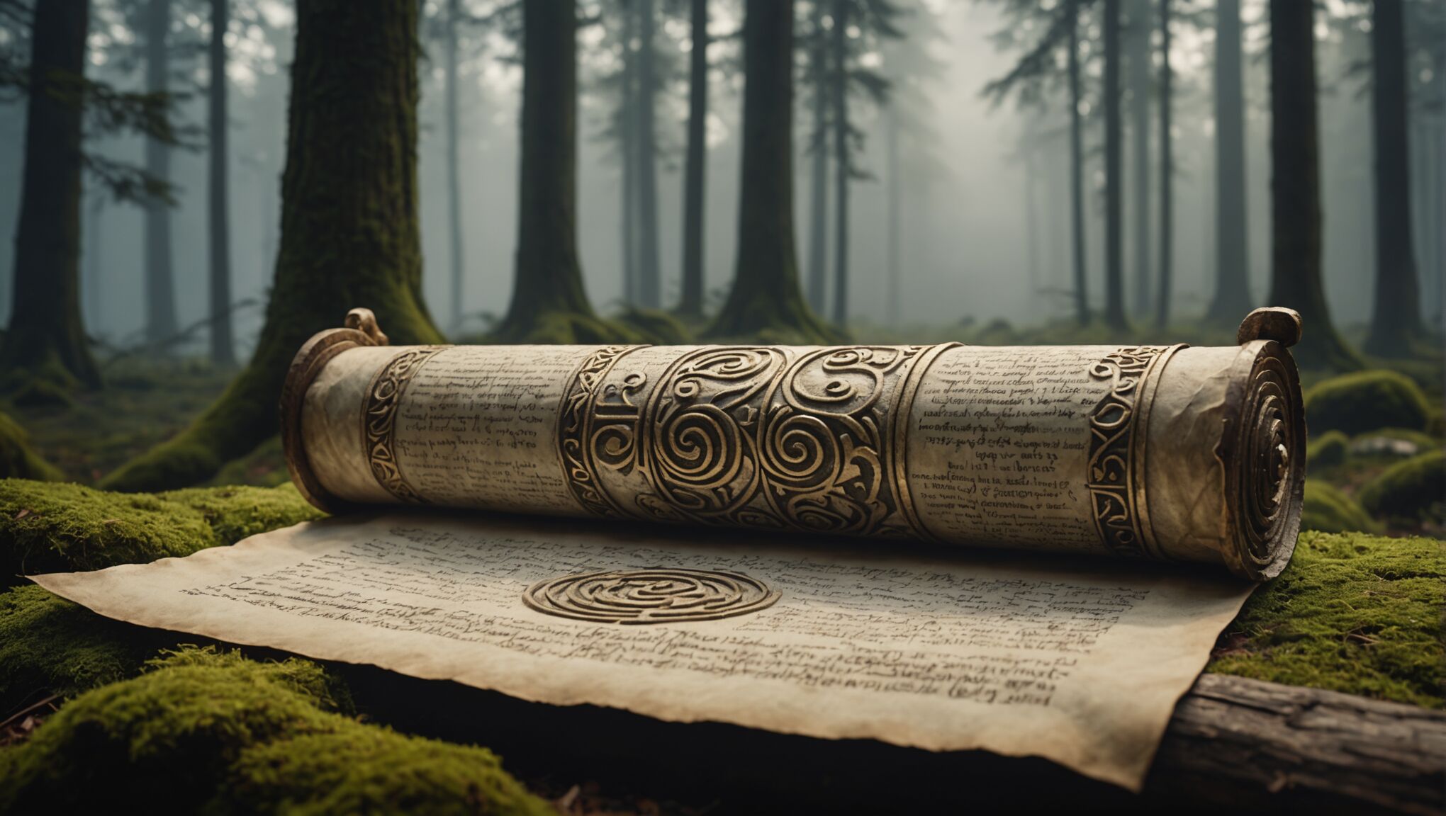
In fantasy covers, magical objects often take center stage as potent symbols. A glowing crystal might represent power or knowledge, while an ancient scroll could suggest hidden wisdom or prophecy. Weapons, too, carry significant symbolic weight; a sword might symbolize justice or heroism, while a wand could represent magical prowess. The way these objects are depicted – whether shrouded in mist, bathed in light, or held by shadowy figures – can further enhance their symbolic impact.
Mythical creatures are another rich source of symbolism in fantasy cover design. Dragons, for instance, can represent primal power, wisdom, or untamed nature, depending on their portrayal. Unicorns might symbolize purity or the magical realm, while griffins could represent the fusion of earthly and celestial powers. The choice and depiction of these creatures can instantly convey the flavor of the fantasy world within.
Celestial bodies and natural phenomena are frequently used to evoke specific moods and themes. A full moon might suggest transformation or mystery, while a solar eclipse could represent a world-altering event or the balance between light and darkness. Mountains often symbolize challenges to be overcome, while forests can represent the unknown or the subconscious mind.
Color symbolism plays a crucial role in atmospheric covers. Red might represent passion or danger, while green could suggest growth or envy. Gold often symbolizes divine power or material wealth, and purple frequently denotes royalty or magic. The strategic use of these colors can reinforce the symbolism of other elements on the cover.
Geometric shapes and patterns can also carry symbolic weight. Circles might represent unity or cycles, while triangles could suggest balance or tension. Intricate knotwork or mandala-like designs can evoke a sense of mysticism or ancient knowledge. These abstract elements can add depth and complexity to the cover’s symbolism without overcrowding the design.
Stand out with a unique cover design. See what’s new.
Cultural and historical references can be woven into cover designs to ground the fantasy world in familiar contexts or suggest its inspirations. Architectural elements, clothing styles, or artistic motifs from various real-world cultures can be adapted and blended to create a unique visual language for the fantasy setting.
The arrangement and interaction of symbolic elements on a cover can create additional layers of meaning. Juxtaposition of contrasting symbols might suggest conflict or duality within the story, while the convergence of multiple symbols could hint at a complex, intertwined narrative. The scale and prominence given to different symbols can indicate their relative importance in the story.
Ultimately, the effective use of symbolism and iconography in fantasy book covers creates a visual puzzle that intrigues and engages potential readers. It invites them to decipher the meaning behind the imagery, fostering a sense of discovery and connection with the story before they’ve even opened the book. When skillfully executed, these symbolic elements work in harmony with other design aspects to create a cover that is not just visually appealing, but rich with meaning and atmosphere.
Balancing detail and mystery for intrigue
Striking the right balance between detail and mystery is crucial in crafting an intriguing fantasy book cover. Too much detail can overwhelm the viewer and leave little to the imagination, while too little might fail to capture interest. The key lies in providing just enough visual information to spark curiosity without revealing the entire story.
One effective technique is to use silhouettes or partial reveals of characters or objects. This approach allows the viewer to fill in the gaps with their imagination, creating a sense of anticipation. For example, a cover might show the shadowy outline of a dragon against a fiery sky, hinting at its presence without fully depicting it.
Selective focus is another powerful tool. By keeping certain elements sharp and clear while blurring others, designers can direct attention and create depth. This technique can be particularly effective in suggesting a vast, mysterious world beyond the immediate focus of the cover.
Layering elements can add complexity and intrigue without overwhelming the viewer. This might involve overlapping translucent images or using subtle textures to create depth. For instance, a cover could feature a foreground character with ghostly figures or landscapes visible through them, hinting at a complex narrative or magical elements.
The use of negative space can be particularly effective in balancing detail and mystery. Empty areas on the cover can suggest the unknown or the unexplored, inviting the reader to imagine what lies beyond. This technique can be especially powerful when combined with carefully chosen detailed elements.
Color gradients and atmospheric effects can add a layer of mystery without adding specific details. A cover shrouded in mist or featuring a dramatic play of light and shadow can evoke a sense of the unknown while still providing a rich visual experience.
Symbolic elements can be used to hint at the story’s themes or plot without explicitly spelling them out. A single, intricately detailed object against a minimalist background can be incredibly intriguing, prompting viewers to wonder about its significance.
| Technique | Effect |
| Silhouettes | Spark imagination, create mystery |
| Selective focus | Direct attention, create depth |
| Layering | Add complexity without overwhelming |
| Negative space | Suggest the unknown, invite imagination |
| Atmospheric effects | Add mystery, create mood |
| Symbolic elements | Hint at themes without explicit revelation |
The placement of text can also play a role in maintaining this balance. Strategically positioned titles or author names can obscure parts of the image, creating intrigue about what lies beneath. Alternatively, transparent or semi-transparent text can allow glimpses of the underlying artwork, adding another layer of visual interest.
Ultimately, the goal is to create a cover that functions as a visual hook, enticing potential readers to pick up the book and discover more. By carefully balancing detail and mystery, designers can create covers that not only attract attention but also resonate with the essence of the fantasy world within, promising adventure and discovery without giving away too much too soon.
Typography and its role in setting the tone
 The choice of typography on a fantasy book cover is far more than a mere aesthetic decision; it’s a powerful tool that can significantly influence the reader’s perception of the story within. The right font can instantly convey the genre, tone, and even the time period of the narrative, acting as a visual ambassador for the book’s content.
Serif fonts, with their traditional and elegant appearance, often lend themselves well to epic fantasy or historical-inspired settings. The subtle flourishes and varying line weights can evoke a sense of antiquity or timelessness, perfect for tales of ancient kingdoms or long-forgotten magic. Conversely, sans-serif fonts might be employed for more modern or urban fantasy stories, their clean lines suggesting a contemporary or futuristic setting.
The weight and style of the font play crucial roles in setting the tone. Bold, heavy typefaces can communicate power, danger, or excitement, while lighter, more delicate fonts might suggest mystery, romance, or ethereal magic. Italics can add a touch of elegance or movement, while condensed fonts can create a sense of tension or confinement.
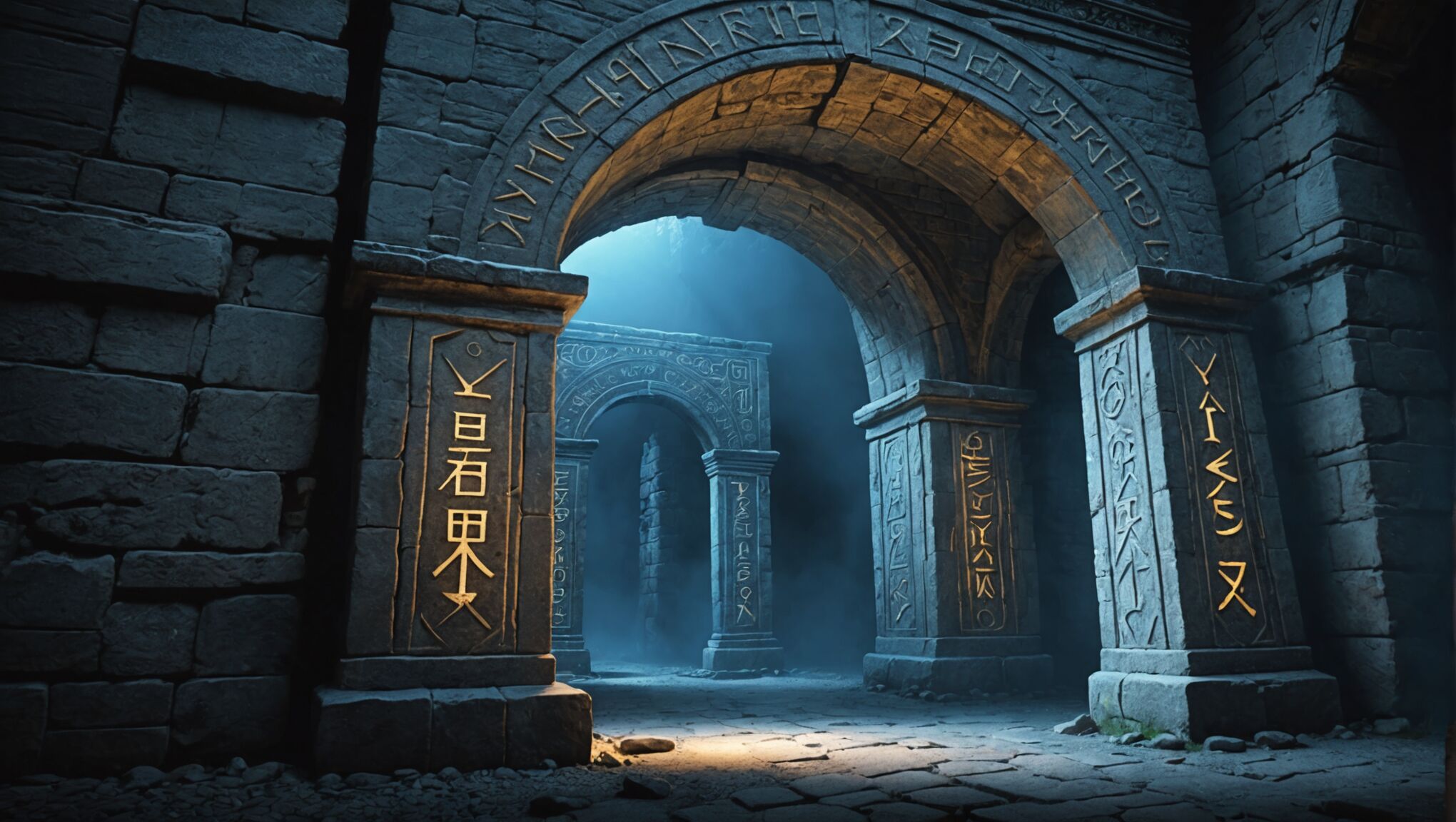
Custom lettering or hand-drawn typography can be particularly effective in fantasy cover design, allowing for unique embellishments that reflect specific elements of the story. Incorporating subtle magical symbols or motifs into the letterforms can add layers of meaning and intrigue.
The positioning and size of the text are equally important. Large, dominant titles can create a sense of epic scale or importance, while smaller, more discreet typography might suggest mystery or subtlety. The interplay between the text and the cover art is crucial – the typography should complement and enhance the imagery, not compete with it.
Color choice in typography can dramatically affect the cover’s atmosphere. Metallic gold or silver lettering might evoke a sense of value or magical properties, while deep, rich colors could suggest depth and complexity. Glowing or luminous text effects can hint at magical elements or otherworldly aspects of the story.
Texture in typography can add another dimension to the cover’s atmosphere. Rough, weathered text might suggest an ancient or rugged world, while smooth, glossy lettering could indicate a more polished or refined fantasy setting.
The spacing and arrangement of letters and words can also contribute to the overall mood. Tightly packed text might create a sense of urgency or crowding, while widely spaced letters could suggest expansion or liberation. Breaking words across multiple lines in unexpected ways can add visual interest and encourage closer examination.
Designers often experiment with the integration of typography and imagery, such as having text interact with elements of the cover art. This can create a sense of depth and immersion, blurring the line between text and image.
Ultimately, the typography on a fantasy book cover should do more than simply state the title and author – it should be an integral part of the cover’s storytelling. When skillfully executed, it can transport the reader into the fantasy world before they’ve even opened the book, setting expectations and igniting imagination.
As you consider the role of typography in fantasy book covers, reflect on how different font choices might alter your perception of a story. How might a sleek, modern font change your expectations compared to an ornate, medieval-inspired typeface? What messages do different typographic styles convey about the worlds they represent?
Case studies of effective atmospheric fantasy covers
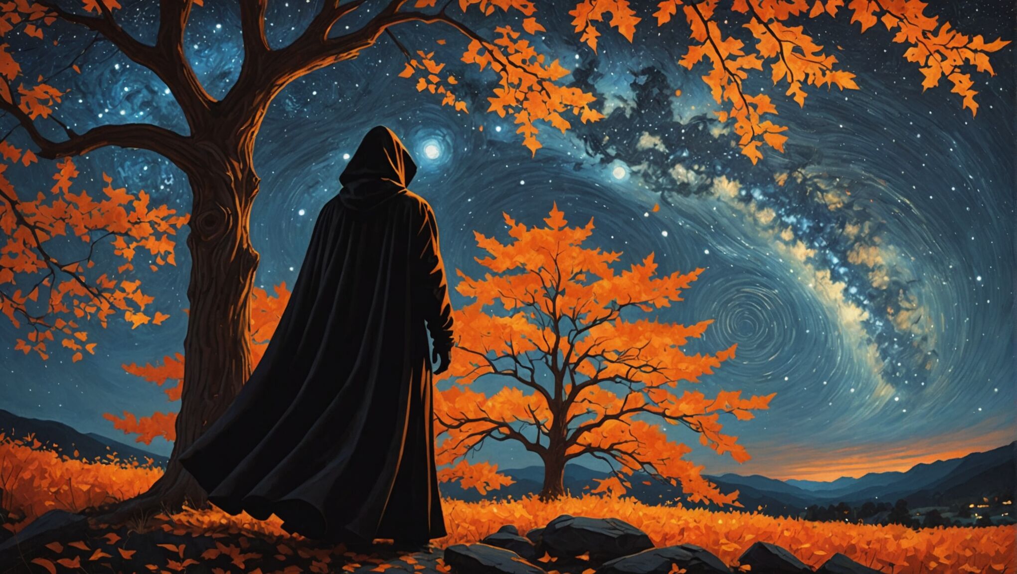
Let’s explore some notable examples of fantasy book covers that masterfully create atmosphere through their design elements. The cover of Patrick Rothfuss’s “The Name of the Wind” presents a striking image of a cloaked figure standing before a tree with flame-like leaves against a night sky. The use of warm oranges and reds against the deep blue background creates a vivid contrast, immediately evoking a sense of magic and mystery. The typography, with its elegant serif font, complements the intricate artwork without overshadowing it, suggesting a tale of epic proportions.
Brandon Sanderson’s “The Way of Kings” features a cover that exemplifies the power of scale and perspective in creating atmosphere. The image of a lone figure dwarfed by massive, otherworldly rock formations instantly communicates the grand scope of the story. The muted color palette, dominated by cool blues and grays, lends an air of solemnity and ancient mystery to the scene. The typography, bold yet unobtrusive, anchors the composition without detracting from the awe-inspiring landscape.
The cover of V.E. Schwab’s “A Darker Shade of Magic” demonstrates how symbolism can be effectively used to create intrigue. The design features a stylized map of London split into four sections, each with a distinct color scheme representing different parallel worlds. This clever use of color and iconography immediately conveys the concept of multiple realities without resorting to literal depictions. The clean, modern typography contrasts nicely with the intricate map design, hinting at a fresh take on fantasy tropes.
Neil Gaiman’s “The Ocean at the End of the Lane” showcases the power of simplicity and negative space in cover design. The cover features a small house silhouetted against a vast, starry sky reflected in water. This minimalist approach creates a sense of wonder and cosmic scale, perfectly capturing the book’s blend of the ordinary and the extraordinary. The delicate, handwritten-style typography adds a personal touch, suggesting an intimate narrative despite the grand backdrop.
The cover of Erin Morgenstern’s “The Night Circus” is a masterclass in creating atmosphere through color and symbolism. The stark black and white color scheme, punctuated by splashes of red, immediately sets a dramatic and mysterious tone. The intricate circus tent design, complete with stars and a crescent moon, hints at the magical and nocturnal nature of the story. The elegant, art nouveau-inspired typography further reinforces the book’s turn-of-the-century setting and its themes of artistry and illusion.
Leigh Bardugo’s “Six of Crows” features a cover that uses negative space and symbolic imagery to great effect. The silhouette of a crow, formed by the negative space between ornate buildings, creates an immediate sense of intrigue and danger. The limited color palette of black, white, and gold lends a sophisticated and slightly ominous air to the design. The bold, angular typography complements the architectural elements, suggesting a story of sharp wits and high stakes.
These examples demonstrate how various elements of cover design – color, composition, symbolism, typography, and use of space – can work together to create powerful atmospheres that not only capture the essence of the stories within but also stand as compelling works of art in their own right. Each cover serves as a visual promise to the reader, offering a glimpse into the unique world that awaits them within the pages of the book.

