blog
Finding the Perfect Balance Between Fantasy and Realism in Cover Art
Cover art serves as the visual gateway to the magical realms depicted within fantasy literature. It is the first point of contact between a potential reader and the story, acting as a powerful marketing tool and a crucial element in capturing the imagination. “A book cover is a distillation of the story within,” as many industry professionals often say, and this is especially true for fantasy genres. Effective cover art not only conveys the essence of the narrative but also sets the tone and atmosphere for the reader’s journey. It must strike a delicate balance between enticing curiosity and accurately representing the book’s content, avoiding misleading imagery that could lead to disappointed readers. In the competitive world of publishing, cover art can make the difference between a book being picked up or passed over. For fantasy literature, in particular, the cover art needs to transport viewers to otherworldly realms, hinting at the magic, creatures, and adventures that await within the pages. It should evoke a sense of wonder and possibility, while also grounding the fantastical elements in a way that feels accessible to the target audience. World-building begins with the cover, and a well-designed piece of art can instantly communicate the subgenre, whether it’s high fantasy, urban fantasy, or a historical fantasy blend. Moreover, cover art in fantasy literature often becomes iconic, representing not just a single book but entire series or even defining visual elements of the genre itself. As such, it plays a crucial role in brand building for authors and publishers, creating recognizable imagery that can spark fan engagement and merchandising opportunities.
Elements of effective fantasy cover design
 Effective fantasy cover design hinges on several key elements that work together to create a captivating and memorable visual representation of the story within. One of the most crucial aspects is the focal point, which should immediately draw the viewer’s eye and convey the essence of the book. This could be a character, a magical artifact, or a striking landscape that encapsulates the world of the story.
Composition plays a vital role in guiding the viewer’s gaze and creating a sense of depth and movement. The rule of thirds, dynamic angles, and the use of leading lines can all contribute to a visually engaging layout that invites exploration. Negative space, when used thoughtfully, can create contrast and emphasize important elements of the design.
Symbolism and iconography are powerful tools in fantasy cover design, allowing artists to convey complex themes and plot elements through visual shorthand. These symbols can resonate with readers on a subconscious level, hinting at deeper meanings within the story.
Texture and detail add richness to the artwork, creating a tactile quality that can make the fantastical elements feel more tangible. This can be achieved through intricate patterns, carefully rendered materials, or atmospheric effects that suggest magic or otherworldly phenomena.
The mood and atmosphere of the cover should align with the tone of the book. This can be conveyed through lighting, color palette, and the overall style of the artwork. A dark, brooding fantasy might use shadowy, muted tones, while a lighthearted adventure could feature bright, vibrant colors.
Scale and proportion can be manipulated to create a sense of awe or to highlight the epic nature of the story. Juxtaposing small figures against vast landscapes or towering structures can evoke a feeling of grandeur and adventure.
“A great cover should whisper a promise, sing a song, and tell a story—all at the same time.” – Chip Kidd, renowned book cover designer
Consistency with genre expectations is important, as readers often have preconceived notions about what certain types of fantasy should look like. However, there’s also value in subverting these expectations in clever ways to stand out on the shelves.
Finally, the cover should be designed with versatility in mind, considering how it will appear in different formats and sizes, from thumbnail images on digital platforms to large-scale posters. The key elements should remain recognizable and impactful across various mediums.
By carefully considering and implementing these elements, designers can create fantasy cover art that not only captures the imagination but also effectively communicates the unique qualities of the book it represents.
Balancing fantastical elements with realistic details

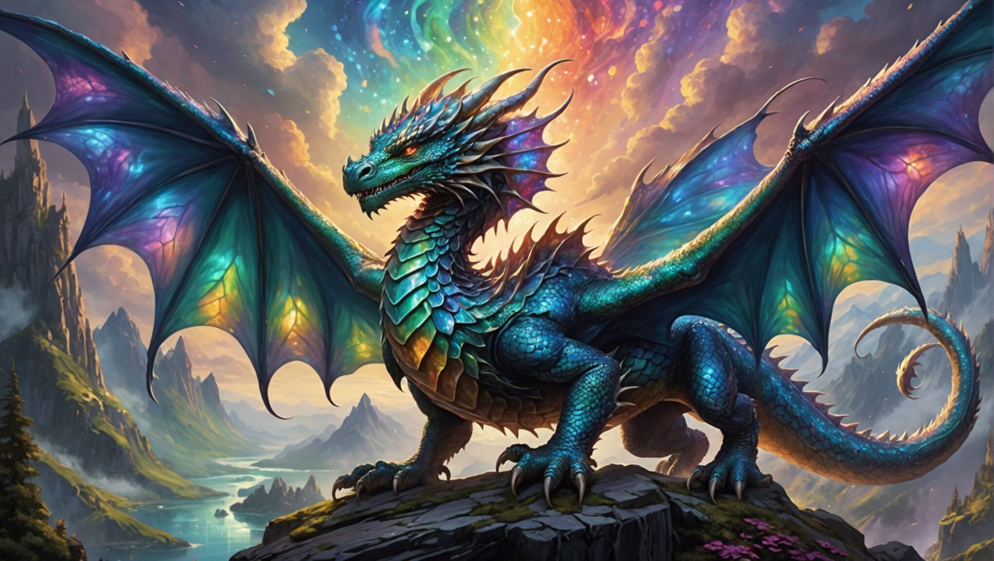
Striking the right balance between fantastical elements and realistic details is crucial in creating compelling cover art for fantasy literature. This delicate equilibrium allows readers to connect with the otherworldly aspects of the story while grounding them in a sense of believability. One effective approach is to anchor fantastical creatures or magical phenomena in realistic environments. For instance, a dragon might be depicted with meticulously rendered scales and anatomically plausible musculature, while soaring over a landscape that follows real-world geological principles. This juxtaposition of the extraordinary with the ordinary creates a visual tension that captivates viewers.
Lighting plays a pivotal role in blending fantasy and realism. By using naturalistic light sources and shadows, artists can lend credibility to even the most fantastical scenes. A magical aura or glowing artifact becomes more convincing when it interacts realistically with its surroundings, casting appropriate shadows and reflections. Similarly, atmospheric perspective can be employed to add depth and realism to fantastical landscapes, making distant mountains or floating islands appear as if they truly exist within the world’s atmosphere.
Design covers that intrigue mystery lovers. Learn more here.
Texture is another powerful tool for balancing fantasy and realism. By incorporating familiar textures—such as the rough bark of a tree or the weathered stone of a castle wall—artists can create a tactile sense of reality that anchors the more fantastical elements. This attention to detail extends to characters as well; realistic fabric folds, hair textures, and skin tones can make even the most outlandish creatures feel tangible and present.
Color palettes can be manipulated to strike a balance between the fantastic and the real. While vibrant, otherworldly colors might be used for magical elements, these can be tempered with more earthy, natural tones in the surrounding environment. This creates a visual harmony that allows the eye to accept the fantastical within a seemingly real context. Gradual transitions between realistic and fantastical color schemes can also help blend these elements seamlessly.
Proportions and scale are critical in maintaining this balance. While fantasy often deals with larger-than-life concepts, keeping certain elements in realistic proportions can enhance the overall credibility of the image. For example, a giant creature might be depicted with realistic anatomical proportions, even if its size is exaggerated compared to its surroundings. This approach helps the viewer’s mind accept the fantastical element as a plausible part of the world.
Incorporating recognizable objects or architectural styles alongside fantasy elements can create a bridge between the familiar and the extraordinary. A wizard’s tower might feature realistic medieval architectural details, while also housing impossible geometry or floating sections. This mix of the known and the unknown helps readers relate to the fantasy world while still feeling a sense of wonder and discovery.
The level of detail in both fantastical and realistic elements should be consistent to create a cohesive image. Over-detailing fantasy elements while leaving realistic components vague can create an imbalance that breaks the illusion. Conversely, hyper-realistic backgrounds with poorly defined fantasy elements can make the magical aspects feel out of place. Striking a balance in the level of detail across all elements of the cover art helps create a unified and believable fantasy world.
Ultimately, the goal is to create cover art that invites the reader to believe in the possibility of the impossible. By carefully balancing fantastical elements with realistic details, artists can craft images that not only capture the imagination but also feel grounded enough to be an extension of our own reality. This balance is what allows readers to step into the fantasy world with both a sense of wonder and a willingness to accept its magic as real within the context of the story.
Color theory and its impact on fantasy cover art
Color theory plays a pivotal role in creating impactful fantasy cover art, setting the mood, evoking emotions, and conveying the essence of the story at a glance. The strategic use of color can transport readers to otherworldly realms, hint at the tone of the narrative, and even subconsciously influence purchasing decisions.
In fantasy cover design, warm colors like reds, oranges, and yellows are often used to signify energy, passion, and adventure. These hues can evoke feelings of excitement and danger, making them ideal for action-packed stories or tales involving fire and dragons. Conversely, cool colors such as blues, greens, and purples are frequently employed to create a sense of mystery, magic, and the unknown. These colors can suggest depth, tranquility, or otherworldliness, perfect for stories involving underwater realms, enchanted forests, or celestial themes.
The use of complementary colors—those opposite each other on the color wheel—can create striking contrasts that draw the eye and make certain elements pop. For example, a blue-toned cover with orange accents can make magical elements stand out dramatically against a cooler background.
| Color | Emotional Association | Fantasy Theme |
| Red | Passion, danger, power | Dragon lore, war epics |
| Blue | Mystery, calm, wisdom | Ocean adventures, magical academia |
| Green | Nature, growth, harmony | Elven realms, forest magic |
| Purple | Royalty, luxury, ambition | Court intrigue, dark magic |
Color saturation and value also play crucial roles in fantasy cover design. Highly saturated colors can create a sense of vibrancy and otherworldliness, while muted tones might suggest a more grounded or historical fantasy setting. The manipulation of value—the lightness or darkness of colors—can create depth and focus, guiding the viewer’s eye to important elements of the cover.
Gradients and color transitions can be particularly effective in fantasy cover art, suggesting the blending of worlds or the presence of magic. A shift from warm to cool colors might represent a journey from the known to the unknown, while a gradient from light to dark could symbolize the hero’s descent into danger or the unknown.
The overall color palette of a cover can instantly communicate the subgenre of fantasy. For instance, urban fantasy might utilize gritty, desaturated colors with neon accents to evoke a modern city infused with magic. High fantasy could employ rich, jewel tones to suggest opulence and grandeur.
Color psychology also comes into play when designing fantasy covers. Certain colors can trigger specific associations or emotions in viewers. For example, gold often signifies wealth and achievement, making it a popular choice for epic fantasy series that promise grand adventures and treasure hunts.
It’s worth noting that cultural context can affect color perception and meaning. What might be seen as a color of mourning in one culture could represent purity in another. This consideration is particularly important for fantasy works that draw inspiration from specific cultural mythologies or are marketed internationally.
The interplay between color and light is another crucial aspect of fantasy cover design. The source and quality of light in the artwork can dramatically alter the perception of colors, creating mood and atmosphere. A cover bathed in warm, golden light might suggest a hopeful or triumphant story, while cool, blue-tinted shadows could hint at mystery or impending danger.
Digital tools have expanded the possibilities for color manipulation in cover art, allowing for effects that were once difficult or impossible to achieve through traditional media. However, it’s important to consider how these colors will translate to print, ensuring that the digital design maintains its impact when physically produced.
By masterfully applying color theory, artists and designers can create fantasy cover art that not only captures the imagination but also communicates complex themes and emotions, ultimately enticing readers to embark on the magical journey within the pages.
Typography and its influence on genre perception
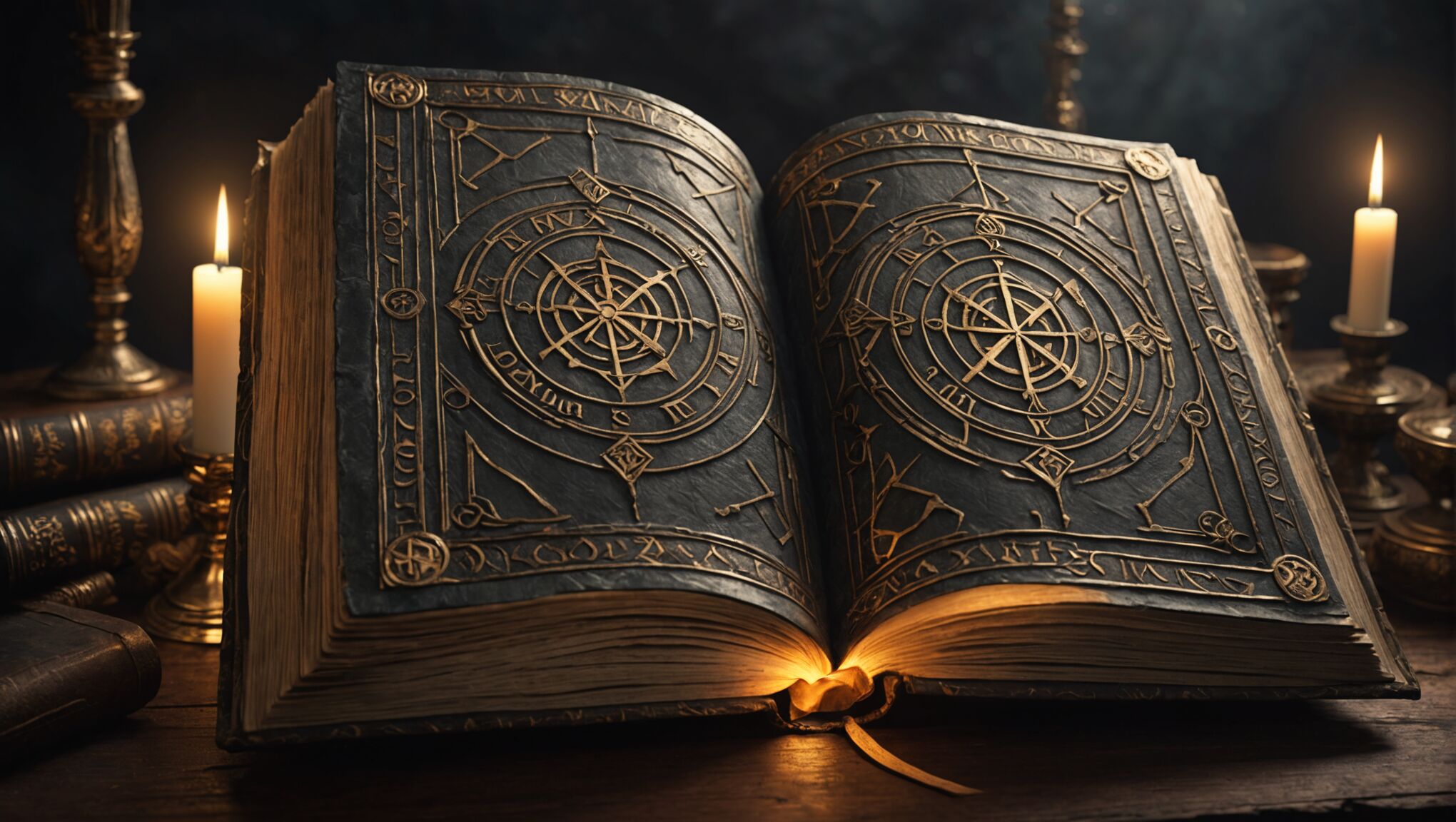 Typography in fantasy cover art is a powerful tool that goes beyond mere text representation, actively shaping the reader’s perception of the book’s genre and content. The choice of font, its size, placement, and styling can evoke specific emotions and set expectations for the story within.
Serif fonts, with their traditional and elegant appearance, often lend themselves well to epic fantasy or historical fantasy settings. They can convey a sense of antiquity and timelessness, reminiscent of ancient tomes or medieval manuscripts. On the other hand, sans-serif fonts might be employed for more modern or urban fantasy tales, suggesting a contemporary or futuristic setting.
The weight and thickness of the typeface can also communicate important information about the book’s tone. Bold, heavy lettering might indicate an action-packed adventure or a dark, intense narrative, while lighter, more delicate fonts could suggest a whimsical or romantic fantasy story.
Custom typography takes this a step further, allowing for the creation of unique letterforms that embody the essence of the fantasy world. Incorporating elements from the story into the typography itself—such as vines wrapping around letters for a nature-based fantasy or rune-like embellishments for a Norse-inspired tale—can create a cohesive and immersive visual experience.
The integration of typography with illustrative elements is crucial in fantasy cover design. Text that interacts with the artwork, such as titles partially obscured by magical effects or characters, can create depth and intrigue. This interplay between text and image invites the viewer to engage more deeply with the cover, potentially uncovering hidden meanings or details.
Color plays a significant role in typography as well. Metallic foils, gradients, or glowing effects can make titles stand out and reinforce the magical or otherworldly aspects of the story. Contrasting colors between the text and background ensure readability while also drawing attention to the title and author’s name.
The placement and hierarchy of text elements on the cover influence how information is absorbed by potential readers. A large, prominent title might emphasize the story itself, while giving more space to the author’s name could leverage their established reputation in the genre.
Typography can also be used to subtly indicate the target audience of a fantasy book. Fonts with a more mature, sophisticated feel might appeal to adult readers, while more playful or adventurous typefaces could attract younger audiences or signal a young adult fantasy novel.
The treatment of subtitles or series information through typography can provide valuable context. Using a different font or style for these elements helps differentiate them from the main title while still maintaining overall design cohesion.
Legibility at various sizes is a crucial consideration, especially in the digital age where covers are often viewed as thumbnails. Typography that remains clear and impactful at smaller scales ensures that the book’s title and author are recognizable across different platforms and formats.
Historical and cultural references in typography can enhance the worldbuilding aspects of fantasy cover art. Fonts inspired by specific historical periods or cultural calligraphy styles can immediately transport the reader to a particular setting or atmosphere.
The evolution of typography in fantasy cover art reflects broader trends in the genre and publishing industry. As fantasy subgenres emerge and blend, typography adapts to represent these new hybrid forms, challenging designers to create innovative typographic solutions that capture the essence of evolving narratives.
By carefully considering these typographic elements, designers can create cover art that not only attracts attention but also accurately represents the fantastical worlds within, guiding readers toward stories that resonate with their interests and expectations.
Adapting cover art styles for different fantasy subgenres
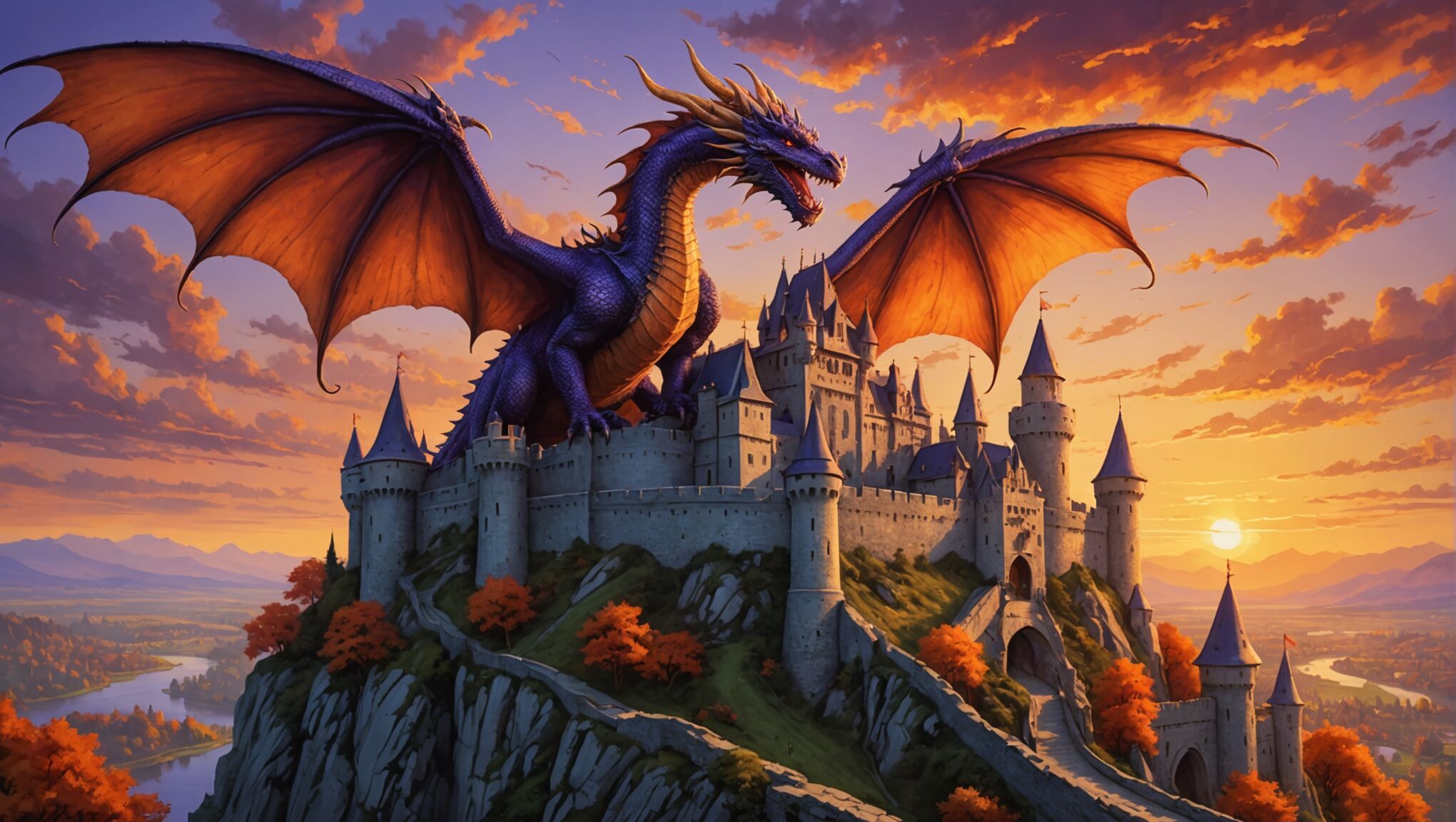
Fantasy literature encompasses a wide range of subgenres, each with its unique themes, settings, and conventions. Cover art must be tailored to reflect these distinctions, effectively communicating the specific type of fantasy story contained within the pages. For high fantasy, cover art often features sweeping landscapes, majestic creatures, and heroic figures, employing rich, saturated colors to convey a sense of epic adventure. Arthurian legends or medieval-inspired fantasies might incorporate elements of heraldry, ancient weapons, and mythical beasts, with a color palette that evokes the age of chivalry.
Urban fantasy covers, in contrast, blend modern cityscapes with supernatural elements. These designs often use darker, grittier color schemes and incorporate recognizable urban elements like skyscrapers or neon signs alongside magical or monstrous figures. The juxtaposition of the familiar and the fantastical is key to capturing the essence of this subgenre.
For steampunk fantasy, cover art typically features intricate mechanical designs, clockwork elements, and Victorian-era aesthetics. Sepia tones, brass and copper hues, and vintage-inspired typography help create the distinctive look associated with this subgenre. Airships, goggles, and elaborate contraptions are common visual motifs that immediately signal the steampunk elements of the story.
Grimdark fantasy covers often employ darker, more muted color palettes to reflect the subgenre’s gritty, morally ambiguous themes. Imagery might include battle-worn characters, ominous landscapes, and symbols of conflict or corruption. The art style for these covers tends to be more realistic and less idealized than traditional high fantasy depictions.
Portal fantasy covers present a unique challenge, as they must represent both the “real” world and the fantasy realm. Designs often feature visual elements that bridge these two worlds, such as doorways, mirrors, or portals that offer glimpses into magical landscapes. The contrast between mundane and fantastical elements is crucial in conveying the premise of these stories.
Romantic fantasy covers blend elements of traditional fantasy with romantic themes. These designs might feature couples or lone figures in fantastical settings, often with a softer, more ethereal art style. Color palettes tend to be warmer and more inviting, with a focus on creating an atmosphere of enchantment and possibility.
For historical fantasy, cover art must strike a balance between historical accuracy and fantastical elements. Period-appropriate clothing, architecture, and artifacts are combined with magical or supernatural imagery. The art style often mimics the artistic conventions of the historical period in question, adding an extra layer of authenticity to the design.
Cosmic or space fantasy covers draw inspiration from both fantasy and science fiction genres. These designs might feature celestial bodies, alien landscapes, and fantastical spacecraft alongside more traditional fantasy elements like magic and mythical creatures. The color palette often includes deep space blues and purples punctuated by bright, otherworldly colors to create a sense of wonder and vastness.
Adapting cover art styles for different fantasy subgenres requires a deep understanding of genre conventions, reader expectations, and the unique selling points of each story. Artists and designers must be versatile, able to shift between different artistic styles and themes while maintaining a high level of quality and appeal. By successfully tailoring cover art to specific subgenres, publishers can ensure that books reach their intended audience and stand out in an increasingly crowded marketplace.

