blog
The Role of Light and Shadow in Fantasy Cover Design
Techniques for creating depth and atmosphere
 Artists employ various techniques to create depth and atmosphere in fantasy cover designs, utilizing light and shadow as powerful tools. One of the most effective methods is the use of atmospheric perspective, where objects in the distance appear less distinct and take on a bluish tint due to the scattering of light particles in the atmosphere. This technique creates a sense of vastness and mystery, drawing the viewer into the fantastical world depicted on the cover.
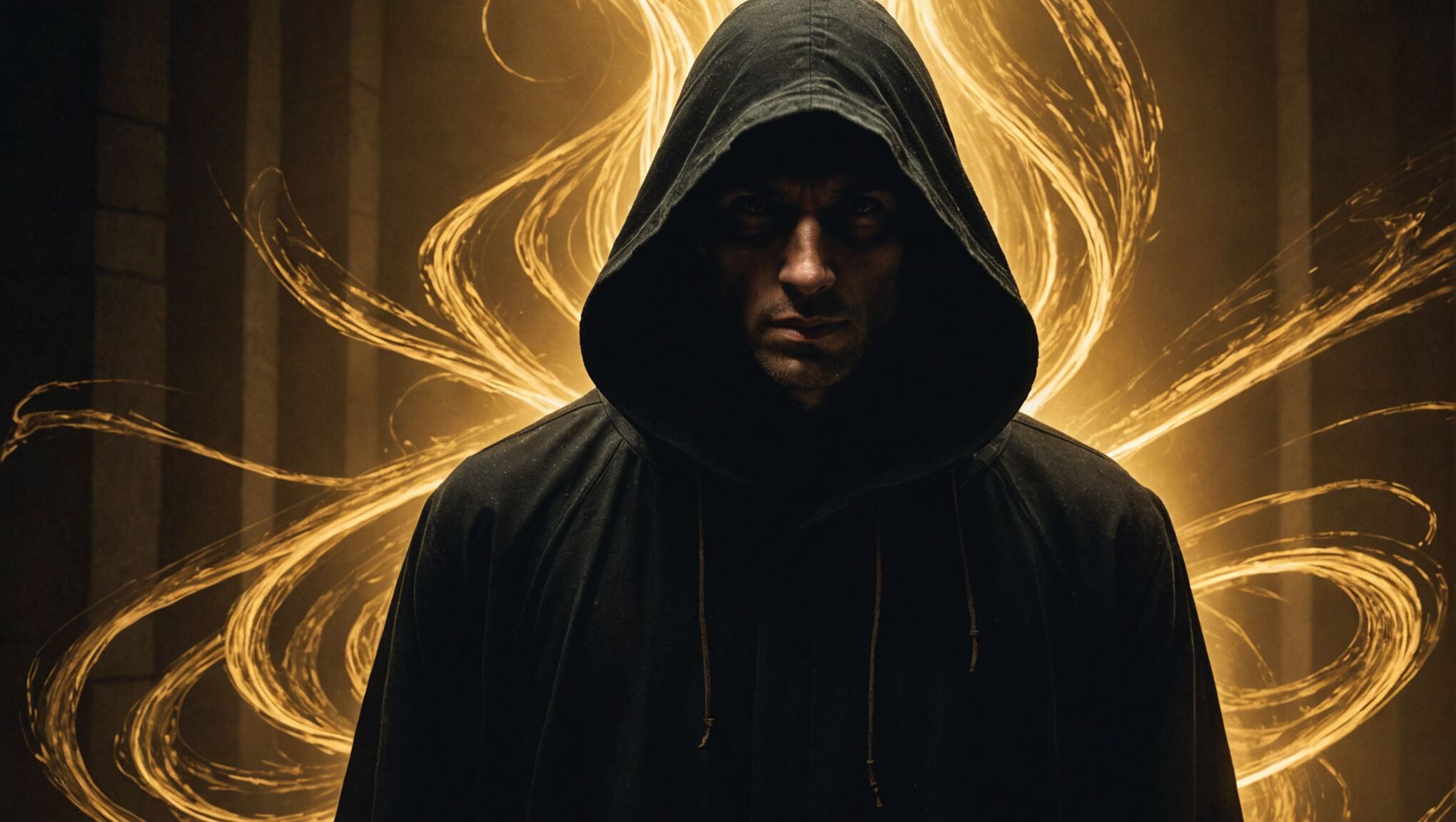
Chiaroscuro, a technique originating from Renaissance art, is another powerful method used to create depth and atmosphere. By employing strong contrasts between light and dark areas, artists can create a dramatic and moody atmosphere that enhances the overall impact of the cover. This technique is particularly effective in depicting supernatural or magical elements, as it can create an otherworldly ambiance.
“Light is the first of painters. There is no object so foul that intense light will not make it beautiful.” – Ralph Waldo Emerson
Layering is another crucial technique used to create depth in fantasy cover designs. By carefully arranging elements in the foreground, middle ground, and background, artists can guide the viewer’s eye through the composition and create a sense of three-dimensionality. This technique is often combined with the use of light and shadow to further emphasize the spatial relationships between different elements.
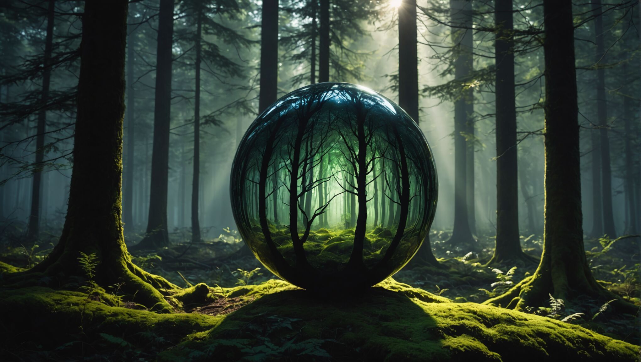
The manipulation of light sources is also essential in creating atmosphere. By strategically placing light sources within the composition, artists can highlight key elements, create focal points, and establish a specific mood. For example, a single shaft of light piercing through darkness can create a sense of hope or revelation, while multiple, diffused light sources can evoke a dreamy or ethereal atmosphere.
Texture and detail play a significant role in creating depth and atmosphere as well. By varying the level of detail and texture in different areas of the cover, artists can create a sense of distance and focus. Areas in shadow or further away from the viewer typically have less detail, while areas in the foreground or highlighted by light sources are rendered with greater precision and texture.
Finally, the use of silhouettes and negative space can be a powerful technique for creating depth and atmosphere in fantasy cover design. By contrasting dark silhouettes against lighter backgrounds or vice versa, artists can create a sense of mystery and intrigue while also establishing a clear visual hierarchy within the composition.
Symbolism and storytelling through light and shadow

Light and shadow serve as powerful storytelling tools in fantasy cover design, conveying complex narratives and symbolism through visual cues. The interplay between illuminated and obscured elements can represent the struggle between good and evil, knowledge and ignorance, or the known and unknown. A character emerging from darkness into light might symbolize a journey of self-discovery or redemption, while a figure casting a long shadow could hint at a hidden nature or impending threat.
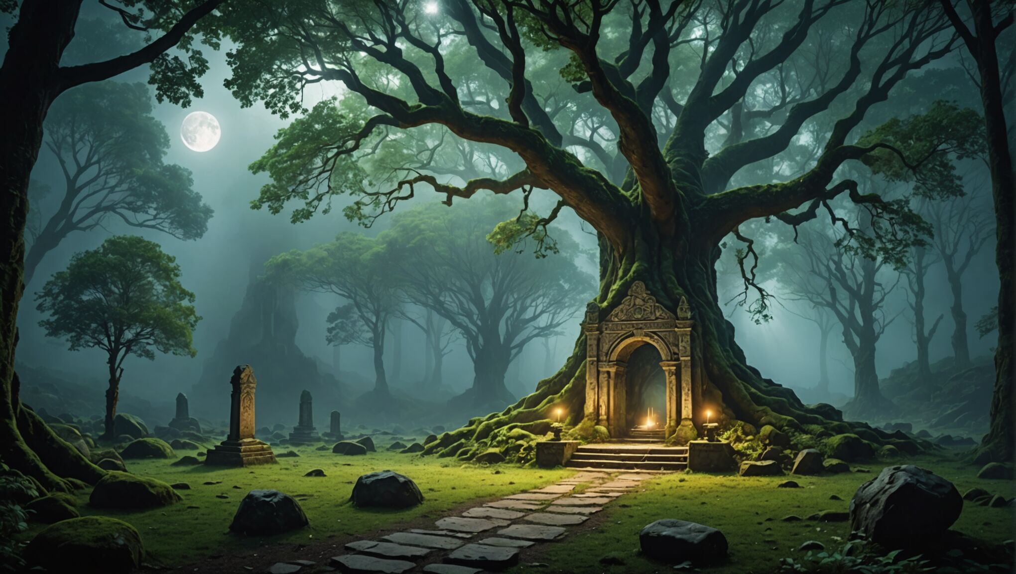
The direction and quality of light sources also carry significant symbolic weight. Warm, golden light often represents hope, divinity, or magic, while cold, harsh light can evoke a sense of danger or otherworldliness. Dappled light filtering through leaves might suggest a mystical forest setting, while a single beam of light in darkness could symbolize a guiding force or divine intervention.
Shadows, too, play a crucial role in storytelling. They can represent the unknown, danger lurking just out of sight, or the darker aspects of a character’s psyche. The absence of shadow, on the other hand, might indicate a supernatural or ethereal quality, setting certain elements apart from the natural world.
Artists often use light and shadow to guide the viewer’s eye and establish a narrative hierarchy within the composition. Key story elements or characters are typically highlighted, while secondary elements remain in shadow, creating a visual journey that mirrors the story’s progression. This technique not only enhances the cover’s aesthetic appeal but also provides potential readers with subtle clues about the book’s content and themes.
Find out how minimalism can work in fantasy design. Explore now.
The manipulation of scale through light and shadow can also convey important story elements. A small figure dwarfed by looming shadows might represent a hero facing overwhelming odds, while a character’s elongated shadow could hint at hidden power or a dual nature. These visual metaphors add depth to the cover design, inviting viewers to speculate about the story within.
Contrast between light and dark areas can be used to represent dualities central to many fantasy narratives: life and death, reality and illusion, or the mortal and divine realms. By juxtaposing these elements, artists can create visually striking compositions that encapsulate complex themes and conflicts within a single image.
The use of negative space, created through strategic placement of light and shadow, can also carry symbolic weight. It might represent the unknown aspects of a fantasy world, the mysteries yet to be uncovered, or the void from which magic or creatures emerge. This technique not only adds visual interest but also invites the viewer’s imagination to fill in the gaps, creating a more engaging and interactive cover design.
In essence, the artful application of light and shadow in fantasy cover design goes far beyond mere aesthetic considerations. It serves as a visual language, rich with symbolism and narrative potential, that can communicate complex ideas, evoke emotional responses, and provide tantalizing glimpses into the fantastical worlds waiting to be explored within the pages of the book.
Color psychology in fantasy cover design
The psychology of color plays a crucial role in fantasy cover design, influencing viewers’ emotions, perceptions, and expectations of the story within. Different hues can evoke specific moods and associations, making them powerful tools for conveying the essence of a fantasy narrative at a glance.
Warm colors like red, orange, and yellow are often associated with energy, passion, and adventure. A cover dominated by these hues might suggest a fast-paced, action-packed story or a world filled with magic and fire. Red, in particular, can signify danger, power, or love, depending on its context and shade.
Cool colors such as blue, green, and purple tend to evoke feelings of calm, mystery, and introspection. A cover featuring these colors might hint at a more contemplative or magical story. Blue can represent tranquility or vast oceans and skies, while green often symbolizes nature, growth, or poison in fantasy contexts. Purple, traditionally associated with royalty and luxury, can suggest themes of nobility or arcane magic.
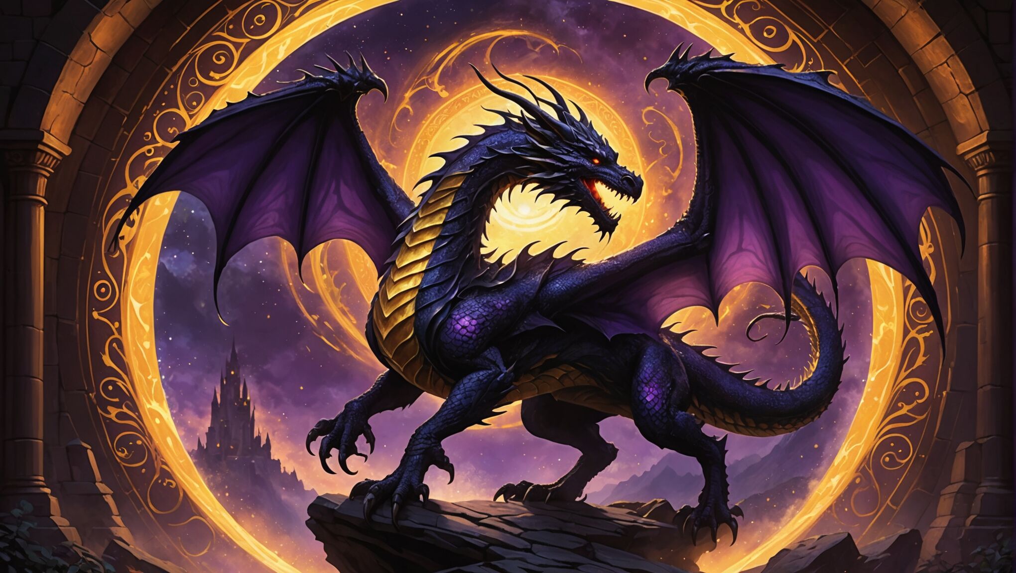
The use of metallic colors like gold and silver can add a touch of opulence and otherworldliness to a fantasy cover. Gold often represents wealth, divinity, or ancient treasures, while silver can evoke moonlight, purity, or ethereal beings.
Contrast and complementary colors play a significant role in creating visually striking covers. For example, pairing a deep blue background with warm orange accents can create a sense of balance and intrigue, drawing the viewer’s eye to key elements of the design.
The saturation and brightness of colors also contribute to the overall mood of the cover. Vibrant, highly saturated colors might indicate a lighthearted or young adult fantasy, while muted or desaturated tones could suggest a darker, more mature theme.
| Color | Common Associations in Fantasy |
| Red | Passion, danger, blood, fire |
| Blue | Magic, tranquility, water, night sky |
| Green | Nature, growth, poison, envy |
| Purple | Royalty, mystery, arcane power |
| Gold | Wealth, divinity, ancient artifacts |
The choice of color palette can also help establish the subgenre of fantasy. For instance, urban fantasy might incorporate more muted, realistic colors with pops of neon to reflect a modern cityscape infused with magical elements. High fantasy, on the other hand, might lean towards rich, saturated colors that evoke a sense of grandeur and otherworldliness.
Gradients and color transitions can be used to create depth and dimension, mimicking the effects of light and shadow. A subtle shift from dark to light can guide the viewer’s eye across the cover, highlighting important elements and creating a sense of movement or transformation.
The interplay between color and light is particularly important in fantasy cover design. The perceived color of an object can change dramatically based on the color of light illuminating it, allowing artists to create surreal and magical effects that capture the essence of fantasy worlds.
Ultimately, the effective use of color psychology in fantasy cover design requires a deep understanding of both the story’s themes and the target audience’s expectations. By carefully selecting and combining colors, designers can create covers that not only catch the eye but also resonate with readers on an emotional level, enticing them to explore the fantastical worlds within.
Balancing light and dark elements for visual impact
 Striking the right balance between light and dark elements is crucial for creating visually impactful fantasy cover designs. This delicate equilibrium can make the difference between a cover that merely catches the eye and one that truly captivates the imagination.
One key aspect of balancing light and dark is the strategic use of contrast. High contrast between light and dark areas can create a sense of drama and intensity, drawing the viewer’s attention to specific elements of the design. However, too much contrast can be overwhelming or chaotic. Skilled artists know how to use varying degrees of contrast to guide the eye through the composition, creating focal points and areas of rest.
The ratio of light to dark areas also plays a significant role in the overall impact of the cover. A predominantly dark cover with selective use of light can create a sense of mystery and intrigue, perfect for darker fantasy genres. Conversely, a mostly light cover with carefully placed shadows can evoke a feeling of hope or adventure, suitable for more uplifting tales.
Gradients and transitional areas between light and dark can soften the overall composition, creating a more nuanced and sophisticated look. These subtle shifts can represent the blurring of boundaries between different realms or the complexity of characters and situations within the story.
The placement of light and dark elements can dramatically affect the composition’s balance. Asymmetrical designs, where light and dark areas are unevenly distributed, can create tension and dynamism. Symmetrical designs, on the other hand, can convey a sense of order and stability. The choice between these approaches depends on the tone and themes of the book.
Texture plays a crucial role in balancing light and dark elements. Rough or smooth textures can interact differently with light, creating varied visual effects. For instance, a rough, dark texture might catch highlights in interesting ways, adding depth and complexity to shadowed areas.
Color temperature is another important consideration. Warm lights contrasted against cool shadows (or vice versa) can create a vibrant, energetic feel. Balancing warm and cool tones within the light and dark areas can add richness and depth to the overall design.
The use of negative space, created by the interplay of light and dark, can be a powerful tool for balance. Negative space can provide breathing room in complex compositions, allowing the eye to rest and process the visual information.
Atmospheric effects, such as mist, fog, or magical auras, can serve as transitional elements between light and dark areas. These effects can soften harsh contrasts and add a layer of mystique to the design.
The scale of light and dark elements can significantly impact the cover’s mood. Large, sweeping areas of light or shadow can create a sense of grandeur or oppression, while smaller, intricate patterns of light and dark can suggest detail and complexity.
Finally, the emotional impact of light and dark balance should align with the book’s content. A cover for a grimdark fantasy might lean heavily towards darkness with only glimmers of light, while an epic fantasy might feature a more even distribution of light and dark to represent the balance of forces within the story.
By mastering the balance of light and dark elements, cover designers can create visually stunning compositions that not only attract potential readers but also accurately reflect the essence of the fantasy worlds contained within the pages. This skillful manipulation of visual elements invites viewers to ponder the interplay between light and shadow, not just in art, but in the stories themselves and perhaps even in their own lives.
Digital tools and software for manipulating light effects

In the realm of fantasy cover design, digital tools and software have revolutionized the way artists manipulate light effects, offering unprecedented control and creativity. Adobe Photoshop stands at the forefront of these tools, providing a vast array of features for creating and enhancing lighting effects. Artists can utilize layers, blending modes, and adjustment tools to craft intricate light and shadow interactions, simulating everything from ethereal glows to dramatic chiaroscuro effects.
3D rendering software like Blender or Maya enables designers to create highly realistic lighting scenarios by simulating how light behaves in physical space. These programs allow for the precise placement of light sources, control over light intensity and color, and the ability to generate complex shadow patterns. The rendered images can then be incorporated into the overall cover design, adding depth and realism to fantastical scenes.
Digital painting software such as Corel Painter and Procreate offers artists the ability to simulate traditional painting techniques while leveraging the advantages of digital manipulation. These tools provide customizable brushes that can mimic the way light interacts with different textures and surfaces, allowing for nuanced control over highlights, shadows, and reflections.
Specialized lighting plugins and filters can be employed to add atmospheric effects like lens flares, light rays, and glowing auras. These tools can quickly enhance the magical or otherworldly qualities of a fantasy cover, creating visual interest and drawing the viewer’s eye to key elements of the composition.
Color grading software, often used in film post-production, has found its way into the toolkit of fantasy cover designers. Programs like DaVinci Resolve allow for precise control over color balance, contrast, and luminosity, enabling artists to create cohesive and emotionally evocative color schemes that enhance the overall lighting effects.
Vector graphics software like Adobe Illustrator provides tools for creating stylized light effects that can be easily scaled without loss of quality. This is particularly useful for creating graphic novel or comic book-style fantasy covers, where bold, clean lines and shapes are often used to represent light and shadow.
Texture mapping tools allow designers to apply intricate light and shadow patterns to 3D models or 2D surfaces, adding depth and realism to fantasy creatures, characters, and environments. These tools can simulate complex lighting scenarios, such as dappled forest light or the shimmer of scales on a dragon’s hide.
As technology continues to advance, emerging tools like AI-powered software are beginning to offer new possibilities for light manipulation in fantasy cover design. These programs can generate complex lighting scenarios based on simple prompts, potentially streamlining the creative process and offering inspiration for unique lighting effects.
Ultimately, while these digital tools and software provide powerful capabilities for manipulating light effects, they remain instruments in the hands of skilled artists. The most effective fantasy cover designs result from a harmonious blend of technical proficiency and artistic vision, using these digital resources to bring imaginative worlds to life through the interplay of light and shadow.
