blog
Fantasy Map Design: Bringing Worlds to Life on the Cover
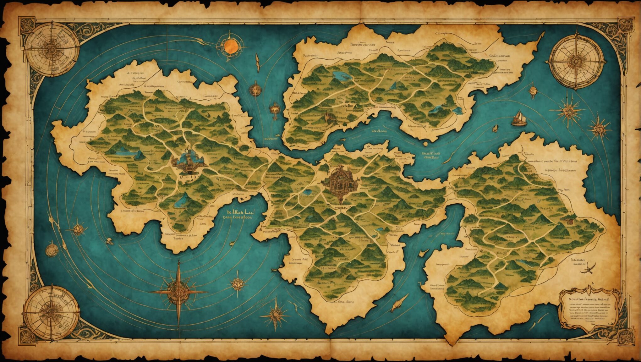
Creating a captivating fantasy map begins with a deep understanding of the world’s core elements. These components form the foundation of your imaginary realm and guide the visual representation on your book cover. Start by considering the geography, climate, and ecosystems that shape your world. Are there vast deserts, lush forests, or treacherous mountain ranges? Each of these elements will influence the overall look and feel of your map. Worldbuilding is key to crafting a believable fantasy landscape.
Next, think about the political and cultural aspects of your world. Are there distinct kingdoms, empires, or tribal territories? How do these boundaries affect the layout of your map? Consider the placement of cities, towns, and important landmarks that play a role in your story. Don’t forget to include mysterious or magical locations that add intrigue to your world. “A map is never finished, only abandoned,” as cartographers often say, so allow room for the unknown and unexplored regions that spark readers’ imaginations.
Consider the unique features that set your fantasy world apart. Perhaps there are floating islands, magical ley lines, or portals to other dimensions. These distinctive elements can become focal points on your map and instantly communicate the fantastical nature of your story. Remember that every detail you include should serve a purpose, either in enhancing the narrative or captivating potential readers. By thoroughly understanding and incorporating these fantasy world elements, you’ll create a map that not only accurately represents your imaginary realm but also entices readers to embark on the adventure within your pages.
Choosing the right art style
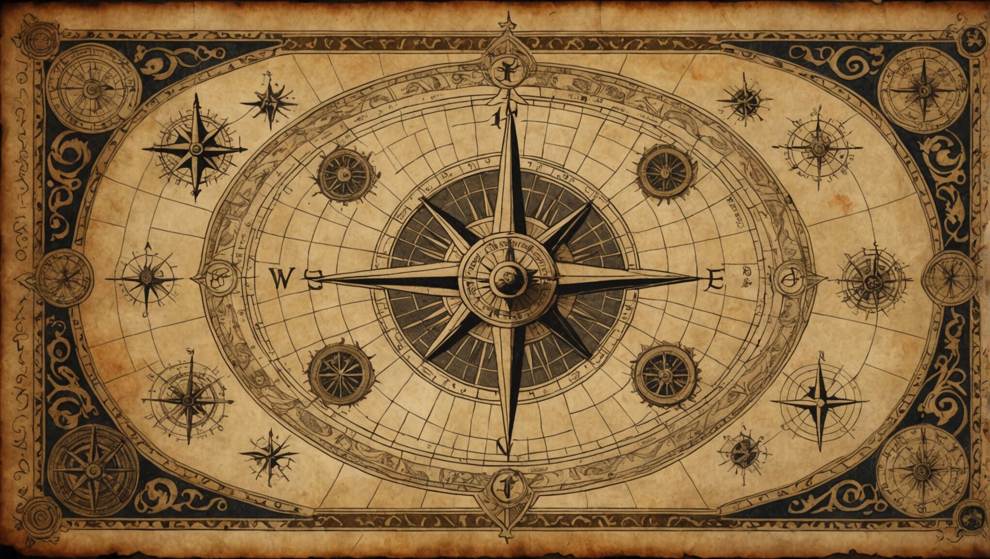 When selecting an art style for your fantasy map, it’s crucial to align it with the tone and atmosphere of your story. A gritty, realistic approach might suit a dark fantasy epic, while a whimsical, illustrated style could be perfect for a lighthearted adventure. Consider the era your world emulates—medieval maps often feature ornate borders and stylized illustrations, while more modern fantasies might call for cleaner lines and minimalist designs.
“The map is not the territory.” – Alfred Korzybski
This quote reminds us that while the map represents the world, it’s also an artistic interpretation. Embrace this concept by infusing your chosen style with unique elements that reflect your world’s essence.
Hand-drawn maps exude charm and character, evoking a sense of exploration and discovery. They can be particularly effective for stories set in worlds where cartography is still developing. Alternatively, digital techniques offer precision and the ability to create intricate details that can bring a more modern or futuristic fantasy world to life.
Texture plays a significant role in establishing the map’s feel. Aged parchment effects can lend an air of antiquity, while smooth, clean backgrounds might suggest a more contemporary setting. Consider incorporating subtle patterns or textures that hint at the world’s nature—perhaps a faint watery ripple for an ocean-based adventure or a subtle scale pattern for a dragon-centric tale.
Iconography is another crucial aspect of your map’s art style. Develop a consistent set of symbols to represent various features like mountains, forests, and cities. These icons should be easily recognizable yet unique to your world. For instance, if your story features distinctive architecture, reflect this in the symbols for settlements.
The level of detail in your map should correspond with your chosen style. A highly detailed, realistic approach might include intricate coastlines and topographical features, while a more stylized design could use simplified shapes and exaggerated proportions to convey the essence of the landscape.
Remember that your map is not just a functional tool but also a piece of art that will adorn your book cover. It should be visually appealing and intriguing enough to draw potential readers in, prompting them to explore further. Experiment with different styles and techniques until you find the perfect balance that captures the spirit of your fantasy world and resonates with your target audience.
Incorporating geographical features
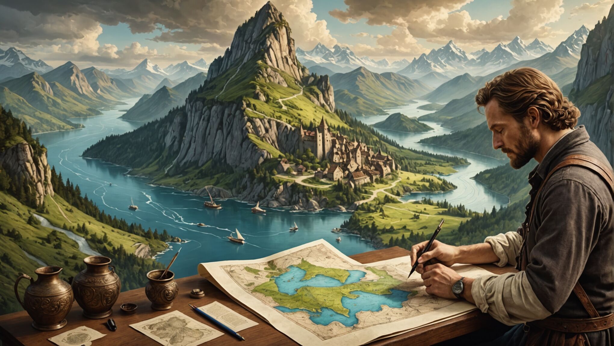
Geographical features are the backbone of any fantasy map, providing structure and realism to your imaginary world. Begin by sketching out the major landmasses, considering how plate tectonics might have shaped your continents. Are there jagged coastlines formed by glacial retreat, or smooth shores carved by gentle seas? Pay attention to the placement of mountain ranges, which often form along the edges of continents or in arcs that reflect underlying geological processes.
Rivers are crucial elements that breathe life into your map. Remember that they always flow from higher elevations to lower ones, typically joining together as they approach the sea. Avoid the common mistake of having rivers split as they flow downstream – this rarely occurs in nature. Instead, focus on creating realistic drainage basins and deltas where rivers meet the ocean.
Forests and jungles should be positioned logically, taking into account rainfall patterns and latitude. Dense woodlands often thrive in areas with abundant precipitation, while arid regions might feature sparse vegetation or desert landscapes. Consider the effects of rain shadows, where mountain ranges block moisture-laden air, creating dry areas on their leeward sides.
Lakes and inland seas can add depth to your map. Place them in natural depressions or areas where glaciers might have carved out basins. For a touch of fantasy, consider unusual formations like floating lakes or bottomless pools that could be tied to your world’s magical elements.
Don’t forget to incorporate unique geographical features that set your world apart. These might include massive canyons, sprawling cave systems, or otherworldly formations like crystal forests or gravity-defying rock pillars. Such elements not only make your map more visually interesting but also provide potential plot points and settings for your story.
When designing coastlines, think about the processes that shape them. Rocky cliffs might dominate areas with hard bedrock, while sandy beaches and barrier islands could form along gentler shores. Include interesting coastal features like fjords, archipelagos, or coral reefs to add variety and intrigue to your map’s edges.
Bring fantasy worlds to life with map design. Learn more here.
As you incorporate these geographical features, consider their impact on your world’s civilizations. Rivers often serve as natural borders and facilitate trade, while mountain passes can be strategic choke points. Fertile valleys might cradle ancient civilizations, and harsh deserts could hide long-lost ruins. By thoughtfully placing these elements, you create a rich tapestry that not only looks believable but also supports the narrative of your fantasy world.
Balancing detail and readability
When designing a fantasy map for a book cover, striking the right balance between detail and readability is crucial. Too much detail can overwhelm the viewer and make the map difficult to understand at a glance, while too little can leave the world feeling sparse and uninteresting. The key is to provide enough information to intrigue potential readers without cluttering the cover.
Start by identifying the most important elements of your world that need to be featured on the map. These might include major cities, significant landmarks, primary geographical features, and key locations relevant to your story. Prioritize these elements and ensure they are clearly visible and easily identifiable.
Use a hierarchy of visual elements to guide the viewer’s eye. Larger, bolder features should represent the most important aspects of your world, while smaller, more subtle details can fill in the gaps. This approach allows readers to quickly grasp the overall layout of your world while still providing depth for those who want to examine the map more closely.
Consider the scale of your map carefully. A continent-wide view might require less detail than a map of a single kingdom or region. Adjust the level of detail accordingly, ensuring that the scale is appropriate for the story you’re telling and the amount of space available on the cover.
Negative space is your ally in creating a readable map. Don’t feel compelled to fill every inch of the map with information. Empty areas can represent unexplored territories, vast oceans, or simply provide visual breathing room that makes the map more appealing and less overwhelming.
When it comes to labeling, be selective. Choose a clear, legible font that complements your map’s style. Label only the most crucial locations, using a consistent naming convention that reflects the world’s culture and language. Consider using different font sizes or styles to differentiate between types of locations (e.g., cities vs. natural features).
Employ visual shortcuts and symbols to convey information efficiently. A simple mountain icon can represent an entire range, while a stylized tree can indicate a forest. Develop a legend if necessary, but keep it minimal and intuitive to avoid cluttering the cover.
| Element | Representation |
| Mountains | Simple triangular shapes or ridgelines |
| Forests | Clusters of small tree icons or textured areas |
| Cities | Dots or small building symbols |
| Rivers | Thin, flowing lines |
Use color and shading judiciously to add depth and differentiate between regions without overwhelming the viewer. Subtle gradients can indicate elevation changes, while varying hues can delineate different kingdoms or biomes.
Remember that the map on your book cover serves as both an informational tool and a piece of artwork. It should be visually appealing enough to draw readers in while providing just enough detail to spark their curiosity and imagination.
Lastly, consider the practical aspects of cover design. Ensure that your map is legible at thumbnail size, as many potential readers will first encounter it in online bookstores. Test your design at various sizes to ensure that key elements remain clear and distinguishable.
By carefully balancing detail and readability, you can create a fantasy map that not only effectively represents your world but also serves as an enticing invitation for readers to embark on the adventure within your pages.
Creating a compelling color palette
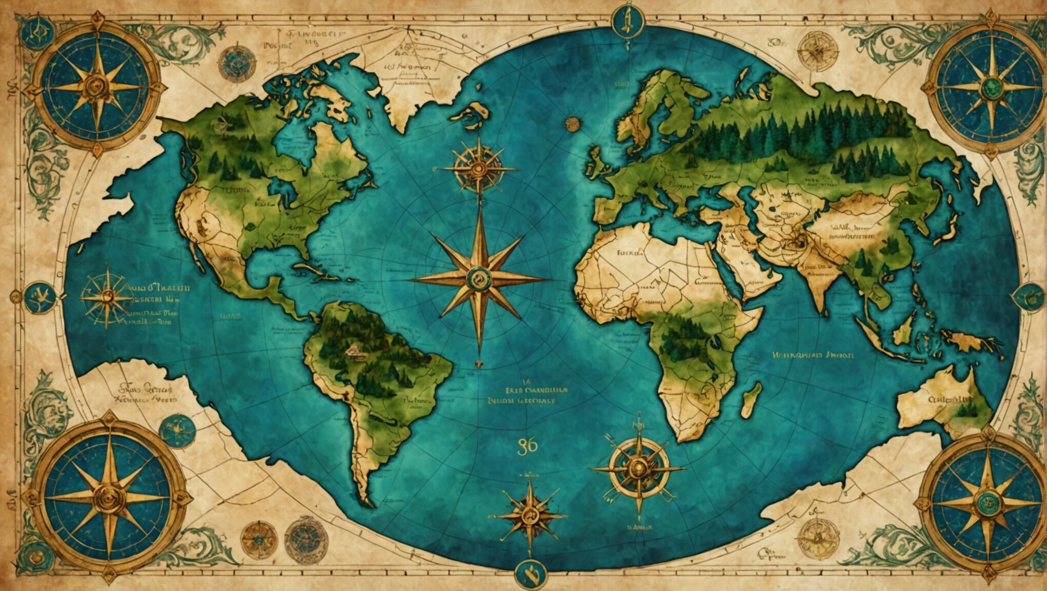 Color plays a crucial role in bringing your fantasy map to life, setting the mood, and guiding the viewer’s eye across the imaginary landscape. A well-crafted color palette can evoke emotions, represent different terrains, and create a cohesive visual experience that resonates with your story’s themes.
Begin by selecting a base color that reflects the overall tone of your world. Earthy tones like warm browns or aged parchment yellows can lend an air of antiquity and adventure, while cooler blues or greens might suggest a more mystical or otherworldly setting. This base color will serve as the foundation for your entire map design.
Next, consider the various geographical features of your world and how color can represent them effectively. Verdant forests might be depicted in shades of green, while arid deserts could be represented by warm oranges and yellows. Mountains could be shown in muted grays or purples to convey height and majesty. Oceans and rivers might range from deep blues to turquoise, depending on the mood you want to set.
Contrast is key in creating a visually interesting map. Use complementary colors to make important features stand out. For example, if your base color is a warm beige, cool blue waterways will create a striking visual impact. Be mindful of color associations – red often signifies danger or importance, so use it sparingly for areas of significance or conflict.
Consider using color gradients to add depth and dimension to your map. Subtle shifts in hue can indicate changes in elevation or transitions between different biomes. This technique can make your map feel more dynamic and three-dimensional, even on a flat surface.
Atmospheric perspective can be achieved through color as well. Distant lands or unexplored regions might be rendered in softer, more muted tones to give the impression of fading into the unknown. This technique not only adds depth but also creates a sense of mystery and potential for adventure.
When choosing colors for political boundaries or different kingdoms, opt for hues that are distinct enough to be easily differentiated but still harmonize with the overall palette. Consider the cultural associations of colors within your fantasy world – perhaps certain hues hold special significance for different factions or races.
Don’t forget the power of neutral colors. Grays, tans, and muted earth tones can provide balance and allow your more vibrant colors to shine. They can also be used effectively for labels and typography to ensure readability without overwhelming the map’s visual elements.
Experiment with color opacity to add layers of information without cluttering the map. Semi-transparent overlays can indicate areas of magical influence, contested territories, or historical significance without obscuring the underlying geography.
As you develop your color palette, consider how it will translate to different mediums. What looks vibrant on screen may print differently, so test your colors in various formats to ensure consistency across digital and print versions of your book cover.
Remember that color can evoke powerful emotions and set expectations. A dark, desaturated palette might prepare readers for a gritty, realistic fantasy, while bright, saturated colors could signal a more whimsical or young adult-oriented tale. Align your color choices with the atmosphere and target audience of your book.
Ultimately, your color palette should tell a story of its own, inviting readers to explore the hues and shades that bring your fantasy world to life. By thoughtfully crafting a compelling color scheme, you create a visual language that speaks to the essence of your imaginary realm, enticing potential readers to embark on the adventure that awaits within the pages of your book.
Adding finishing touches and typography
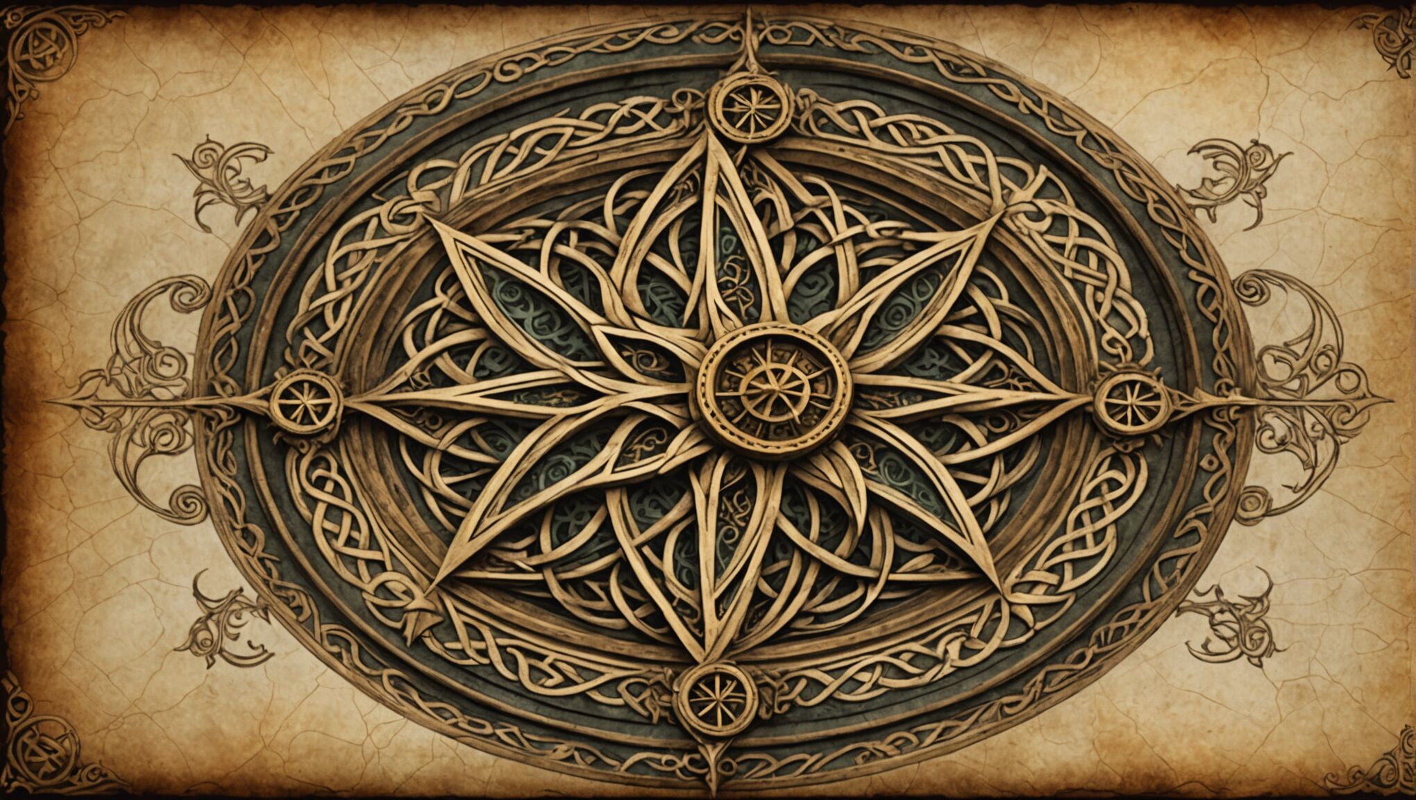
With the foundational elements in place, it’s time to add those final touches that will elevate your fantasy map from good to extraordinary. Consider incorporating decorative borders that reflect the aesthetic of your world. Intricate Celtic knotwork might suit a medieval-inspired realm, while sleek, geometric patterns could complement a more modern fantasy setting. These borders not only frame your map beautifully but also provide an opportunity to showcase the artistic style of your world.
Embellish your map with illustrations that bring key locations to life. Small vignettes of important landmarks, mythical creatures, or significant characters can add depth and personality to your design. Place these illustrations strategically to draw the eye to crucial areas without overwhelming the map’s functionality.
Typography plays a crucial role in the final presentation of your fantasy map. Choose fonts that complement the overall style and era of your world. For a classic fantasy look, consider elegant serif fonts or even custom calligraphy. More contemporary fantasies might benefit from clean, sans-serif typefaces. Ensure that your chosen fonts are legible at various sizes, as they’ll need to work for both large place names and smaller labels.
Experiment with text placement to enhance the map’s visual flow. Curved text can follow the contours of mountain ranges or coastlines, while straight text might be more appropriate for political boundaries. Use different font weights and sizes to establish a clear hierarchy of information – larger, bolder text for major regions or cities, and smaller, lighter text for less significant locations.
Don’t overlook the importance of a well-designed compass rose. This not only provides orientation but can also be a beautiful artistic element that showcases the craftsmanship of your world’s cartographers. Integrate symbols or motifs from your story into the compass design to make it truly unique.
Consider adding subtle textures to enhance the map’s tactile quality, even in digital form. Gentle paper grains, ink splatters, or weathered effects can lend an air of authenticity and age to your creation. Be careful not to overdo these effects, as they should enhance rather than distract from the map’s content.
Finally, pay attention to the edges of your map. Torn or burnt parchment effects can suggest ancient origins or troubled histories. Alternatively, crisp, clean edges might indicate a more contemporary or precise cartographic style. These details, though small, contribute significantly to the overall impression of your fantasy world.
Remember that every element you add should serve a purpose, whether functional or aesthetic. Each finishing touch is an opportunity to reinforce the unique aspects of your fantasy realm and entice readers to explore further. By carefully crafting these final details, you transform your map from a mere geographical representation into a captivating portal to your imaginary world, one that will intrigue and delight potential readers from the moment they lay eyes on your book cover.

