blog
Designing Fantasy Covers That Appeal to Both Young and Adult Readers
When crafting a fantasy book cover that captivates readers across age groups, several crucial elements must be carefully considered. The central image or character should be compelling and mysterious, inviting viewers to explore the world within. “A great cover is a visual gateway to the story,” as many designers often say. Magical elements, such as glowing objects, mystical creatures, or swirling energies, can immediately signal the fantasy genre and intrigue potential readers. The setting or background should hint at the book’s world, whether it’s a enchanted forest, a celestial realm, or a medieval castle.
Contrast is another vital component, both in terms of color and composition. Bold contrasts can make a cover pop on shelves or digital marketplaces, drawing the eye and making the title stand out. Texture also plays a significant role, with metallic accents, embossing, or digital renderings of tactile elements adding depth and luxury to the design. Negative space is equally important, allowing the key elements room to breathe and preventing the cover from becoming cluttered or overwhelming.
The title treatment deserves special attention, as it often serves as the focal point of the cover. Font choice, size, and placement can dramatically affect the overall impact and readability of the design. Incorporating the title into the artwork itself can create a seamless and visually striking effect. Finally, the mood and tone conveyed by the cover should align closely with the contents of the book, giving potential readers an accurate impression of what to expect within its pages.
Understanding dual-audience appeal
 To create fantasy book covers that appeal to both young and adult readers, designers must navigate a delicate balance between whimsy and sophistication. This dual-audience appeal requires a deep understanding of the elements that resonate across age groups. One effective approach is to layer the cover with visual elements that can be interpreted differently depending on the viewer’s age and experience.
“A truly great book should be read in youth, again in maturity and once more in old age, as a fine building should be seen by morning light, at noon and by moonlight.” – Robertson Davies
This quote encapsulates the essence of dual-audience appeal, suggesting that a well-crafted cover should offer multiple layers of interpretation and appreciation.
Incorporating universal themes and archetypal imagery can bridge the gap between younger and older readers. For instance, the hero’s journey, a concept that resonates with all ages, can be depicted through subtle visual cues that hint at adventure and personal growth. Mythological creatures or symbols that have endured through generations often hold a timeless appeal, attracting both children fascinated by the fantastic and adults who appreciate deeper cultural references.
The use of ambiguity in the cover art can also serve to intrigue diverse age groups. An image that appears straightforward to a young reader might reveal hidden complexities or darker undertones to an adult, encouraging both to explore the story further. This technique of visual storytelling allows the cover to grow with the reader, offering new insights upon each viewing.
Appeal to YA audiences with the perfect cover. Find details here.
Color psychology plays a crucial role in crafting dual-appeal covers. While vibrant, primary colors might attract younger readers, incorporating more nuanced shades and gradients can add a level of sophistication that appeals to adults. The key is to find a palette that is neither too childish nor too mature, striking a balance that feels both magical and grounded.
Textural elements can also bridge the age gap. Intricate patterns or detailed backgrounds can capture the imagination of younger readers while providing visual depth that adults appreciate. Digital artists often employ techniques that mimic traditional art forms, creating a sense of craftsmanship that appeals to older audiences while maintaining the fantastical elements that draw in younger readers.
The portrayal of characters on the cover requires careful consideration. Avoiding age-specific representations and instead focusing on universal qualities like determination, curiosity, or wonder can help readers of all ages identify with the protagonists. Silhouettes or partial figures can be particularly effective, allowing readers to project their own interpretations onto the characters.
Lastly, the integration of modern and classic design elements can create a cover that feels both timeless and contemporary. This approach acknowledges the rich history of fantasy literature while embracing current design trends, appealing to long-time genre fans and newcomers alike.
Color palettes that bridge age gaps

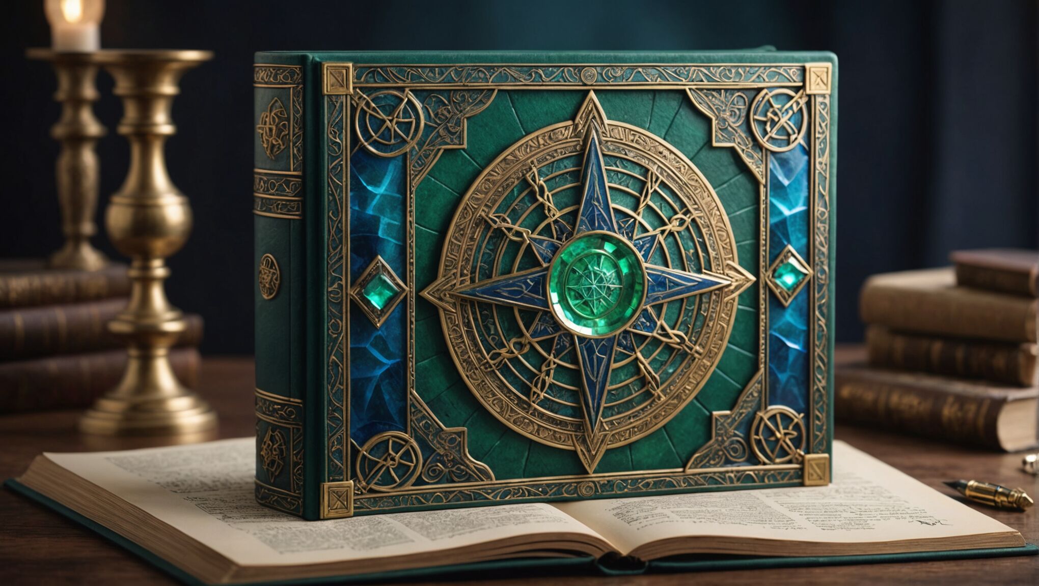
When selecting a color palette for fantasy book covers that appeal across age groups, designers must strike a delicate balance between vibrancy and sophistication. Rich, jewel tones like deep purples, emerald greens, and sapphire blues often resonate well with both young and adult readers. These colors evoke a sense of mystery and magic without leaning too heavily towards a childish or overly mature aesthetic.
Metallic accents, such as gold or silver, can add a touch of elegance and wonder that bridges the age gap. These shimmering elements catch the eye of younger readers while providing a sense of quality and depth that adults appreciate. Designers often use these metallic hues sparingly to highlight key elements of the cover, such as the title or magical objects within the artwork.
Gradients and color transitions play a crucial role in creating covers with broad appeal. Subtle shifts from one hue to another can suggest the blending of worlds or the presence of magic, captivating readers of all ages. For example, a twilight-inspired palette that transitions from deep blue to warm orange can evoke a sense of adventure and possibility that resonates across generations.
Earthy tones, when combined with more fantastical colors, can ground the design while maintaining its magical quality. Warm browns, muted greens, and soft grays can provide a backdrop that allows brighter, more vibrant elements to pop. This combination appeals to adult readers who appreciate nuance while still attracting younger audiences with splashes of more vivid colors.
The use of complementary colors can create dynamic tension in the cover design, drawing the eye and evoking emotional responses from viewers of all ages. For instance, pairing deep purples with soft yellows or rich greens with muted reds can create a visually striking effect that intrigues both children and adults.
Transparency and overlay effects with colors can add depth and complexity to the cover, appealing to more mature readers while creating an enchanting visual experience for younger ones. This technique can be used to suggest multiple layers of reality or the interplay between the mundane and magical worlds often found in fantasy literature.
Designers should also consider the psychological impact of colors when aiming for dual-audience appeal. Cool blues and greens can evoke calmness and wisdom, appealing to adult readers, while simultaneously suggesting mystery and magic to younger audiences. Warm reds and oranges can signify energy and adventure, exciting children while hinting at passion and deeper themes for adults.
Ultimately, the key to selecting color palettes that bridge age gaps lies in finding a harmonious blend of hues that can be interpreted on multiple levels. By carefully balancing vibrant and subdued tones, incorporating elements of both whimsy and sophistication, and considering the emotional and symbolic associations of colors, designers can create fantasy book covers that captivate readers across generations.
Symbolism and imagery for all ages
Symbolism and imagery play a crucial role in creating fantasy book covers that resonate with readers of all ages. The key lies in selecting visual elements that can be interpreted on multiple levels, offering immediate appeal to younger audiences while providing deeper meaning for adult readers.
Mythological creatures and legendary beings often serve as powerful symbols that transcend age barriers. Dragons, for instance, can represent danger and adventure to children, while adults might see them as metaphors for internal struggles or societal challenges. Similarly, unicorns can symbolize purity and magic for younger readers, while older audiences might interpret them as representations of rare beauty or the quest for the unattainable.
Natural elements are another source of universal symbolism. Trees, particularly ancient or magical ones, can represent growth, wisdom, and the interconnectedness of life. Mountains might signify challenges to overcome for younger readers, while adults could see them as metaphors for personal growth or spiritual journeys. Bodies of water, from tranquil lakes to stormy seas, can evoke emotions and themes that resonate across generations.
Celestial imagery, such as stars, moons, and suns, offers rich symbolic potential. These elements can represent guidance, hope, and the cyclical nature of life and stories. For children, they might simply appear magical and beautiful, while adults can appreciate their connections to mythology, science, and philosophy.
Incorporating artifacts and magical objects into cover designs can also bridge the age gap. A glowing amulet, an ancient tome, or a mysterious key can spark imagination in younger readers while hinting at deeper lore and complex plot elements for adults. These objects often serve as visual synecdoches, representing larger themes or plot points within the story.
Symbolic colors and patterns can add layers of meaning to cover art. For example, a spiral pattern might represent a journey or personal growth to an adult, while a child might simply find it visually interesting. The use of complementary colors can create visual tension that appeals to all ages, while also potentially symbolizing opposing forces within the narrative.
Architectural elements, such as castles, towers, or ruins, can serve as powerful symbols on fantasy covers. To younger readers, these might represent exciting settings for adventure, while adults might see them as metaphors for power structures, the passage of time, or the legacy of past civilizations.
The portrayal of light and shadow in cover art can also carry symbolic weight across age groups. Beams of light breaking through darkness can represent hope and revelation to readers of all ages, while intricate plays of shadow might hint at hidden depths or mysteries within the story.
Abstract or surreal elements in cover design can be particularly effective in appealing to diverse age groups. Impossible geometries, floating islands, or dreamlike landscapes can capture the imagination of young readers while offering adults opportunities for deeper interpretation and reflection on the nature of reality and perception.
Lastly, the use of symbolic gestures or poses for characters on the cover can convey universal themes. A figure reaching towards something unseen, for instance, can represent aspiration and the pursuit of dreams to readers of any age, while the specific interpretation may vary based on the reader’s life experience.
By carefully selecting and combining these symbolic elements, designers can create fantasy book covers that not only capture the essence of the story but also offer multiple layers of meaning and appeal to readers across the age spectrum.
Typography choices for broad readership
 When selecting typography for fantasy book covers that appeal to a broad readership, designers must consider legibility, style, and emotional impact. A well-chosen font can bridge the gap between younger and older readers, creating a unified visual experience that resonates across generations.
Serif fonts often lend a sense of timelessness and tradition to fantasy covers, appealing to adult readers who appreciate classic literature. However, when paired with modern design elements or given a slight twist, these fonts can also capture the imagination of younger audiences. Typefaces like Trajan or Garamond, with their historical roots, can evoke a sense of epic storytelling that appeals to all ages.
Sans-serif fonts, on the other hand, can provide a clean, contemporary look that attracts younger readers while maintaining a level of sophistication for adults. Fonts like Futura or Avenir can be particularly effective when used for subtitles or author names, balancing out more ornate title treatments.
Custom lettering or hand-drawn typography can create a unique and magical feel that appeals to readers of all ages. This approach allows designers to infuse the title with personality and style that directly relates to the story’s themes. For younger readers, playful letterforms can be exciting and inviting, while adults may appreciate the craftsmanship and attention to detail.
Combining different font styles within the cover design can create visual interest and appeal to diverse age groups. For example, pairing a bold, decorative font for the main title with a simpler, more readable font for the author’s name or tagline can create a hierarchy that guides the eye and balances whimsy with clarity.
The size and placement of typography on the cover are crucial considerations. Larger, more prominent titles can grab the attention of younger readers, while subtle variations in size and spacing can create a more sophisticated look that appeals to adults. Integrating the text with the cover art, such as having characters or elements interacting with the letters, can create a sense of depth and immersion that fascinates readers of all ages.
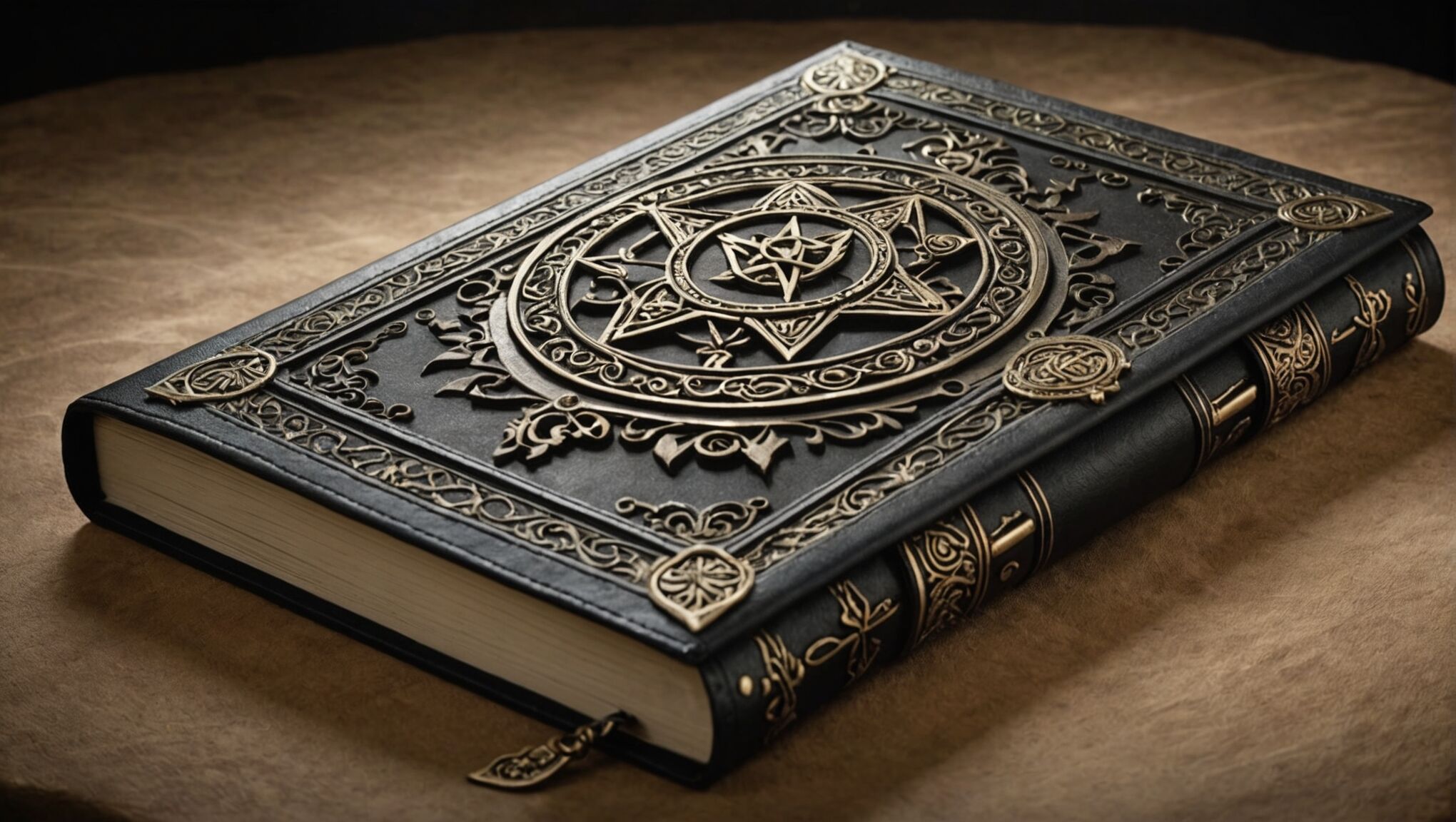
Texture and effects applied to typography can enhance its appeal across age groups. Metallic or iridescent finishes can add a touch of magic that delights younger readers while providing a sense of quality that adults appreciate. Subtle embossing or debossing effects can create a tactile experience that engages readers of all ages, inviting them to explore the cover more closely.
Color choice in typography is another powerful tool for broad appeal. While bright, contrasting colors might attract younger readers, more subdued or complementary color schemes can appeal to adults. Gradients or color shifts within the lettering can create a sense of depth and movement that captivates all age groups.
Adapting classic typefaces with modern twists can create a bridge between traditional and contemporary aesthetics. For example, adding subtle flourishes to a standard serif font or incorporating fantasy-inspired elements into letter shapes can create a unique look that feels both familiar and fresh.
Lastly, the emotional tone conveyed by the typography should align with the book’s content and target audience. Flowing, script-like fonts might suggest romance or adventure, appealing to readers seeking escapism, while strong, angular typefaces could imply action or conflict, attracting those looking for more intense narratives.
By carefully considering these typographic elements, designers can create fantasy book covers that speak to readers across generations, inviting them to explore new worlds and stories regardless of their age.
Balancing complexity and simplicity in cover art

Striking the right balance between complexity and simplicity in fantasy cover art is crucial for appealing to both young and adult readers. A cover that’s too simplistic might fail to capture the richness of the fantasy world within, while an overly complex design could overwhelm potential readers or appear cluttered on digital marketplaces.
One effective approach is to focus on a single, powerful central image that immediately conveys the essence of the story. This could be a character, a magical object, or a symbolic representation of the book’s theme. By rendering this central element in exquisite detail, designers can satisfy the adult reader’s appreciation for craftsmanship while providing a clear focal point for younger audiences.
Surrounding this central image, subtle background elements can add depth and complexity without overwhelming the composition. These could include faint magical symbols, distant landscapes, or atmospheric effects like mist or starlight. These details reward closer inspection, appealing to adult readers who enjoy discovering nuances, while still maintaining an overall clean and accessible look that doesn’t alienate younger viewers.
The use of negative space is particularly important in achieving this balance. By strategically incorporating areas of simplicity around more complex elements, designers can create a sense of mystery and intrigue that appeals to all ages. This technique also ensures that the cover remains legible and impactful when viewed as a thumbnail image online, a crucial consideration in today’s digital marketplace.
Layering is another powerful tool for balancing complexity and simplicity. By creating multiple layers of visual information, designers can cater to different levels of visual literacy. The topmost layer might feature bold, simple elements that immediately catch the eye, while deeper layers reveal more intricate details upon closer examination. This approach allows the cover to grow with the reader, offering new discoveries with each viewing.
Color plays a significant role in this balancing act. A limited color palette can help unify complex elements, preventing the design from becoming visually chaotic. Conversely, strategic use of vibrant colors can add visual interest to simpler designs without overwhelming the composition. Gradients and color transitions can add depth and sophistication that appeals to adult readers while maintaining the magical quality that attracts younger audiences.
The integration of typography with the artwork is another area where balance is crucial. Ornate, fantasy-inspired fonts can add complexity and character, but they must be balanced with clear, readable text to ensure the title and author’s name are easily discernible. Some designers opt for simple typography overlaid on complex artwork, while others integrate elaborate lettering into simpler background designs.
Ultimately, the key to balancing complexity and simplicity in fantasy cover art lies in creating a design that invites exploration while remaining immediately accessible. By carefully considering each element’s role in the overall composition and how it will be perceived by different age groups, designers can create covers that intrigue and delight readers across generations, serving as a true gateway to the magical worlds within.

