blog
Designing Dark Fantasy Covers: Tips and Tricks
When crafting a compelling dark fantasy cover, several crucial elements must come together to captivate potential readers. The central image or character should evoke a sense of otherworldliness, often incorporating mythical creatures, mysterious figures, or haunting landscapes. Atmosphere is paramount in dark fantasy, so consider using elements like mist, shadows, or eerie lighting to set the mood. Textures play a vital role in conveying the gritty or ethereal nature of the story, whether it’s the rough surface of ancient stone or the gossamer-like quality of spectral entities. Contrast is another key factor, not just in terms of light and dark, but also in juxtaposing the mundane with the fantastical. This can be achieved by placing familiar objects in unfamiliar contexts or by blending realistic elements with surreal ones. The composition should guide the viewer’s eye to the most important aspects of the cover while maintaining an air of mystery. “A great cover tells a story before the book is even opened,” as many designers often say. Therefore, ensure that every element on the cover contributes to the overall narrative and genre expectations of dark fantasy, from the positioning of characters to the subtle details in the background.
Choosing the right color palette
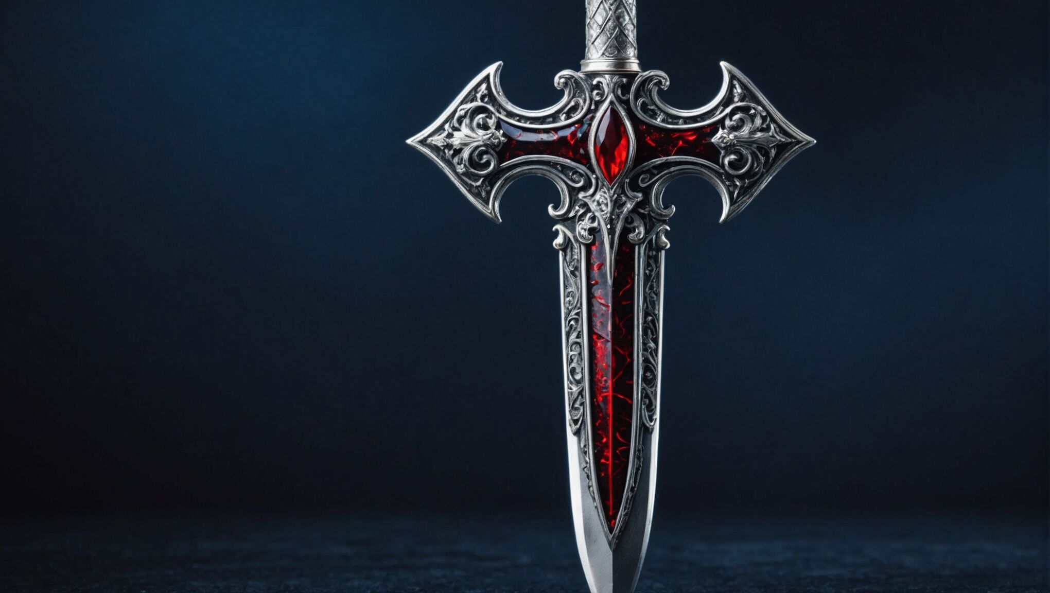 The color palette is a crucial element in setting the tone and atmosphere for a dark fantasy book cover. Typically, dark fantasy covers lean towards a moodier, more somber range of colors. Deep, rich hues like midnight blue, forest green, blood red, and purple can create an air of mystery and foreboding. These colors are often contrasted with touches of metallic gold or silver to add a magical or mystical element.
Black is a staple in dark fantasy cover design, symbolizing the unknown, danger, and the supernatural. However, it’s essential to use it judiciously to avoid overwhelming the design. Pairing black with cooler tones like deep blue or green can evoke a sense of otherworldliness, while warmer accents like amber or crimson can suggest hidden dangers or passion.
Desaturated or muted colors can also be effective in creating a gritty, realistic feel that’s often associated with dark fantasy. Sepia tones, grays, and earthy browns can ground the fantastical elements and make them feel more tangible and believable.
Give your anthology a cohesive look. Visit now for ideas.
When selecting colors, consider the emotional impact they’ll have on the viewer. For instance, deep purples can suggest royalty or magic, while rusty reds might evoke blood or decay. The interplay between these colors can create tension and intrigue, drawing the potential reader in.
“Color is a power which directly influences the soul,” said Wassily Kandinsky, and this is particularly true in cover design where color can instantly communicate genre and mood.
It’s also important to consider how the colors will appear both in print and digital formats. Some colors may look different on screen compared to physical copies, so testing the palette in various mediums is crucial.
Gradients and color overlays can add depth and dimension to the cover, creating a sense of layered reality that’s often present in dark fantasy narratives. A subtle shift from dark to light can guide the eye and create focal points within the design.
Lastly, don’t shy away from unexpected color choices that can make your cover stand out. While adhering to genre conventions is important, a unique color palette can help your book catch a reader’s eye amidst a sea of similar covers. Just ensure that any unconventional color choices still align with the overall mood and themes of the story.
Typography and font selection
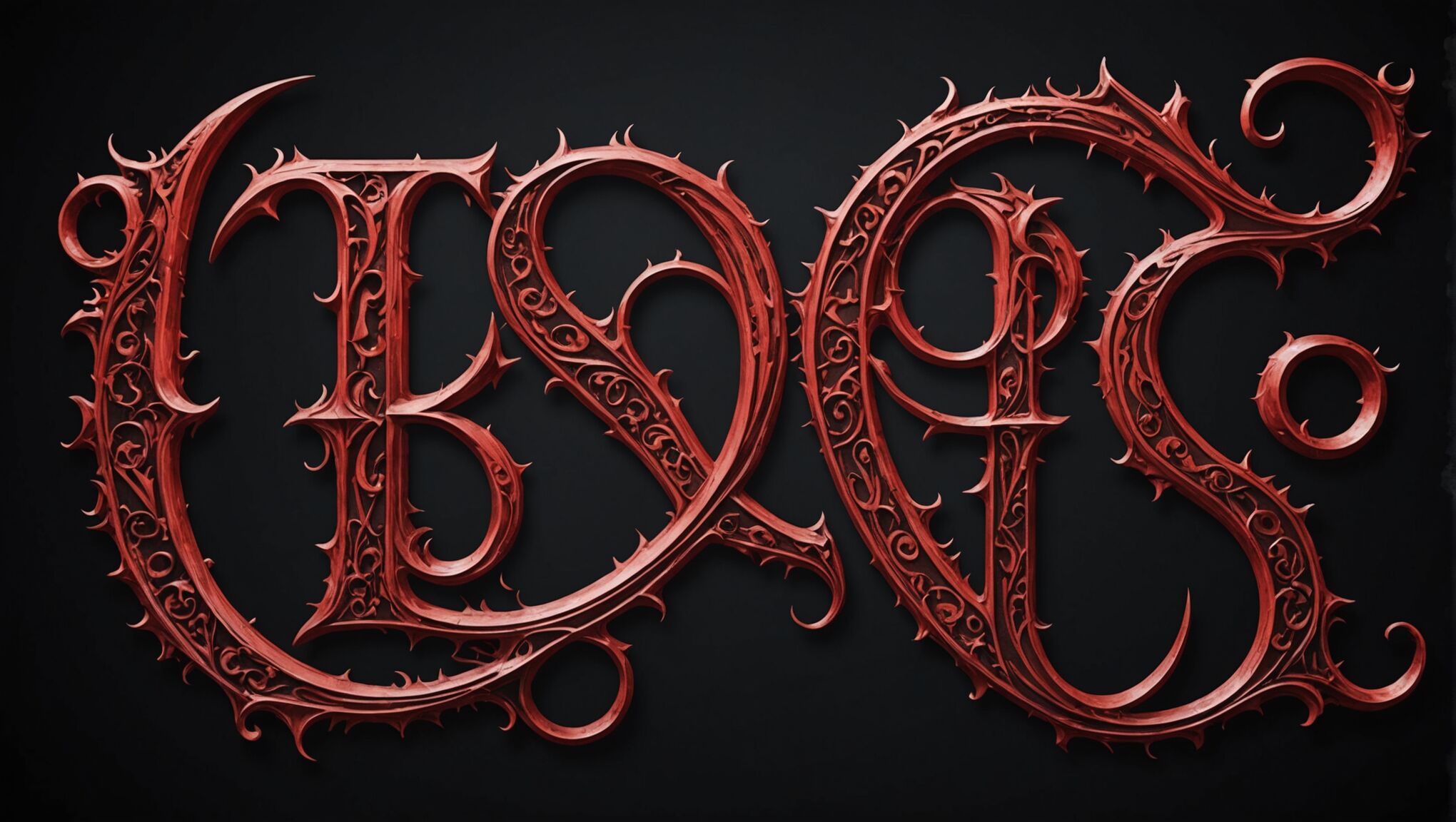
The typography and font selection for a dark fantasy book cover are critical elements that can make or break the overall design. When choosing fonts, it’s essential to consider both readability and the mood they evoke. Gothic-inspired typefaces often work well for titles, as they carry an inherent sense of mystery and antiquity. Fonts like “Luminari,” “Blackletter,” or “Scriptina” can immediately set a dark, fantastical tone.
However, it’s crucial not to sacrifice legibility for style. The title should be easily readable even at thumbnail size, as many potential readers will first encounter the book online. A good practice is to pair a decorative font for the title with a cleaner, more modern sans-serif font for the author’s name and any subtitles. This contrast can create visual interest while ensuring all text remains clear.
The size and placement of typography on the cover are equally important. Large, bold titles can create impact and draw the eye, while smaller, more delicate text can add an air of subtlety and intrigue. Experimenting with the layout of text elements can lead to unique and striking designs. For instance, integrating the title into the cover art itself can create a seamless, cohesive look.
Color plays a crucial role in typography as well. While white text on a dark background is common in dark fantasy, consider using metallic foils or embossing for print editions to add a touch of luxury and mystique. For digital covers, subtle gradients or textures within the text can add depth and interest.
Custom lettering or calligraphy can elevate a cover design, giving it a unique, hand-crafted feel that resonates with the artisanal nature of many fantasy worlds. This approach can be particularly effective for series titles, creating a recognizable brand across multiple books.
When working with typography, it’s important to consider the overall balance of the cover. The text should complement the imagery, not compete with it. Negative space can be just as powerful as elaborate fonts, allowing the eye to rest and enhancing the impact of both text and visuals.
Lastly, don’t underestimate the power of subtle typographic details. Ligatures, swashes, or custom glyphs can add a touch of the arcane or magical to your text, reinforcing the dark fantasy theme. However, use these elements judiciously to maintain readability and avoid overwhelming the design.
Incorporating symbolic imagery
Symbolic imagery plays a crucial role in dark fantasy cover design, serving as a visual shorthand for complex themes and narratives. When incorporating such elements, it’s essential to choose symbols that resonate with the story’s core concepts while also appealing to the genre’s audience.
Ancient symbols and occult imagery often feature prominently in dark fantasy covers. Pentagrams, runes, and alchemical symbols can evoke a sense of forbidden knowledge and mystical power. These can be subtly integrated into the background or used as focal points, depending on their significance to the plot.
Natural elements like trees, particularly gnarled or barren ones, can symbolize the boundary between worlds or the corruption of nature. Moons, especially in crescent or blood-red forms, are powerful symbols of change, mystery, and the supernatural. Ravens or crows are frequently used to represent death, wisdom, or prophecy.
Weapons and artifacts play a significant role in many dark fantasy narratives and can be powerful symbolic elements on a cover. A sword shrouded in mist or a glowing amulet can hint at the story’s magical elements and conflicts.
Human figures, when used symbolically, can be powerful tools for conveying themes. A hooded figure might represent mystery or hidden identities, while a silhouette against a stormy sky can evoke a sense of impending doom or heroic struggle.
Architectural elements like ancient ruins, Gothic cathedrals, or imposing castles can symbolize the weight of history, forgotten knowledge, or oppressive power structures common in dark fantasy settings.
When incorporating these symbols, it’s crucial to consider their placement and size. A large, central symbol can dominate the cover and immediately convey the book’s genre and tone. Smaller, more subtle symbols hidden within the larger design can reward careful observation and hint at deeper layers within the story.
The way symbols interact with other elements of the cover is also important. For instance, a symbol partially obscured by mist or shadow can create intrigue and a sense of the unknown. Symbols that seem to emit light or energy can draw the eye and suggest magical properties.
Color plays a significant role in symbolic imagery. A symbol rendered in blood-red might suggest danger or sacrifice, while one in ethereal blue could hint at otherworldly powers or ghostly presences.
It’s important to research the symbols you use to ensure they carry the intended meaning and don’t inadvertently convey unintended messages. Cultural sensitivity is crucial, especially when dealing with symbols from real-world mythologies or religions.
Lastly, while symbolic imagery can be powerful, it’s essential not to overcrowd the cover. A few well-chosen symbols can be more effective than a cluttered design. The goal is to intrigue potential readers and give them a taste of the story’s themes without giving everything away.
Balancing light and shadow
 The interplay between light and shadow is a fundamental aspect of dark fantasy cover design, serving as a powerful tool to create atmosphere, depth, and intrigue. Mastering this balance can elevate a cover from merely eye-catching to truly captivating.
When crafting the lighting for a dark fantasy cover, consider the source and quality of light. A single, strong light source can create dramatic shadows and highlight key elements of the design. This could be a glowing magical artifact, a beam of moonlight piercing through clouds, or an ethereal mist emanating from a central figure. The direction of this light source can significantly impact the mood; for instance, light from below can create an unsettling, ominous effect, while side-lighting can emphasize texture and form.
Shadows play an equally crucial role. Deep, inky shadows can conceal parts of the image, hinting at hidden dangers or secrets. They can also be used to frame important elements, drawing the viewer’s eye to specific areas of the cover. Gradient shadows can create a sense of depth and dimension, making flat designs appear more three-dimensional.
The contrast between light and dark areas is essential in creating visual interest and guiding the viewer’s gaze. High contrast can create a sense of drama and tension, while lower contrast can evoke a more subdued, mysterious atmosphere. Experimenting with different levels of contrast can help find the right balance for the specific story and mood you’re trying to convey.
Consider using light and shadow to create silhouettes or partially obscured figures. This technique can be particularly effective in dark fantasy, as it leaves room for the reader’s imagination and adds an air of mystery. A shadowy figure with glowing eyes or a partially illuminated face can be far more intriguing than a fully visible character.
Texture can be enhanced through the careful use of light and shadow. The play of light across rough stone, shimmering fabric, or the scales of a dragon can add richness and depth to the design. This attention to detail can make the cover feel more tangible and immersive.
Don’t be afraid to use unconventional lighting techniques. Backlighting, for example, can create striking silhouettes and add a sense of otherworldliness. Rim lighting can define the edges of figures or objects, making them stand out against dark backgrounds.
Color temperature is another factor to consider when balancing light and shadow. Cool, blue-toned shadows contrasted with warm, golden light can create a sense of magical twilight. Conversely, warm shadows and cool highlights might evoke an unnatural, unsettling atmosphere.
Remember that light doesn’t always have to be realistic. In dark fantasy, light can take on magical properties, appearing as swirling tendrils, glowing runes, or pulsing auras. These fantastical light sources can add a unique element to the cover and hint at the magical nature of the story within.
The balance of light and shadow can also be used to create optical illusions or hidden images within the cover design. This can add an extra layer of intrigue for potential readers, encouraging them to look closer and engage more deeply with the cover.
Ultimately, the goal is to use light and shadow not just as visual elements, but as storytelling tools. They should work in harmony with other design elements to create a cohesive, atmospheric cover that captures the essence of the dark fantasy genre and entices readers to delve into the world within the pages.
Creating a sense of mystery and intrigue
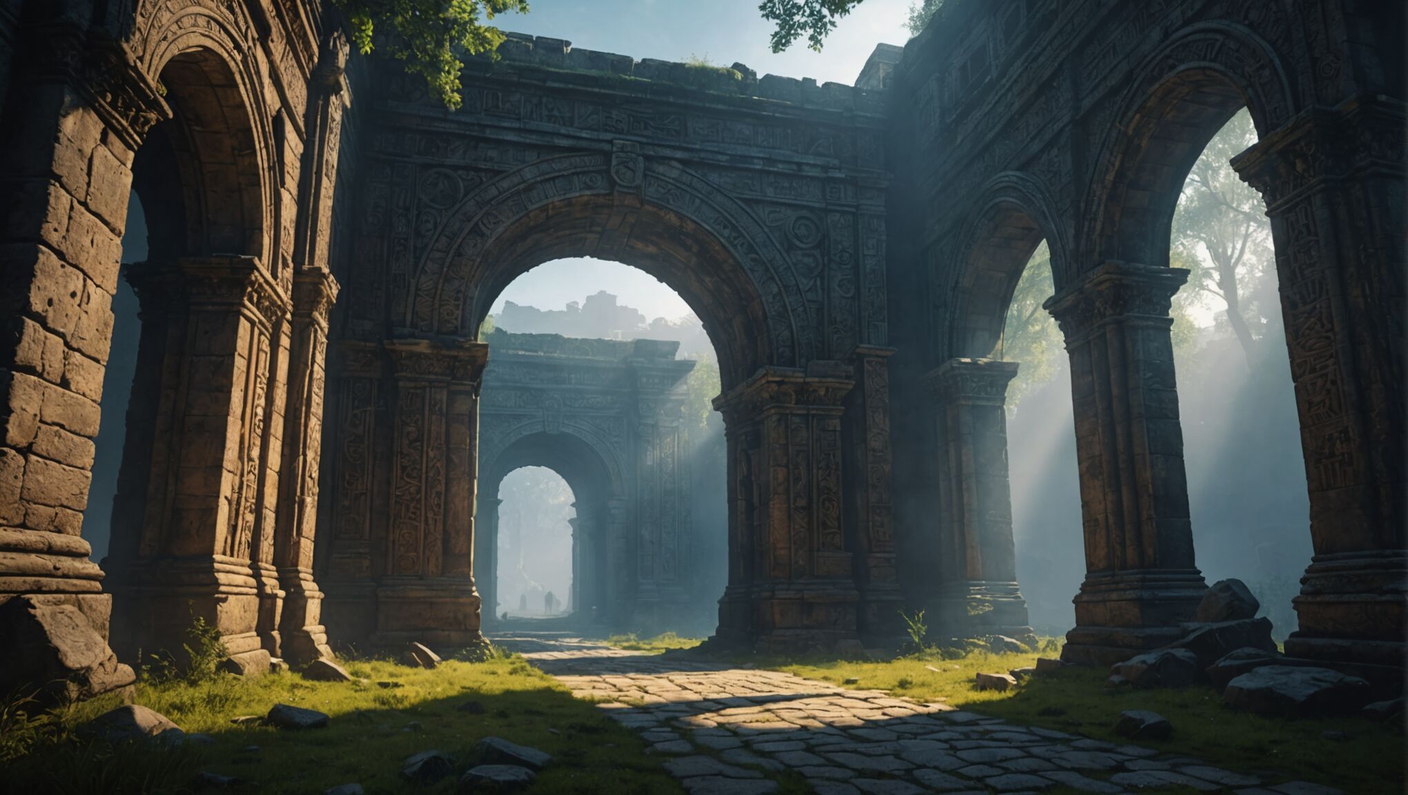
To create a sense of mystery and intrigue on a dark fantasy book cover, employ subtle visual cues and carefully chosen elements that pique curiosity without revealing too much. Obscure parts of key figures or objects, leaving their full form to the imagination. For instance, show only a glimpse of a shadowy creature or a partially concealed magical artifact. This technique invites readers to fill in the blanks with their own interpretations.
Utilize perspective and depth to create layered scenes that suggest hidden worlds or realms beyond what’s immediately visible. A misty forest with a barely discernible path leading into darkness, or a crumbling archway revealing a glimpse of an otherworldly landscape can spark the reader’s imagination and desire to explore further.
Incorporate enigmatic symbols or cryptic text that hint at deeper lore or ancient mysteries within the story. These elements can be subtly woven into the background or integrated into the main design, encouraging closer examination and speculation about their meaning.
Play with reflections and distortions to create visual puzzles. A warped image in a mirror or a rippling water surface can suggest alternate realities or hidden truths, adding layers of complexity to the cover design.
Use negative space creatively to form suggestive shapes or hidden images. The silhouette of a face formed by the spaces between tree branches, or a creature’s outline revealed in the pattern of stars can create a “double-take” effect that draws viewers in for a closer look.
Implement a limited color palette with one unexpected accent color to create visual intrigue. A predominantly dark cover with a single splash of vivid red or ethereal blue can draw attention and spark curiosity about its significance to the story.
Consider incorporating elements that suggest movement or transformation, such as swirling mists, shifting shadows, or objects in mid-metamorphosis. These dynamic elements can create a sense of unfolding mystery and hint at the magical nature of the story.
Experiment with unconventional framing or cropping of images to create a sense of something larger just out of view. This technique can make the cover feel like a window into a vast, mysterious world, enticing readers to open the book and discover more.
Add subtle textures or patterns that reveal hidden details upon closer inspection. Intricate filigree work that forms tiny scenes or characters, or a seemingly random pattern that actually depicts a crucial story element can reward observant viewers and add depth to the design.
Consider the power of juxtaposition to create intrigue. Combine contrasting elements in unexpected ways, such as delicate, ornate objects against a harsh, foreboding background, or place familiar items in surreal contexts. These contrasts can create cognitive dissonance that captures attention and sparks curiosity about the story’s unique blend of elements.

