blog
Crafting Enigmatic Fantasy Book Covers for Niche Markets
Fantasy literature encompasses a vast array of subgenres, each with its own dedicated readership. To successfully craft enigmatic book covers for niche markets, it’s crucial to delve deep into the specific preferences and expectations of these unique audiences. “Know thy reader” should be the mantra for any cover designer venturing into these specialized realms. Urban fantasy enthusiasts, for instance, often gravitate towards covers featuring cityscapes with supernatural elements, while readers of grimdark fantasy may prefer darker, more brooding imagery. Researching bestsellers within each niche can provide valuable insights into what visually resonates with these discerning readers. Additionally, engaging with online communities, fan forums, and social media groups dedicated to niche fantasy subgenres can offer a wealth of information about reader preferences and trending themes. It’s also important to consider the age range of the target audience, as young adult fantasy readers may have different visual expectations compared to those seeking adult high fantasy. By thoroughly understanding these niche markets, designers can create covers that not only capture the essence of the story but also speak directly to the intended audience’s sensibilities and desires.
Elements of enigmatic cover design
 To create an enigmatic book cover that captivates niche fantasy readers, designers must masterfully blend several key elements. The centerpiece of an intriguing cover is often a striking visual that hints at the story’s core without revealing too much. This could be an evocative symbol, a mysterious landscape, or a partially obscured character that leaves room for imagination.
Texture plays a crucial role in adding depth and tangibility to the design. Incorporating subtle textures like worn leather, ancient parchment, or shimmering magic can enhance the tactile appeal and bring the fantasy world to life. Layering these textures with translucent elements can create an illusion of depth, inviting the viewer to look closer and discover hidden details.
Negative space is a powerful tool in enigmatic cover design. By strategically leaving areas of the cover empty or minimally designed, designers can create a sense of mystery and allow the reader’s imagination to fill in the gaps. This technique can be particularly effective when combined with a focal point that draws the eye and sparks curiosity.
Contrasts in light and shadow are essential for creating an air of mystery. Dramatic lighting effects, such as a single beam of light in darkness or ethereal glows, can evoke a sense of the unknown and the magical. Silhouettes and backlit figures are often used to maintain an air of secrecy while still conveying the essence of characters or settings.
“The cover is the first piece of information a reader receives about a book, so it must convey the essence of the story while piquing curiosity.” – Chip Kidd, Graphic Designer
Incorporating subtle visual cues or Easter eggs related to the story can reward attentive viewers and create a deeper connection with the target audience. These hidden elements might include tiny creatures, cryptic symbols, or references to key plot points that only become clear after reading the book.
The use of unconventional perspectives or optical illusions can add an extra layer of intrigue to the cover. A cover that changes appearance when viewed from different angles or distances can create a memorable and interactive experience for potential readers.
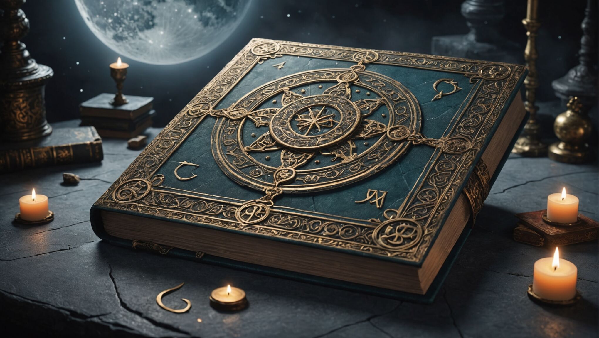
Framing devices, such as ornate borders or trompe l’oeil effects that make the cover appear like an ancient tome or magical portal, can further immerse the viewer in the fantasy world before they even open the book.
Finally, the integration of metallic foils, spot UV, or holographic elements can add a touch of magic and luxury to the physical book, making it stand out on shelves and enticing readers to pick it up and explore further.
Symbolism and hidden meanings in artwork

Incorporating symbolism and hidden meanings into cover artwork adds depth and intrigue, enticing readers to delve deeper into the story. Subtle visual metaphors can convey complex themes without overwhelming the design. For instance, a partially obscured hourglass might represent the passage of time or impending doom, while a fractured mirror could symbolize distorted realities or shattered identities. These elements not only enhance the aesthetic appeal but also provide clues about the narrative’s core concepts.
Mythological and alchemical symbols often find their way into fantasy cover art, appealing to readers well-versed in esoteric knowledge. The ouroboros, a serpent eating its own tail, might hint at cyclical narratives or eternal recurrence. Similarly, the use of sacred geometry, such as the golden ratio or intricate mandalas, can suggest cosmic order or mystical harmonies within the story world. These symbols resonate with audiences seeking deeper layers of meaning beyond surface-level imagery.
Explore the evolution of fantasy cover design. Read on.
Animal imagery carries potent symbolism in fantasy literature. A lone wolf might represent isolation or independence, while a phoenix could signify rebirth or resilience. By cleverly integrating these creatures into the cover design, artists can communicate character traits or plot elements without resorting to explicit depictions. This approach allows readers to form their own connections and interpretations, enhancing the enigmatic quality of the cover.
Color combinations and patterns can also convey hidden meanings. For example, intertwining black and white elements might suggest a struggle between good and evil, while a spiral pattern could imply a journey of self-discovery or descent into madness. The strategic use of complementary or contrasting colors can create visual tension that mirrors thematic conflicts within the story.
Incorporating elements of sacred or occult writings, such as fragments of ancient scripts or mystic runes, adds an air of mystery and authenticity to fantasy covers. These can be subtly woven into the background or integrated into the main design elements, rewarding observant readers who recognize their significance. Even if the exact meaning isn’t immediately apparent, the presence of such writings suggests hidden knowledge and arcane secrets waiting to be uncovered.
Layering and juxtaposition of images can create visual puzzles that invite closer inspection. A seemingly straightforward landscape might reveal hidden faces or creatures when viewed from a different angle or distance. This technique not only engages the viewer but also mirrors the complexity of fantasy worlds where things are often not as they initially appear.
The use of negative space to form recognizable shapes or silhouettes is another powerful tool for conveying hidden meanings. A cleverly designed landscape might subtly outline a character’s profile, suggesting their integral connection to the story’s setting. This technique rewards viewers who take the time to examine the cover in detail, fostering a sense of discovery and engagement.
Incorporating astronomical or celestial elements can hint at larger cosmic themes or the influence of fate and destiny in the narrative. Constellations, phases of the moon, or eclipses might be subtly integrated into the cover design, suggesting the story’s scope extends beyond the immediate characters and setting to encompass grander, universal concepts.
By carefully selecting and combining these symbolic elements, cover artists can create a visual tapestry that not only captures the essence of the story but also provides an engaging puzzle for potential readers to unravel. This approach transforms the cover into a gateway that invites exploration and sets the stage for the enigmatic journey that awaits within the pages of the book.
Typography choices for mystique
When crafting an enigmatic fantasy book cover, the choice of typography plays a crucial role in establishing the tone and atmosphere of the story. The font selection should not only be visually appealing but also convey a sense of mystery and intrigue that aligns with the book’s content.
Custom-designed typefaces can add a unique touch to the cover, creating an immediate visual identity for the book or series. These bespoke fonts might incorporate subtle elements that reflect the story’s themes, such as flourishes reminiscent of magical runes or letterforms that mimic organic shapes found in nature.
Handwritten or calligraphic styles can lend an air of authenticity and intimacy to the cover, suggesting personal journals or ancient manuscripts. This approach works particularly well for stories involving diaries, historical fantasies, or tales of forbidden knowledge. The imperfections in handwritten fonts can also add character and a sense of the otherworldly.
Layering different typefaces can create depth and intrigue. For instance, combining a bold, modern sans-serif for the author’s name with an ornate, serif font for the title can create an intriguing contrast that catches the eye. This juxtaposition can also hint at the blending of different worlds or time periods within the story.
The positioning and arrangement of text elements can contribute significantly to the cover’s mystique. Unconventional layouts, such as vertical text, circular arrangements, or text that follows the contours of an image, can create visual interest and encourage viewers to engage more deeply with the cover design.
Incorporating textural effects into the typography can enhance its enigmatic quality. Weathered, eroded, or partially obscured lettering can suggest age, forgotten lore, or hidden secrets. Techniques such as embossing, debossing, or the use of metallic foils can add a tactile dimension to the text, inviting readers to explore the cover with their fingertips as well as their eyes.
Playing with the scale of typography can create striking visual effects. Oversized letters that extend beyond the cover’s boundaries or miniature text that requires close inspection can both serve to intrigue potential readers and hint at the scale of the story within.
The integration of typography with other design elements is crucial for maintaining an air of mystery. Text that intertwines with illustrative elements or emerges from shadows can create a seamless blend between words and imagery, enhancing the overall enigmatic effect of the cover.
Here’s a table showcasing some font styles and their potential associations in fantasy book cover design:
| Font Style | Potential Associations |
| Gothic | Dark fantasy, horror elements, medieval settings |
| Art Nouveau | Fae realms, nature-based magic, ethereal beauty |
| Futuristic | Science fantasy, dystopian worlds, technological magic |
| Runic | Ancient magic systems, Norse-inspired fantasy, hidden languages |
| Brush Script | Personal narratives, coming-of-age stories, urban fantasy |
Experimenting with the opacity and color of text can further enhance its mysterious qualities. Semi-transparent lettering that reveals glimpses of the artwork beneath or text that changes color depending on the viewing angle can add an interactive element to the cover design.
Ultimately, the typography chosen for an enigmatic fantasy book cover should work in harmony with all other design elements to create a cohesive and intriguing visual experience that entices readers to explore the magical world within the pages.
Color psychology in fantasy book covers
 Color plays a pivotal role in shaping the emotional and psychological response to a fantasy book cover. The strategic use of hues can evoke specific moods, hint at the story’s themes, and create an air of mystery that draws readers in.
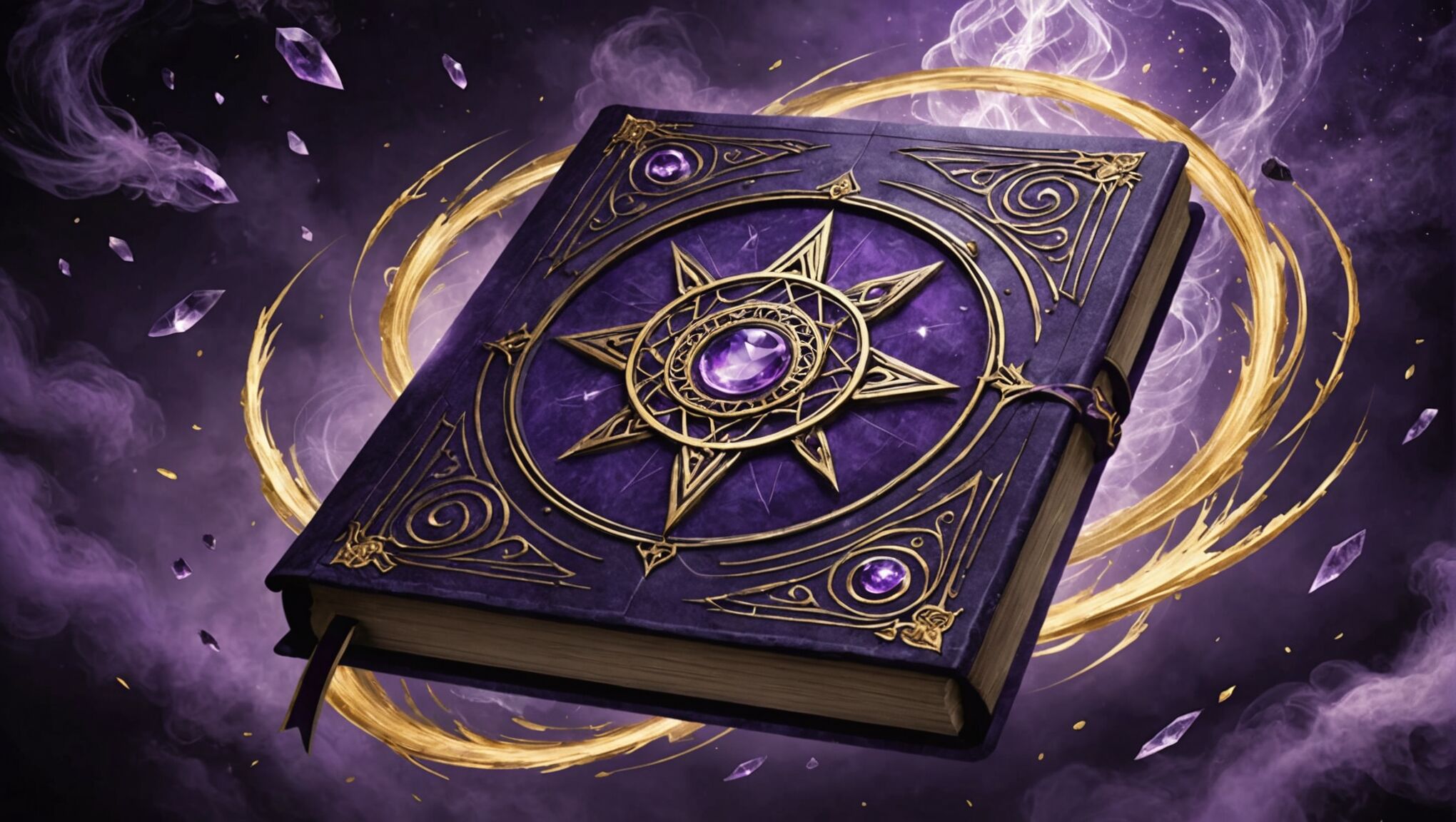
Deep, rich purples often signify magic, royalty, and the mystical. When combined with gold accents, they can create a sense of opulence and hidden power. This color scheme might be particularly effective for stories involving court intrigue or ancient magical orders.
Ethereal blues and greens can transport viewers to otherworldly realms. Misty, desaturated tones in these colors can suggest dreams, illusions, or parallel dimensions. For underwater fantasies or tales of elemental magic, varying shades of blue and green can create depth and fluidity in the cover design.
Warm oranges and reds, when used sparingly, can add drama and intensity to a cover. These colors can represent passion, danger, or transformative magic. A flash of red against a darker background might hint at hidden threats or forbidden knowledge within the story.
Black is a powerful tool in creating enigmatic covers. It can represent the unknown, the void, or the absence of light. When used as negative space or in contrast with brighter elements, black can create striking visual effects that draw the eye and spark curiosity.
Metallic colors like silver and gold can add a touch of magic and luxury to a cover. These hues catch the light and create an illusion of movement, perfect for stories involving alchemy, treasure, or celestial beings.
The use of gradients and color transitions can create a sense of shifting realities or magical transformations. A cover that seamlessly blends from one color to another might represent a journey between worlds or the evolution of a character’s powers.
Monochromatic color schemes, using various shades and tints of a single color, can create a cohesive and mysterious atmosphere. This technique can be particularly effective in conveying a specific mood or environment, such as a shadowy underworld or a moonlit forest.
Unexpected color combinations can intrigue viewers and hint at the unique nature of the story. For instance, pairing a deep burgundy with a vibrant teal might suggest a clash of opposing forces or the merging of different magical traditions.
The strategic use of white space can be just as impactful as color. Areas of stark white can represent the unknown, purity, or blinding light, creating a sense of anticipation or revelation.
Consider the psychological effects of different color combinations:
– Cool colors (blues, greens, purples) tend to be calming and introspective, suitable for more contemplative or philosophical fantasies.
– Warm colors (reds, oranges, yellows) are energetic and attention-grabbing, ideal for action-packed adventures or fiery magic systems.
– Earth tones can ground a fantasy in a sense of history and tradition, perfect for stories with strong worldbuilding elements.
– Pastel shades might suit lighter fantasies or those with fae elements, creating a dreamy, whimsical atmosphere.
The interplay between light and shadow, created through color choices, can add depth and mystery to a cover. Chiaroscuro effects, where light dramatically cuts through darkness, can create a sense of revelation or hidden dangers lurking just out of sight.
Color saturation levels can also convey meaning. Highly saturated colors might represent intense emotions or vivid magical experiences, while desaturated hues could suggest faded memories, lost magic, or a world in decline.
By carefully considering the psychological impact of color choices and how they interact with other design elements, cover artists can create enigmatic visuals that not only captivate potential readers but also provide subtle clues about the fantastical journey that awaits them within the pages of the book.
Balancing intrigue and genre expectations

Creating an enigmatic fantasy book cover requires a delicate balance between intrigue and adherence to genre expectations. While the goal is to captivate potential readers with mystery and allure, it’s crucial not to stray so far from familiar elements that the book becomes unrecognizable within its intended category. This balance can be achieved by incorporating subtle nods to genre conventions while introducing unique twists that set the book apart.
One effective approach is to use familiar fantasy motifs in unexpected ways. For instance, a dragon, a common fantasy element, could be depicted as a shadow or reflection rather than in its full form, maintaining the genre connection while adding an air of mystery. Similarly, magical artifacts or weapons can be partially obscured or integrated into the landscape, hinting at their importance without overtly displaying them.
The composition of the cover plays a vital role in striking this balance. By placing recognizable genre elements in the periphery or background, while highlighting more enigmatic and unique aspects in the foreground, designers can create a visual hierarchy that satisfies genre expectations while emphasizing the book’s distinctive qualities.
Color schemes can also be utilized to bridge the gap between intrigue and familiarity. Using traditional fantasy color palettes as a base, but incorporating unexpected pops of color or unusual combinations, can create a cover that feels both familiar and fresh. This approach signals to readers that while the book fits within their preferred genre, it offers something new and exciting.
Typography choices present another opportunity to balance genre expectations with intrigue. Selecting fonts that evoke a fantasy feel but incorporating unusual treatments, such as fragmented letters or text that interacts with the imagery, can create a sense of mystery while still clearly signaling the book’s genre.
Symbolic elements can be particularly effective in maintaining this balance. By using symbols that are recognizable within the fantasy genre but presenting them in cryptic or abstract ways, cover designers can create intrigue while still providing genre cues. For example, a sword might be represented by a series of intersecting lines, or a magical amulet could be suggested through a pattern of light.
The level of detail in the cover art can also be strategically managed to balance intrigue and expectations. Highly detailed areas can draw the eye and provide clear genre indicators, while more abstract or minimalist sections can introduce an element of mystery and encourage viewers to fill in the gaps with their imagination.
Incorporating elements of perspective and spatial ambiguity can add intrigue without alienating genre fans. Covers that play with impossible geometries or blend multiple scenes can create a sense of wonder and mystery while still featuring recognizable fantasy elements.
Finally, the overall tone and atmosphere of the cover should align with the subgenre expectations while introducing an element of the unexpected. A dark, brooding cover for a grimdark fantasy might incorporate flashes of vivid color or ethereal light to create intrigue, while a whimsical young adult fantasy cover could feature subtle, darker undertones to add depth and mystery.
By carefully considering these elements and how they interact, designers can create enigmatic fantasy book covers that both satisfy genre expectations and pique curiosity, enticing readers to explore the unique worlds waiting within the pages.

