blog
Mystical Worlds in Print: The Importance of Fantasy Book Covers
In the realm of fantasy literature, book covers serve as portals to extraordinary worlds, offering readers a tantalizing glimpse into the magical adventures that await them. These visual representations play a crucial role in capturing the imagination and enticing potential readers to embark on fantastical journeys. Visual storytelling through cover art allows authors and publishers to convey complex narratives, intricate world-building, and captivating characters in a single, striking image. By carefully selecting iconic symbols, mythical creatures, and enchanted landscapes, artists can distill the essence of an entire novel into a powerful visual narrative that resonates with the target audience.
The art of visual storytelling in fantasy book covers extends beyond mere illustration, often incorporating subtle details and hidden meanings that reward closer inspection. Clever use of symbolism and metaphor can hint at plot twists, character development, and underlying themes, creating a sense of intrigue that compels readers to delve deeper into the story. Moreover, effective cover art can establish a distinct visual identity for a series or author, fostering brand recognition and loyalty among fans. As “A picture is worth a thousand words”, fantasy book covers have the unique ability to communicate the tone, atmosphere, and genre conventions of a novel at a glance, helping readers quickly identify stories that align with their preferences and expectations.
The impact of visual storytelling in fantasy literature extends far beyond the initial point of sale. Memorable cover art can become iconic, serving as a lasting visual representation of beloved stories and characters. These images often find their way into fan art, cosplay, and other forms of creative expression, further expanding the reach and influence of the original work. In the digital age, where online marketplaces and social media platforms play a significant role in book discovery, eye-catching cover art has become more critical than ever in helping fantasy titles stand out in a crowded marketplace. By leveraging the power of visual storytelling, authors and publishers can create a lasting impression on readers, igniting their imagination and inviting them to explore new worlds of wonder and magic.
Capturing the essence of magical realms
 Transporting readers to otherworldly realms requires a delicate balance of artistry and imagination. Effective fantasy book covers must encapsulate the essence of magical worlds, conveying their unique atmosphere, laws of nature, and inhabitants in a single, captivating image. Artists and designers face the challenge of distilling entire universes onto a canvas, creating visual cues that hint at the wonders within without overwhelming the viewer.
“The covers of fantasy books are windows into other worlds, offering a glimpse of the magic that lies within their pages.” – Neil Gaiman
To capture the essence of magical realms, cover artists often employ a combination of familiar and fantastical elements. Recognizable symbols and archetypes serve as anchors, providing readers with a sense of familiarity, while otherworldly details and impossible landscapes ignite the imagination. The juxtaposition of the known and the unknown creates a sense of intrigue, inviting readers to explore further.
Color plays a crucial role in evoking the atmosphere of magical realms. Ethereal blues and purples might suggest mystical energies or celestial landscapes, while deep greens and earthy tones could represent enchanted forests or ancient, nature-based magic. Vibrant, saturated hues can convey the intensity and vibrancy of magical worlds, while muted, dreamlike palettes might hint at more subtle or mysterious forms of enchantment.
Texture and lighting are powerful tools for bringing magical realms to life on book covers. Soft, glowing effects can create an aura of wonder and enchantment, while dramatic contrasts between light and shadow can suggest danger or hidden secrets. Intricate details and patterns might represent complex magical systems or ancient civilizations, while smoother, more abstract designs could evoke a sense of the unknown or the cosmic.
The scale and perspective of cover art can also significantly impact how readers perceive magical realms. Vast, sprawling landscapes can convey the epic scope of a fantasy world, while intimate, close-up details might highlight unique magical artifacts or creatures. By playing with scale, artists can create a sense of wonder and possibility, hinting at the adventures that await within the pages.
Make your cover vibrant and bold. Get started here.
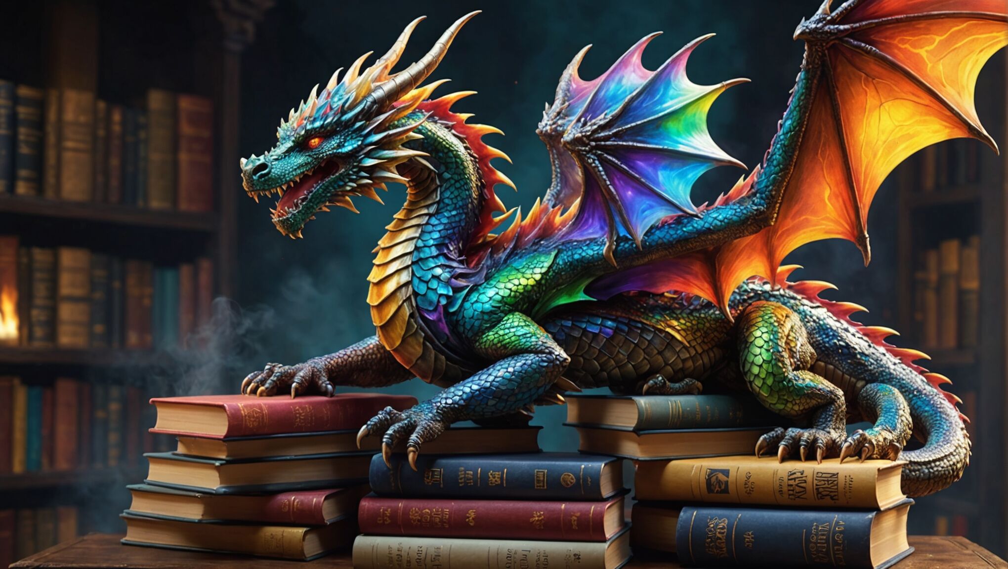
Incorporating magical creatures, mythical beasts, or unique flora and fauna can instantly communicate the fantastical nature of a realm. These elements serve as visual shorthand, immediately signaling to readers that they are about to enter a world unlike their own. However, the key lies in presenting these fantastical elements in a way that feels both fresh and believable within the context of the story.
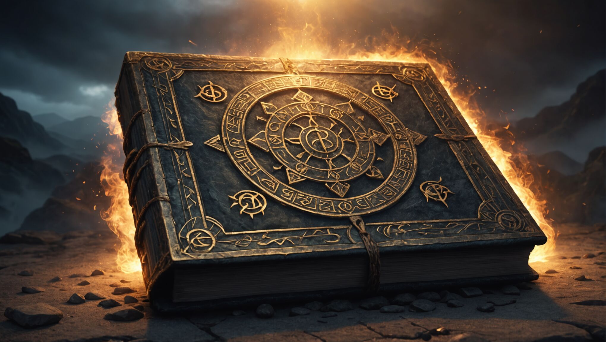
Finally, the integration of magical effects or phenomena directly into the cover design can powerfully capture the essence of magical realms. Swirling energies, impossible physics, or visual representations of spells and incantations can all serve to immerse the viewer in the world of the story before they’ve even opened the book.
By carefully considering and combining these elements, cover artists can create windows into magical realms that not only accurately represent the story within but also spark the imagination of potential readers, inviting them to step through the portal and explore the wonders that await.
Elements of effective fantasy book covers

When crafting an effective fantasy book cover, several key elements work together to create a compelling and immersive visual experience. First and foremost, a strong central focus is essential. This could be a heroic character, a mystical creature, or a powerful magical artifact that immediately draws the eye and conveys the core essence of the story. The chosen focal point should be intriguing enough to pique curiosity and hint at the adventures that lie within the pages.
Atmosphere plays a crucial role in setting the tone for the book. The use of lighting, shadows, and color gradients can create a sense of mystery, danger, or wonder. Misty forests, stormy skies, or shimmering magical auras all contribute to the overall mood and genre expectations. Background elements should complement the main focus without overwhelming it, providing context and depth to the imaginary world.
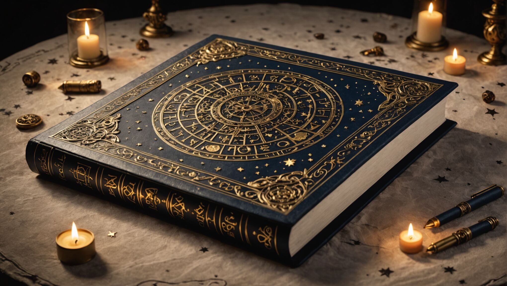
Symbolism and iconography are powerful tools in fantasy cover design. Incorporating recognizable symbols associated with magic, mythology, or specific fantasy tropes can quickly communicate the book’s themes and setting. These might include ancient runes, celestial bodies, or mythical creatures that resonate with the target audience and genre conventions.
The composition of the cover is critical in guiding the viewer’s eye and creating a sense of movement or action. Dynamic layouts that suggest motion or conflict can add excitement and intrigue. Conversely, more serene or symmetrical compositions might be appropriate for contemplative or epic fantasy works. The arrangement of elements should also consider the placement of the title and author’s name, ensuring they integrate seamlessly with the artwork.
Texture and detail can add depth and richness to a fantasy cover. Intricate patterns, ornate borders, or subtle background elements can reward closer inspection and hint at the complexity of the world within. However, it’s important to strike a balance between detail and clarity, ensuring the cover remains visually appealing and easily readable at various sizes, from thumbnail images to physical book displays.
The use of contrast is another crucial element in creating eye-catching fantasy covers. This can be achieved through color contrasts, such as warm against cool tones, or through contrasts in scale, juxtaposing large, imposing elements with smaller, intricate details. Contrast helps create visual interest and can be used to highlight important aspects of the cover design.
Consistency with the book’s content is paramount. While a cover should be visually striking, it must also accurately represent the story and characters within. Misleading cover art can lead to disappointed readers and negative reviews. The most effective fantasy book covers not only attract attention but also set appropriate expectations for the narrative, tone, and world that readers will encounter when they open the book.
Color psychology in fantasy cover design
Color plays a pivotal role in fantasy book cover design, serving as a powerful tool to evoke emotions, set the tone, and transport readers to otherworldly realms. The strategic use of color can instantly communicate genre, atmosphere, and even hint at the magical systems or themes present in the story.
Deep, rich hues like royal purples, midnight blues, and emerald greens are often associated with magic and mystery. These colors can create a sense of depth and intrigue, drawing readers into the fantastical world. Conversely, brighter, more vibrant colors such as fiery reds, electric blues, or golden yellows might be used to convey energy, action, or the presence of powerful magical forces.
The psychology behind color choices in fantasy cover design is complex and nuanced. For example:
| Color | Psychological Association | Fantasy Context |
| Red | Passion, danger, power | Dragon-themed stories, tales of warfare or dark magic |
| Blue | Serenity, wisdom, depth | Ocean-based fantasies, stories involving sky or ice magic |
| Green | Nature, growth, harmony | Forest settings, elemental magic, druidic themes |
| Purple | Royalty, luxury, mystery | Court intrigue, arcane magic, cosmic realms |
Color combinations and contrasts can also be used to great effect. A predominantly dark cover with a burst of bright color can create a focal point and suggest a spark of hope or magic in a grim world. Complementary colors, such as blue and orange or purple and yellow, can create vibrant, eye-catching designs that stand out on bookshelves or in digital marketplaces.
The use of gradients and color blending can create ethereal effects, perfect for depicting magical auras or transitional spaces between worlds. Soft, misty blends might evoke a sense of dreams or illusions, while sharp color transitions could represent the clash of different magical forces or realms.
Metallic accents, such as gold or silver, can add a touch of magic and luxury to fantasy covers. These elements catch the light and draw attention, often used to highlight magical artifacts, weapons, or titles. Similarly, iridescent or holographic effects can create a sense of otherworldliness and movement, particularly effective for stories involving shapeshifters, portals, or transformative magic.
The overall color palette of a fantasy book cover should align with the mood and themes of the story. Darker, more muted tones might be appropriate for grimdark or gothic fantasy, while lighter, more whimsical color schemes could suit fairy tale retellings or lighthearted adventures. Consistency in color usage across a series can also help build brand recognition and create a cohesive visual identity.
It’s important to consider how colors will be perceived in different contexts. A cover that looks stunning in print may not have the same impact when viewed as a small thumbnail online. Designers must ensure that the color choices remain effective across various formats and sizes.
Ultimately, the psychology of color in fantasy book cover design is about creating an immediate emotional connection with potential readers. By carefully selecting and combining colors, designers can craft visual experiences that not only capture the essence of the story but also resonate with the target audience’s expectations and desires for fantastical adventures.
Typography and its role in fantasy branding
 The art of typography in fantasy book covers goes far beyond mere legibility; it’s an essential component of the overall visual storytelling and branding. Fonts and lettering styles can evoke specific time periods, cultures, or magical traditions, instantly communicating the essence of the fantasy world within. A gothic, ornate script might suggest a dark, Victorian-inspired setting, while runic or elvish-inspired lettering could transport readers to a world of high fantasy and ancient magic.
The size, placement, and treatment of text elements on a cover can dramatically affect the overall composition and impact. Bold, oversized titles that dominate the cover space might be used for epic sagas or action-packed adventures, while more subtle, integrated typography could suit introspective or mysterious tales. The interplay between text and imagery is crucial, with skilled designers finding ways to blend lettering seamlessly into the cover art, creating a cohesive visual experience.
Custom typography and hand-lettering have become increasingly popular in fantasy cover design, allowing for truly unique and memorable branding. These bespoke typefaces can incorporate elements of the story or magical system, such as swirls of energy, flames, or intricate patterns, further immersing the reader in the world before they’ve even opened the book.
The choice of typography can also influence the perceived genre and target audience of a fantasy book. Sleek, modern fonts might appeal to readers of urban fantasy or science fantasy, while more traditional serif typefaces could attract fans of classic high fantasy. Young adult fantasy titles often feature playful, energetic typography that resonates with their target demographic.
Color and texture play a significant role in typography for fantasy covers. Metallic effects, gradient fills, or textured overlays can add depth and magic to lettering, making titles appear to glow, shimmer, or even seem carved from stone or wood. These effects can be particularly effective when viewed on physical books, adding a tactile dimension to the cover experience.
The consistency of typography across a series or an author’s body of work is crucial for building brand recognition. A distinctive lettering style can become as iconic as the cover art itself, allowing readers to instantly identify new releases from their favorite authors or series. This visual consistency helps create a sense of cohesion and continuity, even as cover art styles may evolve.
In the digital age, typography must be considered not only for its aesthetic appeal but also for its legibility across various platforms and sizes. Fonts that look stunning on a full-sized book cover may become illegible when reduced to thumbnail size on online retailers. Designers must strike a balance between creative expression and practical considerations to ensure that titles remain clear and impactful in all contexts.
The power of typography in fantasy branding extends beyond the cover itself. The chosen fonts often carry through to chapter headings, marketing materials, and even merchandise, creating a cohesive visual language that reinforces the unique identity of the book or series. This comprehensive approach to typography helps create a immersive brand experience that resonates with fans and encourages deeper engagement with the fantasy world.
As we consider the role of typography in fantasy branding, it’s worth reflecting on how these visual choices shape our perceptions and expectations of the stories we encounter. How do different lettering styles influence our assumptions about a book’s content or quality? In what ways does typography contribute to the overall worldbuilding of a fantasy series? By examining these questions, we can gain a deeper appreciation for the artistry and strategy behind fantasy book design, and perhaps discover new dimensions to our reading experiences.
Evolution of fantasy cover art trends

Over the decades, fantasy book cover art has undergone significant transformations, reflecting changing artistic trends, technological advancements, and shifting reader expectations. In the early days of fantasy literature, covers often featured simple, illustrative designs that focused on key characters or scenes from the story. These covers, while charming, were often limited by printing technologies and budget constraints.
The 1960s and 1970s saw a surge in popularity for fantasy literature, accompanied by more elaborate and colorful cover designs. Artists like Frank Frazetta and Boris Vallejo pioneered a style characterized by muscular heroes, scantily clad heroines, and fearsome monsters, setting a visual standard that would dominate fantasy art for years to come. This period also saw the rise of airbrushing techniques, allowing for smoother blending and more ethereal effects.
As the fantasy genre diversified in the 1980s and 1990s, cover art began to reflect a wider range of styles and themes. Urban fantasy and contemporary settings led to grittier, more realistic depictions, while high fantasy continued to embrace more traditional, epic imagery. Digital art tools started to make their mark, enabling artists to create increasingly complex and detailed compositions.
The turn of the millennium brought a revolution in digital art techniques, leading to hyper-realistic renderings and fantastical scenes that were previously impossible to achieve. Photoshop and other digital painting software became industry standards, allowing for seamless blending of photographic elements with illustrated components. This era also saw a trend towards more symbolic and abstract cover designs, moving away from literal scene depictions to more conceptual representations of themes and moods.
In recent years, there has been a noticeable shift towards minimalist and typography-driven cover designs in some segments of the fantasy market. This trend, influenced by broader graphic design movements, aims to stand out in an increasingly crowded digital marketplace where covers are often viewed as small thumbnails. However, traditional illustrated covers remain popular, with many artists combining digital techniques with traditional media to create unique and captivating imagery.
The rise of self-publishing and print-on-demand services has dramatically expanded the variety of fantasy cover art styles available. Independent authors and small presses often experiment with unconventional designs, pushing the boundaries of traditional fantasy aesthetics. This has led to a more diverse visual landscape in fantasy literature, with covers ranging from highly stylized illustrations to abstract digital art.
Another significant trend in recent years is the increased representation of diverse characters and cultures in fantasy cover art. As the genre expands to include voices and stories from around the world, cover art is reflecting this diversity, moving beyond the Eurocentric imagery that once dominated the field. This shift not only makes fantasy more inclusive but also introduces readers to a richer variety of visual inspirations and cultural aesthetics.
The evolution of fantasy cover art continues to be influenced by technological advancements. Augmented reality features are beginning to appear on some book covers, allowing readers to interact with the artwork through their smartphones. Meanwhile, the growing popularity of e-books has led to the development of animated covers, adding a new dimension to visual storytelling in the digital space.
As we look to the future, it’s clear that fantasy cover art will continue to evolve, adapting to new technologies, artistic movements, and changing reader preferences. The challenge for artists and designers will be to create covers that not only capture the essence of the stories they represent but also stand out in an increasingly crowded and visually sophisticated marketplace.

