blog
The Art of Myth and Magic: Designing Fantasy Book Covers
Fantasy book covers are a gateway to magical worlds, enticing readers with visual promises of adventure and wonder. Key elements often include iconic characters, mystical creatures, and enchanted landscapes. These covers frequently feature a central hero or heroine, their silhouette or portrait serving as a focal point. Magical artifacts, such as wands, swords, or amulets, play a crucial role in hinting at the story’s magical elements. Atmospheric lighting is essential, with many designers employing dramatic contrasts or ethereal glows to evoke a sense of mystery and otherworldliness. Fantastical architecture, from towering castles to ancient ruins, helps establish the setting and scale of the narrative. Intricate borders or frames often adorn the edges, reminiscent of illuminated manuscripts or magical tomes. The use of fantastical flora and fauna can add depth and intrigue, populating the cover with glimpses of the unique ecosystem within the story. Celestial elements like moons, stars, or cosmic swirls frequently appear, reinforcing themes of destiny or otherworldly influence. Texture plays a significant role, with designers incorporating techniques that mimic aged parchment, weathered leather, or shimmering magic to enhance the tactile appeal. Negative space is cleverly utilized to suggest hidden depths or unseen forces at work. The interplay of these elements creates a visual narrative that not only captures the essence of the story but also sparks the imagination of potential readers, inviting them to embark on a fantastical journey before they’ve even opened the book.
Symbolism and archetypes in cover art
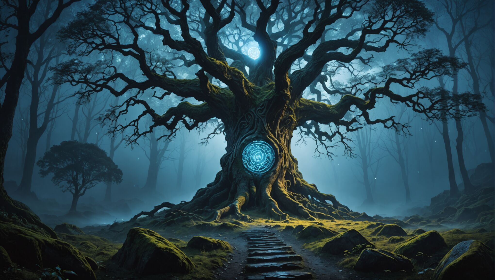 Symbolism and archetypes play a pivotal role in fantasy cover art, serving as a visual shorthand that resonates deeply with readers. These universal symbols tap into the collective unconscious, evoking powerful emotions and associations. The hero’s journey, a cornerstone of fantasy literature, is often represented through archetypal imagery such as the sword in the stone, the magical doorway, or the lone figure facing a vast, unknown landscape.
“Symbolism is the language of the mysteries… By symbols men have ever sought to communicate to each other those thoughts which transcend the limitations of language.” – Manly P. Hall
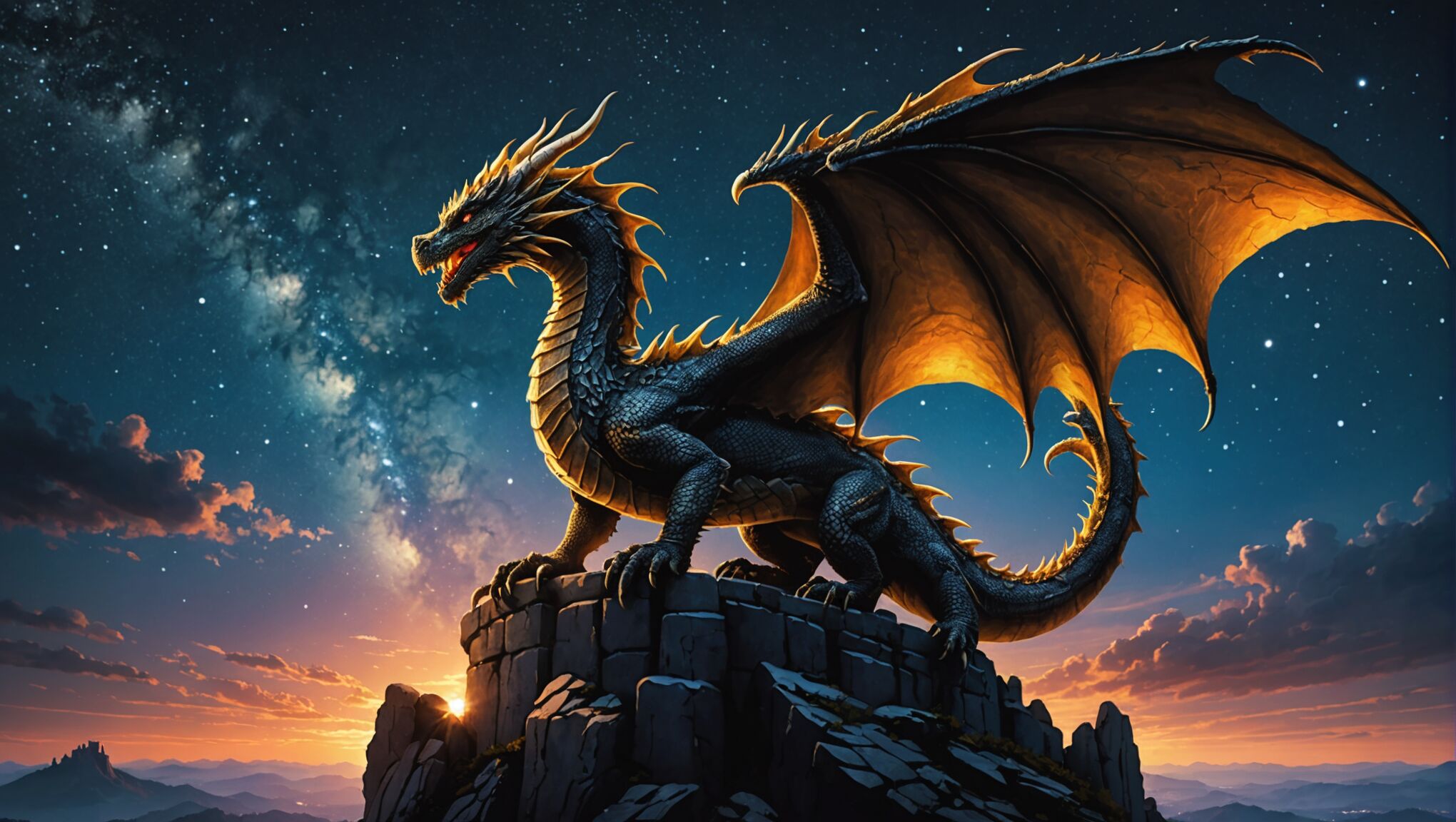
Animals frequently appear as potent symbols on fantasy covers. Dragons embody power and ancient wisdom, while phoenixes represent rebirth and transformation. Wolves often signify loyalty or wildness, and owls are associated with knowledge and mystery. These creatures not only hint at the story’s content but also appeal to readers’ primal connections with nature and myth.
Celestial bodies are another rich source of symbolism. A full moon might suggest transformation or hidden knowledge, while a sun could represent enlightenment or a golden age. Stars often symbolize destiny or divine guidance, particularly when arranged in constellations or forming patterns.
Trees, especially ancient or magical ones, are frequently used to symbolize knowledge, growth, or the interconnectedness of all things. The World Tree or Tree of Life is a powerful archetype that spans many cultures and often appears in fantasy art to represent the cosmos or realms of existence.
Geometric shapes and patterns also carry symbolic weight. Circles suggest unity, wholeness, or cycles, while triangles can represent balance or spiritual aspiration. Spirals often symbolize growth, evolution, or journeys.
Color symbolism intertwines with these elements, reinforcing their meanings. Gold might represent divinity or royalty, while deep blues could suggest mystery or magic. Green often symbolizes nature or growth, and red can signify passion or danger.
Hands are a particularly versatile symbol, representing creation, power, protection, or fate. A hand holding a flame might suggest the theft of divine fire, while an open palm could invite the reader into the story’s world.
Water is another multifaceted symbol, potentially representing the subconscious, purification, or the boundary between worlds. A calm lake might suggest reflection, while stormy seas could symbolize emotional turmoil or adventure.
Archetypal characters also feature prominently. The wise mentor, often depicted as an elderly figure with a staff or book, suggests guidance and hidden knowledge. The trickster, perhaps shown as a masked figure or a mischievous animal, hints at chaos and transformation within the story.
By skillfully incorporating these symbols and archetypes, cover artists create a visual language that speaks directly to the reader’s subconscious, promising a story that will resonate with fundamental human experiences and the timeless appeal of myth and magic.
Color theory for magical atmospheres

Color plays a crucial role in setting the mood and atmosphere of fantasy book covers, often serving as a powerful tool to evoke emotions and create magical ambiances. Deep, rich purples are frequently employed to suggest mystery, nobility, and magical energies. These hues can be combined with shimmering golds or silvers to add a touch of opulence and otherworldliness. Ethereal blues, ranging from pale cerulean to deep midnight, are perfect for conveying a sense of wonder, vastness, and the unknown. They can be used to depict starry night skies, mystical portals, or the depths of enchanted waters.
Vibrant greens are essential for portraying lush, magical forests or the glow of supernatural phenomena. When paired with earthy browns, they can ground the fantasy elements in a sense of natural magic. Fiery reds and oranges are powerful choices for depicting dragons, magical flames, or intense action scenes. These warm colors can create a sense of urgency and excitement that draws the reader’s eye.
Pastels and muted tones have their place in fantasy cover design as well. Soft pinks, lavenders, and peaches can create a dreamy, romantic atmosphere suitable for fairy tales or more whimsical fantasy stories. These gentler hues can be accented with metallic elements to maintain a magical feel without overwhelming the senses.
Contrast is key in creating visually striking covers. A single burst of bright color against a monochromatic background can create a focal point that immediately captures attention. For instance, a vivid red cloak on a character set against a misty grey landscape can symbolize hope or danger in an otherwise bleak world.
Gradients and color blending techniques are particularly effective in fantasy cover design. They can be used to create seamless transitions between realms, suggest the merging of magic and reality, or depict the fading boundaries between worlds. A cover that shifts from deep underwater blues to airy sky tones can visually narrate a journey from ocean depths to heavenly heights.
The use of iridescent or holographic effects in printing can add an extra layer of magic to cover designs. These techniques can simulate the shimmering scales of a dragon, the glint of magical artifacts, or the ethereal glow of fantastical beings. When used judiciously, these effects can make a cover truly stand out on a bookshelf.
Color psychology also plays a significant role in fantasy cover design. Cool colors like blue and green can evoke feelings of calm and introspection, suitable for more contemplative or philosophical fantasy works. Warm colors like red and orange can generate excitement and adventure, perfect for action-packed quests. Understanding these psychological associations allows designers to subtly influence the reader’s expectations and emotions before they even open the book.
Lighting can set the mood. Find out more here.
Seasonal color palettes can be utilized to enhance the setting of the story. Autumnal oranges and browns might suggest a world in transition or decay, while the fresh greens and pastels of spring can imply rebirth and new beginnings. Winter whites and icy blues can create a sense of isolation or purity, depending on the context.
The interplay of light and shadow is crucial in creating magical atmospheres. Dramatic lighting effects, such as rays of sunlight piercing through dark forests or the soft glow of magical auras, can be achieved through careful color selection and placement. These lighting techniques not only add depth and dimension to the cover but also contribute to the overall sense of wonder and enchantment that is so essential to fantasy literature.
Typography and its role in fantasy branding
Typography in fantasy book covers serves as a crucial element that not only conveys the title and author’s name but also reinforces the magical and otherworldly nature of the story within. The choice of font can instantly transport readers to different eras, realms, or magical systems, setting expectations for the adventure that awaits.
Serif fonts, with their elegant and traditional appearance, often lend an air of antiquity and gravitas to fantasy titles. Typefaces like Trajan or Garamond evoke a sense of timelessness and can be particularly effective for epic fantasy or historical fantasy genres. These fonts may be embellished with subtle swashes or flourishes to enhance their mystical appeal without sacrificing readability.
For more whimsical or contemporary fantasy, sans-serif fonts can provide a clean, modern look that contrasts effectively with fantastical imagery. Fonts like Futura or Avenir can give a fresh, accessible feel to urban fantasy or young adult titles, bridging the gap between the magical and the familiar.
Custom lettering is a powerful tool in fantasy branding, allowing designers to create truly unique typefaces that embody the essence of the book or series. These bespoke fonts might incorporate elements from the story, such as runes, magical symbols, or motifs inspired by key artifacts or creatures. The “Harry Potter” series, for example, has become instantly recognizable through its lightning bolt-inspired typography.
The texture and treatment of the typography can significantly enhance its impact. Metallic foils, embossing, or debossing techniques can add a tactile dimension to the cover, inviting readers to trace the letters with their fingers. Glowing effects or subtle gradients within the lettering can suggest magical energies or otherworldly origins.
Placement and scale of typography on fantasy covers require careful consideration. Oversized titles that dominate the cover can create a sense of epic scale, while smaller, more intricate lettering might hint at hidden secrets or intimate, personal narratives. The integration of typography with cover art is crucial; letters might weave through magical vines, emerge from swirling mists, or be carved into ancient stone.
Series branding through typography is particularly important in fantasy literature, where multi-volume epics are common. Consistent use of a distinctive font or typographic treatment across a series creates visual cohesion and helps readers quickly identify new installments. This consistency can extend beyond the cover to chapter headings, maps, and other interior design elements, creating a fully immersive typographic world.
The color of typography plays a significant role in its effectiveness. Gold or silver lettering against dark backgrounds can evoke a sense of precious metals and ancient treasures. Vibrant, contrasting colors might be used for more action-oriented fantasies, while subtle, tone-on-tone approaches can create an air of mystery and sophistication.
Legibility remains paramount, even as designers strive for fantastical effects. The most evocative typography is worthless if readers struggle to decipher the title. Balancing artistic expression with clear communication is a key challenge in fantasy cover design.
Typography can also reflect the tone and subgenre of the fantasy work. Angular, sharp fonts might suit darker fantasies or those with technological elements, while flowing, organic letterforms could represent nature-based magic systems or romantic themes.
Multilingual considerations are increasingly important in global fantasy publishing. Designers must ensure that typographic treatments work across different alphabets and character sets, maintaining the magical essence of the design while accommodating various language editions.
In the digital age, typography must also be considered in the context of thumbnail images and e-book covers. Fonts that are striking and legible at small sizes are essential for capturing attention in online marketplaces and on e-reader devices.
By thoughtfully applying these typographic principles, designers can create fantasy book covers that not only capture the imagination but also establish strong, recognizable brands that resonate with readers and stand the test of time in a crowded literary landscape.
Balancing realism and imagination
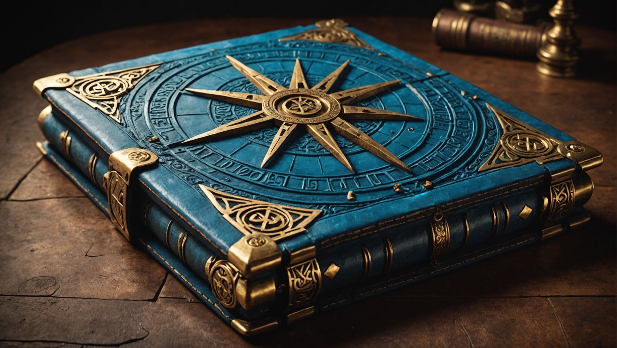 Creating a compelling fantasy book cover requires a delicate balance between realism and imagination. This balance is crucial for grounding the fantastical elements in a sense of believability while still igniting the reader’s imagination. Successful cover artists often blend photorealistic techniques with surreal or mythical elements, creating a visual narrative that feels both familiar and extraordinary.
One effective approach is to anchor fantastical elements within a realistic setting. For instance, a dragon might be depicted with exquisite, lifelike detail, but set against a backdrop of recognizable landscapes or architecture. This juxtaposition helps readers bridge the gap between their world and the fictional realm, making the fantasy more accessible and believable.
Lighting plays a pivotal role in this balancing act. Realistic lighting can lend credibility to even the most fantastical scenes, while subtle, otherworldly glows can infuse mundane objects with a sense of magic. The interplay of light and shadow can create depth and dimension, making imaginary creatures and landscapes appear tangible and present.
Texture is another powerful tool for blending realism and fantasy. Hyper-detailed textures on fantastical elements, such as the scales of a mythical beast or the bark of an enchanted tree, can provide a tactile quality that grounds these elements in reality. Conversely, adding subtle, magical textures to everyday objects can hint at hidden enchantments within the mundane world.
Color palettes can be strategically employed to strike this balance. Realistic, earthy tones can provide a foundation, while pops of vibrant, otherworldly colors can suggest magical elements or energies. This approach allows the eye to move seamlessly between the familiar and the fantastical, creating a cohesive visual experience.
The portrayal of characters on fantasy covers often embodies this balance. Human or humanoid figures might be rendered with realistic proportions and expressions, while their clothing, weapons, or surroundings incorporate fantastical elements. This approach helps readers identify with the characters while still sensing their otherworldly nature or circumstances.
Perspective and composition can also be manipulated to blend realism and imagination. Using realistic perspective techniques for fantastical landscapes or architecture can lend them a sense of plausibility, while subtly distorting perspective in otherwise realistic scenes can create an unsettling, magical atmosphere.
The level of detail in a cover can significantly impact the balance between realism and imagination. Highly detailed elements can anchor the fantastical in reality, while strategically placed areas of abstraction or simplification can leave room for the reader’s imagination to fill in the gaps.
Sometimes, the most effective covers use realism to highlight the fantastical by contrast. A hyper-realistic portrayal of a mundane object or scene can make the introduction of a single fantastical element all the more striking and magical.
As we consider these techniques, it’s worth reflecting on how this balance between realism and imagination in cover art mirrors the craft of fantasy writing itself. Both seek to create worlds that are at once familiar enough to relate to and wondrous enough to inspire. How might this visual approach influence our understanding and appreciation of fantasy literature as a whole?
Moreover, this discussion raises intriguing questions about the nature of imagination and belief. Why do certain combinations of realistic and fantastical elements resonate so strongly with us? How does our perception of reality influence our ability to engage with and believe in fictional worlds? These are questions that not only inform the art of cover design but also touch on deeper aspects of human psychology and our relationship with storytelling and myth.
Marketing considerations for fantasy book covers
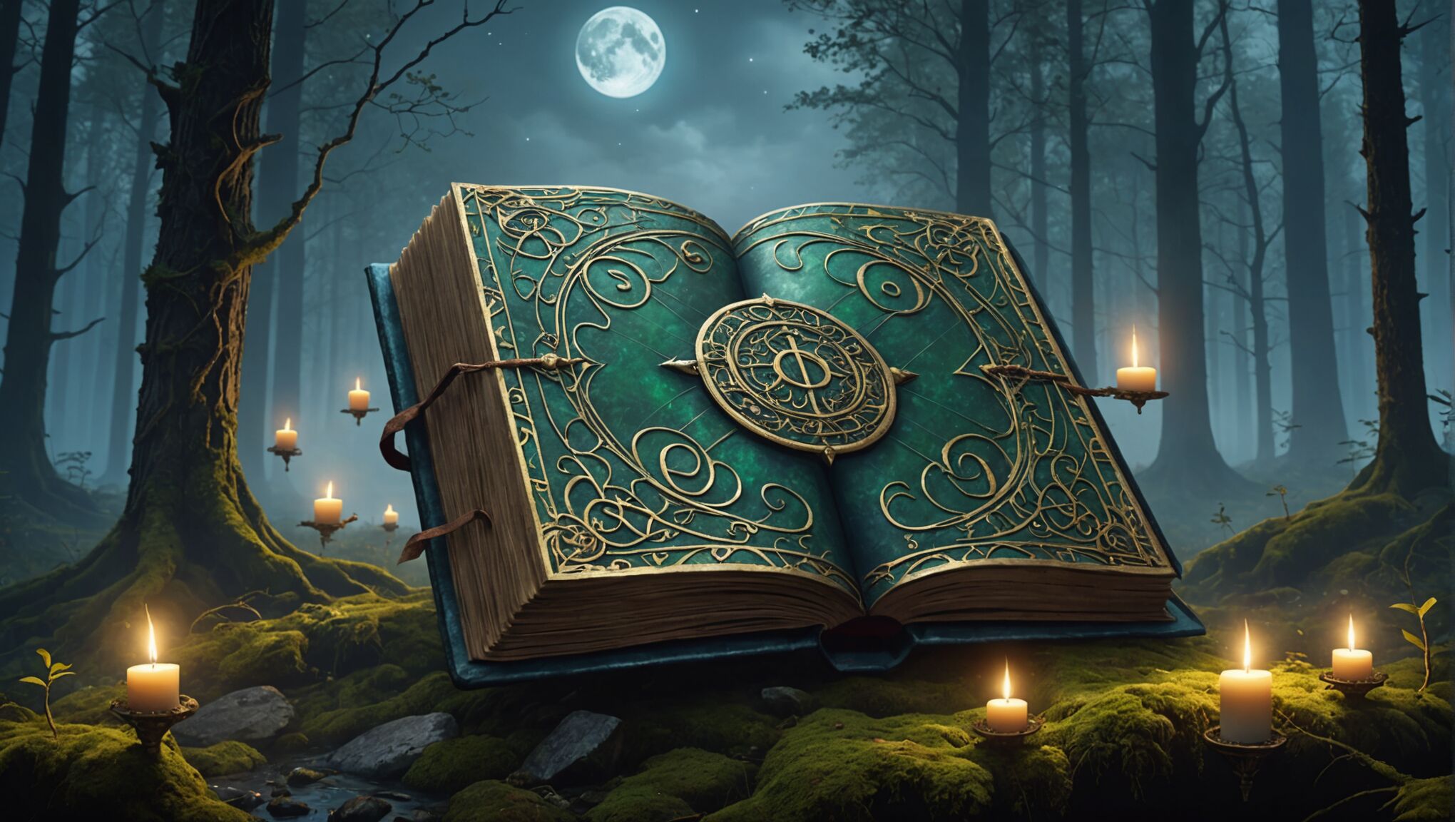
When designing fantasy book covers, marketing considerations play a crucial role in ensuring the artwork not only captures the essence of the story but also appeals to the target audience and stands out in a crowded marketplace. Genre expectations are paramount; readers of epic fantasy might expect grand, sweeping landscapes, while urban fantasy fans look for gritty cityscapes with magical twists. Understanding these expectations allows designers to create covers that immediately signal the book’s genre and attract the right readers.
Series consistency is another vital aspect of fantasy cover design from a marketing perspective. Creating a unified visual brand across multiple books helps readers quickly identify new installments and builds brand recognition. This can be achieved through consistent color palettes, typography, or iconic elements that appear on each cover in the series.
Adaptability for various formats is essential in today’s diverse publishing landscape. A cover must be equally striking as a full-sized hardcover, a paperback, an e-book thumbnail, and in social media promotions. This requires careful consideration of composition and typography to ensure key elements remain visible and impactful at different sizes and resolutions.
Trends in fantasy cover design can significantly influence marketability. While it’s important to create a unique and memorable cover, being aware of current trends can help a book feel contemporary and relevant. However, designers must balance trendiness with timelessness to ensure the cover doesn’t quickly become dated.
Inclusivity and representation have become increasingly important marketing considerations. Covers that feature diverse characters or elements from various cultural mythologies can appeal to a broader audience and reflect the growing demand for inclusive storytelling in fantasy literature.
The use of recognizable tropes or symbols can serve as visual shorthand, quickly communicating the book’s subgenre or themes. A prominent magical artifact, for instance, might suggest a quest narrative, while a shadowy figure in a modern setting could indicate urban fantasy. These elements help potential readers quickly assess whether the book aligns with their interests.
Collaboration between cover designers and marketing teams is crucial. Understanding the book’s unique selling points, target demographic, and planned promotional strategies can inform design choices that support overall marketing efforts. This might include leaving space for promotional stickers, considering how the cover will look when displayed in bookstore windows, or designing with potential merchandise in mind.
The role of social media in book promotion cannot be overstated. Covers that are visually striking and shareable on platforms like Instagram or TikTok can significantly boost a book’s visibility. Designers might consider creating additional assets, such as character portraits or magical symbols, that can be used in social media campaigns to extend the cover’s impact beyond the book itself.
Ultimately, while artistic integrity is paramount, the most effective fantasy book covers strike a balance between creative vision and marketing savvy. They must simultaneously capture the imagination, convey the essence of the story, meet genre expectations, and stand out in a competitive market. This delicate balance is what transforms a beautiful piece of art into a powerful marketing tool that can significantly impact a book’s success in the fantasy genre.

